

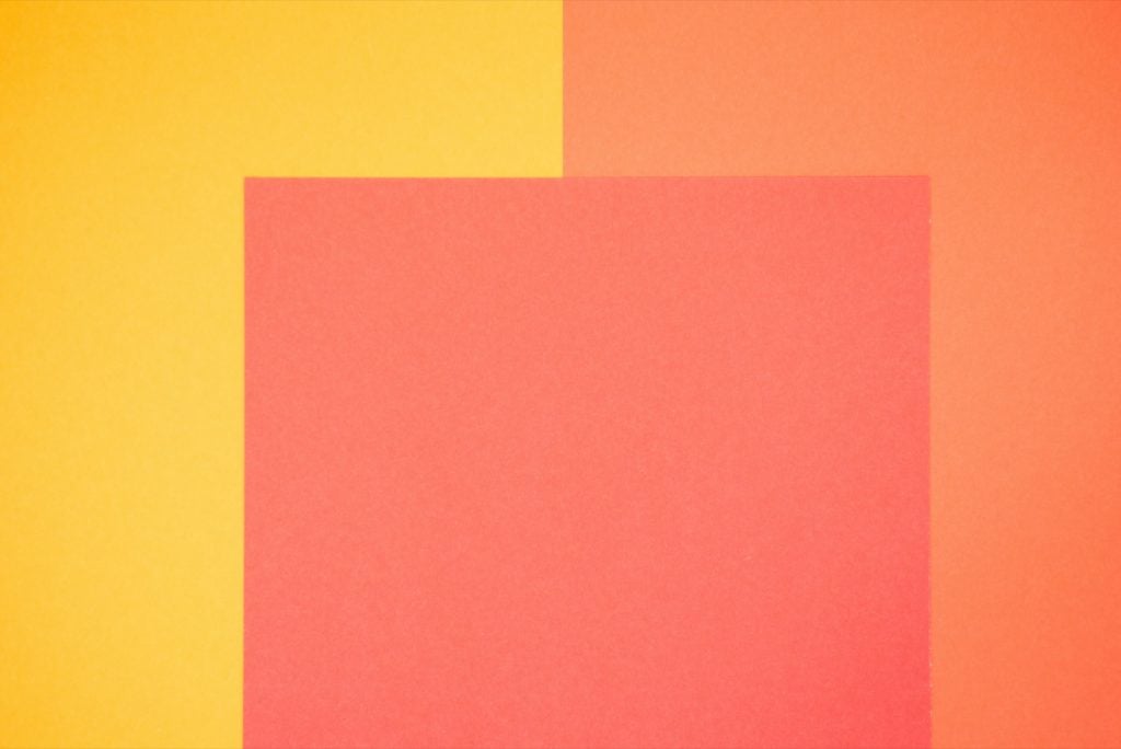
Color is such an important part of life that we often forget to properly appreciate it. When we look at a beautiful sunset, it’s nature that receives the credit. When we hesitantly approach alluring people to introduce ourselves, we usually attribute their look solely to the person’s physical form.
Any given life will have countless examples to draw from. But in the case of a sunset there’s no intrinsic sense of beauty to be found in nature. We see beauty there because of our ability to perceive color. Likewise, the most alluring people are usually so captivating because of the interplay of colors they’ve clothed themselves with.
People seldom stop to consider why they feel the interplay of specific colors is so appealing. What makes the myriad colors of a sunset so appealing when an equally complex oil stain is usually seen as ugly? Why do the same colored accessories look great on one person but seemingly clash with another? To find an answer, we need to look at the concept of color harmony and color schemes, and the rich history behind them.
A Careful Study of Color

As we’ve noticed, people tend to take color for granted. Throughout history most people have taken it for granted in a similar way to gravity. Some colors just seem pretty in a similar way to how objects naturally fall when dropped. Interestingly enough, the same man is responsible for the scientific study of both color and gravity. This man is Isaac Newton.
Newton began his study of color when he noticed how prisms reflected a rainbow of different colors. He then categorized the colors in a variety of different ways. In a modern context the most important part of this process comes from his organizational method. Newton first began to organize color into a square pattern. This would eventually lead to his creation of the very first circular color wheel. Our view of color would change over time. But Newton deserves a lot of credit for his willingness to look at color in a very different way than his peers.
Organizing color and investigating the relationships between various hues was a huge step forward in our formal understanding of the subject. Over time this method of organization led to what we now call color theory. Color theory furthers Newton’s efforts to efficiently organize and understand color. It provides us with new and more scientific ways to look at color. With color theory we can begin to codify how and why colors evoke such visceral reactions from us. And it’s with an aspect of color theory, called color harmony, that we start to see why some color combinations are more appealing than others. Some colors are inherently harmonious with others. And this is often seen by simply applying basic relational rules onto a color wheel.
The Basics of Color Harmony

Color harmony uses a color wheel not too dissimilar from what Newton created. This wheel classifies colors as primary, secondary or tertiary. The primary colors include red, blue and yellow. These are the colors from which all others on the wheel originate. The secondary colors are created from a mix of primary colors. The secondary colors include purple, green and orange. Finally, the tertiary colors are created by blending a primary and secondary color together. These can include colors such as cyan, magenta and gold.
Color wheels commonly include 12 different colors. However, this is largely an issue of the wheel’s size. It’s simply not practical to include the millions of colors we can perceive.
The real magic of the wheel comes from how it organizes color. The primary colors are set perfectly equidistant from each other. Secondary colors sit halfway between the primary colors which create them. And the tertiary colors fill the remaining space. This organizational system provides an easy way to match colors with each other based on spatial relationships. It’s often far easier to work with color this way than it would be to simply consider colors without any set method of comparison.
Color harmony provides us with some specific ways to relate colors to each other. The resulting categorization can help inform us of how well any given combination will work in different contexts. It also guides us when we need to choose which colors to accentuate within a collection. There are seven primary methods to relate colors to each other with color harmony. Each method links colors together through a spatial relationship on the wheel.
A Straight Line for Complementary Colors

Complementary color relationships are one of the easiest ways to understand color harmony. Complementary colors are those which sit opposite of each other on a color wheel. We can think of it as essentially drawing a straight line from one color on the wheel to another. For example, green and red are complementary colors because they are directly opposite of each other on the color wheel.

Complementary colors tend to be jarring. This means that they’re often not the best choice for continual exposure. For example, it’s a bad choice for text which people will need to refer to throughout their day. But the colors can be a fantastic choice for a few words or sentences meant to quickly grab people’s attention. It’s often a great way to mark special occasions as well. Our example of green and red are often associated with Christmas decorations for this very reason.
Example of Complementary Color Harmony

Making Complementary Colors a Little Smoother With Split-Complementary

A split-complementary color scheme is quite similar to a complementary color scheme. We start by drawing a straight line from one side of the color wheel to the other. In this example we’ll reuse green as our starting point. A straight line from green will reach red on the wheel’s opposite side. But instead of using red, we use the colors on either side of it. To red’s left we have red-violet. And to red’s right we have red-orange. Or in other words we simply use the two colors adjacent to a complementary color.
Split-complementary color schemes have a similar eye-catching appeal to what we find with complementary colors. However, split-complementary colors are a little more subtle. This means that split-complementary colors are more relaxing and less jarring than complementary colors. It’s an appealing but not distracting combination of colors.
Example of Split-Complementary Color Harmony

Analogous Colors Flow Into Each Other

Analogous colors are those which sit next to each other on a color wheel. We’ll once again return to green as a starting point. To the left of green we find blue-green. And yellow-green sits to the right of green. Blue-green, green and yellow-green are therefore considered analogous colors.
Analogous colors tend to be relaxing and evocative of nature. Consider the appearance of a forest with a gentle creek running through it. We see a blue sky overhead and green of the forest’s vegetation. The small creek flows through the scene while reflecting a lighter shade of green from its surroundings. The feelings we have in such a scene are classically attributed to analogous colors. No single color insists on our attention. Instead our eyes can smoothly drift along with each color as it transitions into the next.
Example of Analogous Color Harmony
The Carefully Balanced Vibrancy of Triadic Color Schemes

The triadic color scheme can be thought of as a triangle moving through the color wheel. We can once again use green as an example. If we start with green then we’d make a line diverging from it at a roughly 90 degree angle. This would connect green with violet. We’d then draw a straight line out from violet to its opposite side. This would connect violet to orange. Then we could draw a straight line from orange back to the original point of origin at green. This would create a triangle within the color wheel.
Triadic color schemes are usually vibrant and eye catching. It’s often best to use one color from the triad as a foundation for the others. For example, you could use green as the base color for a design. The violet and orange would be used in a less prominent, but still eye catching way.
Example of Triadic Color Harmony

Tetradic Color Schemes Call for Some Extra Balancing Efforts

A tetradic color scheme is somewhat similar to a triadic color scheme. The main difference is that we’re forming a rectangle rather than a triangle. To start at green again we could draw a straight line to orange. We’d then want a line of equal length on the opposite side of the wheel. Then we’d draw shorter lines to connect the two. This would create a link between green and orange on one of the longer lines. The opposite longer line would connect red and blue. The smaller lines would go from blue to green and red to orange.
The main difference we get here from previous examples is the sheer number of colors to work with. Four colors give us a lot of options. It’s often best to again decide on one color of the four to act as a dominant color in your design. Some balance is also called for to ensure that the emotional impact of the color choices is in harmony.
Warm colors that make us think of heat and sunshine should balance out with cool colors which evoke water, snow and sky. Which color you pick to control that balance can influence the overall tone of your larger design.
Example of Tetradic Color Harmony

Square Color Schemes Create a Solid Balance

A square color scheme is quite similar to a tetradic scheme. We simply create a square shape instead of a rectangle. We’ll return to green once more for our example. Of course you can start from any location on the color wheel.
From green we’d draw a straight line up to red. We’d then create a line of the same size moving from each side of both red and green. This would link green to blue-violet. Blue-violet would link to red. Red would, in turn, connect to yellow-orange. And finally yellow-orange would connect back to the starting point of green.
It’s best to use a square color scheme in a similar way to a tetradic scheme. This means choosing one of the four colors to act as a foundation for the rest. And as with tetradic color schemes it’s also a good idea to create a balance in representation between warm and cool colors. Accenting warm over cool or cool over warm will give you the ability to easily influence the piece’s emotional resonance with an audience.
Example of Square Color Harmony

Monochromatic Color Schemes Show How Beautiful Complexity Can Rise From a Single Choice

Have you ever seen an old sepia picture which somehow seemed more vibrant than many modern photographs? This is due to the older picture’s use of a monochromatic color scheme. We could also see this when the rising sun tinges fog with an orange glow.
Unlike the other color schemes a monochromatic selection starts and ends with a single color. We only change the saturation and luminosity of that initial color. In a sepia picture everything has that familiar red-brown color. But shapes have contrast due to different levels of saturation and luminosity. The example of sunlit fog also shows how this can occur naturally in the world.
Example of Monochromatic Color Harmony

Color Combinations for Your Next Design
Here’s a list of colors that go well together. Each post has many color palette examples to choose from so you can find the perfect color combination for your design:
- Colors That Go With Red
- Colors That Go With Green
- Colors That Go With Blue
- Colors That Go With Yellow
- Colors That Go With Orange
- Colors That Go With Purple
- Colors That Go With Pink
- Colors That Go With Brown
- Colors That Go With Black
- Colors That Go With Gray
- Colors That Go With White
- Colors That Go With Turquoise
- Colors That Go With Navy Blue
- Colors That Go With Lavender
- Colors That Go With Burgundy
- Colors That Go With Emerald Green
- Colors That Go With Teal
- Colors That Go With Royal Blue
- Colors That Go With Rose Gold
- Colors That Go With Gold
- Colors That Go With Silver
- Colors That Go With Lilac
- Colors That Go With Cream
- Colors That Go With Mauve
- Colors That Go With Beige
- Colors That Go With Sage Green
- Colors That Go With Charcoal Gray
- Colors That Go With Taupe


