
Our choice of colors goes a long way into making the right statement, and analogous colors can help with that. This works whether you’re building a website or logo, painting, or just getting dressed in the morning.
So, exactly what are analogous colors? If you’re unaware, let’s take a closer look at these colors and some of the best ways you should use them.
Analogous Colors: What Are They?
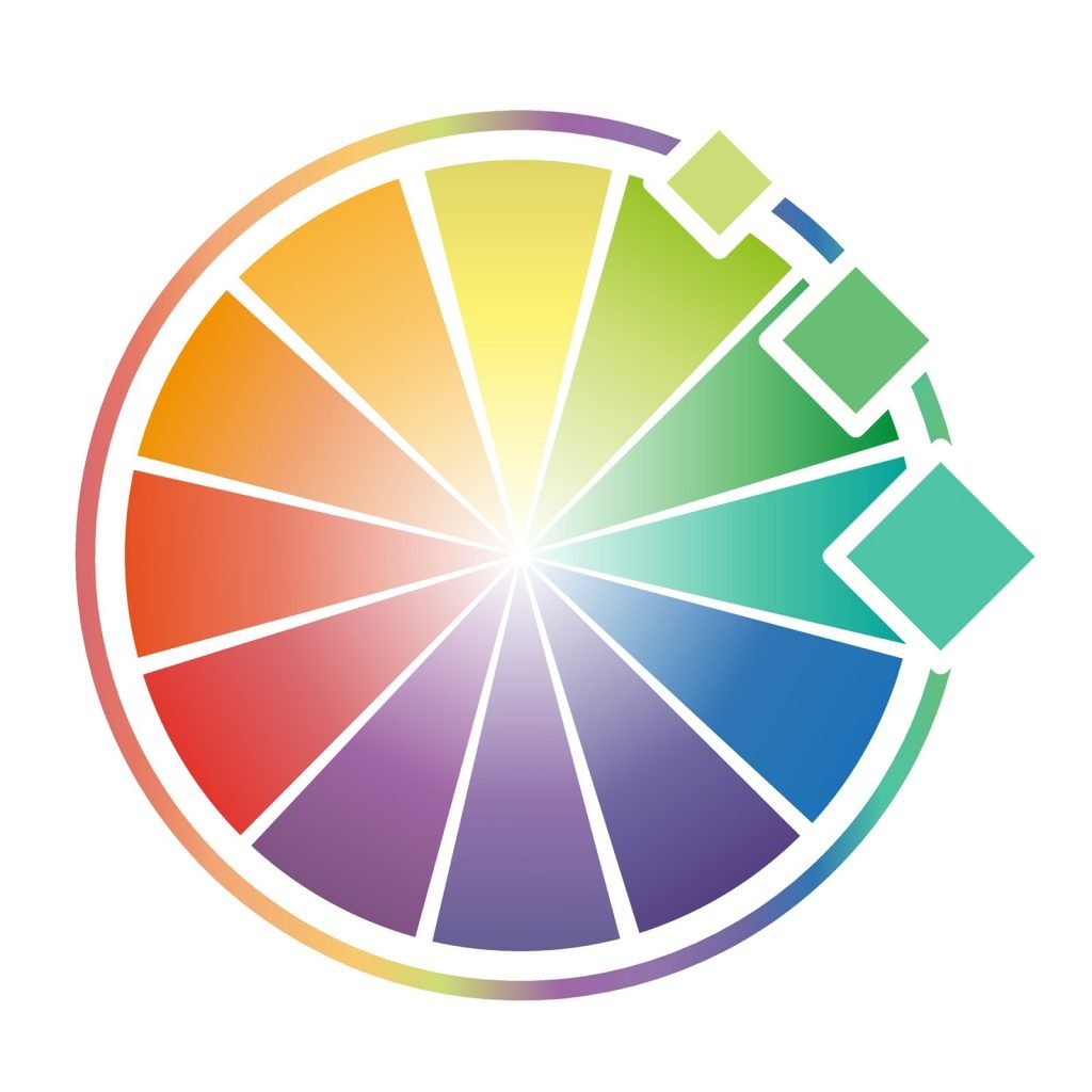
To figure out what analogous colors are, it’s best to dissect the word “analogous“. It means things that are similar or comparable. When it comes to colors, it means things that are parallel or colors that resemble each other. On a color wheel, analogous colors will be next to one another.
Let’s focus on a more in-depth color wheel. Say you’re looking at the color red. Depending on which way on the wheel you go, you’ll notice a gradual change before reaching either yellow or blue.
In the direction of yellow, you can see shades of red-orange, then move onto orange, and then reach yellow-orange and finally yellow.
On the other path, you can encounter shades of red-violet, violet, blue-violet, and eventually blue.
The same scheme works for the other colors. As long as they’re nearby each other, they’re deemed analogous colors.
With this in mind, it’s easier to recognize what aren’t analogous colors. Red-violet, violet, and blue-violet may be analogous, but red isn’t known to be analogous to blue since they aren’t exactly near each other.
Red is also not analogous to green or yellow since there are multiple colors in between them.
Best Ways to Use Analogous Colors
One of the most incredible things about using analogous colors is that they create a wonderful sense of flow. It’s almost seamless, in fact, and there are numerous combinations you can use to develop a certain style or invoke a particular mood.
Building Your Color Scheme
The first step you will want to take when using analogous colors is to find your primary color. To stick with our examples from earlier, let’s begin with red. Now that you’re at red, you have the freedom to move either left or right on the color wheel and work on your scheme from there.

If you are unsure which way to go, consider whether or not you want to use warmer or cooler colors. For the sake of this example, let’s go with cooler colors. So, you’ll work your way from red to red-violet, and then to violet.
And with that said, you now have a color scheme to work with. You can readily do the same with the other primary colors.
Implementing Your Chosen Colors
Now that you have a color scheme in mind, it’s time to put this to good use. Thankfully, there are plenty of avenues you can go down.
Painting

Paint a picture or paint a room. No matter which way you go, analogous colors can bring it all together.
Say you’re working on a nature picture. You can capture a beautiful forest scene using green and its analogous colors. This can take you down the path of using green, yellow-green, and yellow for various trees. Or you can go the route of green, blue-green, and blue to build up the forest against the sky.
Such use of color can help build the atmosphere of a painting, giving viewers a specific feeling when they look at the piece.
On the other hand, you can use analogous colors when painting the walls of a room in your house, for instance. It’s easy to use a single solid color on the walls, but perhaps you want to create a design pattern or even just an accent wall. The right analogous color can make a room pop.
Let’s go with another example here. Perhaps you want to use blue in a room. You can build a more impressive, eye-catching look by utilizing some shades of blue-violet and violet. Maybe do the majority of the wall in blue and paint the upper or lower trim in violet to offset it.
Logos
If you’re working on a logo for your business or someone else’s, analogous colors can truly capture people’s attention. Take a look at some popular logos from big companies to get ideas.
John Deere, BP, Kodak, and Taco Bell are some great examples of analogous color usage. Each of those logos instantly catches the eye without being overwhelming. The color scheme can help create a more unified piece so audiences are more willing to look at it, and hopefully, check out the company behind it.
Website

It doesn’t matter if this is a company website or a personal blog you’re working on, the choice of colors for the website can make or break it. You can find several websites that are loud with clashing colors, and that can work if that’s the emotion you wish to get from visitors.
However, if you want something that’s a touch more serene or easy to view, then you can use a good mixture of analogous colors. They can make such a calming effect that it might encourage visitors of the website to stay and surf around.
To use an example, the likes of orange-yellow, yellow, and yellow-green can work well for an upbeat, inviting website.
Outfits
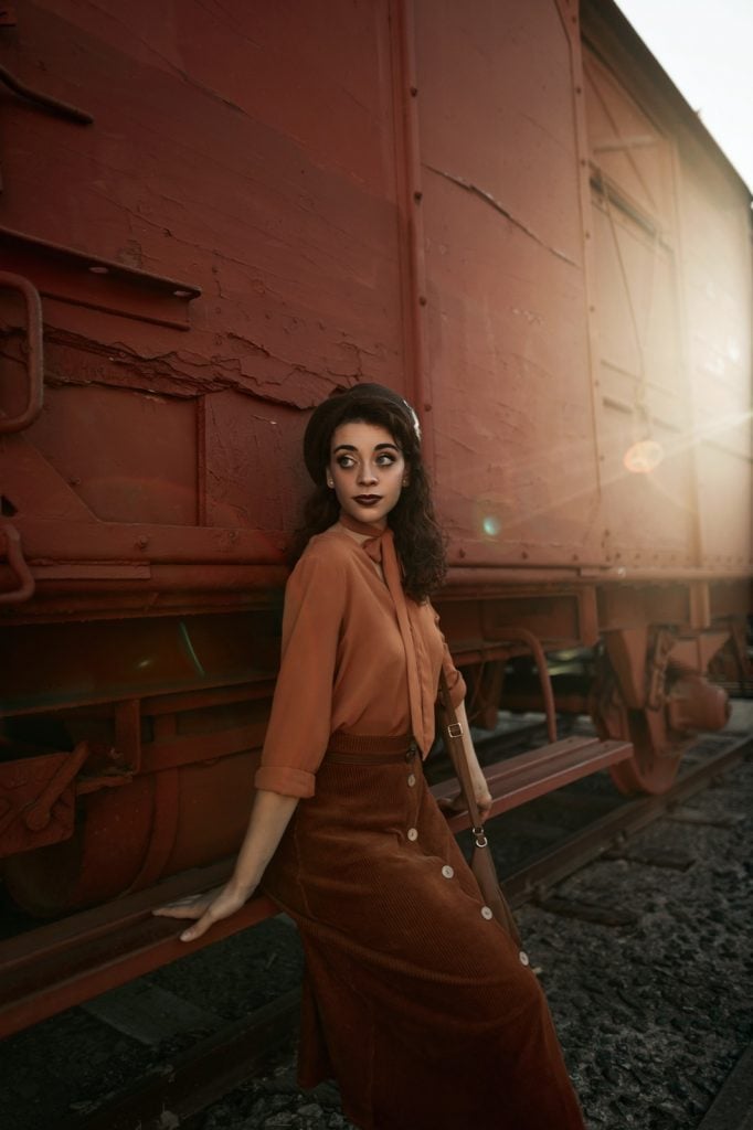
Yes, you can indeed use analogous colors when creating an outfit. This is especially useful for designers or personal shoppers, but it can work well in anyone’s everyday life.
In simple terms, it’s all about matching, but not in a way that the colors are exact from head to toe as that can have you fade into the background too much.
Have a blue jacket? Consider pairing it with jeans that are just a slightly different shade of blue, lighter or darker.
Maybe you have a nice yellow dress that features shades of orange. You’ll probably notice this use of color in many stylish or trendy outfits.
The best thing about this is that you can easily use it by just pairing the right shoes or hat with the rest of your clothes.
How Not to Use Analogous Colors
It can be remarkably easy to use analogous colors, but it’s just as simple to apply them in a way that they won’t work.
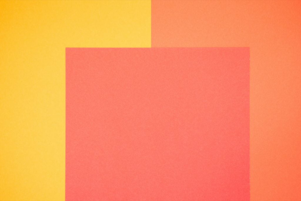
This is done by being a touch too subtle in the shades of colors that you use. For instance, let’s take orange. You can work your way from red-orange or orange-yellow to make a successful scheme. However, you have to take care that there’s a noticeable difference between the orange and red-orange or the orange and yellow-orange.
If you go too similar in shade, then it’s hard to tell where one color stops and another color starts. This can make things look like one single color rather than multiple ones, and it defeats the purpose of using analogous colors in the first place.
So, you must ensure that everything blends, but that the mixture is more even so you can pick out the various colors and hues.
Should You Use Analogous Colors?

Analogous colors do well at eliciting certain emotions, and with such a blend of colors, that tends to be more harmonious in nature. So, when you’re looking to create that comfort or a more composed feeling, then analogous colors are the way to go.
On the other hand, if you want something that’s loud and filled with energy, then perhaps it’s best if you use contrasting colors instead of analogous tones, as they might be too tame.
Analogous colors have their purpose. As long as you understand how to build a color scheme, blend them well, and understand when to apply them, then analogous color patterns can become your best friend for your next project.


