If you are an artist, you probably got your first taste of color theory in one of your first art courses.
Otherwise, you may have first crossed paths with the color wheel in a very different place – the cosmetics counter.
Color theory and the concept of complementary colors is a major driver in many areas of life today, including fashion and style, interior design, even psychology and sociology.
But what exactly is color theory? How does it work? How can you harness the secrets of color theory and complementary colors in your own life and work? Let’s find out!
The History of the Color Wheel
What we know of today as “color theory” actually started around the turn of the 20th century. The original color wheel was created by Sir Isaac Newton in 1666, but it was reinvented by Swiss painter Johannes Itten (born in 1888) in the mid 1900’s.
Itten fell in love with colors, and as a teacher, artist and designer, he devoted his life to the exploration of how color, emotion, personality and life itself intersect. Relationships between colors was of particular interest.
Professor Itten developed an introductory course for all new art students at Germany’s famed Bauhaus School of Art. The course encouraged students to dive into their own deeply personal exploration of color, texture and form.
Today, our modern color wheel can be traced all the way back to Itten’s pioneering work.
Color Theory Basics: The Color Wheel in a Nutshell

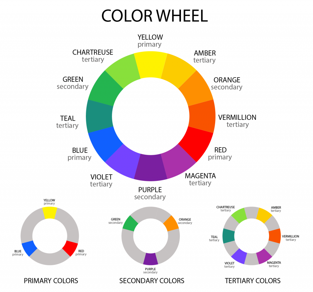
Professor Itten’s original color wheel contained three levels of colors: primary, secondary and tertiary.
Primary Colors
Primary colors could also be thought of as “primal colors” or “original colors.” There are only three of them, and they can’t be created by mixing other colors together. But they can create other colors when mixed together.
The primary colors, sometimes denoted as P’, are red, yellow and blue.
Secondary Colors
Secondary colors arise when any two primary colors are mixed together. There are three secondary colors just like there are three primary colors.
A mix of red and yellow, both primary colors, gives you the secondary color orange.
A mix of yellow and blue primary colors gives you the secondary color green.
A mix of red and blue primary colors delivers the secondary color of purple.
Secondary colors are sometimes denoted as S’.
Tertiary Colors
Tertiary colors, as their category name implies, are created when you mix one primary color together with one secondary color.
There are six tertiary colors:
- Yellow-green
- Yellow-orange
- Blue-green
- Blue-violet
- Red-orange
- Red-violet
Tertiary colors are sometimes denoted as Ts.
By now you have probably started to notice lots of repetition as the primary and secondary colors come together to create tertiary colors. Perhaps you even have a visual in your mind of these different colors interacting as neighboring colors meet, mingle and transform as a result.
This is precisely the way the color wheel evolved.
An Overview of the Modern Color Wheel

While the color wheel may not look like it incorporates every color in the color spectrum, it actually is designed to do just that.
When you look at the modern color wheel, you can think of it like looking at a table with place card settings in front of each seat. Every color sits next to colors it has an existing relationship with. The placement of each color on the wheel is strategic.
Another easy way to visualize and remember the color wheel is to think of it like a compass. At the top is North. To the left is West. To the right is East. Below is South.
True North is where the primary color yellow sits. One degree below true West, you will find the primary color red. One degree below true East is where the primary color blue sits.
In between each of the three primary colors you find the secondary and tertiary colors. Starting at the next position to the left of true North (Yellow), you have yellow-orange, orange and red-orange.
To the right of one degree below true West (Red), you have red-violet, violet and blue-violet.
To the right of one degree below true East (Blue), you have blue-green, green and yellow-green. Then you are back at true North (Yellow) once again.
The Four Basic Color Qualities

Professor Itten felt strongly that color must been seen, felt and experienced at every level from its most primary expression through all the increasingly subtle permutations as colors combined together.
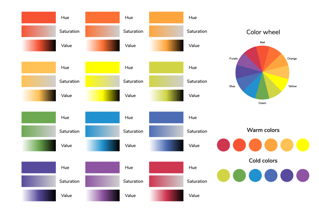
To this end, he wrote and taught about four essential color qualities: hue, value, temperature and intensity.
Hue
Hue could also be called “root” or “source” color. The hue is always one of the 12 key color places on the basic color wheel just described earlier here.
Beginning painters learn to start mixing their custom palette from one of these 12 hues.
Value
The value of a color is always going to be compared against a basic palette of white, gray or black.
A color’s value is expressed in terms of “lightness” or “darkness” in relation to each of these three basic colors.
Temperature
Temperature is perhaps the most subjective of the four basic color qualities outlined by Itten. It is also in this quality where it is easiest to see the emotional relationship Itten himself had with color.
Temperature is expressed in terms of warm or cool.
Intensity
Intensity is more commonly called “saturation” today. To measure a brightness of any given color, it is first necessary to identify the root hue/color it is most closely related to. This is usually one of the two neighboring colors that sit next to it on the color wheel.
Then the new color’s intensity can be characterized in terms of “brightness” or “dullness” as related to the predominant root hue.
Seven Methods for Identifying Complementary Colors

Now that you have a basic understanding of the three color levels (primary, secondary, tertiary) and the color wheel layout itself, we can take a closer look at the evolution of complementary colors in modern color science.
Itten taught about complementary colors using seven key methods he called “contrasts.”
1. Contrast of Saturation
This method requires the mixing of intense and dull colors.
An example might be a vibrant red or yellow set against a dull gray.
2. Contrast of Warm and Cool
This method requires more subjective assessment by the user to match a “warm” and a “cool” color.
Traditionally, colors like orange, red, brown and yellow are viewed as warm, while colors like blue, gray and green are viewed as cool.
So a complementary match of warm and cool might pair red, which grabs the viewer’s attention, with green, which recedes into the background.
3. Contrast of Light and Dark
This method is one of the easiest to understand and apply, as it requires only a match of light and dark colors.
4. Contrast of Hue
Here, a complementary matching pairs one hue that is closer to one of the three primary colors (red, yellow, blue) with a hue that is farther away from the primary colors.
5. Contrast of Extension
This method is easier to understand when the word extension is swapped for the word proportion.
Here, two colors are paired where one takes up a majority of the canvas while the other occupies only a minority of space or presence.
6. Simultaneous Contrast
The simultaneous contrast method pairs colors that are opposites on the color wheel (i.e. that sit opposite each other in their positions on the color wheel).
An example might be pairing a blue-based hue with a hue that falls between yellow and red on the color wheel.
7. Complementary Contrast
In this method, the word “complementary” could also be swapped for the word “opposing.”
A complementary contrast occurs when two colors that would ordinarily face one another on the color wheel are placed right next to each other.
You can find the most common opposite colors on different color wheels here:
- What Is the Opposite of Red?
- What Is the Opposite of Green?
- What Is the Opposite of Blue?
- What Is the Opposite of Yellow?
- What Is the Opposite of Orange?
- What Is the Opposite of Purple?
- What Is the Opposite of Cyan?
- What Is the Opposite of Magenta?
What Are Complementary Colors? Strength and Harmony

At their most fundamental, complementary colors are the two colors that sit facing each other on the modern color wheel.
An easy example is yellow (true North) and violet (true South). Another easy example is red-orange (true West) and blue-green (true East).
From here, the distinctions become more subtle and may increasingly make use of the seven methods for pairing complementary colors that Itten developed.
But the underlying goal is to produce a visual palette that blends equal parts strength with harmony and harmony with strength.
This effect may be seen or, as Itten often encouraged his students to do, felt and experienced.
Experienced color wheel users can increasingly dig down into ever-more-infinite iterations of these pairings to create new multi-level experiences using color.
Learning to Work With Complementary Colors

Whether your primary interest in mastering color theory and working with complementary colors is one of wardrobe, design, art, digital, photography, cosmetics or some other use, the first steps will always be essentially the same.
Step 1: Draw the Color Wheel
When you can draw the color wheel from memory, you will be on your way to developing a working knowledge of color relationships.
You can then build on this knowledge to begin pairing complementary colors because you know which colors face each other on the master color wheel.
Step 2: Build Your Color Palette
Regardless of what media you work with, whether it be oil paints or blush and eye shadow, using complementary colors requires building a palette based on the color wheel positions.
Beginning artists (in any media) arrange their palette formally, with every color represented and in its proper place.
Experienced artists can then customize their palette to emphasize favored colors and complementary relationships that over time have become like artistic signatures in their work.
Step 3: Experiment With Custom Mixing
In the same way, beginning artists (in any media) may prefer working with premixed secondary colors (orange, green, purple).
Experienced artists, on the other hand, may feel comfortable branching out to mix their own secondary colors by hand. This can then reveal deeper and subtler color relationships using the principles of Itten’s seven methods.
Step 4: Consider Complementary Color Composition
One of the most important aspects of mastering use of complementary color is to get the composition right.
In interior design, for example, complementary colors are often discussed in terms of “accent colors.” A room with neutral tones may feature a splash or two of complementary colors in the form of a throw rug or lamp shade.
In digital media, complementary colors are used similarly to how you might use a highlighter to draw attention to the most important passage in a legal document. For instance, a website template might feature a basic blue color scheme with a vibrant yellow call-to-action box.
Advanced Complementary Colors: Color Schemes

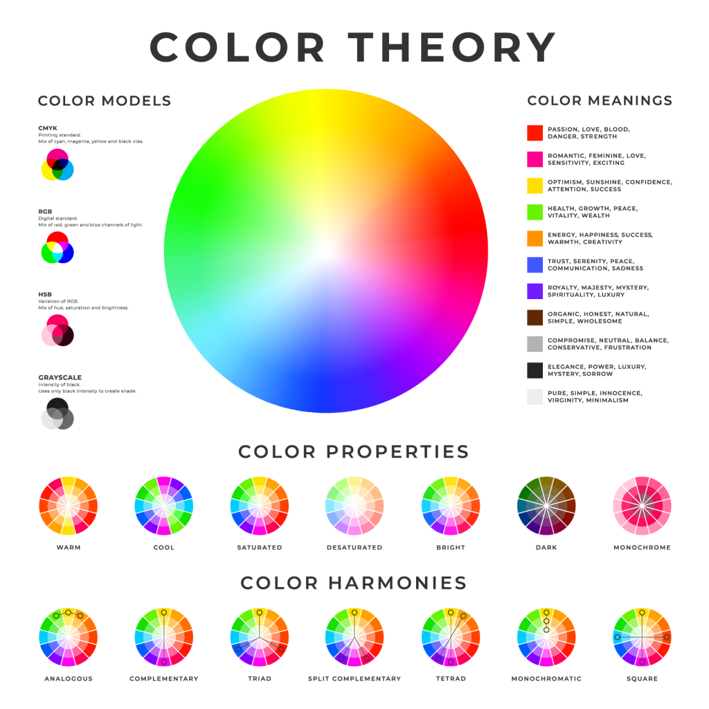
The advanced color theory concept of color schemes comes from the understanding that one-half of the color wheel contains cool-dominant color hues and the other half of the wheel contains warm-dominant color hues.
There are seven basic color schemes (sometimes also called color harmonies).
Complementary
A complementary scheme at its most basic is to pick the two colors that sit most directly opposite each other on the color wheel.
Split-complementary
A split-complementary scheme uses one base color and the two opposing colors that sit most closely opposite to it on the color wheel.
Triadic
A triadic scheme uses three colors that sit equally opposite from each other on the color wheel.
Square
A square scheme uses four equally-spaced color pairs.
Tetradic
A tetradic or rectangular scheme uses four colors that represent two complementary color pairs.
Analogous
An analogous scheme uses three colors that sit directly next to each other on the color wheel.
Monochromatic
A monochromatic scheme focuses on a single color and using variations (tones, tints and shades) of that particular color.
To learn more, here’s a color terminology glossary that explains the most basic color theory terms.


