

Choosing a color scheme can be one of the more challenging tasks of an interior decoration project. There are so many choices. Do you want a warm, vibrant look or do you prefer cool, calming colors? Perhaps a monochromatic color scheme using just one color is more to your liking.
Monochromatic color schemes definitely create a unique look. They work very well with modern designs heavy on whites, grays, earth tones and plenty of straight lines. Yet, they aren’t for everyone. Some people simply find the monochrome look too boring.
Defining the Monochrome Look

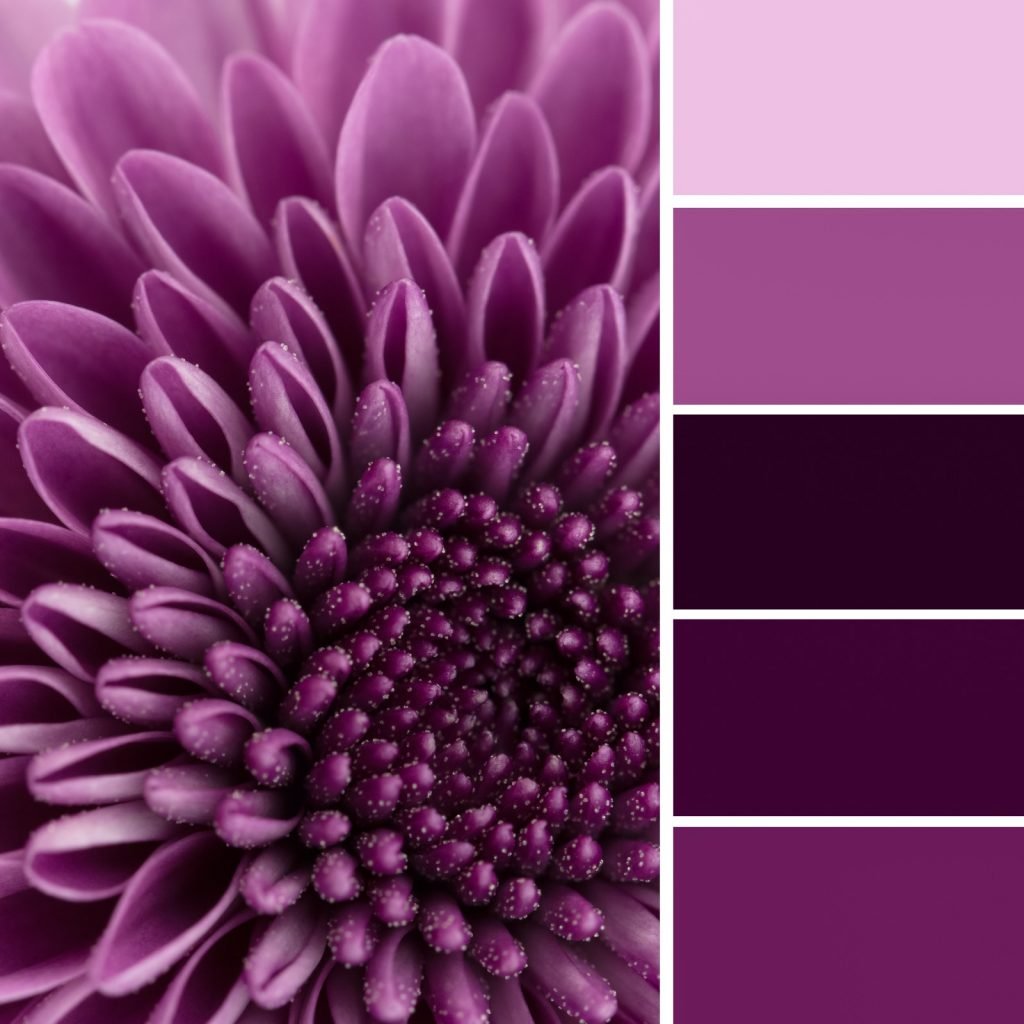
A monochromatic color scheme focuses on a single color. For example, you might choose blue as your base color. You may even have a specific shade of blue that strikes your fancy. Building a monochromatic color scheme around that shade of blue involves choosing various shades, tones, tints and hues to complement the base.
The one thing about monochrome colors is that you’re not limited to a particular base. Some people hear monochrome and automatically assume black and white. And yet, you can create very beautiful monochromatic color schemes starting with any color on the color wheel.
Understanding the Color Wheel

The color wheel is a tool for defining the relationships between colors. A typical color wheel is divided into 12 sections. There are the primary colors of red, yellow and blue. The next six are secondary colors, while the final three are tertiary colors. An interior decorator or a designer can look at the color wheel to see which colors work well together in a particular color scheme.
Using the wheel to choose a monochromatic color scheme isn’t difficult at all. You choose one of the colors in the wheel to act as the base. Then you work toward the center of the wheel to determine shades, tones, and tints. None of the other colors on the perimeter matter.
Some would argue that the base color should be one of the primary colors. Others would argue that any color on the wheel works fine as a base. Neither argument is necessarily correct in the eyes of interior designers. You can choose any shade of any color to act as your base. That’s the beauty of monochromatic schemes.
Creating a Monochromatic Scheme
Choosing a base color should be relatively straightforward. Start with whatever color excites you the most. That particular color will dominate the space. It is going to form the foundation on which all of your other choices will build. You will need to know some terms before you begin:
- Shade – A shade is a color resulting from adding black to the base color.
- Tint – A tint is a color resulting from adding white to the base color.
- Tone – A tone is a color resulting from adding gray to the base color.
- Hue – A hue is one of the 12 colors in the color wheel.
Hue is the most important thing to understand if your base color isn’t one of the colors in the wheel. You may choose a particular shade or tint as your base. Then you might choose the corresponding hue as one of your complementing colors. Then again, you might choose to avoid the corresponding hue altogether.
Considering Light and Space

Your choice of base color should be influenced by the size of the space and the amount of natural light it receives. A smaller room without a lot of natural light calls for a lighter base color. You can accent with darker colors in your furniture, wall treatments, etc.
Also consider the difference between warm and cool colors in relation to the space. Cool colors are colors like blue and green. Warm colors are colors like red and orange. Warm colors in an exceptionally large room may be overbearing if your choice of shades and tones is too dark. Likewise, cool colors in light tints can cause smaller rooms to lose their definition.

It is also possible to give the illusion of space by combining your base color with the right shades, tints and tones. One way to do that is to choose a lighter shade as your base. This lighter shade is what you use on the walls. Then gradually go darker for window treatments and furniture.
Such a combination brings contrast to the space. By accenting with darker colors, the walls become less prominent in the visual scene. That makes the room appear bigger than it really is. A good amount of natural light seals the deal.
Reasons to Choose a Monochromatic Scheme

With 12 color wheel choices and an endless variety of shades, tints, tones and hues, you might wonder why someone might choose a monochromatic color scheme. Beyond the fact that some people just think it looks good, there are other legitimate reasons. Simplicity is at the top of the list.
A monochromatic scheme oozes simplicity. The lack of contrasting colors prevent the eye from constantly being distracted as one moves around the room. It prevents the brain from being overwhelmed with too many perceptions of color that can sometimes confuse. In essence, monochromatic color schemes don’t bring a whole lot of noise into the visual signal.
Hand-in-hand with simplicity is streamlining. When you are going monochrome, you don’t have to work as hard to bring in a few common elements to tie everything together. The color scheme itself does that for you. Visual unity is achieved by your color choices as long as you don’t introduce anything into the space that contrasts excessively.
The simplicity and unity of monochromatic color schemes create a sense of calm and relaxation. This is due to how the brain tries to make sense of new spaces. The less the brain has to understand, the more quickly it absorbs everything. This promotes a more peaceful mindset.
Decorating Mistakes to Avoid

It has been said that monochromatic colors are the easiest to decorate with. That may be true in a general sense, but it is still possible to make mistakes and end up with a monochromatic design that just doesn’t look that good.
Here are some common decorating mistakes to avoid when decorating with monochrome colors:
- Sticking With One Color – Monochrome doesn’t mean just a single color. Everything doesn’t have to be one shade of blue or yellow. Mix it up a bit by combining different variations until you find the look that’s right.
- Avoiding White – Some people avoid white because they incorrectly assume that there aren’t enough variations. Nothing could be further from the truth. There are more shades of white than you might imagine. A few subtle shades in either direction of your base can do wonders for creating an elegant look.
- Avoiding Black – By the same token, black can be as glamorous as white is elegant. Don’t be afraid to consider a black color scheme unless you are completely averse to dark rooms.
- The Same Scheme Everywhere – Unless you are especially attached to your monochromatic color scheme, avoid the temptation of using it throughout your entire home. Choose a different color scheme for at least one or two rooms to offer some visual variation.
- Failing to Consider Furnishings – Your furnishings should play a role in your choice of colors. For example, a modern color scheme based on pink is not likely to go well with older furniture designed to reflect a more Victorian style. Colors should reflect the overall feel of the room as influenced by furnishings.
- Obsessing Over the Floor – The final mistake to avoid is obsessing over the floor. If the floor is neutral, just about any monochromatic color scheme will work with it. If it’s not neutral and clashes with the color scheme you have in mind, you might consider changing it. Just don’t let the floor make the decision for you.
Remember, a monochromatic color scheme utilizes a single color as its base. All of the complementing colors are various shades, tints, tones and hues. A well conceived monochromatic scheme can truly revolutionize the look and feel of a space. If you’ve never considered going monochromatic before, it is something to think about for your next interior decorating or design project.


