Whether you’re creating a poster for a food festival, designing an ad campaign for a restaurant, or just interested in making appetizing design projects, food-inspired color palettes are great to have in your arsenal.
These palettes range from fresh and bright to soft and sugary. Not sure where to start?
Check out these beautiful food color palettes. Hex codes are included if you want to use the colors in your next design.
1. Summer Salad
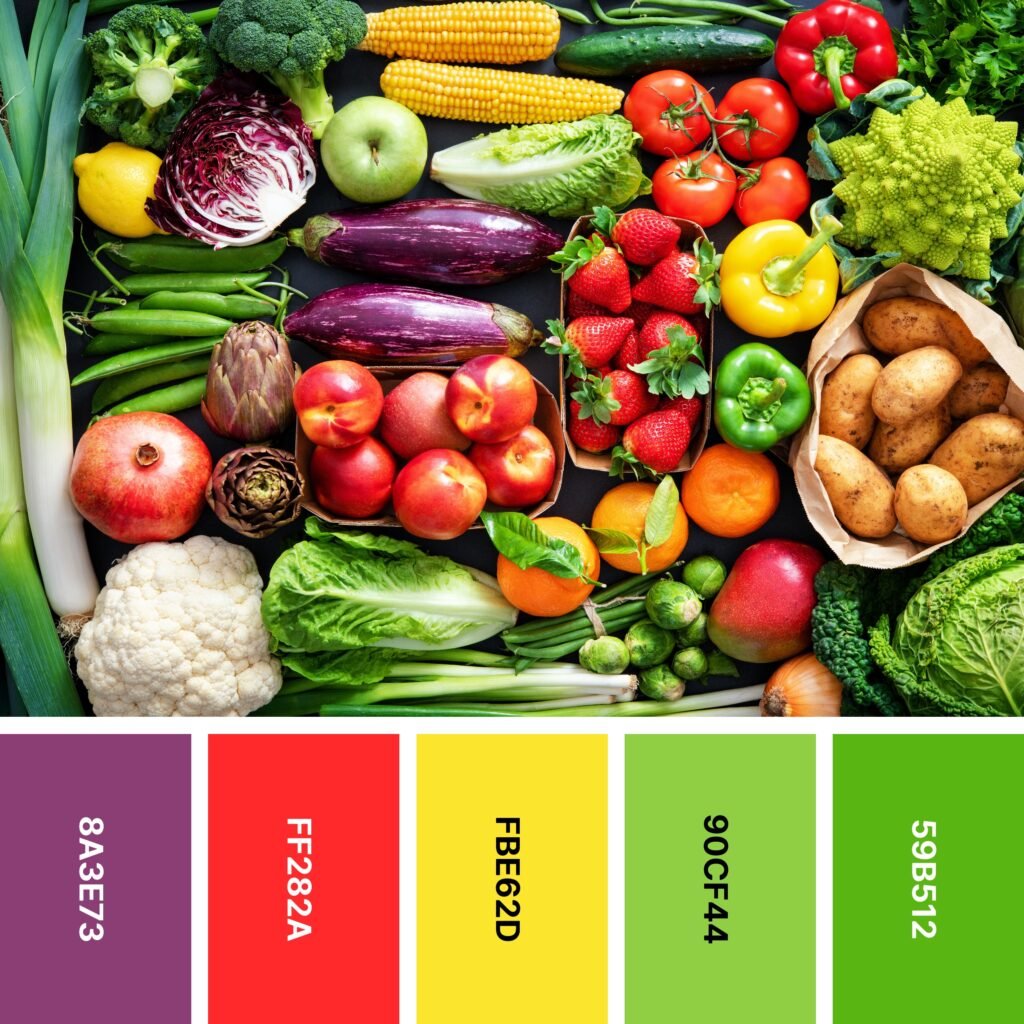
Names: Plum, Red (cmyk), Aureolin, Yellow green, Kelly green
Hex Codes: #8A3E73, #FF282A, #FBE62D, #90CF44, #59B512
This scrumptious produce lineup looks like something right out of a catalog. And if you select it for your design, you’ll find that it’s difficult to choose which color to use first. From the eggplant-purple depth of Plum to the sunny yellow of Aureolin to the grassy Kelly Green, you have no shortage of options.
This palette has a fairly even warm-cool balance, and the colors are far enough apart to appear rainbow-inspired. If you’re looking for a collection of bright shades perfect for colorblocking, this is a great choice.
2. Fruit Cup
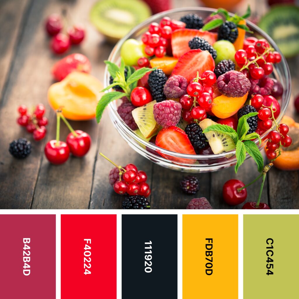
Names: Amaranth purple, Red (cmyk), Rich black, Selective yellow, Citron
Hex Codes: #B42B4D, #F40224, #111920, #FDB70D, #C1C454
Few things are as refreshing as a bowl of chilled fruit on a hot summer day. This palette captures the juicy, diverse shades you’ll see in raspberries, strawberries, blackberries, peaches, and kiwis.
It’s a great choice if you’re looking for a color scheme for a high-contrast design. Every other shade in the palette really pops against Rich Black. So whether you’re creating patterns or colorblocked projects, it’s certainly worth a look!
3. Rainbow Delight
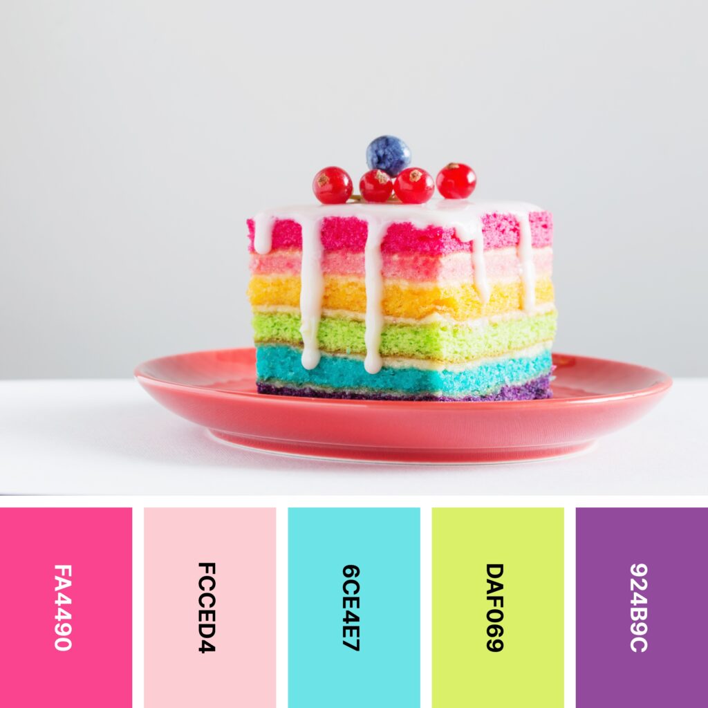
Names: French rose, Tea rose (red), Electric blue, Mindaro, Purpureus
Hex Codes: #FA4490, #FCCED4, #6CE4E7, #DAF069, #924B9C
Layer cakes are delicious as-is. But add some bright, multicolored layers, and you get a whole new dimension!
Whether the design you’re making is food-related or not, this collection of colors is an attention-grabbing choice. The main challenge here is to ensure this bright grouping doesn’t overwhelm your audience. The example image solves that problem with a stark white background.
4. Green Smoothie

Names: Dark moss green, India green, Pigment green, Yellow green, Tea green
Hex Codes: #326414, #428612, #54AC5A, #BCD76D, #E1EDC1
Rainbow-like, multicolored food-inspired palettes are certainly beautiful. But as you see here, color palettes based around a single shade can also be very effective. This one covers the spectrum between the color of tea and the color of dark leafy greens.
Thanks to its all-green appeal, this is a color palette that would do beautifully in designs for outdoor- or sustainability-focused organizations. Similarly, because green is associated with money (at least in the United States), it might work well when used for a financial organization, too.
5. Turmeric
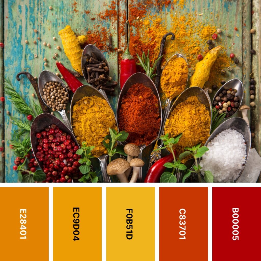
Names: Fulvous, Gamboge, Xanthous, Sinopia, Turkey red
Hex Codes: #E28401, #EC9D04, #F0B51D, #C83701, #B00005
If you’re hoping to work with a food-inspired palette with an autumnal vibe, this is a great one to choose. It captures the colors of the various spices in the picture, but it also conjures up images of autumn leaves, pumpkins, and butternut squash.
All of these shades are vivid and high-energy, so if you don’t use them thoughtfully, you might end up with a design that overwhelms your audience. You may want to consider incorporating a cool neutral — deep gray-browns and cooler shades of taupe are two possibilities.
6. Healthy Snacks

Names: Chocolate cosmos, Sinopia, Orange (pantone), Almond, Yellow Green
Hex Codes: #4E070C, #D22701, #FF670E, #FDE4CE, #AAD15F
The beautifully-colored bowls in the example picture look more like art than food! And if you choose this color palette, you can capture the rich colors of beets, squash, tomato, avocado, and sweet potato.
As you can see in the example image, these are colors that really pop out against a black background. If you like the look of a darker background but don’t want something with such stark contrast, you might consider using Chocolate Cosmos as a backdrop for the other colors.
7. Farmer’s Market

Names: YInMn blue, China rose, Xanthous, Atomic tangerine, Bittersweet
Hex Codes: #3E5B8F, #AB5B84, #FFCA70, #FFA789, #FF6064
Fresh fruits and vegetables come in an endless array of colors. This palette shows you a sampling of them. It’s a good color grouping to choose if you want something that includes vivid, fiery shades but counterbalances them with deep cool colors, too.
Because YInMn Blue is so much darker than the other colors here, it makes an excellent background shade. For example, if you’re designing a “Meet the Team” page for a website, you could use a YInMn Blue background and put each team member’s photo and bio in a different-colored square.
8. Sashimi

Names: Bright pink (crayola), Pumpkin, UT orange, Almond, Asparagus
Hex Codes: #F45F67, #FC7100, #FB8818, #F5DDC2, #5CA135
If you’re a sushi fan, you’ll almost certainly find the picture above especially appetizing! The warm colors of salmon and tuna come together with cooler green shades to make an image that’s beautiful and engaging.
This picture also offers a great suggestion for using brighter shades on a dark background. As you can see, the bright sushi rolls are centered in the image. But there are also touches of vivid color along the edges — the sauce, sliced limes, and pomegranate seeds all make a difference.
9. Macarons
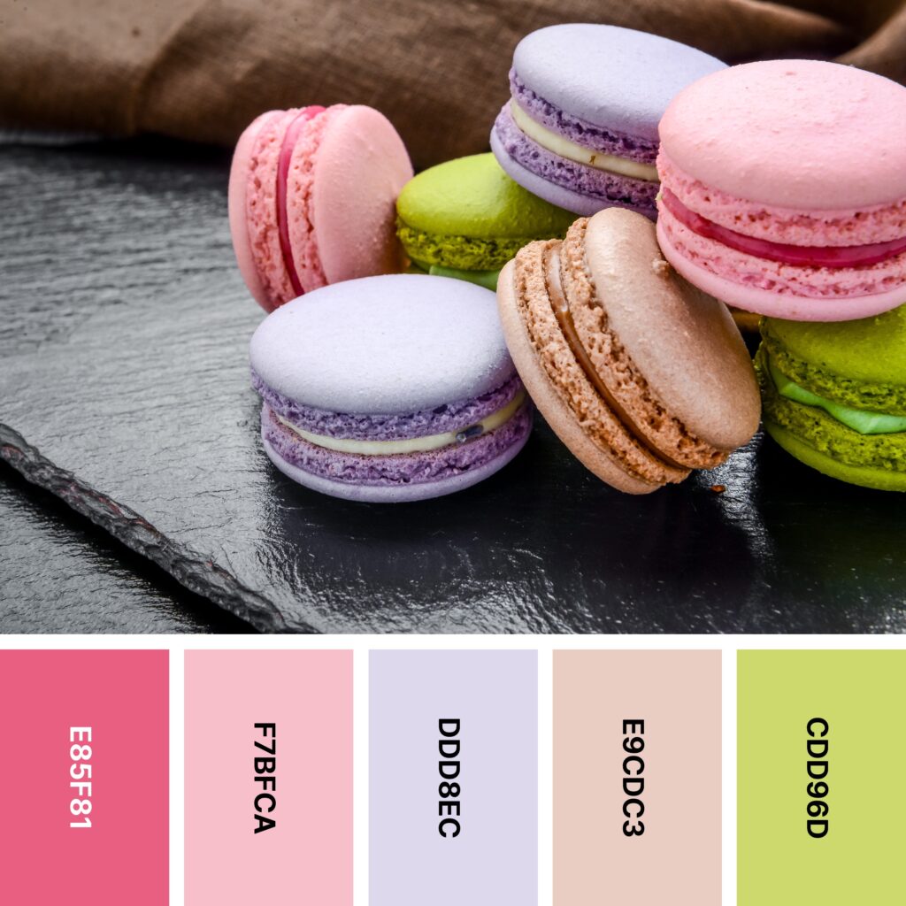
Names: Blush, Pink, Lavender (web), Pale dogwood, Straw
Hex Codes: #E85F81, #F7BFCA, #DDD8EC, #E9CDC3, #CDD96D
Macarons are some of the world’s most colorful sweet treats. These pretty pastries have inspired the delicate, mostly-pastel palette above. This grouping of colors is interesting and somewhat unusual — Pink, Web Lavender, and Pale Dogwood are all pastels, but Blush and Straw are markedly more saturated. These two shades are also roughly complementary, so they can add some real dynamism to any design you create.
10. Feast
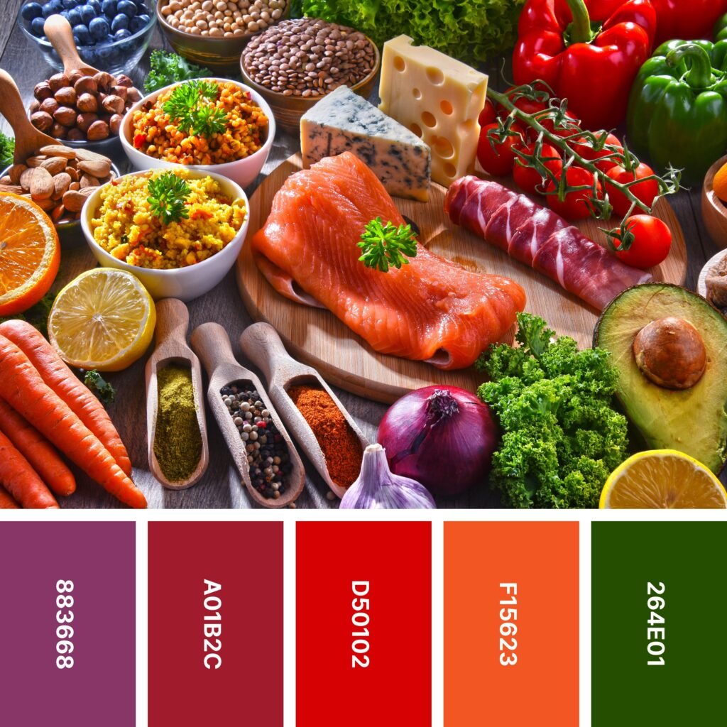
Names: Quinacridone magenta, Madder, Engineering orange, Tangelo, Dark moss green
Hex Codes: #883668, #A01B2C, #D50102, #F15623, #264E01
This rich array of foods has inspired an equally rich color palette. It’s a bit more saturated than many on the list, so it’s ideal for drawing attention.
As is the case with most similar color palettes, this one can sometimes get a little too intense. If that’s a concern, consider breaking it up with large stretches of neutrals. Cooler neutrals will be more effective when it comes to tempering the overall energy of the design.
11. Complementary Cauliflower
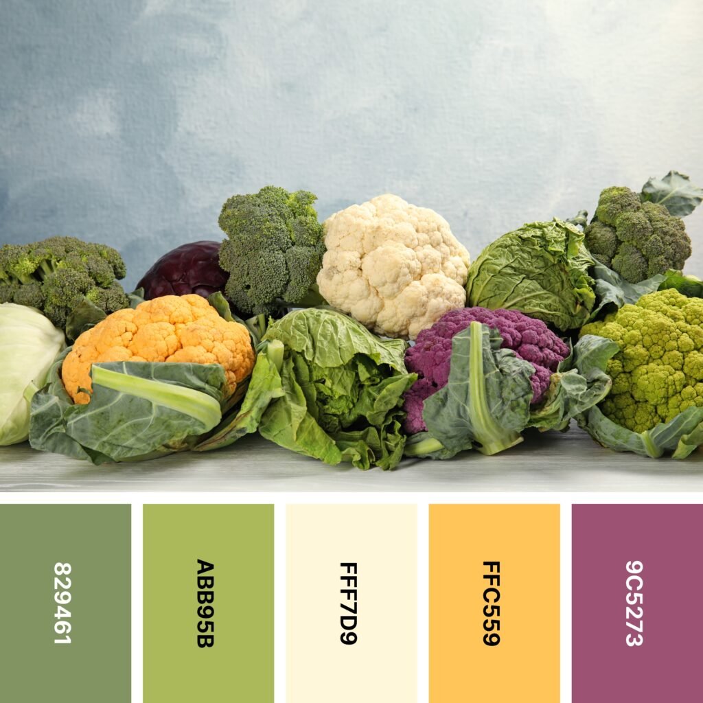
Names: Moss green, Olivine, Cornsilk, Xanthous, China rose
Hex Codes: #829461, #ABB95B, #FFF7D9, #FFC559, #9C5273
What color is cauliflower? Most people would say white. That’s the most common shade for this fiber-rich broccoli relative, but did you know that cauliflower comes in a number of other colors as well? This one showcases yellow and purple varieties. And as you might know already, purple and yellow are complementary colors. That gives this colorful mix even more pizzazz!
12. Gingerbread House

Names: Madder, Hooker’s green, White smoke, Lion, Chamoisee
Hex Codes: #9B1B32, #547061, #F3F3F2, #C69255, #A1754F
Thus far, most of the featured palettes have centered around the super-bright colors of fruit and vegetables. This one captures the seasonal delight of a beautifully-built gingerbread house (and pretty Christmas cookies to match!).
Even if your design doesn’t include gingerbread houses or gingerbread men, your audience will likely associate Lion and Chamoisee with gingerbread. This combination is ideal for Christmas-themed designs like posters for gingerbread house contests and holiday parties.
13. Beetroot
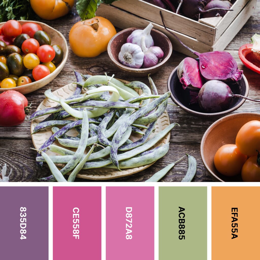
Names: Chinese violet, Mulberry, Thulian pink, Sage, Sandy brown
Hex Codes: #835D84, #CE558F, #D872A8, #ACB885, #EFA55A
This mixture of colors might seem a little disjointed at first. After all, Sage and Sandy Brown (which is really closer to a shade of orange) look like they’re part of an autumn palette. Chinese Violet, Mulberry, and Thulian Pink have a sweet, dreamy look. But when you use all of these colors together, you get a striking, sunset-like design.
With Chinese Violet, Mulberry, and Thulian Pink, you have an opportunity to create a color gradient. Try an ombre-style blend where Chinese Violet fades into Mulberry and Mulberry fades into Thulian Pink.
14. Spice Rack

Names: Red (ncs), Red (cmyk), Orange (web), Citron, Buff
Hex Codes: #C80238, #F92827, #FDA501, #C5C957, #D19B66
You might think of spices as just uniform, little glass jars at the grocery store. But when you really look closely, you see that each one has its own magnificent color. The example image gives you just a little glimpse into the many shades of ground and whole spices.
But no matter what type of design you’re making, this warm-leaning yet balanced color palette is worth considering. CMYK Red is ultra-bright, but the jewel-tone depth of NCS Red and the leafy green of Citron help keep it in check.
15. Sweet Fig

Names: Tea rose (red), Mimi pink, Baby powder, Fire engine red, Penn red
Hex Codes: #F6C4C7, #F1CCD3, #F5F7F2, #C1312E, #951911
Some research suggests that the color pink can make us crave sugar. And the pink-frosted cake in the picture certainly looks appetizing! You can re-create this scrumptious vibe with shades of frosting pink, strawberry red, and whipped-cream white.
You might find that your design looks best with Red Tea Rose, Mimi Pink, Fire Engine Red, and Penn Red on a background of Baby Powder. But if you want something a little less stark, you might be inspired by the picture — try a soft wood tone instead!
16. Tropical

Names: Marian blue, Amaranth, Atomic tangerine, Maize, Emerald
Hex Codes: #35417B, #E22A4F, #FA8D54, #F4EB67, #7EC487
Sometimes, you just need a bright, cheerful color palette that makes you think of a bowl of tropical fruit. This is exactly that! It’s also a great choice if you want to create a rainbow design. With the exception of indigo and violet, it includes each color of the rainbow.
If you’re working on a multicolor project, you also might find this palette to be a good choice. The colors are different enough that each one will stand out against the others. Alternatively, you can arrange them on a white or gray background.
17. Continental Breakfast
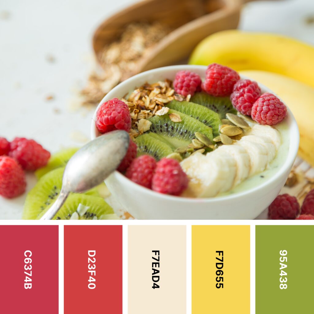
Names: Cardinal, Poppy, Champagne, Naples yellow, Apple green
Hex Codes: #C6374B, #D23F40, #F7EAD4, #F7D655, #95A438
The combination of fruit, yogurt, and granola is a delicious one. And if you wish, you can capture that deliciousness with this energetic palette of (mostly) red, yellow, and green.
In the example image, you can see Champagne being used as the color of the sliced banana and the yogurt. But it also makes a nice background shade. Cardinal, Poppy, Naples Yellow, and Apple Green each have a somewhat muted character. When you place them against a warm Champagne background, you can create a design with vintage appeal.
18. Purple Carrots

Names: Violet (jtc), Royal purple, Purpureus, Ghost white, Orange (crayola)
Hex Codes: #642B52, #754599, #9650B8, #F9F8FD, #FE7C39
Purple isn’t too terribly common in nature, but you do see it somewhat often in the world of fruits and vegetables. This palette’s example image includes a few classic examples of purple produce, including turnips and purple carrots.
You could use this palette’s three purplish shades to form a gradient, but they’re such different shades of purple that it might be difficult. A better way might be to incorporate discrete bursts of JTC Violet, Royal Purple, and Purpureus like you see in the photo. Because they’re related shades, they’re good for giving your design a unified look.
19. Celery Stick

Names: Forest green, Pistachio, White, Lapis lazuli, Eminence
Hex Codes: #549829, #93C154, #F8FCFF, #115B9A, #613677
There are plenty of different colors in the image above. But the palette primarily captures the shades of lettuce, celery, blueberries, eggplant, mushroom, and garlic. If you want your design to only include cool colors and a neutral, this is a good one to pick.
This color grouping really lends itself to striped designs (with thin stripes of the other colors against white). But it’s also great for florals. You might try a White backdrop with Lapis Lazuli and Eminence flowers and Forest Green/Pistachio leaves.
20. Green Tea and Cherries

Names: Madder, Cornell red, Sandy brown, Modern zen, Yellow green
Hex Codes: #AB002D, #C00219, #FFAC67, #D7D797, #A6C058
Here’s another smorgasbord of different fresh foods! Its corresponding color palette is ideal if you want to emphasize shades of red and green without making your design look like a Christmas decoration.
However, because this palette does lean somewhat warm, you might want to counterbalance it with something a little cooler. It doesn’t have to be a lot — even the dark wooden table in the example picture is enough.
21. Decadent Delight

Names: Fuchsia rose, Pistachio, Baby powder, Orange (web), Pacific cyan
Hex Codes: #C64573, #A6C769, #FAFAF3, #FDB14A, #18AED4
You don’t often see doughnuts that are this colorful! If you want a cheerful color palette with two pairs of nearly-complementary colors, this is one you don’t want to miss. Blue and orange are complementary, so Web Orange and Pacific Cyan will really pop — especially if you place them beside one another. Likewise, Fuchsia Rose and Pistachio are also very close to being complementary. If you combine these four on a Baby Powder background, you’ll create a fun and memorable design.
22. Umami

Names: Quinacridone magenta, Engineering orange, Hunyadi yellow, Apple green, Forest green
Hex Codes: #883A61, #CC010A, #E7A545, #72B800, #189E01
The one-bowl meal in the picture brings together multiple mouthwatering foods: red cabbage, edamame, tofu, avocado, radishes, and more! These foods create a super-vivid palette that’s reminiscent of the colors of the rainbow. Even though three of the five shades here are cool colors, their brightness makes the group as a whole seem warmer than it is.
There’s not anything wrong with that, but if you want to balance out the warmth (while also making the colors pop!), you might take a page out of the example image’s book. Both the dark wooden table and the black sesame seeds really make a difference!
23. Berry Parfait

Names: Amaranth purple, Off red (rgb), Sunset, YInMn blue, Licorice
Hex Codes: #A60839, #ED0101, #F9D3A0, #435272, #1D121B
This sweet collection includes a number of delectable fruits — including the somewhat rare white raspberries (also called yellow raspberries). They add a touch of subtle warmth that really sets this palette apart.
Although the white raspberries (and their corresponding color, Sunset) are only incorporated in small amounts, you can also use their color more abundantly in your designs. It’s an ideal background shade for the deep reds, purples, and blues in the rest of the palette. And because it’s a bit more yellow than white, it can be combined with red and blue without making your design look Americana-themed!
24. Sugary

Names: Light red, Pink, Lilac, Vanilla, Sunset
Hex Codes: #FE7573, #FFC8D0, #C3AACD, #FDEEAB, #FED28B
Here’s another look at the rainbow of colors found in macarons. Although the palette doesn’t include every single color you see in the picture, it still offers you enough variety to create a captivating design.
These five colors look similar to the ones you’d find in a magnificent sunset. If you want to lean into that, you might try blending these shades together in a watercolor-style look. If you need a dreamy backdrop for a poster or other design, this is a good one to try!
25. Citrus Twist

Names: Cardinal, Vermilion, Orange (wheel), Selective yellow, Kelly green
Hex Codes: #D10134, #FD423F, #FE8000, #FFB701, #67AD00
When you think of citrus-inspired palettes, you might imagine shades of yellow, green, orange, and grapefruit pink. But this one takes it a little further with the addition of the deep, rich red of a blood orange. As a whole, this collection leans very warm, but Kelly Green adds a refreshing, lime-like burst of cool color.
To really showcase these bright shades, try including a charcoal gray background like the example image does. Orange and charcoal also really pop, so this is a combination that can add a lot of positive energy.
26. Rainbow Chard
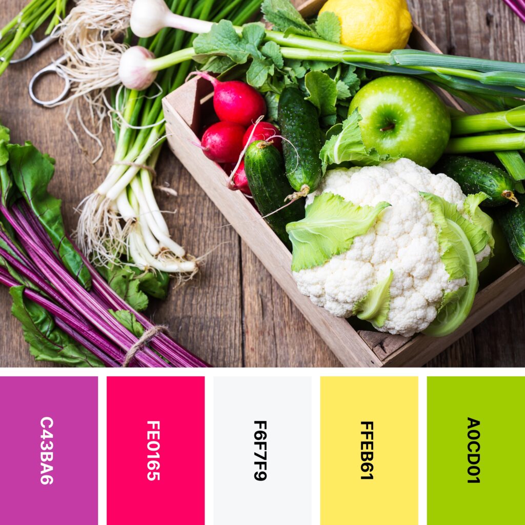
Names: Fandango, Cerise, Anti-flash white, Maize, Yellow green
Hex Codes: #C43BA6, #FE0165, #F6F7F9, #FFEB61, #A0CD01
If you’re the kind of person who prefers a hefty dose of color with your leafy greens, you might like Swiss chard. It often has purplish stems whose color is close to Fandango. But rainbow chard’s stems can be yellow, orange, red, and other bright shades.
This color palette is reminiscent of the colorful veggie. And even though it contains a couple of very warm shades, you can make your design emphasize freshness by including a large proportion of Yellow Green.
27. Shrimp Boil

Names: Violet (jtc), Engineering orange, Atomic tangerine, Dark orange (web), Office green
Hex Codes: #69325A, #CA0500, #FA9D83, #FE8B00, #397C09
The light taste of seafood makes it the perfect companion for a fresh salad (and maybe even some noodles!). This color palette is based around the bright colors of lobster, shrimp, crab, and more, but JTC Violet and Office Green bring in the cooler colors of different salad greens. Red and green are complementary shades, so when you juxtapose red (or orange) and green like you see in the picture, you’ll get a great high-energy design!
28. Sweet Salad

Names: Cardinal, Red, Brown, Orange (web), Apple green
Hex Codes: #C92038, #FF0101, #A44000, #FEAA00, #6EA602
Anyone who loves a good salad knows the joy of assembling a deliciously creative mix. And in the summer, nothing beats a sweet salad with yellow and orange tomatoes, fresh fruit, pecans, and a fresh vinaigrette.
This palette gives you a close-up look at the lovely colors you’ll find in a salad like this. If you want to expand it a bit, consider adding the deep, cool colors of blueberries, too!
29. Berry Cheesecake

Names: Fire engine red, Crimson, Baby powder, Charcoal, Prussian blue
Hex Codes: #D90024, #E20437, #FCFBF7, #2B4456, #11263B
What’s better than homemade cheesecake? Homemade cheesecake with a berry sauce on top! This palette primarily focuses on the shades of blue and red you find in a berry sauce like the one pictured. Baby Powder captures the color of the plates and bowls in the picture. If you want to also use the shade of the cheesecake’s baked edges, consider adding a yellowish white or whitish yellow like Sunset.
30. Fruit Basket

Names: Wine, Rose, Orange (wheel), School bus yellow, Dark moss green
Hex Codes: #622B3D, #FD2A82, #FF841F, #FADF3A, #41522E
This colorful picture of a fruit market shows off the lovely shades of familiar and exotic fruit alike. From the glowy skin of oranges to the vivid pink of dragonfruit, this palette has it all. It’s also quite a balanced color collection, as the mega-bright Rose, Wheel Orange, and School Bus Yellow are tempered by the cool depth of Wine and Dark Moss Green.
31. Cayenne

Names: Red (cmyk), Persimmon, Almond, Mikado yellow, Bole
Hex Codes: #E20101, #EF5400, #F5E5D6, #FDC707, #724635
Cayenne peppers are fiery in terms of both color and flavor, and CMYK Red embodies the bright red shade of the peppers’ skin. The rest of the palette includes a range of other spice-inspired colors. As a dark neutral, Bole works to keep things from getting too hot. But if you want to cool down your design even more, try including some blue-green like you see in the picture.
Using Food Colors in Your Design
Now you’ve gotten a glimpse into the beauty of food-inspired color palettes. But how do you go about using them in your own designs? Here are a few tips to help you get started using food colors.
Don’t Feel Limited by the Type of Food in the Picture
You don’t have to own (or design for) a food-related business to benefit from the wonders of food-related color palettes. And even if you do, don’t feel as though you have to choose one that closely parallels what you do.
For example, if you own a chocolate shop but love citrus-inspired color palettes, you don’t have to miss out simply because you don’t sell citrus fruits. Palettes like this are perfect for summertime promotions, so feel free to use them in your design!
Consider Mood and Color Associations
The overall mood of the color palette (and the associations your audience might have with the different colors) matters far more than the food that inspired the palette. If you want your audience to feel calm, try combinations of varying shades of blue and white. If you’re hosting a springtime sales event, a palette rich in pastels and/or vibrant greens can be a real asset.
Warmer shades can excite and energize. But be careful here — too much of a very warm color (like red) can be overwhelming to audiences. Red in particular has been linked to feelings of aggression and irritation, so be sure to use it sparingly!
Make sure you don’t forget color associations, either. For example, people often associate blue with water, so it’s a great color to include if you’re creating a design for a river outfitting company or a seafood restaurant. Green is commonly associated with money, so if you’re making a logo for a personal finance website, it might be a good shade to include.
The Right Background Makes a Big Difference
Regardless of the type of design you’re making, a solid background color is a must! But as you might have noticed above, many of the colors in the example images really stood out against the included backgrounds.
In the case of lighter, brighter shades, darker neutrals like deep wood tones or slate gray will really make the colors of the palette stand out. Black is also an option, but for some collections of color, it can appear overly harsh.
If your chosen palette includes mainly darker colors, lighter backgrounds make more sense. For instance, if you’re making a navy blue logo, it will stand out much more clearly on a white background than on a dark gray one.
Create Delicious Designs With Food-Inspired Color Palettes
If you really want to capture your audience’s attention, the lively food color palettes above offer you a great place to start. Whether you’re designing for a food-related business or not, they can add a burst of color to revitalize your brand.
Find more design inspiration in this collection of 24 themed color palettes.


