

Paint sets come in a wide range of colors, but it’s impossible for them to include every shade in existence. They might cover the full rainbow, but what happens if you want a lighter blue or a darker red? Or if they don’t have enough neutrals like shades of brown? Even if you buy a large set with lots of colors, you can always create a larger variety by mixing your own.
By mixing colors, you can make them lighter, darker, duller, paler, or brighter. Sometimes, you can even create entirely different hues. Understanding the basics of color mixing makes the process easier and helps you achieve better results. While paint is the most common medium, colors are also mixed in other contexts like digital design and printing.
- What Is Color Mixing and Why Does It Matter?
- Essential Color Mixing Formulas
- Creating Specific Shades and Tones
- Color Mixing for Different Mediums
- Common Color Mixing Mistakes and Fixes
- Advanced Color Theory Concepts
- Real-World Applications
- Experiment to Improve Your Color Mixing Skills
What Is Color Mixing and Why Does It Matter?
Color mixing occurs when two or more colors are combined to create a new one. The amount of each color you include in the mixture can influence the results. By mixing colors, you can create almost any color imaginable, which can help you more easily achieve your artistic projects.
Many kids learn about mixing paint colors in early art classes because it helps them develop critical thinking skills. Mixing various colors can help curious individuals discover new paint colors that they can use in their creations. You can use mixing skills for other mediums, such as digital art, but the mixture results might differ.
Difference Between Additive and Subtractive Mixing

There are two main types of color mixing: additive and subtractive. Subtractive mixing is the type most people are familiar with because it’s pigment-based, such as mixing paints or ink colors. When we combine colors through pigment-based mixing, we’re subtracting light from the color rather than adding it.
Additive mixing is the opposite. It involves adding light when mixing colors rather than removing it. This could include combining colored lights or colors on a screen. Additive and subtractive color mixing often have very different results, even when the same two colors are mixed in both color models.
Overview of Color Models
A color model is a system used to describe, represent, and organize colors. There are three common color models, two of which are subtractive and one of which is an additive color model.
RYB

RYB is the color model most people are familiar with because we learn it in early art classes. It’s a subtractive color model with the primary colors of red, yellow, and blue. When those primary colors are mixed together in different amounts, they can create other colors. Mixing all three together equally typically results in black or muddy brown. This is a color model artists use when mixing colors in their paintings.
CMYK

You might recognize CMYK as the colors used for printer ink. The primary colors of this model are cyan, magenta, and yellow. Like in RYB, mixing these primary colors in different amounts can result in a wide range of colors. Mixing an equal amount of all three colors together gives you black.
RGB

RGB differs from the other two because it’s an additive color model. It uses light to produce various colors, such as the images on screens. The primary colors of this model are red, green, and blue. Mixing the three primary colors together equally creates white, which is a very different result from the subtractive color models.
Essential Color Mixing Formulas
Let’s take a look at some essential formulas to help you expand your palette using just a few basic hues.

Primary, Secondary, and Tertiary Colors

If you’re planning to mix colors in any color model, it’s important to know the primary, secondary, and tertiary colors. Each color model consists of three primary colors. Primary colors are the ones that can be mixed to create all other colors in a color model. Adding different amounts of each primary color into the mixture will create a new color. However, within each color model, there aren’t any colors that can combine to create the primary colors.
Secondary colors are colors you can create by mixing two primary colors. For example, yellow and blue are two primary colors in the RYB color model. Mixing them together creates green, which is a secondary color. Finally, tertiary colors occur when you combine a secondary color with a primary color. For example, mixing green with blue in the RYB color model will give you blue-green, which is a tertiary color.
Most of the time, color mixing involves mixing colors that are near each other on the color wheel. However, it’s possible to mix colors on opposite sides too. They’re just not talked about as much since they usually result in muddy colors that most people wouldn’t use in designs. But they can be used purposefully in muted color palettes or to darken or neutralize a color.
How to Mix Basic Colors

When most people research color mixing, they want to find paint mixtures. So, below are a few ways to create colors in the RYB color model.
What Colors Make Violet/Purple?
Purple has always been a special color. In ancient times it was incredibly difficult to produce, making it very rare. As a result, it became a color associated with royalty.
These days purple isn’t as hard to make. In fact, you can make it yourself by mixing red and blue. The ratio of each is up to you, but a 50/50 split will create a nice rich shade of purple. You can increase the red to make a more reddish purple and get a shade of magenta, or you can increase the blue to darken the shade. The resulting colors can be used in analogous color schemes.

Shades of purple tend to pair well with yellow, which is opposite on the color wheel. This is known as complementary colors, and for good reason. The darker tones of the purple will make the brightness of the yellow pop, while the yellow makes the purple look deeper and richer by comparison.
Read more about violet/purple color mixing.
What Colors Make Green?
Green is actually a primary color of the light spectrum, but when it comes to pigments, things are a little different. Shades of green are made by mixing yellow and blue. As you would imagine, making shades of yellow-green is done by increasing the ratio of yellow, and making shades of blue-green is done by increasing the ratio of blue.

One notable thing about the color green is that it’s one of the most common colors in nature thanks to the presence of chlorophyll in plants. This has made it a very popular shade when it comes to art as well.
Read more about green color mixing.
What Colors Make Orange?
Orange is a secondary color that lies between yellow and red on the color spectrum, and on the color wheel. As you would probably guess, it is made by mixing red and yellow. Darker shades are known as red orange, while lighter shades are yellow orange. You can also mix it with black to create brown.

The origin of the name “orange” is interesting because it is actually named after the fruit. Before it had an official name, the color orange was just called “yellow-red” after the colors used to make it.
Read more about orange color mixing.
What Colors Make Pink?
Speaking of colors named after plants, pink is a shade created by mixing red and white. However, when using watercolors, you can make it by simply diluting the red with water. In any case, more red will make a darker, richer pink, while more white will make it lighter and paler.

Like blue, pink has an interesting history. It was once seen as a symbol of masculinity in many cultures, but that changed in the 1940s when department stores began marketing it for girls. Today, pink is closely associated with femininity and romance.
Read more about pink color mixing.
What Colors Make Brown?
Brown is one of the strangest and most unique colors. This is because it doesn’t occupy a place on the color spectrum or color wheel, but it also isn’t an achromatic color like black, white, and gray. Instead it is considered a composite color.
Making brown via color mixing is also unique because it can be done in many different ways. Using pigments, it can be made by combining red, yellow, and black, or by combining red, blue, and yellow. Using the RGB color spectrum, brown is made by combining red and green. Technically, this can also work in RYB if you’re mixing the secondary green with the primary red because you’re combining all three primaries indirectly.

However, when painting, brown is often made by combining black with orange. While this may seem like it would just produce a darker shade of orange, it will in fact give you a nice shade of brown if done correctly.
Read more about brown color mixing.
What Colors Make Gray?
As previously mentioned, gray is an achromatic color like black and white. What this means is that it’s a color without a hue. This can also be referred to as a neutral color.

Making shades of gray is fairly straightforward as you just need to mix black and white. You can make it darker with more black, or lighter with more white. You can also mix in some yellow to create warmer tones of gray, or blue to make cooler tones of gray.
Read more about gray color mixing.
What Colors Make Cyan/Turquoise?
Turquoise is a shade of cyan. It’s sometimes called aqua, or even just “blue-green” after the colors used to make it. Shades of turquoise can be altered by adjusting the ratio to make shades such as Celeste, sky blue, dark turquoise, or bright turquoise. Being a primary pigment color in the CMYK model, true cyan cannot be mixed from other colors, but adding blue to white or a little green to blue can create a similar hue.

Turquoise probably has the most unique name out of all the standard colors since it is literally the French word for “Turkish.” This is because the color was closely associated with a precious gem that was imported from Turkey.
Read more about cyan/turquoise color mixing.
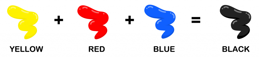
What Colors Make Black?
Black is the exact opposite of white in more ways than one. While white is a combination of all wavelengths of light, black is the absence of light. Black is also made by mixing red, blue, and yellow, the three primary colors of the color wheel.
Unlike white, black absorbs all of the wavelengths of light rather than reflecting them. Since it absorbs so much energy, black surfaces tend to get much hotter than other surfaces. The darkest shade of black, created by MIT engineers, actually absorbs up to 99.995% of light.
Read more about black color mixing.
Color Mixing Formulas (Quick Reference Guide)
This is an overview of all the color mixing formulas mentioned above.
- Violet = Red + Blue
- Green = Yellow + Blue
- Orange = Red + Yellow
- Pink = Red + White
- Brown = Red + Green
- Gray = Black + White
- Cyan = Blue + White
- Black = Red + Yellow + Blue
You may have noticed that red, yellow, and blue weren’t included here. That’s because they are the starting pigments and you can’t mix other colors to make red, yellow, or blue in RYB. You can’t make white in RYB either; it must be added as its own pigment.
How to Create Variations
Once you’ve mixed colors to create a new hue, it might still feel like something is missing. If the color doesn’t feel right to you, there are ways to adjust it further through unique mixing techniques.
Warm vs. Cool Versions

Certain colors feel warm or cool. While colors like red, orange, and yellow are typically labeled as warm, and colors like green, blue, and purple are labeled as cool, some colors can have warmer or cooler undertones. To adjust the temperature of a color, simply add warm or cool colors to it.
For example, purple is typically a cool color, but adding more blue to it can make it feel even cooler than before. On the other hand, adding red to purple can make it warmer since red is a warm color. Making a color feel warmer typically gives it more energy and positivity, while cooling a color down could make it feel relaxing or sad. Altering versions of colors can help artwork evoke different meanings when painting.
Lightening and Darkening

Another easy way to create variations of colors is to make them lighter or darker. You can make a whole painting with one color simply by using different tints and shades of colors. Tints are lighter versions of colors, which you can make by adding white to them. Then, shades are darker versions of colors, which you can create by adding black to them.
When mixing colors, black is a much more intense color than white, so a little can go a long way. If you’re trying to make a shade, only use a touch of black at a time so the color still shines through.
Another way to adjust a color appearance is to add gray, which is called a tone. The more gray you add, the less saturated a color becomes.
Creating Specific Shades and Tones
Now that you know how to create basic colors and variations, the next step is to get more intentional with your mixes. Knowing how to control your combinations is essential, whether you want to create soft pastels, balanced neutrals, deep rich tones, or vibrant hues.
Pastel Colors

Pastel colors are very pale versions of colors, such as soft pink, baby blue, and mint green. Luckily, creating these delicate colors with paint is fairly simple. All you have to do is take some white paint and add a touch of your desired color into the mixture. For example, if you want pastel orange, mix a touch of orange with a lot of white to get a very light orange hue.
If the color still doesn’t look light enough after you mix it, add more white. If you want it to be more vibrant than it appears, then you can add another touch of the color.
Neutral Colors

The term “neutral color” usually refers to a hue that lacks color, such as brown, gray, beige, and taupe. These colors are all around us, but you won’t see them appear on the color wheel. It’s possible to create them with only the primary colors, but doing so can be tricky.
The best way to make brown is to mix complementary colors (colors on opposite sides of the color wheel). For example, mixing red and green creates brown. If you only have the three primary colors, you can mix blue and yellow to create green, and then mix that with red. By playing around with different mixtures of complementary colors, you can get different types of browns.
Brown created by red and green is a warm brown with a red tint. If you mix yellow and violet, which are also complementary colors, you’ll get a lighter brown due to its yellow tint. Mixing orange with certain colors, such as dark green or purple, will also give you brown. Adding yellow or white will typically lighten a brown mixture (creating tan and taupe) while adding a touch of black can darken it. You can get a wide range of browns simply by trying out different mixtures of colors on opposite sides of the color wheel.
To create gray, the simple way is mixing white with black. The more white you include, the lighter the gray will be. If you only have the primary colors, you can mix all three primary colors to get a black or dark gray hue. Certain complementary colors can make gray instead of brown. For example, combining orange and blue, but using more blue than orange, can make the mixture look more gray than brown.
Deep and Rich Colors

Mixing colors can help make colors deeper and richer. For example, navy blue is a rich blue hue that can be created by mixing royal blue with a touch of black. When mixing, create four equal spots of paint, three of which are royal blue and one of which is black. Then, when you mix all the paint together, it’ll create a rich navy blue color.
Another great example is emerald green, which is usually described as a deep green color with a hint of blue. It can be made by adding a hint of dark blue, such as cobalt blue, to dark green. If you want to lighten it up while still keeping it rich, mix in a bit of lighter blue, such as turquoise.
If you wanted to make a warmer color like burgundy, you could do so by mixing red with purple. If you don’t have purple, you can also mix red with a small amount of blue.
Vibrant Colors Without Muddiness

When mixing paint colors, the results could become muddy, leaving you with a color that doesn’t match what you were looking for. The more pigments that are included in a mixture, the more likely it will appear muddy. To ensure your paint mixtures stay vibrant, use paints that only have one pigment in them. The paint’s label should say how many pigments are included.
For example, if you mix a blue and red that are made of only one pigment, you’ll get a vibrant purple. However, if one of those colors is made of two or three pigments, the purple might be darker and closer to brown.
Color Mixing for Different Mediums
Whether you’re painting, designing digitally, or preparing something for print, each process has its own rules. This means color mixing works differently in every medium. Let’s see what that means for artists, digital designers, and print professionals.
For Artists (Paint and Pigments)

Most of the information above applies directly to artists, since painting is the type of color mixing most people are familiar with. However, those fundamental techniques are just the beginning. There are plenty of other factors artists need to consider when working with paints and pigments.
Transparency vs. Opacity
Not all paints have the same transparency or opacity. Transparent paints allow more light to pass through them, making it easier to see items beneath them. Opaque paints don’t allow light to pass through, meaning they cover any designs below them.
Of the two, opaque paints are easier to mix with, especially for beginners. Since opaque paint completely covers what’s underneath, the color of the paper or canvas doesn’t influence how the color appears. However, when mixing transparent paints, the material you’re painting on could influence how the mixture looks since the paints are partially see-through.
Mixing Acrylic, Watercolor, and Oil Paints
Acrylic paints are the most common and the easiest to mix. You simply need to swirl the paints together to create a new hue. Oil paints can be mixed using a similar method. While the two types might seem the same at first glance, oil paints take longer to dry but often create more saturated colors and blend better.
Watercolor paints are a different story. To use watercolor paint, you need to get the pigment wet. You’ll need to use a special paint palette that clearly separates the colors from each other so the water doesn’t combine. Make a water puddle in the tray, and then add your desired paint color to it. Then, clean the first pigment off your brush and add a second color to the puddle to create a color mixture.
Understanding Pigment Strength and Undertones
Some paints have stronger pigments than others, meaning they’ll last longer but may overpower colors with less pigment strength. The finer the pigment is ground in the paint, the higher its pigment strength will be.
When mixing paints, it’s also important to consider the undertones. For example, two similar browns can have different undertones. If the brown is warmer, it might have a yellow undertone. When mixing colors together, the undertones can affect the results. Mixing a color with a yellow undertone means there will be a hint of yellow in the mixture, which could make the result muddy if you weren’t planning on using any yellow.
For Digital Designers (RGB and HEX)

Mixing colors on a screen is a completely different process. Not only is it a very different medium, but mixing colors digitally also creates completely different results from paints because of the RGB color model. Digital art can also use hex codes to find specific colors.
How RGB and HSL Work in Color Mixing
RGB (red, green, blue) and HSL (hue, saturation, lightness) must be considered for digital color mixing. When mixing colors on a screen, you’re mixing colors made up of a certain percentage of red, green, and/or blue. So, while mixing red and magenta in the RGB color model gives you a tertiary color of bright pink, you’re actually just creating a higher percentage of red compared to blue in a mixture since red is 100% red while magenta is 100% blue and red.
Rather than combining two colors, it’s usually easier to adjust the percentage of red, green, and blue to get the color you want. You can also change how a color appears by adjusting the hue, saturation, and lightness digitally, something you can’t do as easily with paints.
Creating Color Gradients and Harmonies
A gradient is the gradual transition from one color to another, which is much easier to achieve in digital art than painting. When working on digital art, you can create gradients by selecting the gradient tool and dragging a line across the area you want to insert it in. Gradients are typically used to add depth and dimension to images.
Harmony is when all the elements of an art piece come together and appear unified. Using too many colors and elements can make digital art feel chaotic. So, focus on consistent color schemes, textures, and balance to create harmony across a piece.
Matching Colors Across Screens
To ensure you’re using the same color on all your screens, you can make sure the colors have the same hex code. Yet, exact colors may vary in appearance across screens. If one screen’s colors are off, you may need to adjust the RGB settings to alter its appearance. Windows also has a color management tool to help you ensure color consistency across various platforms.
For Printing (CMYK and Physical Colors)

Printing comes from images on a computer screen but appears on paper like paint. Thus, it has its own unique color model, so mixing colors is different once again.
CMYK vs. RGB Differences
CMYK is a subtractive color model while RGB is an additive one. You might notice that the primary and secondary colors are swapped on them. CMYK’s primary colors are cyan, magenta, and yellow (the secondary colors of RGB) while the secondary colors are red, green, and blue.
Printing uses a different color model because the additive color mixing of screens has a brightness and variety of hues that printed colors can’t exactly reproduce. So, even though you’re printing colors that appear on your screen due to an RGB color model, printing them requires a different process to display similar hues.
Why Colors Look Different in Print vs. Digital
Colors are emitted differently on screens compared to paper. Computers use lights to display colors while images printed on paper use colored ink. Ink cannot produce colors in the exact same way light can, which can cause some minor differences between the two. Yet, as long as your printing settings are correct, the printed image should be as similar as possible.
Spot vs. Process Colors
There are two main ways of printing colors. Spot color is when a specific pre-mixed ink is used for printing. However, process color is when the four ink colors (cyan, magenta, yellow, and black) are printed with tons of tiny, overlapping dots to create various colors. Spot color might work well for images that only need a few accurate colors, but process colors are more common for printing because of the wide variety of hues those four ink colors can easily create.
Common Color Mixing Mistakes and Fixes

Even minor mistakes can mess up your colors, but most are easy to fix. Here are some of the most common ones.
Why Colors Turn Muddy and How to Fix It
If you’re testing out different paint mixtures, there’s a good chance some of them might appear muddy. Using paints made of only one pigment can prevent this issue, but is there a way to fix an already muddy mix? Typically, it’s best to start over and create your mixture from scratch, ensuring you use high-quality paints without unnecessary undertones. Adding more colors to an already muddy mixture is likely going to make it even less vibrant than it already is.
How to Make Colors Brighter Without Over-Saturating
If colors are oversaturated, it means they’re brighter and more vivid than normal. While bold, vibrant colors look great in certain contexts, they can be overpowering if used too much or out of place in the wrong contexts, such as realistic paintings. It’s important to remember that colors can be vivid without being blinding.
If a color seems too bright for the context, adding a touch of white can tone it down slightly without making it less appealing. Adding a tiny bit of black instead can also tone down a color if you’re looking for darker versions of the hues. If you want to tone down a color’s saturation without making it lighter or darker, add a touch of gray.
How to Correct Mistakes in Paint, Digital, and Print
Mistakes can be made with any type of color mixing. For paint, you can dab the problem area with a damp cloth if it’s still wet. Otherwise, wait for it to fully dry and paint over that area. If the unwanted paint is a thick layer, consider sanding it down and clearing the dust before repainting that area.
For digital art, fixing mistakes is typically easier, but it depends on the mistake. Eraser tools and undo tools can be a life-saver if something doesn’t look right. Some online art tools can also color over problem areas.
Printing simply creates an image from your screen onto paper. If it doesn’t look right, you’ll need to make sure all your ink colors are full and check your printer settings. Print quality, paper type, ink saturation, and printing speed are all aspects that can affect how the image turns out.
Advanced Color Theory Concepts
Once you’ve mastered the basics, these advanced techniques for working with color can take your mixing skills to the next level.
Warm vs. Cool Colors and Their Interactions

As mentioned before, warm colors are typically shades of red, orange, and yellow, which give off warmth. Cool colors typically feel colder, including shades of green, blue, and purple. Considering these colors and how they make you feel can influence the emotions your artwork evokes.
When a warm or cool color is placed next to certain colors, those colors can interact with each other to create stronger feelings. For example, a blue object in an art piece might feel colder than usual if it’s surrounded by a warm, contrasting color like red. If a yellow art piece is displayed with a warm yellow light shining on it, it can feel warmer than normal due to the added brightness. Context is crucial for colors and their symbolism.
Complementary Colors and Their Uses

Complementary colors are colors on opposite sides of the color wheel like red and green, blue and orange, and yellow and violet. While mixing them can create neutral colors, there are other ways to use these hues strategically in designs.
One unique method is using complementary colors for shading. You can mix a color with its complementary color to create a realistic shade or shadow for an object. For example, if you’re painting a bright red apple, you can mix red and green to create a dark hue for the apple’s shadow.
You can also use complementary colors to increase vibrancy in a piece. Since complementary colors contrast each other, using a complementary color as a background can make an object seem more vibrant, making it a clear focal point. However, you should add other colors to the mix to avoid making it too obvious. For example, if you’re painting a house, you could make some aspects of the house orange, such as the roof. Then, use a light blue background for water or sky to help the house pop slightly.
Light and Shadows in Color Mixing

You can make it look like there are lights and shadows in an art piece simply by using color mixtures strategically. First, decide where the light source would be coming from in your painting. In spots where light would hit the object, use tints of the color (adding white to it). For example, if the sun is above a bird, you would paint the top of the beak a lighter version of the beak’s overall color.
The opposite occurs for shadows. If a part of the painting isn’t in the light, such as the back of a bird’s body, you can use shades (colors with black added) to make it look like a shadow. Gradually transition colors to shades and tints so they don’t stick out on your painting. Make shades lighter than you think they need to be since black can easily overpower other paint colors if used too much.
Real-World Applications

Color mixing is something we learn in early art classes, but it’s for more than just having fun with paints. Physical art mediums, digital art, and printing all have different color models, meaning you’ll get different results when mixing colors. Familiarize yourself with the primary colors and common mixtures of each color model to help you better create art and designs in all mediums.
There are so many ways where these techniques come in handy in the real world, such as:
Art and Painting
Of course, art and painting are the most obvious. Mixing colors with paints, markers, and other physical art mediums can help you create new hues in your pieces. Familiarize yourself with the RYB color model to set yourself up for success.
Interior Design
While you might not create new colors during interior designing, understanding the basics of the color wheel improves your designs. Knowing complementary colors, analogous colors, warm colors, and cool colors can help you create a pleasant and balanced space.
Fashion and Textiles
Mixing pigments in fabrics can help create new colors in clothing designs. Plus, knowing the basics of color theory can help you design colors properly in fashion, just like you can in interior design.
Printing and Publishing
It’s important to understand the CMYK color model and how the primary colors create other colors when printing. This can help you more effectively create books and artwork that will look just as good on paper as it does on the screen.
Graphic Design and Branding
Graphic design is all about using colors strategically, so basic color theory is important. However, it’s also good to familiarize yourself with the RGB color model when mixing colors digitally so you can understand how to effectively create the hues you’re looking for.
Experiment to Improve Your Color Mixing Skills

The best way to improve your color mixing skills is to experiment. Try mixing different colors together to see what the results are. If you don’t get quite what you’re expecting, adjust it by applying other colors, such as adding white to a purple mixture to make it lighter.
While there are lots of tricks to mixing the perfect colors, many artists learn best from a hands-on approach. So, don’t be afraid to try color mixing to discover your own ways to achieve the hues you want. There are practically an infinite number of shades to explore and play with.
By mixing your own colors rather than relying exclusively on premade store bought products, you can create shades that are more unique, and better suited to your artistic pursuits. You can also experiment with color theory, and all the ways that different colors interact with one another.
On computers, it’s even easier because you can access various blending tools and options. Using the RGB spectrum, you have millions of different colors at your disposal that you can use as you see fit.
Whether you’re mixing colors on the job or for your own interests, it’s always fun watching new variations come to life. Who knows, maybe you’ll find a hue you hadn’t thought of that will make all the difference for your project!


