While Crayola makes 120 colors of crayons, scientists estimate there are 10 million shades of color. Among this brilliant spectrum of hues and shades, one family stands out: the versatile palette of pastels. And if you’re looking to add a new dimension of flair and style to your designs, using pastels can be the key.
Let’s take a closer look at pastel colors and how you can confidently incorporate this delicate family of colors into your design.
What Are Pastel Colors?

A pastel can be defined as any color with just enough white to make it soft and pale looking while maintaining the original integrity of the base color. Referring to a pale tint of virtually any secondary and primary color, pastels have a low intensity or saturation and high luminance or amount of light. In fact, you can create a pastel by adding light to any pure color on the color wheel.
Pastel colors are generally described as mild, soothing, and inoffensive colors. For the most part, pastels are employed to evoke a calming sense of relaxation. While soothing and inoffensive, pastel colors boast the unique ability to stand out.
Largely, pastels have been associated with motherhood and femininity. These delicate colors are often used to decorate the bedrooms of younger children. And these key attributes allow pastel colors to have lasting popularity across all types of designs.
Here are a few popular pastel colors and palettes:
Pastel Yellow
Pastel Yellow
Hex #FDFFB6
RGB 253, 255, 182
CMYK 1, 0, 29, 0
Representing the color of sunshine, yellow can evoke positivity, freshness, optimism, honor, and joy. In more vivid tones, bright yellow can be used to attract the eyes of impulsive buyers. Pastel yellow hues, however, are associated with fun and optimism. While most think of the more vivid pastel yellow for excitement, it can also be used in a more toned-down hue as a complementary color.
Pastel Red
Pastel Red
Hex #FFADAD
RGB 255, 173, 173
CMYK 0, 32, 32, 0
Pastel palettes with red tend to stimulate the body and evoke a sense of urgency. When the palettes with red are more muted, they tend to lose this urgency and intensity a bit to become easier on the eye and more welcoming. This sentiment is amplified whenever red is mated with pastel blues, pinks, peach, and grayish greens.
Pastel Pink
Pastel Pink
Hex #FFD1DC
RGB 255, 209, 220
CMYK 0, 18, 14, 0
Ideal for “It’s a Girl” announcements or as a contrasting tone, pastel pink is regularly associated with love and femininity. This pastel hue can also be used to infuse a soothing aesthetic and calming sense. If you like the notion of pastel pink but are less keen on femininity for your design, a more muted pink may be the more ideal solution. Muted pastel pinks are not overly bright and can be used for a tropical, island feel. Popular examples of pastel palettes with pink include:
- Flamingo
- Blush
- Punch
- Baby pink
- Rose
Pastel Blue
Pastel Blue
Hex #A0C4FF
RGB 160, 196, 255
CMYK 37, 23, 0, 0
While pastel pink is associated with “It’s a Girl” announcements, pastel blue is most popular for “It’s a Boy” baby shower invitations and announcements. The most common light and airy pastel blue mimics the color of the sky. In either case, this hue normally is associated with purity and innocence. When pastel blue is darkened a little, it can quickly evolve into more of a business design. The darker pastel blue is associated with professionalism and trust.
Pastel Green
Pastel Green
Hex #CAFFBF
RGB 202, 255, 191
CMYK 21, 0, 25, 0
Representing renewal, energy, nature, and life, the traditional color of green is also associated with finances, money, and ambition. On the other hand, an individual can be “green with envy” to represent jealousy. Similar to the base color, pastel green is synonymous with nature, tranquility, and can offer viewers a deeper appreciation for the world. Because pastel green symbolizes renewal and growth, it’s the perfect color for designs based on progression in life.
Pastel Peach (Light Brown)
Pastel Peach
Hex #FFECD9
RGB 255, 236, 217
CMYK 0, 7, 15, 0
The dainty peach pastel offers a high degree of rejuvenation and positivity. This refreshing hue offers stimulating benefits; and when it’s combined with other similar brown, pinkish, or pale yellow tones, it can bolster happiness and improve the mood. Based on the intensity of the colors, peach pastel palettes can infuse designs with romance and positive energy.
Pastel Purple (Soft Violet)
Pastel Purple
Hex #BDB2FF
RGB 189, 178, 255
CMYK 26, 30, 0, 0
In general, the color purple is associated with power, nobility, luxury, royalty, wealth, and ambition. And it makes perfect sense to use pastel purples to mark milestones or to celebrate achievements. Similar to mauve and lilac, pastel purple or violet is a stable and calm color that can serve as an alternative to pastel pink. Other popular pastel palettes with purple or violet include:
- Floral
- Orchid
- Lavender
- Plum
- Mulberry
Pastel Orange
Pastel Orange
Hex #FFD6A5
RGB 255, 214, 165
CMYK 0, 16, 35, 0
As a blend of yellow and red, orange is often associated with the happiness of yellow and the vibrancy of red. This equates to meanings of sunshine, joy, heat, warmth, success, fun, balance, freedom, and fascination. Naturally offering the comforting glow of summer, pastel orange can make designs more engaging and colorful at the same time.
How to Use Pastels in Graphic Designs

Because pastels have been traditionally associated with femininity, many brands immediately turn to these colors when marketing products designed for female audiences. Brands and marketers tend to rely on tones of lemon, mint, and pink as a natural go-to graphic design solution for women audiences. But this is only the beginning. Pastels can be used across the board for gender-agnostic designs:
- Infographics: Pastel-themed infographics are perfect for telling stories or presenting information. By highlighting the most important information in pastels, you can immediately attract the readers’ eye with an easy-to-scan format.
- Web Design: The best websites are designed to be lightweight and clean, which is why pastels are the perfect fit. As an added bonus, pastels play well with white, and the strategic use of white space is key in web design.
- Digital Art: Pastels can channel the essence of the 80s futuristic-retro feeling in a sophisticated and modern way. Consider replacing your neons with softer pastel colors to create more delicate digital art.
- Packaging: Pastels are regularly used in packaging across the baby clothing industry, cosmetics, fashion, and food industries. Pastels can make cosmetics and fashion product packaging look more high-end and luxurious; packaging for baby clothing can feel softer and more tender. And for food packaging, pastels can bring an extra level of deliciousness.
- Photography: Experienced photographers turn to pastels for more modernity and surrealism. You can use pastels in photographs for product photography, futuristic compositions, and fashion magazines.

The More, the Merrier
When designing with pastels, it’s important to understand that a single stand-alone pastel hue may miss the mark because of its desaturated nature. To bring it to life and get the most from pastels, use them collectively. In doing so, you will effortlessly channel a vintage vibe or summery feel into your designs.
Unlock Optimism with Pastels
Looking to brighten a website, flyer, or poster? An all-pastel palette of shades inspired by ice cream will certainly lift the mood. On the other hand, you can’t go wrong with tested, tried, and true pastel pairings, such as a pale blue pastel and a pastel pink. This classic and timeless tandem works to unlock the optimistic and attractive nature of pastels.
Be Bold with Pastels
Because pastels have a subdued hue, they can and should be treated with an increased level of versatility than the base color. As such, you can confidently combine two or more pastels without worrying about creating an eyesore – like you would with more vivid tones. When designing advertising or marketing materials with pastels, the message is simple: be bold, be brave, and be extravagant. The result will most likely be chicer than you’ve ever imagined.
Make a Colorful Impact on Your Audience with Pastels
Although pastels may be subtle and soft, they can make a dramatic impact on your designs and audience. The dual nature of pastels boasts the ability to soothe while still maintaining brightness and vibrancy. In fact, your audience may feel a calming and therapeutic effect on their mind by simply looking at your pastel-infused design.
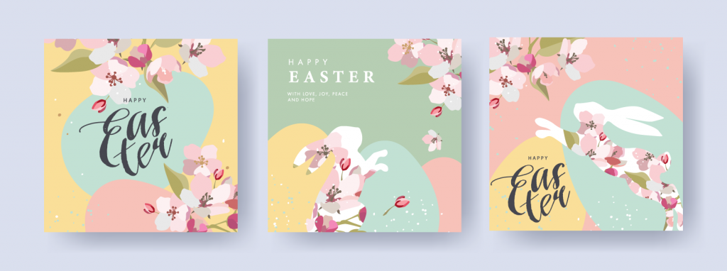
These soothing color combinations can both boost and calm the viewer’s mood because of the serene setting created. Pastels remind viewers of summer and spring, optimism and joy, babies and sweets – and Easter. Several brands also target the combination of pastels and metallics to create an exclusive feeling of luxury.
How to Use Pastels in Interior Design

Traditionally, pastel colors are associated with retro interior designs from around the 50s to 70s era. These colors were loved because of their ability to create the perfect ambiance in the home. For these very reasons, pastels are making a roaring comeback in interior design. Today, they can be used to add a retro appeal to space while lending a relaxed, pleasant feeling.
- Pastel + White: One highly effective strategy is to pair pastels with white. This tried-and-proven approach works to heighten the effect of pastels and allows the softer hues to speak for themselves.
- Pastel + Bright: You can truly wow by pairing pastels with unexpected bright colors, such as neon hues. This wowing approach is one of today’s hottest trends and can add a vivid punctuation mark to any space.
- Pastel + Gray: If you’re looking to create a more sleek and contemporary look, combining pastels with gray will create the soothing, warm space you desire.
- Pastel + Nothing Else: For those who want a pastel paradise, you can always go all out. Use a monochromatic saturation of your favorite pastel to demonstrate your love for the hue refreshingly and cleanly.

Use Pastel Statement Furniture
You can make a bold statement by placing pastel furniture statement pieces throughout your home and living space. Whether it’s a soft blue chair or a gentle lavender ottoman, you can elevate the profile of your home’s design to new heights with the perfect patch of pastel.
Add Pop with Pastel Color Accents
Is there a pastel color that has caught your eye, but you are unaware of how well it will play in your home’s decor? Before you commit, you can always try a small rug to see how well it plays. In either case, you can easily add a pop of pastel vibrancy with small decorative items placed around your home.
Pastel Walls
If you’re ready to be bold, pastel-colored walls will assert your essence. When choosing pastel paint for your walls, remember to incorporate your own unique tastes vs the latest trends. Why? Because trends come and go, but your tastes, likes, and dislikes are more likely to remain. Failure to do so may lead to regrets sooner – or later – down the road. You can also paint just one accent wall to capture the beauty of pastels without the commitment.
Pastel Colored Tiles
Whether it’s your kitchen, bathroom, or laundry room, pastel tiles can be used to create a one-of-a-kind space. Pastel tiles are perfect for kitchen ceiling-height backsplashes or in the laundry rooms. The possibilities are endless when it comes to your home decor and design options.
Pastel Appliances for Your Kitchen
Pastel kitchen appliances are making a comeback like a boomerang. Pastel yellow and blue kitchen appliances are allowing designers and homeowners to channel the allure of the 50s and 60s.


