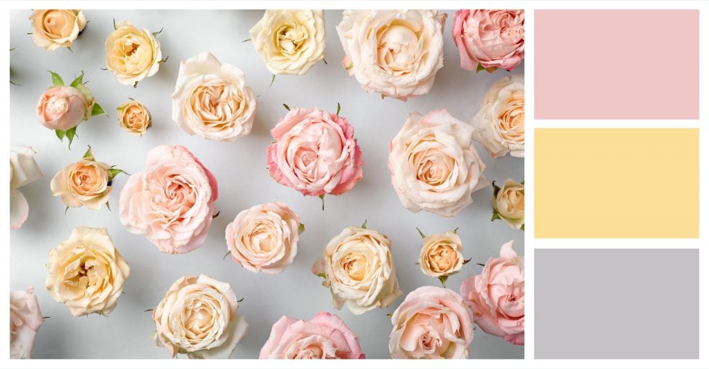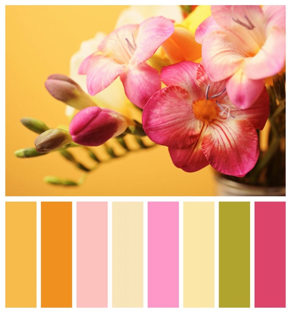
Associated with imagery of love and romance in our psyche, pink is a secretly powerful hue with a potent ability to stir the senses. Pink brings to the surface feelings associated with femininity, softness and gentleness. However, the secret power of pink rests in its ability to stir up creative energy and elicit joyful euphoria.
Pink first made its mark on the world in an artistic sense during the French Rococo period spanning from 1720 to 1777. The world’s love affair with pink extends from the soft, petal-inspired pinks of high-society days to the neon pinks of today. Many artists and decorators prefer shades of pink to red when they want to create a vibe that’s more subdued and calming. One of the perks of working with pink is that you have so many different shades to work with. From fierce fuchsia to peachy looks, pink takes the cake when it comes to bringing fun, positive energy.
With so many different shades of pink to choose from, you may be wondering what colors make pink and how you can make this pretty color from scratch. Making pink is actually quite easy. What’s more, you can easily adjust your formula to make an array of pink shades.
What Colors Make Pink?

When making pink, we’re really just bringing down a shade of a red. The formula for pink is Red + White. However, you’ll want to avoid some common mistakes to properly mix red and white to land at pink. First, don’t simply try to add white to red to make pink. The secret is to slowly add dabs of red to a blob of white. This will prevent the common problem of your pink being too dark. It will also save you a lot of work and paint because trying to “bring down” red using white is a big job. Just keep mixing your chosen shade of red into the white paint until you find yourself at pink.
If your pink still looks overly sharpened by the influence of red hues, you can actually bring down the tone even more by adding a complementary color. The classic option is to add just a dab of black. However, a beautiful pink shade can also be created when you add blue or green. Next, we’ll cover the secret to reaching specific shades of pink.
How to Mix Different Shades of Pink

The red you choose as your base will determine the shade of pink that you ultimately produce. In fact, you can save yourself a lot of time by simply selecting a red that displays the right characteristics. Here’s a quick rundown of reds that produce specific results:
Scarlet Reds: Bright, vibrant pinks.
Rose Reds: Lighter, softer pinks.
Ruby Reds: Jewel-like, shimmering pinks.
Naphthol Reds: Ultra-bright, neon pinks.
Crimson Reds: Pinks with hints of purple and blue.
Cadmium Reds: Orange-hued pinks.
Quinacridone Reds: Bright pinks.
Brick/Venetian Reds: Natural-looking pinks.
Again, your end result when creating pink rests in the shade of red that you choose. You’re really looking for a red that is a bolder version of the pink that you’ll be creating when selecting your base. In fact, the close relationship between pink and red actually makes your job much easier because you’re really just reengineering an existing red to make your desired shade of pink.

There’s no denying that pink draws in attention. What’s more, it can sometimes create a jarring effect due to the fact that very few things found in nature are actually pink. This is one of the reasons why pink is typically an accent color when it’s used in art, fashion and decorating. One of the ways to get around the “flashiness” of pink while still creating a pink effect is to layer multiple pinks together. For instance, a softer rose-pink hue pairs beautifully against a deeper, ruby-influenced pink. This technique yields especially striking results when using pink to shade the petals on a rose or paint sprays of wild flowers on a canvas.
What Colors Match With Pink?
Many people find working with pink to be intimidating because they don’t have a full grasp on which colors work well with such a perky hue. What makes working with pink such an exciting exercise is that pink’s perfect matches often go against instinct. Take a look at the colors that work best with pink:
Blue

When paired with muted pink tones, blue attains a new level of vibrancy. Many people also like the playfulness of mixing traditional masculine and feminine colors in one space.
Green

Green creates a very natural partnership with pink that brings to mind the companionship between flower and stem.
Brown

When paired with a dusty pink, brown brings forth a very earthy and wholesome feel.
Gray

Gray and baby pink create a very relaxing and sophisticated combo.
Yellow

When pops of pink are added to a yellow theme, the result is a very tropical and festive look.
Gold

Gold tones and pink evoke Victorian high-society vibes.
The big takeaway is that pink is far more versatile than people give this shade credit for. While the whimsicalness of pink can be played up, it’s not the only option. Pink can bring energy and strength to a canvas when used with colors that play up its red-derived power.


