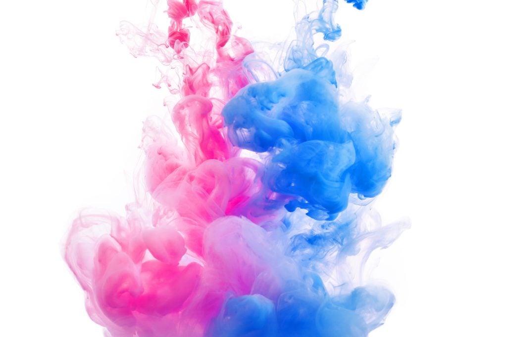
Blue and pink are two very different colors, but they often look nice together, especially in lighter tints. Pink and blue are generally seen as gender colors and are often used as pastel colors for holidays like Easter and Mother’s Day. They’re a bright, positive, and cheery combination, so what color do they make when mixed together? Let’s find out.
What Color Do Blue and Pink Make in Paint?
Blue is a primary color while pink is a tint of red, which is also a primary color. So, when you mix blue and pink together, you get a secondary color. The result is similar to a mix of blue and red, only much lighter.
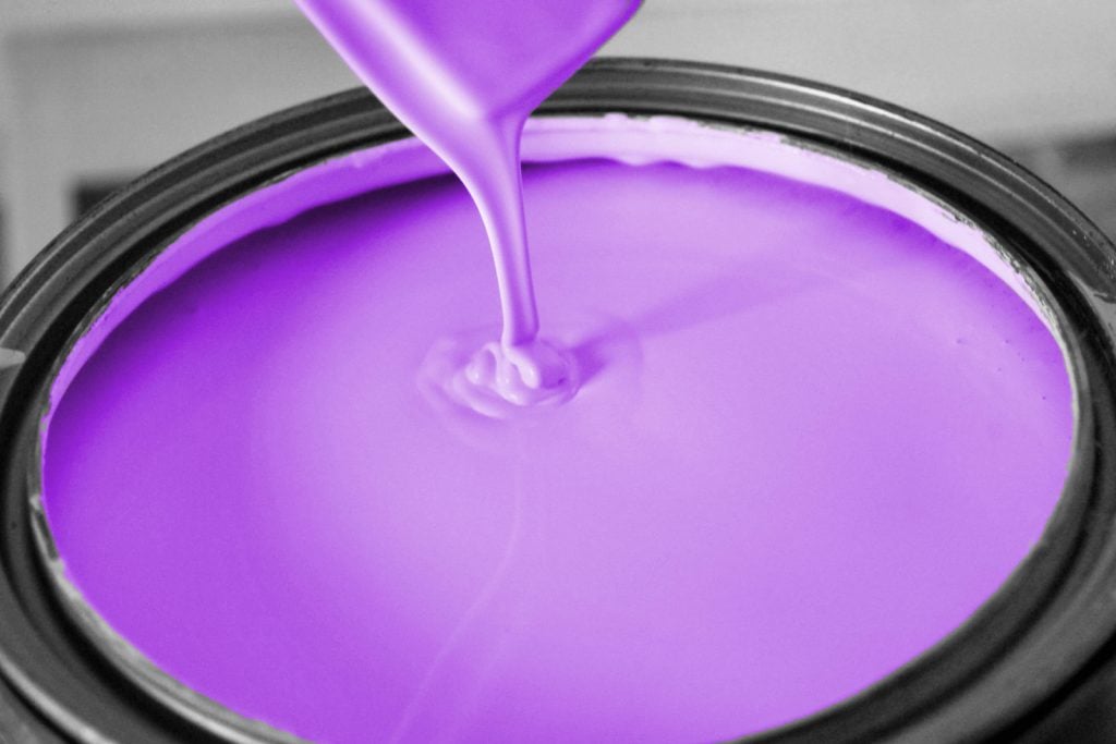
When blue and pink mix together, they create light purple or pastel purple. The exact shade of purple can vary, depending on how much white is mixed into the red to make the pink color.
An Easier Method for Mixing Purple

While blue and pink will give you purple, it isn’t the most logical method. The best way to create a true purple is by mixing blue and red.
After all, since pink is a lighter version of red, it might not come in most paint sets. So, you’d have to mix red and white anyway to create pink to use for your mixture. Mixing red and blue instead will save you a lot of time and effort.
Even if you want a lighter purple, it’s still easiest to mix red and blue first. Then, if you decide the color is too dark, you can add more white until it ends up looking like the purple you want.
Why is it Difficult to Mix a Perfect Purple?
Whether you use blue and pink or blue and red to make purple, you might realize that it’s a bit harder than anticipated. A lot of times it will end up closer to a purple-brown color than a bright purple, even with a 50/50 mixture. It’s because of the way most paints are made.
It can be challenging to find paint that’s labeled as just “blue” or “red.” Instead, you’ll see more specific variations of those colors, such as “ultramarine blue” or “permanent rose.” Those are not the pure colors you’re looking for, and they might have other colors mixed into them. Some reds and blues might even have a touch of yellow mixed in.
Red, yellow, and blue make brown, so having yellow mixed in can make your purple look not quite as pretty. So, if your purple doesn’t turn out as expected, you might want to try a different type of blue, red, or pink. When in doubt, try mixing various blues and reds together to see the different purples they make. Sometimes, you’ll get a result that’s even better than what you expected.
Making Tints and Shades of Purple

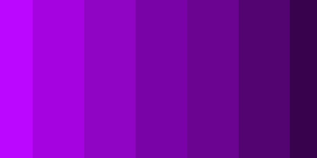
Purple is known for coming in a wide variety of tints and shades. Some famous purples are lighter, like mauve and lilac, while shades like indigo and grape are much darker.
Mixing Lighter Purple
Adding in more pink or red can make the purple brighter. Also, adding in white on its own can lighten the mixture. Since white is so light, you might need to add lots of it before you notice a significant change.
Mixing Darker Purple
Adding more blue to the mixture can create a darker, cooler shade of purple. Also, adding a touch of black can be used to darken the paint too. Yet, be careful not to use too much black since it can easily overpower the other colors.
Purple Meaning
Purple is one of the most popular colors, so it has a very consistent meaning. It’s known as a color of mystery, royalty, spirituality, and imagination. It encourages people to focus on their innermost thoughts to gain wisdom and growth. It’s a color that’s meant to inspire, encourage, and enlighten others.
In history, purple was often seen as a color worn by royalty to signify power and luxury. It’s also used for objects related to fantasy and magic. Keep these messages and themes in mind when using purple for your artwork.
Can You Mix Colors to Make Blue and Pink?

If you don’t have a blue or pink to use for your light purple, you can still make those colors from scratch. As mentioned earlier, pink is a tint of red, so mixing 50% red with 50% white will give you a nice pink color.
However, blue is a primary color, so creating it is a bit more tricky. With subtractive mixing using the CMYK color model, you can create a perfect blue color. According to that color wheel, which is mostly used for ink, magenta and cyan can mix together to create blue.
What Color Do Blue and Pink Make in Lights?
When it comes to mixing lights, the process is a little bit different. Lights use the RGB color model rather than RYB. So, according to the RGB color model, pink and blue lights will give you a rich purple or purple-pink color, depending on the brightness of the colors used in the mix.
Note that purple is usually referred to as violet when using lights and the RGB color wheel.
Understanding the RGB Color Model

To understand how blue and pink make purple in lights, we’ll need to look closer at the RGB color model. This color wheel uses red, green, and blue as the primary colors, rather than red, yellow, and blue like in painting.
All colored lights are made by mixing the primary colors at different brightnesses. For example, red and blue mix together to make magenta, blue and green make cyan, and green and red make yellow.
Pink is made with lights when red is at 90 percent brightness, blue is between 40 and 50, and green is 50 or less, depending on the type of pink. Hot pink has no green in it while light pink has about 50. When you mix any of these pinks with more blue, the amount of blue will be equal to the amount of red being used.
So the light will look purple, which can be lighter or darker depending on how much green is used. While primary colors in painting clash if all three are mixed together, the primary colors of lights all work together to make different colors. When all the colors are at full brightness, the light will turn white.
How Do Our Eyes Perceive Color?
When our eyes see color, there’s a lot more going on than we realize. The visible light spectrum has a range of colors from violet to red. The frequency of the wavelengths varies to determine which color we see. So, the violet end of the spectrum has short, frequent wavelengths while red has much longer wavelengths.
Yet, looking at objects is about more than just wavelengths. When we look at something, certain wavelengths are absorbed into the object, depending on that object’s properties. The color that doesn’t get absorbed reflects back toward us, allowing us to see that color. So, a red apple would absorb orange, yellow, green, cyan, blue, and violet light, but then reflect red light at our eyes, allowing us to see the red color.
In your eyes, there are cones and rods, which are sensitive to certain types of colors. How the cones and rods process the reflected colors is how you see hues on objects. So when you look at something colorful, there’s a lot more going on than you even realize.
Purple vs. Violet
Purple
Hex: #800080
RGB: 128, 0, 128
CMYK: 0, 100, 0, 50
Violet
Hex: #8F00FF
RGB: 143, 0, 255
CMYK: 44, 100, 0, 0
The words purple and violet are often used interchangeably for the same color, but despite popular belief, they’re actually two slightly different colors. Purple is described as a 50/50 mixture between blue and red, while violet contains a bit more blue than red. When looking at the colors side by side, it’s easy to tell the difference.
Designing with Purple

Purple is a common color in art and design, especially since it has so many beautiful shades and tints. It looks best with other cool colors, such as different shades of blue and blue-green. In some cases, it also goes with pink. Like most colors on the color wheel, it looks good with neutral colors, such as gray, white, and black, especially when designing furniture. A gray couch with a purple pillow can help add a little excitement to a neutral color scheme.
If you’re making a logo or advertisement with purple, you might want to consider using the colors on the opposite side of the color wheel instead. Yellow is a complementary color to purple, so they contrast each other. While it might not be pleasing to the eye on wall decor, using these colors together can make words or logos stand out more.
Purple is an inspiring and enlightening color, which is why many people use it in art pieces. It holds a lot of different meanings, so it also serves unique purposes. Keep that symbolism in mind when using the color purple for any future design project.


