Red and yellow are warm colors on the color wheel, and they’re often associated with bright objects like fire. Yet, these two popular hues also have a famous mixture, which pairs nicely with both of them. So, what color do yellow and red make when mixed, and is it different depending on the medium you use?
What Color Do Yellow and Red Make in Paint?
Both yellow and red are primary colors on the RYB color wheel. They mix together to create orange, which is a secondary color. Mixing 50% yellow with 50% red should give you a bright, perfect orange.
Why is Mixing Orange Paint Difficult?

Even though mixing orange sounds fairly simple in theory, it sometimes won’t turn out as you expect. Using 50% yellow and 50% red might give you more of a brown-orange color, which probably isn’t what you’re looking for.
This is a common issue with mixing paints because it’s difficult to find pure red or yellow. Most reds, yellows, and blues have more specific color names, such as yellow ochre or alizarin crimson. Sometimes, these specific colors have hints of other colors mixed in. Some types of red and yellow could even have hints of blue in them.
Mixing red, yellow, and blue paint together will give you brown. So, if blue is mixed into any of the colors, your orange will look more muddy than anticipated. So, the best way to mix orange is to find a yellow and red with nothing else added to them.
If you’re unsure which red and yellow will work best, it can’t hurt to try mixing a few different colors together to compare the results. You might discover a shade of orange that works even better than what you were looking for.
How to Mix Shades and Tints of Orange

Like all colors, orange has a wide range of shades, tints, and tones. After you mix an ideal orange color, you can add other paints to it to affect how light or dark it appears.
Mixing Light Orange
Adding a lot of white paint to your mixture is the best way to make it lighter. Yet, colors lose some of their brightness when combined with white. So, if you want a light orange that’s still vibrant, try adding some extra yellow instead of white.
Mixing Dark Orange
To make a darker orange, you can add in a hint of black. A little black can go a long way but only use it sparingly. If you use too much black, it could overpower the other colors. Adding darker shades of red to your orange is an alternative to mixing in black.
Orange Meaning
Orange is often associated with enthusiasm, emotion, and youth. It’s meant to encourage and uplift those who look at it. When people see the color orange, they might feel the need to be more spontaneous and positive in life. In history, many cultures also considered orange a spiritual color.
The color orange has been around for many years, but it didn’t always have its name. Before the 16th century, people commonly referred to orange as yellow-red. Then, when orange trees were first brought to Europe, artists began calling the color orange, named after the ripe fruits.
Can You Mix Colors to Make Yellow and Red?

While yellow and red are both primary colors, it’s possible to mix them using other colors. For red, you’ll have to do subtractive mixing using the CMYK color wheel, which is primarily used for ink. In that color model, the primary colors are yellow, cyan, and magenta. Yellow and magenta mix together to create red.
However, yellow is a bit trickier since it’s a primary color on both color models. When mixing with lights, green and red make yellow, but that’s not the case for paint. So, the only way to get a yellow color from scratch is to mix a lot of white with orange. Yet, that mixture won’t be quite as bright and vibrant as the yellow you’re used to seeing.
What Color Do Yellow and Red Make in Lights?
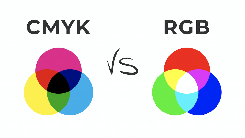
When it comes to lights, the mixtures are slightly different. Lights use the RGB color model instead of RYB. In the RGB model, red is a primary color while yellow is a secondary color. Yet, red and yellow still mix together to make orange, which is now considered a tertiary color.
RGB vs. RYB

RYB is the color model that most people are familiar with since it’s what we learn in elementary school art classes. It uses red, blue, and yellow as the primary colors, which can be combined to create all the other colors. This color wheel is used primarily for painting and other hands-on art styles.
Then, RGB is the color model for lights. It uses red, green, and blue for the primary colors, which still mix to make all other colors. However, when all three primary colors on the RGB model mix together, they make white, but in the RYB model, they make brown.
You might also come across the CMYK color model, which is used for ink and printing. In this instance, the primary colors are cyan, magenta, and yellow. They can mix together to create all the other colors. When they’re all mixed together, they make black.
Even though all three of these color models are very different, they still have some similarities. For example, red and yellow always make orange no matter what medium you use to mix them.
How Do Our Eyes Perceive Color?

When we see colors like orange, there’s a lot more going on than we think. It starts with a light hitting an object, and wavelengths of colors are absorbed or reflected on the object based on the properties of the item.
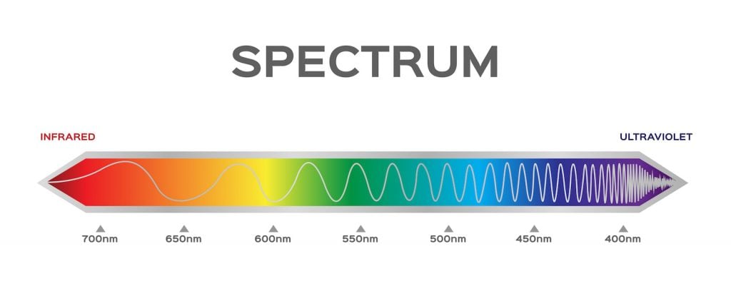
All colors on the visible light spectrum have different wavelengths. On one end, violet colors have short, frequent wavelengths, while red is on the other end with long, stretched-out wavelengths. The frequency of wavelengths helps determine the color you see.
For example, the wavelengths that reflect off a ripe banana are all within the yellow range of the spectrum. All other colors, including red, blue, cyan, green, orange, and violet, are absorbed into the object instead. So, when we look at a banana, we only see it as bright yellow.
Inside our eyes, there are also cones and rods. Those cells help your eyes and your brain register the color you’re looking at. The cone cells see colors in bright light best, while the rods are more sensitive, so they see colors better in dim lights. That way, your eyes can still register some colors no matter the lighting.
Orange Colors in Design

You might’ve noticed that red and yellow are frequently used in logos, especially fast food signs. They easily catch your eye, and together, they provide a mixture of comfort and hunger. As it turns out, orange can give off some similar feelings in designs. So, you’ll see a wide variety of companies use orange in their logos.
Orange in logos and advertisements makes viewers think of youth and fun. It has the perfect balance of the excitement of red and the welcoming nature of yellow. Yet, in logos, orange is rarely paired with yellow or red since they are similar colors. Instead, it’s often matched with darker colors like black, brown, or navy to make the orange stand out even more.
When it comes to other forms of design, such as painting and architecture, orange is used more sparingly. After all, orange is one of the brightest, most vibrant colors, and it can easily overpower a design. So, many designers use it in small areas here and there to add a pop of color. Like in logos, it also works best around neutral furniture colors like brown, white, or gray.
If you want to use more orange in designs, consider opting for a lighter or darker shade. That way, it won’t stand out as drastically. Orange is most commonly seen in designs related to summer, including patio furniture, sundresses, and swimsuits.
Do Red and Yellow Always Create Orange?

Yes, no matter what medium you’re using, red and yellow will always give you some type of orange. This might not sound surprising, but when you look at the RYB, RGB, and CMYK color wheels, you’ll realize that this doesn’t happen often. For example, mixing red and green makes brown in paint, but it makes yellow in lights.
That’s because the processes of mixing lights and paints are very different. When you shine two colored lights on top of each other, the colors add together. But when you mix paints, you swirl them together, causing them to absorb the color together. So, these two processes often have slightly different results.
Red and yellow is one of the few mixtures that is consistent through paint, ink, and lights. In every color model, orange is a vibrant color that gives off a lot of excitement and positivity. It can be a powerful color to use in designs, especially in logos and advertisements.


