

Considered a healing stone, natural turquoise is a calming blue with unique striations and variances. What makes turquoise especially versatile is that it falls somewhere between green and blue. This gives it a natural, earthy look that invites the eyes to make a spiritual connection with whatever object is shaded in turquoise.
The color turquoise is associated with calmness, growth and positivity. Its similarity to the aquamarine that paints the world’s oceans a signature blue-green color also creates visual associations with soothing waves and natural movements. Many people experience a sense of emotional balance when gazing at turquoise. It’s easy to see why turquoise is an attractive choice for creating a mood that is upbeat, serene, powerful and connected to nature.
You may be wondering what colors make turquoise and how you create your own shade of turquoise from scratch. Is it as easy as mixing different shades of cyan until you arrive at a stone-inspired shade of natural blue? Not exactly! There are actually two specific formulas for creating turquoise to choose from.
What Colors Make Turquoise?
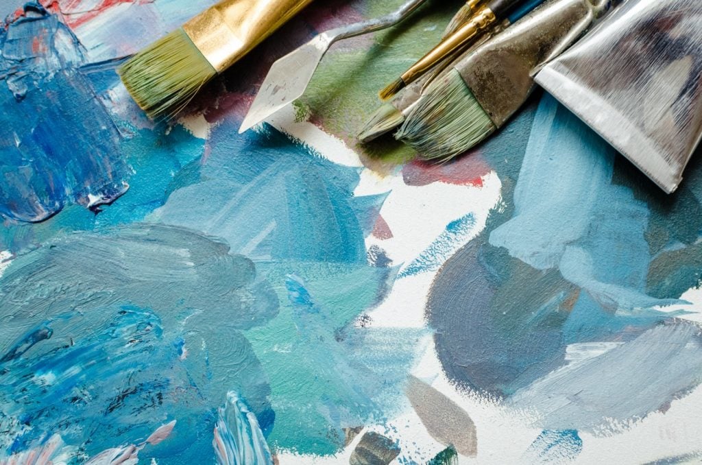
Creating a pale, genuine shade of turquoise can be achieved by using a formula of Blue + Green + White. When the blue and green are mixed, you should have a nice shade of cyan. You can then blend in small amounts of white until you reach your desired level of turquoise. Generally, you’ll want to start your turquoise formula with a 2:1 ratio of blue to green. It’s easy to add more intensity to your blue-heavy turquoise using this method.
The second formula for making custom turquoise is Blue + Yellow. With this formula, you’re adding just a touch of yellow to an existing blue paint. Try to aim for a ratio of 1:6 for white to blue to get the most vibrant and realistic turquoise.
The Art of Mixing Different Shades of Cyan
Cyan is one of the most valuable shades that artists can use for developing colorful worlds. Cyan is created by the removal of red from white light. A greenish-blue color, cyan can easily be lightened or intensified to create different shades within the green and blue families. Colors in the cyan range include turquoise, teal, aquamarine and electric blue. Here’s a look at how to create them:
Turquoise: Blue + Green + White
Teal: Cyan + Yellow + White
Aquamarine: Blue + Yellow + White
Electric Blue: Cyan + White
Colors in the cyan family are some of the easiest to tweak. Generally, a dot of white can greatly sway a cyan shade lighter or darker. In addition, this is one color group where intensity matters a lot. Combinations of green and blue can create vastly different results depending on which color comprises of the majority of the mix.

How to Use Turquoise

Like all cyan shades, turquoise pops when paired with certain colors. You actually have a few different ways to treat turquoise when working it into a color scheme. Red is the compliment of cyan. That means that red will look more brilliant when paired with turquoise. However, not everyone is looking for this level of boldness when pairing turquoise with other colors.
Using options from the subtractive color model, you can pair turquoise with both magenta and yellow. Of course, these two options still don’t create what would be considered a “conservative” color model by any means. To create a more conservative look using turquoise, you can opt to combine this cyan tone with darker shades of blue. Turquoise combined with dark, royal blues will create a very rich, layered look. Another way to make turquoise “pop” while still being conservative is to combine it will cool grays. This keeps the palette light while also adding some depth to a canvas or space. Lastly, turquoise can look very airy and beachy when paired with white. This can be a great combination when painting waves with white sand, creating a colorful background wall behind white cabinets or styling a turquoise dress shirt with white khakis. In fact, white and turquoise is a timeless combination that summons breezy, island-inspired vibes.
Some Tips for Creating Turquoise

When creating authentic-looking turquoise, it can be helpful to study photos of genuine turquoise stones. There are actually many natural variances in turquoise stones taken from different mines around the world that can be recreated when you develop your own custom shade of turquoise. For instance, Sleeping Beauty turquoise is a very uniform shade of blue that lacks the variances that many other types of turquoise possess. However, most types of natural turquoise have something called a “matrix” in the stone. A matrix looks like a web of black veins that spread across the stone in cracked patterns. While some veins are thin, others actually resemble large splotches that are tinged with earthy browns, tans and grays.
The Two Types of Turquoise
We’ve mostly focused on true turquoise that has a distinct aqua coloring. However, green turquoise is also popularly used when capturing the essence of turquoise on canvas. Green turquoise is commonly used when bringing to life stones or painting natural bodies of water. Green turquoise generally looks a bit murkier than its blue counterpart. It is also generally full of more veins and webs than blue turquoise.
Final Thoughts
The fact that turquoise is a color that’s based on a natural stone means that you have plenty of real inspiration to pull from when coming up with your own specific turquoise shades. It also means that you have a lot of freedom to base your variation of turquoise on any one of the millions of natural representations of turquoise found throughout the world. Bright, highly spiritual turquoise is a great color to bring into the picture when you want to elevate the mood and increase positivity in whatever work of art you’re creating. It is highly prized in art, décor and fashion.


