

Most people are familiar with the concept of warm colors, but not everyone knows exactly what they are and how to incorporate them in home decor, art, and design. If you have trouble determining which colors are “warm,” a quick glance at a warm color is all you would need to learn the difference between warm and cool colors. Warm colors are reds, yellows, shades of orange, and much more. They create a feeling of heat, brightness, and an atmosphere of warmth and illumination.
In art and design, we use warm colors to represent fire, light, hot landscapes, and a few of the more exotic nature colors. For example, a lion will often be portrayed using somewhat warmer tones than we would find on these great cats in reality. In truth, a lion is more of a wheat-like or buff tone. But we often see them rendered in subtle tones that incorporate gold and orange. This is because a lion is correctly seen as energetic, regal, and dangerous.
What Are Warm Colors: The Main Characteristics

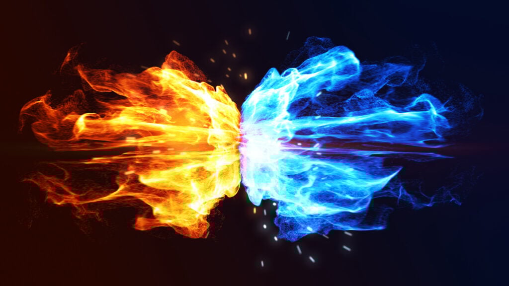
Warm colors exude a feeling of warmth and energy. They are used to denote alarm, motion, light, heat, and to portray anger, fear, love, and desire. Contrary to cool colors, warm colors appear to advance toward the viewer and to press against lines of contrast with cooler colors.
Consider a blue dot on a bright orange background. In such an image, the blue dot would appear to be embedded in the orange or pressed in on all sides by it. By contrast, an orange dot inside of a field of blue would appear to press outward and almost seem as if it wants to leap off the page. This is why we say that dark colors are “slimming,” and bright colors are not.
This is especially true of colors that we associate with sunlight like yellow and orange, but expansion is a characteristic of all warm colors. This is because light is an active force, one that reaches out, expands, and touches everything around it. Light has no directional bias. It reaches out in all directions with equal vigor, bringing illumination, warmth, and in the case of sunlight, vital nutrients.
This effect comes from the unintuitive ability of light to obscure what is behind it. The edges of any very bright object will always be slightly indistinct. There is a subtle, and sometimes not so subtle, smearing of its edge. Consider for a moment the idea of an ultra massive planet behind the sun. You would not be able to see it. It would be obscured by the intense light. In the same way, a powerful flashlight is good as a self-defense aid in darkened locations. This is because the viewer loses the ability to see the person holding the flashlight, giving the wielder of the flashlight a slight tactical advantage.
Warm vs Cool Colors
The best way to understand warm colors is to contrast them with cool colors. As we move forward, we will see that this goes for both sides of the spectrum. Here is a quick reference guide:
| Warm Colors | Cool Colors | |
| Colors | Red, orange, yellow | Blue, purple, green |
| Symbolism | Heat, light, motion | Water, darkness, stillness |
| Emotion | Passion, coziness, playfulness | Soothing, calmness |
| Utility | Make a space cozier | Expand a space |
Uses of Warm Colors in Art and Design
As mentioned above, warm colors are often used to depict a lion. This is for the reasons mentioned above, but it is also because a lion is often used as a symbol of the sun, or as having sun-like qualities.
In ancient Norse and Germanic spiritual traditions, the Sun was portrayed as a goddess with bright golden hair. Her name was either Sol or Sunna, and her bright, golden hair would reach out in all directions, depicting the rays of the sun, which are her defining characteristic.
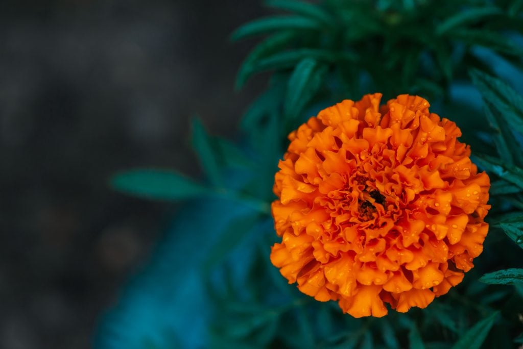
These bright tones and active colors are also used in still life art and nature settings to portray life and wholesomeness. Brightly colored flowers in a painting can seem to burst with living energy. A well-rendered flower should have a sun-like quality in that it gives off the impression of being so full of life that it is radiant with it.
Uses of Warm Color in Home Decor

Warm colors are used to create a feeling of warmth and comfort. Because they appear to expand, warm colors can be used to make a room seem cozier. These colors create a feeling of closeness or approach. Conversely, cool colors give off a sense of space or retraction. Warm colors move toward the viewer, while cool colors move away.

Warm and cool colors intensify each other’s qualities of motion and emotion. When designing a home interior, the feeling you wish to create in a room will give you the color types that will dominate the space. At the same time, careful use of cool colors will strengthen the effect of your warm colors. Also, adding cool colors to a warm design will help to prevent the warm colors from being overwhelming or oppressive.
The best example might be the most common color used on interior walls, off-white. White is arguably the warmest color possible. It is also far less distracting than red, orange, or yellow. But we temper it by darkening it slightly, to make eggshell, mother-of-pearl, or what have you. In this way, we get all the effects of a massive splash of warm color without drawing unwanted attention to it. White is also unique among warm colors as it is the most tranquil among them.
Warm Colors That Aren’t Bright

Certain colors can feel warm without being bright. In point of fact, these colors are technically cool. But they can look or feel warm because they are commonly seen on things and in situations that are associated with heat. Examples include the buff color of desert sand, dark browns, creamy browns, orange with a tinge or reddish-brown, and so on. You may agree that a shining, jet-black car does not look cool – at least not in the way we’re using the word “cool” here.
Colors like these are wonderful for interior décor because they give you the warm, cozy feeling that warm colors are so good at producing, but they are gentle on the eyes and are not too distracting. They go very well with hardwood, wooden beams, and wood ceilings. These warm-looking colors, which are technically cool, are also a good way to create an effectively warm atmosphere without resorting to a lot of more common cool colors.
For example, if you wanted to create a very indulgent, sophisticated atmosphere, like what you might see in a fine restaurant or a classy cafe, you’d likely want a lot of warm-feeling colors. Through these colors, the effect of warmth can be achieved without using colors that come with a risk of looking cheap or that might spoil the mood in some way.
Different Moods, Different Colors
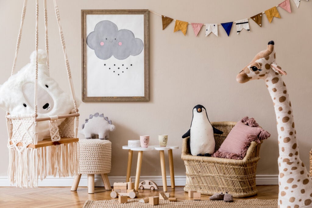
Any color scheme can be used to great effect in any type of space. When you start looking up warm colors in interior design, one of the recommendations you’ll run into frequently is to use warm color in game rooms, children’s rooms, and other “fun” areas.
But there are no hard and fast rules determining what colors are best for a given space. To suggest as much is to slander the emotional and communicative power of color. Using bright colors in a game room does sound like a fine idea, and rather something of a no-brainer. However, what if you’re putting together a swanky billiards room? Would you fill such a room with great splashes of red, orange, or yellow? I think not. More likely, you would want to use strong wood accents and some of the technically cool, warm-feeling colors discussed above.
A children’s room is clearly an excellent space in which to use warm colors, but it is equally appropriate to use cool colors. The question is, do we want an energetic feeling, a feeling of ease, or do we want something in between. The only way to answer this question is to interrogate our subjective tastes, desires, and motivations. We may paint a little girl’s room with an abundance of pink. But in doing so, we might be getting the opposite of the intended effect.
Pink, of course, is a dilution of red, which is an energetic and warm color. Likewise, blue is a cool color, but when it is over-diluted, it can look cheap or create an unsettling feeling of insecurity.
How to Get the Effect We Want

The emotive power of color is nothing if not subjective. This means that the colors we think will look good used in a certain space or in a certain way can leave us disappointed. When it comes to interior decoration, the best place to start is with an image search. Search for terms like “burnt orange in a master bedroom,” or “warm colors in kitchens.” You’re going to get a lot of results coming from highly qualified interior design sites.
Second, take a look at the space you intend to paint. Consider the contours and how the colors you plan to use will contrast on a given corner, angle, bend, or trim. Finally, be prepared to make changes. If you’re taking chances, then having more paint than you need is a good idea.
Finally, if it’s an art project you’re working on, you might again try an image search. But more important is to have a lot of scratch paper and practice working with the colors you have at hand.
In conclusion, be mindful of the expansive quality of warm and bright colors. Have a plan for complementing that effect by mixing them with cooler colors or by contrasting them with cool colors. At the end of the day, you’ll find trial and error will be your best friend when it comes to getting the effect you want. So experiment, have fun, and get ready to learn a lot about how colors can support and conflict with each other.


