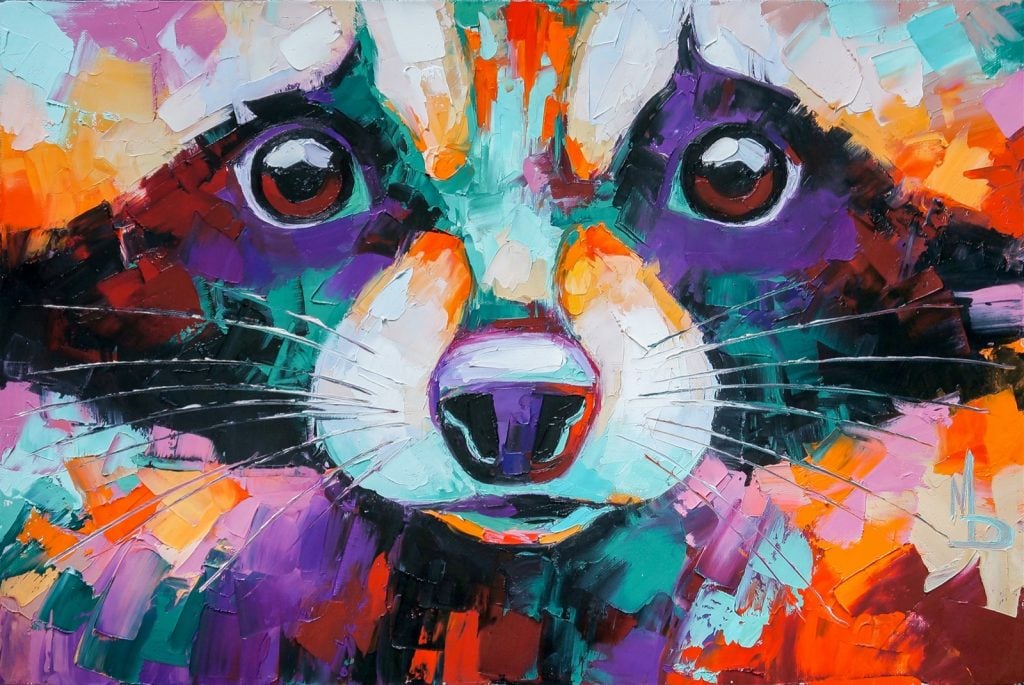
On the surface, people enjoy art because the colors are appealing. Yet, most artists think deeper about their color schemes than just how pretty they are. Many art pieces have hidden meanings based on the colors they include. Those colors may evoke certain emotions that might not be obvious at first.
So, what do the colors in art pieces mean? Using different color schemes may affect a painting drastically.
Choosing Types of Color
Even though each color has individual meanings, the exact emotions a color conveys may vary based on the colors you pair it with. Here are some combinations of colors you might use in art.
Warm Colors

Warm colors are bold colors that create warm feelings. On the color wheel, they’re types of red, orange, and yellow. Since they’re next to each other on the color wheel, they go well together and give off similar emotions.
These colors can evoke a wide range of emotions, including happiness, hunger, or anger. The designs and images used in the art can make the exact meaning clearer. People may feel excited or experience an increased heart rate when they see warm colors.
Cool Colors

Cool colors are the opposite of warm colors. Most cool colors are variations of blue, green, and purple. They’re not as overwhelming as warm colors, so they may depict calming or sad emotions.
Art with cool colors is usually hung in rooms people want to feel relaxed in, such as bedrooms.
Complementary Colors

Complementary colors are colors that sit on opposite sides of the color wheel from each other. Some examples are red and green, orange and blue, and purple and yellow. When used together, these pairs of colors have a high contrast, making both colors stand out more. They can be used in a design that’s meant to capture someone’s attention.
Color Meanings in Art
Colors have many meanings in general, but those meanings are even more important in art. Many artists choose colors based on how they might make people feel, so if you’re creating art, it’s a good idea to think about the meanings of every color. Here are examples of what each color could mean.
Red

Red is a vibrant color that symbolizes strength, energy, and passion. It can be used to represent positive emotions like love, but in other contexts, it can be a sign of danger and violence.
If you use red in your artwork, make sure to put it on an object that’s a focal point. Eyes are naturally drawn to red, so if only part of the painting is red, people will likely look there first, especially if the other colors used are duller.
Red can also be used to enhance or flatter other objects in the painting, such as a red dress on a person or a red background on a dark landscape. When it comes to red in art, one thing’s for sure: it will attract a lot of attention.
Orange

Orange is made by combining red with yellow, so it can share some of red’s meanings, but it’s not as extreme. Like red, orange is a vibrant color that will stand out in a painting, so it’s most commonly used for fun, exciting pieces. It’s often a symbol of youth, optimism, and enthusiasm.
This color exudes confidence and creativity. It’s rarely used in large amounts because it can overpower the rest of the artwork. Using paler or darker shades of orange can help tone it down, but no matter how you use it, you’ll want to take a lot into consideration first.
It’s hard to look away from art that uses bright orange, so it’s a color that’s best for pieces with a lot of energy. In some cases, orange might be seen as a sign of stubbornness or impatience.
Yellow

It’s commonly known that yellow is a symbol of happiness, optimism, and positivity. It’s a vibrant color that often brings a smile to our faces. Looking at yellow artwork might make someone feel energized, creative, or inspired.
Yellow is often associated with light and sunshine, which are natural parts of life. It may go hand-in-hand with intellect and freshness. Yellow can be used on objects to attract attention to them, such as taxis. So, if there’s an item that you want to stand out in your art piece, make it bright yellow.
Even though yellow is usually a positive color, it also has some negative meanings. It’s sometimes used as a sign of caution or cowardice. Shades of it might come across as sickly. Like every color in art, it all depends on the context.
Green
Green is one of the most common colors in nature, so it’s the perfect color for landscapes. It can be seen as a sign of growth, health, harmony, and safety. Since it’s a cool color, it’s calming and easier to look at than the above colors.
Dark green is the most calming type of green while yellow-green can sometimes give off uneasy vibes. Yellow-green or some tints of light green can be associated with envy, greed, and sickness. Yet, those negative aspects of green are less common.
Overall, green is a color that’s used frequently in artwork to depict nature and living things. It’s easy to look at and it gives people a sense of hope.
Blue

Blue is one of the most calming colors, so it’s often used in artwork that will be hung up in relaxing areas. It’s a soothing color because it symbolizes trust, loyalty, and responsibility. It represents many calming things in nature, such as water and the sky.
Since blue is easy on the eyes, it’s a great background color that can provide an interesting contrast to more vibrant colors. It can have meanings of wisdom, depth, and honesty.
Like all colors, blue can also have some downsides. Blue is a color that’s often associated with depression or coldness. If the focal point of a painting is blue, it might hint that there’s a sad story behind it. Picasso’s Blue Period is a good example of using blue to convey misery and mourning.
Purple

Purple is a unique color that isn’t used as often as the other colors listed. It’s a favorite color for many people, but it’s not seen often in nature. So, it’s more likely to be used in paintings that are abstract or less realistic.
Purple is a color of mystery, royalty, and imagination. It’s viewed as elegant and regal, especially dark purple. Tints of purple, such as violet and lilac, are more fun, playful, and creative. So, you’ll need to consider which feelings you want to portray when choosing a type of purple in your design.
Since purple is a mix of blue and red, it combines the fiery energy of red with the calming presence of blue. Thus, it’s used in the most unique designs. It has very few negative associations, but some may view it as an overly emotional color. Regardless of which meaning it represents, it’s a great pop of color to use next to neutral colors.
Black
Black is only used sparingly in art, especially paintings, because it can easily overpower other colors. It’s also commonly associated with intense meanings like power, sophistication, and elegance. Some people see it as a mysterious and intimidating color.
An art piece with lots of black can reflect negative meanings, such as depression, grief, and fear. It can add an eerie or somber vibe to a painting. It can also be mixed with other colors to create shades, making the hues darker while still being colorful.
Black is a neutral color, so it can go well with any other color. You can pair it with dull colors to make the piece as haunting as possible or you can use it with vibrant colors to provide some contrast.
White

Like black, white is a neutral color that can go well with any other color. However, its meanings are very different from black’s symbolism. White is a sign of cleanliness, purity, innocence, and perfection.
White is a simple color that can provide a neutral backdrop for a colorful focal point. It’s a great way to tone down or balance out loud colors. When it’s mixed with other colors using physical art mediums, it makes them lighter and paler. Tints of colors are often more calming to look at.
While white is generally seen as a pleasant color, it can be viewed negatively if it’s used too much. Artwork with an excess of white may be seen as boring, cold, and empty. Most artwork uses at least a little white, but you need to be careful with how you use it.
Brown

Brown is a natural color that’s often seen in nature. It symbolizes stability, honesty, and comfort. It’s a neutral color that pairs well with almost every other color.
On its own, brown doesn’t evoke a lot of emotions or attract much attention. It’s a simple, reliable color that can provide a neutral background for other colors. If it’s used with vibrant hues, it can help the other colors stand out more.
Too much brown in an art piece could be seen as boring. However, if you’re creating a nature scene, lots of brown may be necessary. Using a variety of brown tints and shades can help make your artwork more appealing.
Gray
Gray is a color that’s often overlooked due to its simplicity, but it’s a great neutral color to design with. It’s a perfect balance between black and white. So, it symbolizes control, compromise, and practicality. It can be more calming and soothing than white or black.
If it’s used too much, your piece might lack emotion. So, using several tints and shades of gray might make the image more interesting, especially if it’s paired with some eye-catching colors.
If you want to tone down any colors in your paintings, you can add gray to the color. Doing so will keep your piece looking colorful without being overwhelming.
Creating Colorful Art
Now that you know more about the hidden meanings of colors in art, it’s time to use those meanings to create your own masterpieces. If you want to make something bold and eye-catching, use vibrant warm colors like red and yellow. If you want to create a calm piece, choose cool or neutral colors.
As long as your artwork means something to you, that’s what matters most. So, take color meanings into consideration, but also make sure the colors you use are appealing to you.


