

A brand is a design, symbol, or even a name that represents a particular product or service. Nearly everyone who has a company, product, or service to sell will need to choose colors for their brand. This is an extremely important part of making whatever the business is promoting as successful as possible. The power of color is so strong that by simply seeing a color combination, many customers will instantly decide if they want to find out more information about a certain product.
Here we provide a step-by-step guide for choosing the best colors possible for your brand.
Why Are Colors Important?
Colors play an important role in all of our lives. Most of us have had a favorite color since we were kids. We’ll spend time choosing colors for nearly everything we use in our daily lives. We take great pains in choosing the right colors for the clothes we buy, the car we drive, and how we decorate our entire house. Colors often create a first and lasting impression. Colors are associated with holidays, strong emotions, and sometimes even good and evil.
Extensive studies have shown that different colors bring out specific feelings and emotions in humans. For example, bright red causes people to be on the alert for danger. This may have a psychological basis in the fact that blood is red and people know that their very lives are endangered if they lose too much blood. This is why stop signs are red. People know to completely stop and look around in order to protect themselves.
Certain colors are known to even affect a person’s health and well-being. Many people know that blue is a soothing color, while red has the opposite effect. This is why you’ll rarely see a doctor’s office or waiting room painted in shades of red. But fewer individuals probably know that purple calms the mind and nerves and is associated with the eyes, nose, and mouth. Eye doctors and other specialists might consider using shades of purple when decorating their offices.
When it comes to putting together colors for a brand, the color scheme you use is just as important. First impressions are extremely important when people are deciding what products to try. If the colors are unappealing or don’t seem to fit the product, a person might pass by without even giving the product a second glance. The best place to start when understanding how important colors are for branding is to study some good examples of companies that use color well.
What Are Some Examples of Great Branding Colors?

All the big corporations, from Facebook to McDonald’s, have specific color combinations that represent their brand. If you look at the branding of banks, you’ll discover that nearly all their brand logos have one thing in common. Whether it’s Chase, Citibank, or Bank of America, they all use the color blue. In fact, blue is the most used color in brands for all types of businesses. Why? Blue is associated with trust and tranquility.
McDonald’s, Burger King, and Pizza Hut all use yellows and reds when creating their logos and brands. These colors are associated with food and will often elicit a psychological response when people see the colors. Red and yellow colors will usually make people more hungry. A color you won’t find in most restaurants is blue. Blue is the only proven appetite suppressant color, so it’s also the worst color to use in a food logo.
There are several examples of companies that use a unique combination of different colors to convey a variety of feelings among their customers. Target, for instance, uses the simplicity of two red circles against a white backdrop. Their registered trademark sends the message of simplicity, yet the bright color attracts immediate attention. T-Mobile’s combination of pink and gray makes the statement that they’re splashy and youthful, yet serious and solid.
FedEx uses an interesting combination of purple and orange. It’s interesting to note, however, that FedEx uses different colors on the “Ex” part for different departments in the company. Studies have shown that many consumers base their assessment of products primarily on the colors of the products and the brands that represent them. You can see now why it’s so important to choose the right colors for your brand.
What Can You Learn From the Competition?

When choosing the colors for your brand, it’s necessary to remember that you’ll be in direct competition with other companies that are also vying for the customer’s attention by using colors. Your product or service will likely be situated among others of a similar nature. Whether it’s online, in a store, or in printed materials, you’ll want your brand to stand out from the competition.

Start by studying other brands and the color combination your competitors are using. Studying the brand means more than just recognizing the colors or admiring them. What stands out about their particular brand? What are the first things you think or feel when you look at their brand?
After you answer these questions, you can figure out how you can make your brand better. What did other companies do that worked well? What didn’t seem to work so well? If you find ideas you like in a direct competitor, make sure you don’t just copy the idea. Put together a color combination that is as unique as your particular brand.
For example, if the competition is using green and blue against a white backdrop, and you’re determined to use green and blue against a white backdrop as well, there are a few things you can do to differentiate yourself. Start by experimenting with different shades of blue and green to see if that will still adequately represent your product. You could also make sure you use different shapes and sizes of letters or incorporate images such as flowers, smiley faces, etc., to make your brand stand out.
What Do Colors Generally Convey?

Most of us think of certain things or feel a certain way when seeing various colors. Just like scents and aromas play an important role in engaging consumers and convincing them to buy certain products, so do colors. The following are generally the types of feelings and emotions that certain colors convey.
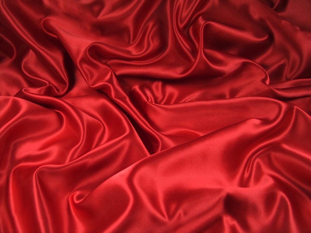
Red
Red is playful, loud, and often communicates danger or warning. If you want to make a bold statement or quickly get someone’s attention, you might consider red for your brand.
Blue
Blue conveys calm, relaxation, and trust. If you need people to trust your brand and see you as reliable and stable, blue is a good choice. Blue is sometimes associated with spirituality or wisdom. It is the most used color in logos and branding.
Yellow
Yellow represents cheerfulness and friendliness. If you want your brand to portray youthfulness and energy, you may want to include yellow. The color yellow is used a lot in branding, especially intense bright yellows. You’ll likely want to avoid light yellow, as it is often associated with sickliness.
Green
Green is associated with both growth and money. It’s also a color that can mean balance and tranquility, since it is also associated with nature. However, the color green can also mean other things such as good luck as well as jealousy and envy.
Purple
Purple can represent many things, beginning with royalty and sophistication. It also sometimes means creativity. Purple is close to blue and can also mean authenticity and truthfulness. Since purples can either be close to red or almost blue, there are a lot of feelings and emotions that purple can convey.
Orange
Orange is a combination of yellow and red and brings out emotions that fall between these two colors. Orange says vitality and energy without going to the extremes of red.
Brown
Brown often makes people think of seriousness or security. Reliability or elements of nature are also associated with the color brown. Although the company no longer uses the phrase, UPS not only had brown on their logo but said the color name when stating, “What can brown do for you?”
Black
Black is often used to represent a sense of luxury and glamour. The color also stands for power and strength. Black can also represent sorrow or even evil. It’s important to use black carefully so as not to convey a negative feeling.
White
White is often used as a background color to provide contrast. Almost all logos and branding have some white or off-white shade. White as a primary color can mean purity or sophistication.
Gold
Gold represents elegance and high standards. It also causes people to think of wealth and great success. Gold and black are often used together when promoting luxury products.
Pink
Pink represents romance, sexuality, and femininity. Products geared toward women or young girls often use pink.
Gray
Gray stands for practical, serious, or something that is a timeless classic. The color is also thought to represent complexity and impartiality. Gray is sometimes used as a secondary color.
How Should You Choose Your Colors?

Before choosing the right colors for your brand, you’ll want to take into consideration the type of product or service you’re creating a brand for. The following are different types of industries and the colors that might work well in each.
Restaurant Industry
As stated earlier, many restaurants use red or other warm colors like yellow or brown. There are some nuances, however, to keep in mind when choosing colors for any type of business related to food. Green is sometimes associated with healthier types of food, while blue and purple are associated with desserts.
Food Industry
It’s important to distinguish between restaurants and individual types of foods sold in grocery stores. Nearly 2,500 grocery products from Walmart’s online grocery service were analyzed. They list different types of food and the colors they use to promote and sell these items. Examples include using light gray and light blue for selling ice cream and ivory and dark gold for chocolate.
Tech Companies
The technology industry will often go with different shades of blue and white. This signifies trust, dependability, and intelligence. Orange is sometimes added, which can mean vitality and energy. Blue, black, and white are the top colors. You’ll rarely, if ever, find a tech company using browns or pinks.
Healthcare Industry
Most healthcare or medical brands include either blue or green or a combination of these two colors. Blue represents trustworthiness while green stands for health and growth. Well-known health insurance companies such as Aetna, Cigna, and Blue Cross Blue Shield all have blue as a major color in the brand’s logo.
Beauty Industry
There are several colors different beauty companies might use, depending on the type of products they’re selling and the demographic they’re targeting. Colors often include black and pink. Cosmetics companies might use a deep shade of red if they’re marketing toward an older, more sophisticated demographic. Pink would be for a younger age group.
Athletic Teams
When branding a sports team or league, what mascot is chosen will play a huge role in selecting colors. For example, the Miami Dolphins use blue and orange. The orange sun represents energy and vibrancy, while the teal blue dolphin represents the beautiful waters surrounding Miami.
How Can Colors Promote Your Personal Brand?

Even after you’ve established your brand, you’ll need to answer specific questions before selecting the best colors. The first question is what are your company’s goals? This goes beyond the obvious of wanting to sell a product or a service. What does your product or service do? Why should people want to buy it or use it?
Will your product or service help people financially? If so, you may want to consider the color green or gold, or a combination of green and gold for your brand. Do you want customers to feel happy and have fun, then colors like yellow and orange might be good choices.
The other important aspect of choosing colors you’ll need to consider is who is your target audience? Are you targeting middle-aged professionals who are looking for a good investment or millennials who are buying lawn furniture? How does your brand and how you want your customers to feel all come together? Once you’ve answered these questions, you’ll likely be able to narrow down your choices to a few colors.
How Should You Create Your Color Scheme?
Once you’ve selected your colors, the next step is putting together a particular color scheme. Emotions such as anger, love, and fear are often stronger than rational thought processes. Successful branding will therefore want to focus on how to make their potential customers feel rather than making them think a certain way. What kind of emotions do you want to bring out in a person? You’ll base your selection of colors on what you want your customers to feel when they see your brand, and specifically your logo.
There are several questions you’ll need to ask yourself when putting your colors together for your brand:
- The first step is to choose your brand identity. This means creating a brand design and image you want to present to the public that represents your company, product, or service.
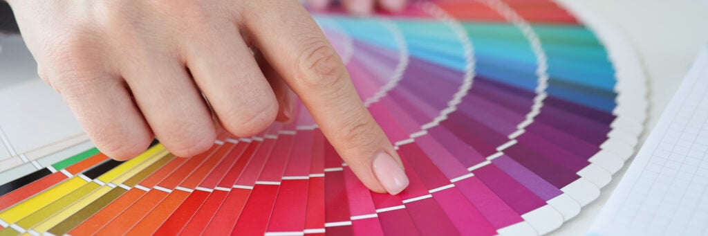
- Study what each color means and pick a few colors for consideration. Create several different color combinations so you’ll have different choices to consider. It’s important not to rush this process.
- Decide on a primary color and where in the logo that particular color will go. Then choose one or two secondary colors that complement the primary color. Your main color should reflect your overall message and what your product or service represents.
- Try not to choose more than two or three colors. Using several colors will likely muddy your message, and customers may be confused about what your company actually represents. There are exceptions, of course. NBC uses many colors in their famous peacock trademark. This is likely because they present a variety of programs aimed toward a diverse group of consumers.
- Test your colors and get feedback either internally or from the public. Make changes where necessary. You don’t want to stick with a color scheme that doesn’t convey the exact message that represents your company.
- You may want to consider a trademark once you find the perfect logo or brand for your company. Since registering a trademark is often a complex and time-consuming process, don’t start this step until you’re absolutely sure you’ve created the best brand and color scheme possible.
93 percent of buyers will focus on the visuals of a product. The majority state that color plays a big role in drawing people to a specific product. Since color obviously plays such a major role and can contribute to the success or failure of most products, it’s extremely important to take the time to study colors and find the best color combination possible.


