

Blue and purple go so well together, which is why they make a pleasant and predictable mixture. They’re both cool colors that sit close to each other on the color wheel. So, both colors and their mixture work in harmony in art and design.
The results of a blue and purple mixture may vary based on the shades of blue and the mediums you use. However, most of the results will be fairly similar.
What Color Do Purple and Blue Make When Mixing Paint?
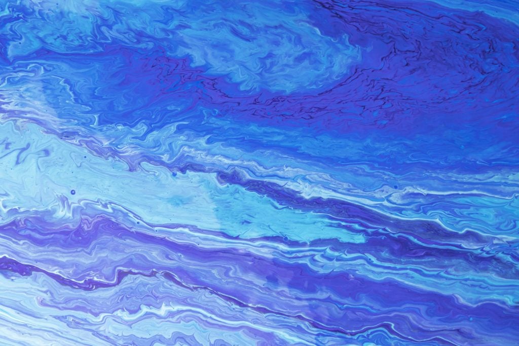
Blue is a primary color and purple is a secondary color, and they mix together to create blue-purple, sometimes called blue-violet, which is a tertiary color. There are many shades of blue-purple, including well-known colors like violet, indigo, lavender, and periwinkle. Yet, blue-purple is the best name for a 50/50 mixture.
What are Tertiary Colors?
Tertiary colors are created when a primary color is mixed with a secondary color that’s beside it on the color wheel. There are six tertiary colors on the RYB color wheel: yellow-orange, red-orange, red-purple, blue-purple, blue-green, and yellow-green. As you can guess, each color is a 50/50 mix of the two colors in its name.
Types of Blue-Purple
There are many shades of blue-purple, some of which have much more blue in them than others. These different types of blue-purple are created by mixing in more blue or purple, using different types of blue and purple, or adding white or black into the mix.
For example, if you mix light blue with purple, you’ll get more of a lavender or periwinkle color. If you mix purple with navy, you’ll get a deeper, darker purple.
If you add extra blue or purple, you might get colors like mauve, indigo, lilac, or plum. They’re all types of blue-purple, but their mixes aren’t perfectly even.
How to Make Blue-Purple Lighter or Darker
If you have a perfect mixture of blue and purple, there are plenty of things you can do to create a more unique mix. Here are some tips for making your blue-purple lighter or darker.
Mixing Lighter Colors
Adding some white to the color will make it lighter, but it might require a lot of white to create a significant change. Using lighter versions of blue and purple to begin with can also create a brighter tint.
Mixing Darker Colors
Adding a touch of black can darken your blue-purple, although this mixture is usually dark to begin with. Only use black sparingly as it can quickly overpower the rest of the color. Adding in darker shades like navy blue can also alter the color and make it not as vibrant.
Does Blue-Purple Have a Meaning?

Blue-purple doesn’t have one clear meaning, but since it’s a perfect mix of blue and purple, it holds some meanings of both colors. Blue is known for being a color of trust, security, and loyalty while purple has meanings of mystery, royalty, and imagination.

Blue-purple might be a sign of dignity, devotion, and independence. It represents strong relationships and beliefs, but also a sense of excitement and wonder for the future. Many people see types of blue-purple as signs of creativity, peace, and magic.
A whimsical color like blue-purple is sure to intrigue others. So, while it might not be as well-known as purple or blue, it’s a great color to use in your designs. You can decide which meaning you want to shine through in your art.
Can You Mix Colors to Create Blue and Purple?
If you don’t have blue and purple paint, you can mix other colors to create them. Yet, since blue is a primary color, the mixture isn’t quite so obvious. To get blue, you’ll have to use subtractive color mixing through the CMYK color model, which is primarily used for ink. According to that color wheel, magenta and cyan will give you blue.
Being a secondary color, purple is much easier to mix. It’s made of 50% blue and 50% red. So, when you mix purple and blue together, it’s like creating purple with extra blue added to it.
What Color Do Purple and Blue Make When Mixing Lights?

When it comes to lights, blue and purple are not often mixed together, as the light color model (RGB) uses violet instead of purple. Magenta and blue make violet, which is a tertiary color.
Mixing the primary color blue with the tertiary color violet would give you a slightly blue-violet color. So, you could say that it’s the light equivalent of blue-purple.
Understanding Different Color Models
There are three different color models for color mixing: RYB, RGB, and CMYK. All three are used for different things, and some create different results when colors are mixed. Understanding these color models and the difference between additive and subtractive color mixing will help you see why blue and purple are rarely mixed in lighting.
RYB
RYB is the subtractive color model that most people are familiar with since it’s the one that we often learn in early art classes. This color wheel is used for mixing paint and other hands-on art mediums together. In the RYB color model, red, yellow, and blue are the primary colors. All other colors can be made by mixing those together.
RGB
RGB is the additive color model that’s used for mixing lights. In lights, the primary colors are red, green, and blue, rather than red, yellow, and blue. So, their mixtures are slightly different. For this color model, red and green make yellow, red and blue make magenta, and blue and green make cyan.
CMYK
The subtractive CMYK color model is used primarily for ink and printing. On this color wheel, the primary colors are cyan, magenta, and yellow. All three colors mix together to make black. In the CMYK color model, cyan and magenta make blue, magenta and yellow make red, and cyan and yellow make green.
How Do Our Eyes Perceive Color?

When we look at an object, that item absorbs all the colors on the visible light spectrum, except the one that we perceive it as. For example, if you look at a red apple, it absorbs the blue and green colors, and then it reflects red. So, our eyes see the apple as red.
In our eyes, we have cones that sense colors. In particular, we have cones for red, green, and blue, which are the primary colors on the RGB color model. When different amounts of these colors are added together, we perceive mixtures of the colors.
The cones in your eyes detect wavelengths on the visible light spectrum. How we see color is all about the colors reflecting off an object and the frequency of the wavelengths that our eyes perceive.
We detect the colors, and then our brain has to process them in a certain way. So, every time you look at a colorful object, there’s a lot more going on than you realize. That’s why color mixing is so much different for lights than it is for paint or ink.
Violet vs. Purple
Purple
Hex: #800080
RGB: 128, 0, 128
CMYK: 0, 100, 0, 50
Violet
Hex: #8F00FF
RGB: 143, 0, 255
CMYK: 44, 100, 0, 0
The names purple and violet are often used interchangeably, but they’re actually two different colors. Purple is a mixture of 50% blue and 50% red, while violet contains a little more blue than red.
So the difference between the two is fairly noticeable when looking at the colors side by side. Technically, violet is the wavelength we see on the visible spectrum and the color used in the rainbow.
Designing with Blue and Purple
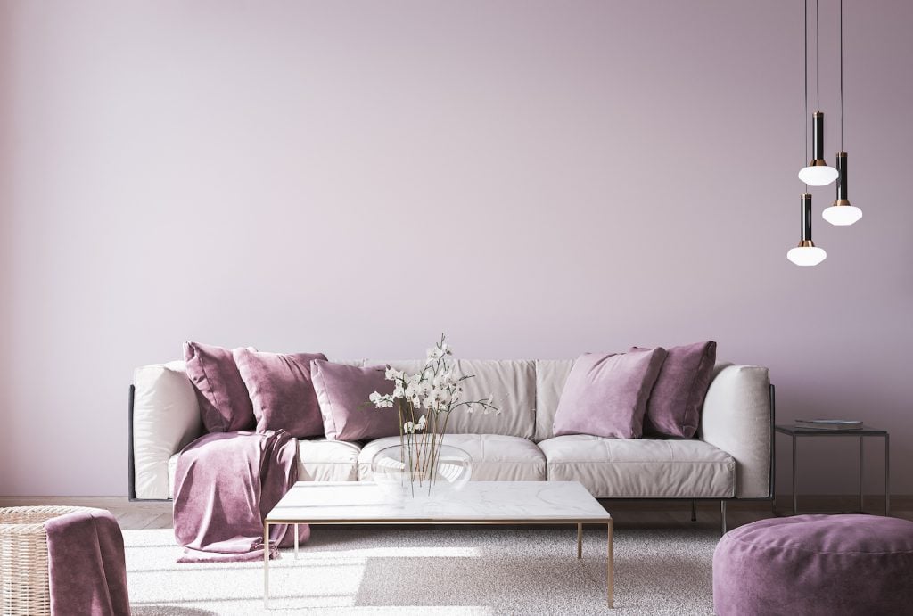
Blue and purple are both cool colors, and they work well together in designs. Blue-purple colors of all shades and tints can also be paired with them. Using colors that sit close to each other on the color wheel is a great way to make a pleasing design. So, colors like pink, turquoise, and green might go well with blue, purple, and blue-purple.
When designing a room, blue-purple goes well with neutral colors like gray, white, black, and tan. Too many colors in a house can be overwhelming, so it’s pleasing to see a touch of blue-purple color in an otherwise neutral space. For example, you could have a gray couch, but having blue-purple pillows, flowers, or paintings nearby could make it look more appealing.
If you’re designing a logo or ad, you might want to use contrasting colors, such as the colors on the opposite side of the color wheel. That way, the words or images in your design will stand out more. Some complementary colors to blue-purple are orange and yellow. However, using blue-purple with those colors only works for specific purposes since it can create a vibrant and somewhat chaotic look.
Blue-purple is a beautiful color that often goes by violet, lavender, or periwinkle. It’s a great color to use in elegant and peaceful designs. Keep its meanings in mind when using it for various art pieces or in graphic designs. Like blue and purple, it makes people feel relaxed and confident and might even spark their imagination.


