Magenta is a beautiful color, providing a perfect balance between energetic, emotionally-charged red and calming, healing blue. Typically, artists and designers choose magenta intentionally to indicate harmony and tranquility. Since it is such a deliberate color choice, it can be helpful to know how to take full advantage of its hue. One of the best ways to do so is to incorporate or add its opposite color into your work. In this way, you may be able to create eye-catching magenta elements in paintings, photographs, fabrics, or room designs. You may also be able to change vibrant magenta to a more subdued shade or neutralize magenta altogether, in cases of color mistakes. Of course, in order to do so, you will need to know some key information such as:
- How can magenta and its opposite make a difference in designs?
- What is the opposite of magenta on different color wheels?
- What are the opposites of popular magenta shades?
- How can you find a specific opposite color to a magenta hue?
- What are the popular uses of magenta and its opposite?
How Can Magenta and Its Opposite Make a Difference in Artwork and Design?

Artists and designers use opposite colors, or complementary colors, in their work in three main ways: to bring the primary color out, to subdue the primary color’s shade, or to neutralize the color. When you are using a vibrant color like magenta, you may desire any one of these results while working on your project.
Grabbing the attention of your audience and holding their gaze is a desirable attribute in any work. You can use this technique to attract attention to a certain area, sell products or advertise services, or provoke emotions or behaviors. Although magenta is certainly eye-catching on its own, it may not be in certain contexts or in specific amounts. By incorporating its opposite color, which lacks its pigments, you create a noticeable contrast. Furthermore, using a large amount of bright magenta can often overwhelm an audience rather than attract them. When you use an appropriate amount of magenta, and strategically place its opposite colors alongside it, you can bring the eyes to it without disrupting aesthetic pleasure.
In some cases, you may make a mistake with the brightness or saturation of magenta. This is a common occurrence selecting magenta inks, paints, or dyes rather than digital media. For instance, it can be difficult to envision what a certain color will look like in particular lights or with certain undertones. In these cases, you can use magenta’s opposite color to bring down the vibrancy. Likewise, if you change your mind about magenta altogether, using the opposite can neutralize the hue and achieve a white or gray instead.
What Is the Opposite of Magenta?
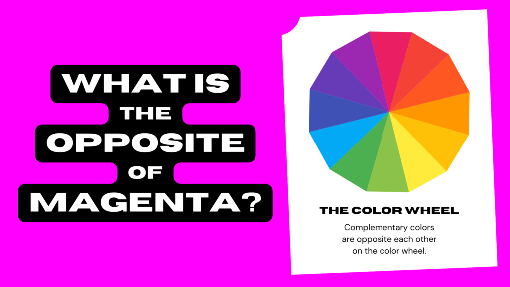
The opposite of magenta is green, although there may be slight variations in the specific pigments depending on your media and your chosen color wheel. Colors show up differently on digital screens than they do with physical media like painting or printmaking. Since this is the case, you must use a color model corresponding to your specific work. Depending on if you use RGB, CMY, or RYB color models, your magenta, and its opposite hue, will be very different. Find out more about each of these common color models below and what they can tell you about magenta’s opposite color.
What Is the Opposite of Magenta in RGB?

If you are working with a digital art software program, you may already know of the RGB color model and wheel. RGB stands for Red, Green, and Blue, which are the three primary colors of this model. With red, green, and blue, artists can create hundreds of colors to be shown on device screens, such as computers or televisions. Artists can also brighten the colors by increasing the amount of light, up to a vibrancy of 255. If they combine all the colors at the vibrancy of 255, they create the color white or pure light. If they introduce all colors at a vibrancy of 0, there is no light shining through the screen (black).
When looking at the RGB color wheel, you may notice that magenta is a secondary color. It is a mix of two different colors: red and blue. More accurately, it mixes 255 red with 255 blue. Across from magenta in RGB, you will find a primary: green. As it is magenta’s opposite, green contains no red light and no blue light.
Alongside magenta, you can find violet (heading towards blue) and pink (heading towards red). For this reason, different magenta hues are found between violet and pink. Likewise, accurate magenta opposites are found in a range as well. Respectively, this range goes from chartreuse to turquoise.
Magenta
Hex #FF00FF
RGB 255, 0, 255
CMYK 0, 100, 0, 0
Green
Hex #00FF00
RGB 0, 255, 0
CMYK 100, 0, 100, 0
What Is the Opposite of Magenta in CMY?

If you are working with physical art, there are two popular choices for color models: CMY and RYB. CMY stands for Cyan, Magenta, and Yellow. It is perfect for people who are working digitally and intend to print their work with CMY or CMYK (+black) ink. It may also be ideal for any artist or designer looking to use a wide range of colors. CMY colors work differently than they do with RGB. From a white base, artists can add colors in increasing saturation. When they add more pigment or color, they effectively darken the color. As such, colors are less vibrant than they are with RGB. When they mix all colors at full saturation, they produce a dark brown or black rather than white. For this reason, many people look to CMY as the inverse of RGB. Likewise, if you look at a CMY color wheel, you may notice that the colors flip to reflect this idea.
On the CMY color wheel, magenta is a primary color. It has 100 saturation of magenta, with 0 saturation of any other color. Across from magenta in CMY, you can find green with 100 saturation of cyan and 100 saturation of yellow. Alongside magenta, you can find the tertiaries: pink and violet. Across from these colors, you can find their opposites: turquoise and chartreuse.
You may notice that these colors are the same as they are on the RGB color wheel. Yet, it is important to notice that the colors look darker and more muted when printed. Likewise, their pigmentation is completely different; their primary colors are different.
Magenta
Hex #FF00FF
RGB 255, 0, 255
CMYK 0, 100, 0, 0
Green
Hex #00FF00
RGB 0, 255, 0
CMYK 100, 0, 100, 0
What Is the Opposite of Magenta in RYB?

Another popular choice for artists with physical media is the RYB color wheel. It stands for Red, Yellow, and Blue. You may see teachers, students, painters, interior designers, fashion designers, hair colorists, makeup artists, sculptors, potters, florists, and chefs use this color wheel. It is an easier wheel to use, as it does not produce a large range of colors. Yet, it works in the exact same way as the CMY color wheel. An artist can add more and more color to achieve a darker or muted color, at 100 saturation. If they mix red, yellow, and blue together at full saturation, they will produce dark brown.
On the RYB color wheel, magenta and its opposite color change slightly. On the RGB and CMY color wheels, the opposite of magenta was pure green. On the RYB color wheel, the opposite color is chartreuse or yellow-green. Alongside magenta, you can find purple and red. Across from purple is yellow and across from red is green. Accordingly, magenta’s range goes from purple to red and its opposite range is yellow to green.
Magenta
Hex #A7194B
RGB 167, 25, 75
CMYK 0, 85, 55, 35
Chartreuse
Hex #D0EA2B
RGB 208, 234, 43
CMYK 11, 0, 82, 8
What Are the Opposites of Specific Magenta Hues?

When learning about the opposite of magenta on different color wheels, you may have seen there is a range of magenta hues, and likewise, a range of opposite hues. While this means that you have plenty of choices when deciding on magenta as a color, it also makes it more complicated to find the opposite color.
In many scenarios, you can use your color wheel to find a close opposite. It is most common for hair colorists and makeup artists to do so, as they do not need a precise hue to achieve their purposes. However, in other contexts, discovering the accurate opposite to pair with a magenta hue is crucial. For instance, this may be the case in interior design, advertising, or painting. In this way, they can create a flawless contrast, perfect color harmony, or a specific feeling or attitude.
Below, you can find the exact opposite of some popular magenta color choices.
What Is the Opposite of Pink?
Pink is a delicate light red shade. It stands on one side of the range of magenta, leaning towards red on the color wheel. Its opposite is a light turquoise color named Aero Blue.
Pink
Hex #FFC0CB
RGB 255, 192, 203
CMYK 0, 25, 20, 0
Aero Blue
Hex #C0FFF4
RGB 192, 255, 244
CMYK 25, 0, 4, 0
What Is the Opposite of Violet?
Violet is vibrant, light blue-red. It stands on the other side of the range of magenta, leaning towards blue on the color wheel. The opposite of violet in RGB and CMY is Chartreuse, just like it’s the opposite of magenta in RYB. Pairing violet and chartreuse is common in paintings and photographs.
Violet
Hex #8000FF
RGB 128, 0, 255
CMYK 50, 100, 0, 0
Chartreuse
Hex #7FFF00
RGB 127, 255, 0
CMYK 50, 0, 100, 0
What Is the Opposite of Dark Magenta?
Dark magenta is a dark, rich purple. Its opposite is a very light, vibrant green called Screamin’ Green. It is a unique pairing, typically seen only in avant-garde fashion and cinematography.
Dark Magenta
Hex #8B008B
RGB 139, 0, 139
CMYK 0, 100, 0, 45
Screamin’ Green
Hex #74FF74
RGB 116, 255, 116
CMYK 55, 0, 55, 0
What Is the Opposite of Orchid?
Orchid is a light pink-purple and it is very pleasing to the eye. Its opposite is Forest Green. Savvy advertisers, painters, photographers, and fashion designers use these hues together in the spring.
Orchid
Hex #DA70D6
RGB 218, 112, 214
CMYK 0, 49, 2, 15
Forest Green
Hex #258F29
RGB 37, 143, 41
CMYK 74, 0, 71, 44
What Is the Opposite of Pastel Magenta?
Pastel magenta is very light and matte pink. Its opposite is Cadmium Green. When paired together, artists can create a very stark contrast, pulling attention to the pastel color.
Pastel Magenta
Hex #F49AC2
RGB 244, 154, 194
CMYK 0, 37, 20, 4
Cadmium Green
Hex #0B653D
RGB 11, 101, 61
CMYK 89, 0, 40, 60
How to Find Specific Opposites to Magenta Hues

When your preferred magenta is outside any of the mentioned popular hues, you may need to find it manually. It is easy to find your precise opposite, especially if you can access digital software, printmaking programs, or paint and dye matching technology.
If you are creating digital art, you may use a specialized program such as Photoshop or Illustrator. Within most software programs, you can find an RGB color picker and inverter. You can easily use this to find a specific magenta hue and an appropriate opposite. Likewise, similar features are available when you use CMYK for printed work. You should be able to find a CMYK color selector and inverter. However, since some programs only offer RGB, you may need to convert your RGB codes into CMYK codes before printing.
Don’t worry if your program does not have an inverter. There are free, online tools that can help you accomplish this: Pine Tools, WTools, Image Online.
If you need to examine your paint or dye color, break down its pigments, and determine its opposite, you can use special equipment and software. Many companies have one of these machines, such as hardware stores that do paint matching or fabric companies that create custom dye colors. If you are working on a project that requires absolute precision, it may be worth it to contact one of these companies to analyze your magenta color.
Popular Uses of Magenta and Its Opposite Color

You may have seen magenta and green paired in:
- Fashion: Magenta and green are a bold statement pairing in the fashion world. Although designers typically choose vibrant colors, they are equally as stunning in softer and more subtle hues.
- Art Prints: Light magenta or pastel magenta and dark green are popular choices for art prints. They add a soft, yet dramatic element to any interior design project.
- Paintings: Marshes, ponds, lakes, and gardens are a few of the most common painted scenes for magenta and green.
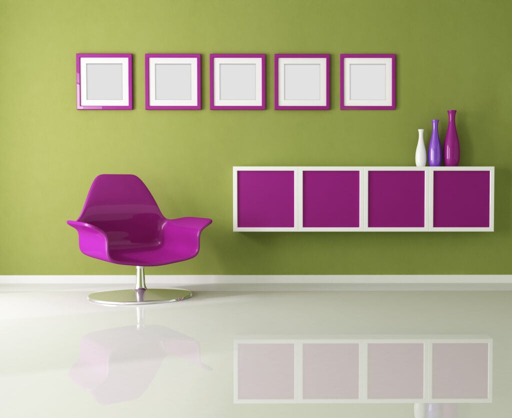
- Interior Design: Dark green walls with bold, magenta elements are a popular choice for contemporary houses and businesses.
- Hair Colorists: Color corrections on green hair are popular, indicating a need for the pink dye deposit or toner to neutralize the green.
- Spring Advertising: Magenta and green are great choices for spring advertising and sales marketing.
Moving Forward with Magenta
Adding magenta and its opposite color can truly boost any art or design project. Now that you understand how to find the opposite of magenta, how it can elevate your work, and where you can see it in action, you can try it out for yourself. Give it a try and notice how the technique of using opposite colors can achieve noticeable effects.


