
Whether you’re setting up your first retail store or your hundredth, there are seemingly endless variables to consider. From ordering your inventory to hiring new employees to organizing and stocking merchandise, each decision makes a difference when it comes to your business’s success.
With all of that effort, it’s easy to forget another important factor: color. The right color scheme can set your store’s mood, make your customers feel at home, and encourage them to make a purchase. Consider using some of these colors for your retail space.
1. Warm White

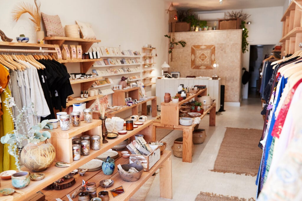
Warm white is a classic when it comes to decorating living spaces. But in the right retail space, it creates an open yet welcoming feel as well. Stark white walls can make a business feel like a warehouse, but warm white offers just a hint of glow. It’s an outstanding choice for businesses with a bohemian edge like the one in the picture.
This shade is a fairly obvious choice for a wall color, but you don’t have to feel limited to walls—tables and counters can be painted to coordinate with your walls, too. Warm white can make a somewhat plain space look instantly homey: note how the pictured walls balance out the unfinished concrete floor in the picture!
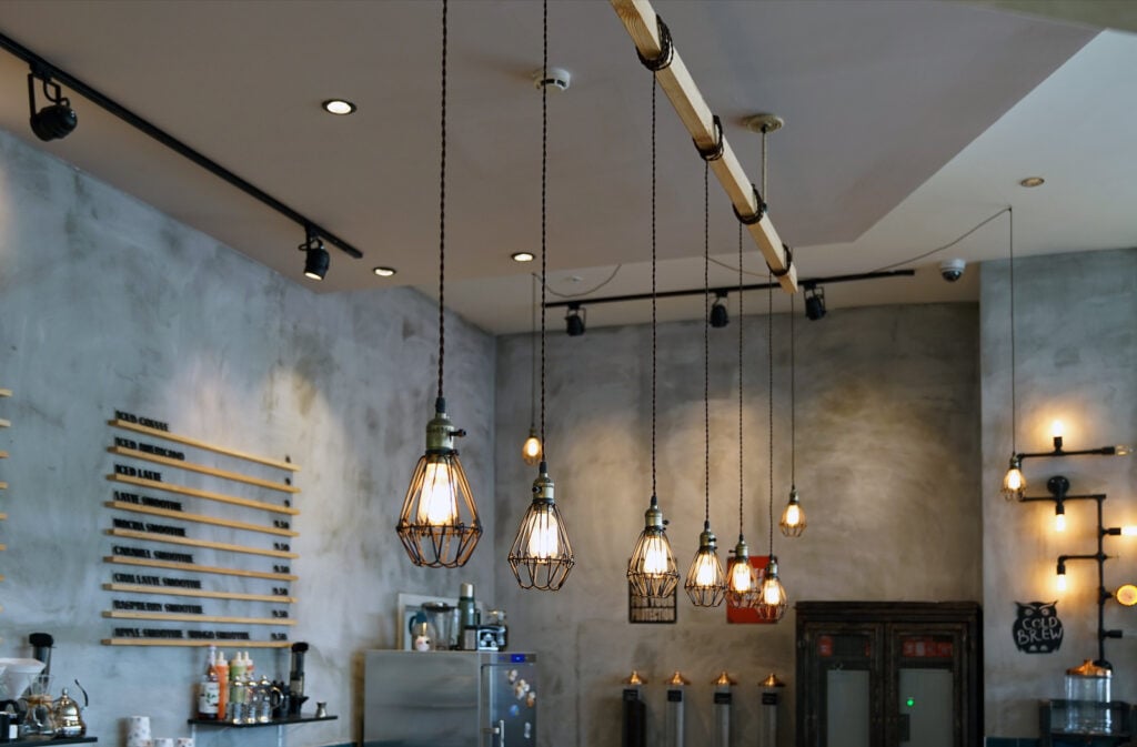
2. Gold

Gold might not be what most of us think of when it comes to retail color schemes. Too much of it can certainly look tacky, but in the right amounts, gold can give any business an upscale touch. The pictured store uses just enough: gold counters, gold-edged tables, and faint golden lighting on some of the shelves create a distinguished ambiance.
This type of aesthetic may be too glitzy for some. The good news is that a little bit of gold goes a long way, and you can create a high-class effect with just a touch of it. Start by adding gold hardware to any furniture and including a few gold hanging lamps.
3. Olive Green

The somewhat unusual layout of the shop in the picture can be a little disorienting, but the olive wall behind the counter draws the eye and pulls everything together. It’s an interesting choice with the cool white walls, but it ties in beautifully with the vintage wooden flooring.
The overall look is a balanced one with a decent light/dark balance. But if you wanted to make it a little cozier, you could use an olive and white patterned wallpaper on the pure white walls.
4. Cobalt Blue

Technically speaking, this is a photo of a shopping mall and not an individual retail store. However, the color scheme was too unique and dynamic to leave out! This palette is dynamic without being frenetic. That’s mostly thanks to its use of cool colors. Cobalt and white create a pleasing contrast, but cobalt’s coolness prevents the overall look from becoming too high-energy.
This combination works well alone, but it works even better with accents of various shades of blue. The aquatic-inspired panels of color on the upper level are an inspired touch.
5. Gray-Green
The distinctively mottled walls in the photo certainly leave an impression, and their unusual gray-green hue is one that would work in almost any storefront. The slight hint of deep green adds some depth to an otherwise nondescript gray. And in this case, the irregular patterning makes the walls much more memorable than solid neutral walls.

This is a color choice that works well in most situations, but it’s an especially fitting canvas for a sales floor with pops of bright color. In particular, bright red and bright orange pair beautifully with this shade.
6. Cool White
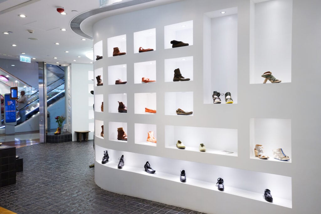
Cool white walls have gotten a bit of a bad rap over the years, but cool white can be a key part of a successful color scheme for any store. Buyers often associate white with sleek, modern, and “cool” products.
This shade of white is ideal when used in deliberately minimalist spaces. The pictured display is a great example: the single-color scheme lets the individual shoes stand out, but it still imparts an undeniable cool factor.
7. Wood Tones

Wood tones work well just about anywhere. And while wood floors are common enough in boutique shops, you can create a wonderfully uncommon space with wood paneling on the storefront and/or walls.
The exact wood tones you choose can really shape the mood and overall feel of your retail space. For a more modern look, light wood tones are a great option. If you want something more vintage-inspired, dark and weathered wood floors are a good choice. It’s hard to go wrong with wood, so don’t be afraid to branch out and try a different stain or color than you normally would.
8. Black
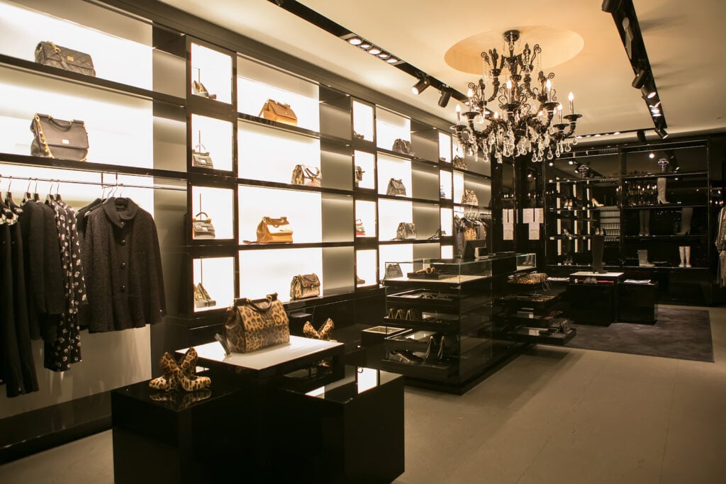
Depending on how you use it, black can look traditional or trendy. The pictured store definitely takes it in the trendy direction. And thanks to the bright white walls behind the black shelving, the overall look avoids becoming overly dark.
Even if you don’t select black as the main color for your store, it’s still incredibly useful for grounding lighter color schemes. The polished black floor displays shown here would work well when used with most light palettes.
9. Cardinal Red

Bright, intense red might seem like an unusual color for a retail store (though it does seem to work quite well for one big-box retailer!). But it doesn’t have to be garish or overwhelming. Red walls might be a little much, but as the pictured store shows you, a red area rug can really bring a sales floor together.
Especially in a more upscale setting, bright red can look luxuriant (and maybe even remind your customers of a red carpet). Just make sure to use cooler neutrals elsewhere to help balance out its intense energy.
10. Celery
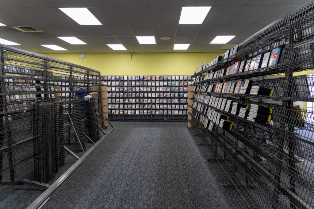
The somewhat-empty store pictured is a Blockbuster Video shortly before it shut down. You probably don’t want your business following in Blockbuster’s footsteps, but you can take a page out of its book when it comes to color! The striking celery green on the back wall is an energizing color that’s successful in both residential and business palettes.
Celery is a bit like its more popular cousin, sage—just with yellower undertones. It does best when balanced out with darker, cooler colors. The textured charcoal carpet in the photo balances out this wall color well.
11. Powder Blue
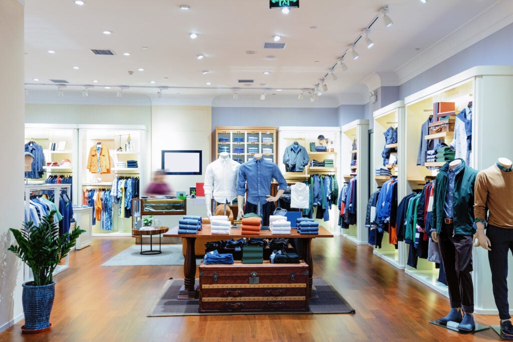
The pictured store’s fun, multicolored palette practically beckons customers in. While a few different pastels come together to create this look, powder blue is by far the most memorable. When juxtaposed with white molding, powder blue imparts a classic look to any space. In this store, combining it with white and green gives it a more casual, springlike feel.
It’s also worth noting that part of this color scheme’s success is due to the fact that it coordinates with a good bit of the store’s merchandise. Many of the shirts and jackets on display are similar shades of blue, so the overall aesthetic ties together nicely.
12. Warm Beige

Beige can sometimes look a bit nondescript. This plain aesthetic does have its advantages, though: it really lets your merchandise shine. The pictured store strikes a great balance between keeping the color scheme interesting and making sure that the clothing displays are still the main focus.
One of the best ways to do this is to incorporate a layered palette with various shades of warm beige. Patterned floor tiles make it easy, but you can also use slightly different shades of beige on the floor, walls, ceiling, etc.
13. Mint Green

When used in any type of interior, mint is like a breath of fresh air. This crisp pastel looks especially nice alongside wood tones and other earth-inspired shades.
The pictured store takes this balance and uses it effectively throughout the rest of the space. The mint green walls pair well with the wooden back wall. Wooden shelving, a small mint green rug, and a collection of green plants round out this lovely palette.
14. Charcoal Gray

Charcoal gray never really went out of style, but in recent years, it seems to have become more popular in residential and commercial spaces alike. It’s commonly seen as a floor color in retail spaces, but the pictured store turns that paradigm on its head with light flooring and deep charcoal walls.
Charcoal gray is a competent neutral on its own, but if you really want to get the most out of it, use it as a springboard for high-energy shades. Bright blue wall accents in the pictured store seem to jump out at shoppers. And in some modern commercial spaces, the combination of charcoal gray and bright orange has become quite popular as well.
15. Lemon Yellow
If you’re opening your business in a pre-existing retail space, it’s often costly and impractical to replace the flooring. However, painting the walls is easy, relatively inexpensive, and a great opportunity to make your store unique. Lemon yellow isn’t exactly a popular color for retail stores, but as you can see in the photo, it’s certainly capable of imparting a cheery vibe!
That said, if you do use lemon yellow, it’s usually wise to include a cooler color to keep things in balance. The store in the picture uses soft green, but you can also use navy blue or a cool neutral.
16. Silver
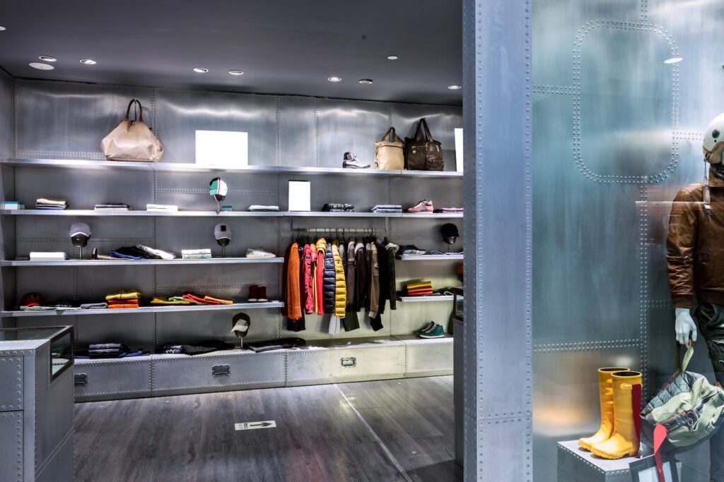
You might associate silver-hued metals with industrial kitchens, but silver (the actual metallic, that is) is exceedingly rare when it comes to retail spaces. For many boutique stores, creating a distinctive brand aesthetic is critical to success, so unusual design choices can really pay off.
If your store is in a niche industry or if you just want an offbeat vibe, you might consider silver as a color for your walls, shelves, and more. You don’t have to make your entire shop silver, but even a few polished silver displays can make a major difference!
17. Kelly Green
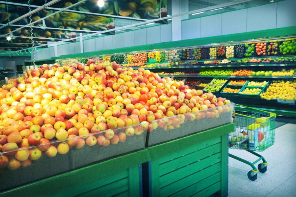
In some industries, the right colors might encourage your customers to spend more. In a grocery store (and specifically in the produce section), kelly green might serve that purpose. Intense, vibrant greens make us think of freshness. So when you see this color next to collections of fresh fruits and vegetables, it just might inspire you to make a purchase. The green shopping cart doesn’t hurt, either!
18. Slate Blue

Slate blue is a striking color that’s somewhat businesslike while still being interesting. Like navy, slate blue isn’t technically a neutral, but it can sometimes work like one. It’s a great color to choose if you can’t make your mind up between slate gray and navy blue.
In the pictured appliance store, slate blue makes an ideal wall color. The mostly silver and white appliances look especially shiny and new against it. Slate blue also imparts a distinctly professional vibe, which is always a good thing for a retail business.
19. Sage Green

Sage green might be earth-inspired, but it’s found its way into some of the most upscale boutiques on the planet! Whether you’re designing your home or a retail space, sage is a winning wall color. As a bonus, it works almost like a neutral, so it’s highly unlikely to clash with any of your inventory.
If you use sage as a wall color in your business, you can pair it with wooden accessories (tables, displays, etc.) for a natural look, silver accessories for a more modern look, or a mix of both for a more eclectic appeal. The pictured boutique successfully uses both metal and wood alongside its eye-catching sage walls.
20. Tangerine Orange
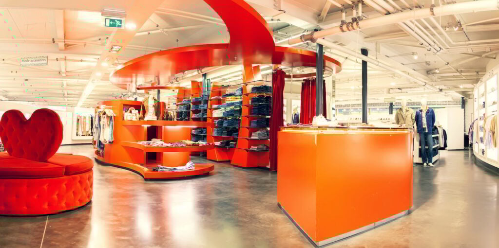
When you operate a brick-and-mortar business, creating a memorable-looking retail space can be critical when it comes to attracting customers and earning their loyalty. Take a look at the store in the photo. With that one-of-a-kind layout (and choice of decor), wouldn’t you want to at least step inside to see what they’re selling?
Color can go a long way when it comes to drawing customers, and the vivid tangerine orange shown is a big part of the store’s appeal. If you do choose to use tangerine orange, you don’t have to go all out. Even small touches can be very noticeable!
21. Mustard Yellow

Few colors possess the level of vintage charm that mustard yellow does. But you don’t have to run an antique store or a vintage shop to benefit from its appeal!
The display window in the photo illustrates one of the ways you can use mustard yellow to attract customers. This shade isn’t one you usually see in display windows, so if you were walking next to this shop window, you might turn your head to look. From there, if you had any interest in purchasing shoes or handbags, you might take a closer look at the inventory.
Of course, if you go this route, you should make sure the merchandise you’re displaying doesn’t clash with the mustard yellow display or blend into it. You probably wouldn’t want to display mustard yellow handbags here!
22. Burgundy
Burgundy is a deep, dignified shade of red-purple that seems to fit in nicely with classic and modern design schemes equally well. It’s not an overly common color when it comes to department stores (or retail stores in general), but as you can see in the pictured store, it’s perfect for creating bold and non-traditional looks.
A store with all or mostly burgundy walls can start to feel a little too closed in. If you choose this color, do your best to break it up with a good bit of white, beige, or another cool-leaning neutral.
23. Medium Brown
Plenty of stores incorporate shades of medium brown via wood tones on their floors, displays, or both. But you can also bring this color in via rugs, couches (if your store has a seating area), accent walls, and more.
Brown might not be most people’s first choice of color for a rug. However, when you use it with wooden or leather furniture, it’s great for creating a monochromatic palette. A medium brown accent wall also makes a great backdrop for displays that are mostly blue, orange, or another color that really pops.
24. Lavender

Some stores adopt a bright color palette to energize their customers. But if you want your retail space to make your customers feel calm and content, try lavender.
As you can see in the picture, you don’t need a bold shade of lavender to make a difference. Even a very dilute shade will work. Paler walls also keep the focus on your merchandise. If you’re going for a more offbeat look, try wallpaper patterned with lavender and white or cream.
25. Forest Green

It’s easy to confuse forest green with other shades of deep green. However, forest green has calming, bluish undertones that make it a remarkable, if unusual, choice for a retail space.
Forest green walls can be a little much. But forest green pairs beautifully with virtually any type of wood tone. The pictured store makes great use of forest green shelves by placing them on warm, honey-colored wood floors. The shelves are thin, but their green hue is present enough to make an impression. It’s a nice departure from industrial-style black, white, or silver shelving!
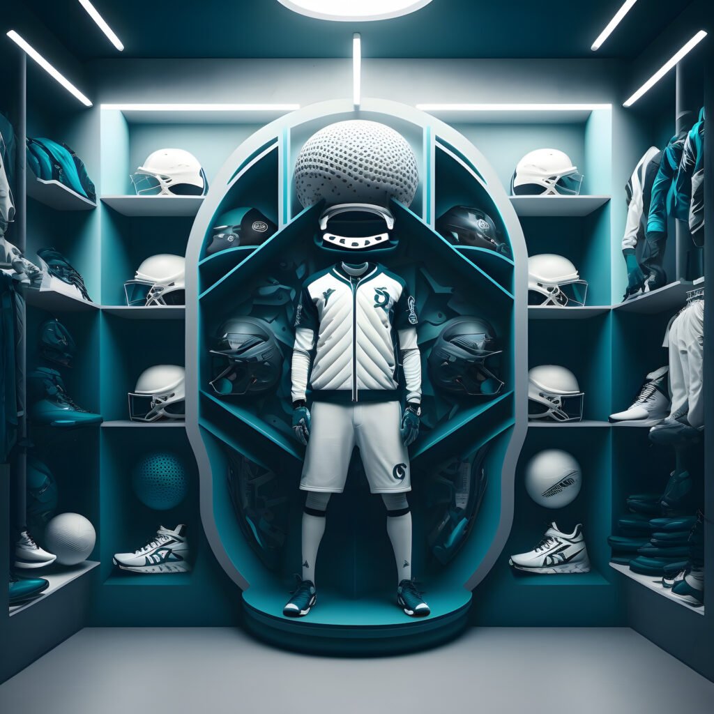
26. Aqua

Many interior designers warn against using overly bright colors. However, in a sporting goods store, bright colors can be right at home. These high-energy shades can be appropriately energizing, but it’s still wise to use them with caution!
Aqua is a great high-energy shade to choose. It’s technically a cool color, but its near-neon glow makes it especially eye-catching. The pictured sports store makes good use of it: the aqua display only takes up a small part of the sales floor, and it’s an effectively contrasting backup for the yellow and black merchandise it holds.
27. Sand
“Sand” is a somewhat vague color name, but it’s usually a bit less brown than beige. Think somewhere between peach and warm beige. It’s a shade that lends itself to layering, making it ideal if you’re looking to create a neutral palette that’s still interesting.
The pictured store creates an impressively varied palette. The walls are a pale shade of sand, the rugs are a darker shade, and the shelving sits somewhere in the middle. The overall effect is a warm, calming, and inviting space.
28. Teal
Teal is a classic cool color, but as illustrated here, it can work well in futuristic design schemes. It’s pictured in a sports store where it creates a high-energy contrast with crisp white.
You don’t have to use this much teal to make a statement, though. In a white or beige space, even a couple of teal display cases and rugs can go a long way. Teal tends to look good alongside warm-stained wood, so it’s a great choice for stores with wood floors.
29. Brick

Some retail spaces, especially those in older or reclaimed buildings, have exposed brick walls. Brick can really add character, so think twice if you’re considering covering up your existing brick walls!
Brick is essentially a neutral, so it will go with almost any color palette you choose for the rest of the space. If you need a starting point, you can let the shade of the brick be your guide. Warmer-toned brick goes nicely with cool colors. But if your existing brick is a cooler shade, you may want to balance it out with warmer colors.
30. Golden Yellow

Golden yellow is a warm, fall-inspired shade you don’t see in too many retail spaces! But if you want to create a welcoming vibe and aren’t afraid of using an uncommon color, it’s a nice shade to build a palette around.
However, on its own, golden yellow can sometimes get a little too warm. To balance things out, try including cooler accents. The pictured business easily accomplishes this by adding a blue piece of abstract art.
31. Greige

“Greige” is effectively a color that’s neither gray nor beige. It’s a common wall color, especially if you want something a little more interesting than white. Greige can add a little character without overwhelming your customers.
It’s also a great choice if you want to show off your merchandise. In the picture, notice how it coordinates with the pastel pots without taking away from them. It’s also a great backdrop for the darker-colored pots.
32. Pastel Yellow
For a warm and cheery space, look no further than pastel yellow. This delightful shade is a great complement to dark, cool colors. But as you can see, it also fits in well with almost monochromatic, warmer palettes.
If you choose to use pastel yellow this way, make sure the store has at least a touch of a darker, grounding color. In this example, the black countertops and boards are just enough to keep everything grounded.
33. Peach

Peach is a versatile shade that works equally well as a pastel or as a more saturated version. Pastel shades like the one pictured are ideal for creating a calming, welcoming space. Summery, saturated hues are perfect if you need a higher-energy sales floor.
It’s a good idea to shift the neutrals in your palette depending on what peach shade you use. Pale peach looks good with gentle, cool neutrals like cool gray. Saturated peach goes well with darker, cooler neutrals like charcoal.
34. Turquoise

At first glance, the pictured store might look like it has cream-colored walls. But look closer, and you’ll see a turquoise ombre effect: the walls are turquoise at the bottom and fade to a warm shade of cream at the top. Turquoise can be an energetic shade, so using it this way has a subtler effect.
In this instance, the turquoise walls coordinate nicely with the merchandise, which is mostly denim. But walls this soft tend to work almost like neutrals, so they should go with merchandise of any color.
35. Orchid Purple

This bold shade of purple might not seem like a shade for your typical store. But as you can see, it has a modern, almost futuristic look when used with a white background. You can use purple-colored lighting to give your store a faint purplish cast. Alternatively, you can incorporate purple accents or other touches of purple to add just enough interest.
36. Navy Blue

If you want to add some color while also grounding a lighter-colored palette, navy is a great choice! All-navy walls have become somewhat popular in residential color schemes, but navy blue walls tend to be a little much for retail stores.
Instead, partially-navy walls like those in the picture are a great option. In this space, navy creates a pleasant contrast with the pale wooden walls. As a bonus, it also draws the eye upward, so your customers will be able to see every bit of merchandise on the shelves.
37. Pale Gray

Pale gray is a pretty, pleasant neutral that makes a great wall color for residences and commercial spaces alike. If you have a business with cinder-block walls, you have this color already built in. If you don’t, pale gray walls are an easy enough addition.
This shade of gray will go with just about anything. It looks especially nice with all-neutral palettes like the one pictured. The gray walls look right at home beside wood floors and black shelving!
What Is the Best Color for Your Retail Store?
Only you can answer that question. But generally speaking, it’s good to choose something that mirrors how you want your customers to feel. In a sports store, high-energy colors are a great choice. In a grocery store, green and other fresh shades work well. And in a high-end, modern store, a minimalist design featuring cool white works well.
That said, there aren’t really rules governing what color you should use. Take your time, try out some paint samples, and create a palette your customers won’t soon forget!


