Working from home has its advantages, and one of these is being able to design your home office.
Selecting the right color will help create a peaceful environment that fosters productivity, so choose carefully! These color ideas will get you started.
1. Cool White

Some people might argue that cool white tends to look too sterile and cold. But as you can see in the photo, this shade is perfect for modern spaces with lots of natural light.
The key to success when designing with cool white is to incorporate colorful accents. Bright green plants will make the space feel alive, and colorful art pieces can add a lot of visual interest. How you incorporate these colorful accents is up to you.
Some people prefer choosing a single color (like blue) and adding a few pops throughout the office. Others choose a few colors and intersperse them throughout. There’s no right or wrong way to decorate an office like this; you’ll do your best work if your office is inviting and suits your tastes.
2. Warm Beige
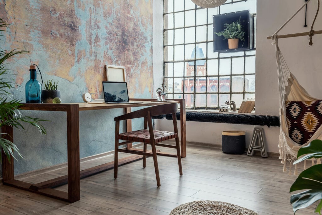
One of the benefits of designing your own home office is that you can really make it feel like home. Few colors are homier than warm beige. As the pictured office illustrates, a largely-beige color scheme doesn’t have to be boring!
For an interesting look, include several shades of beige. Warm beige works as a color for flooring, furniture, walls, rugs, and other accents. This setup also looks great with a few colorful accents.
Cool colors like blue and green will help promote focus and calm. But if you work better with bursts of warmer colors like red and orange, these shades also work well against a canvas of warm beige. Don’t be afraid to experiment here; as a neutral, warm beige will end up looking nice with most types of colorful accents.
3. Leafy Green
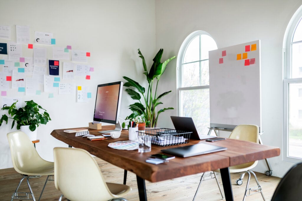
House plants produce oxygen and help keep the air in your work environment fresh. But their bright foliage will also energize a space. As you can see, green pairs well with white walls and wooden furniture, but just about any color scheme will benefit from the addition of green.
How many plants you include is up to you. For a workspace that doesn’t require a lot of extra maintenance, you can always include one or two plants. But if you have a green thumb and work well surrounded by plants, you can include plenty in your workspace!
You also don’t necessarily need to lean on plants for this color scheme. A lively, leaf-like green is a nice color for an accent wall, or you can opt for a leaf-printed wallpaper. Green is the color of new life and the color of money, so it may prove useful on days when your motivation is a little lacking!
4. Sky Blue
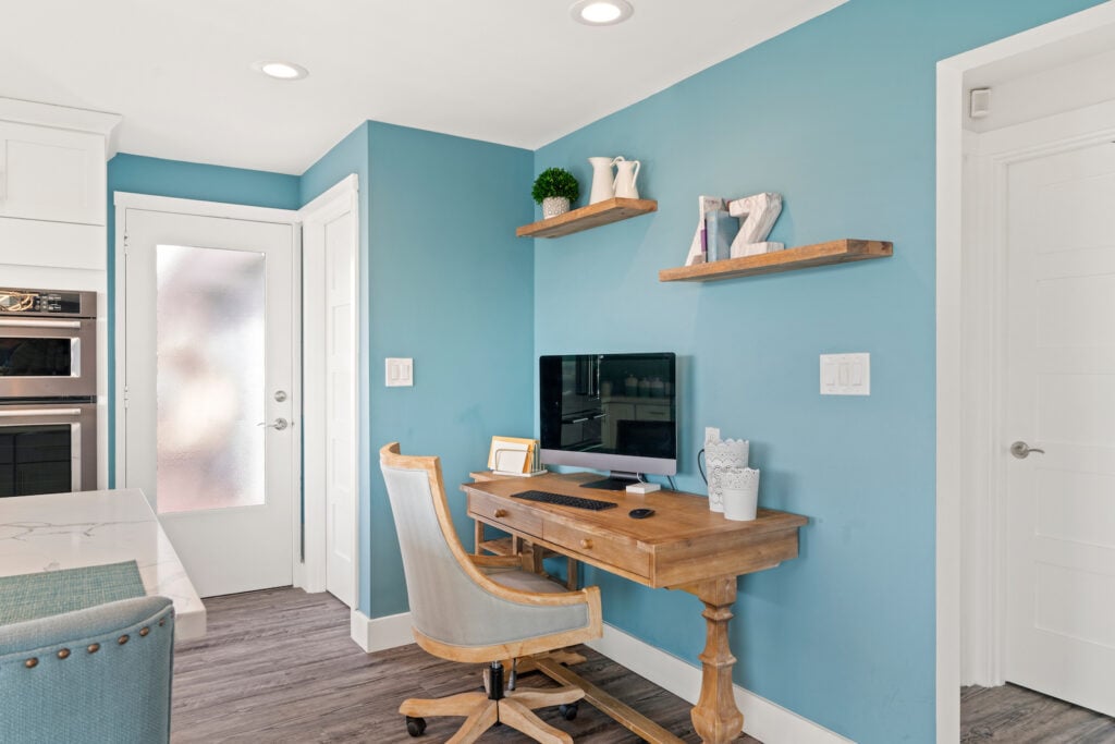
You might notice that this list includes several shades of blue. There’s a scientific reason for that, though: research has indicated that people tend to be more productive in blue rooms.
Blue also has been linked to feelings of security, stability, and calm—all good feelings to have when you’re trying to get work done. Sky blue is an especially useful shade, as it might remind you of sunny skies.
As a result, you’re likely to feel simultaneously relaxed and energized as you work. And if you really want to think of the outdoors as you work, include elements of bright white in the form of ceilings and wall trim.
5. Brick

Exposed brick has become a popular element of design in recent decades. This is especially true of urban offices built in reclaimed or renovated buildings. But if your home has an exposed brick wall, it can become a central element of your home office design.
In fact, brick walls minimize the amount of work you need to do when designing your office. Brickwork tends to be visually interesting and has a built-in pattern. If you want to accentuate that, try adding wall lamps or other types of lighting that highlight the brick.
Brick is essentially a neutral, so it will work well with all manner of accent colors. But especially if you have an office space without a lot of natural light, avoid very dark accents. They may make the room feel smaller or overly dark.
6. Charcoal Gray
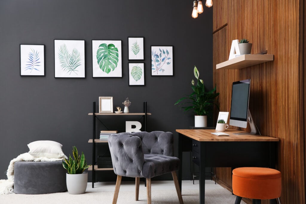
Few colors are as sleek and modern as charcoal gray. It has a look that is focused and businesslike, and its blue undertones may make it easier to focus. If you want a dramatic yet dignified shade for one or more walls in your office, charcoal gray is a wonderful choice.
As the pictured office illustrates, charcoal offices do well with elements of white and a smattering of cooler colors. White will help add just enough lightness, while the cooler colors will connect with charcoal’s cooler nature.
That doesn’t mean that your office’s interior can’t benefit from the addition of some warmer colors. Burnt orange is a contemporary and stylish companion for charcoal. And like most other darker, cooler shades, charcoal looks good with warm wood tones as well.
7. Cerulean Blue
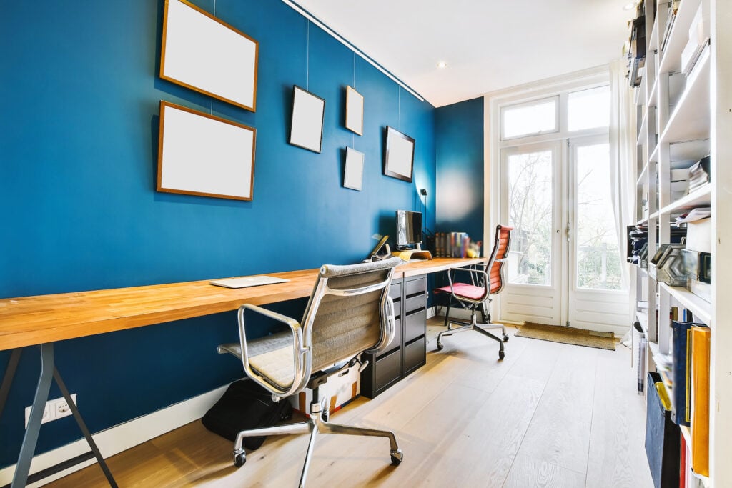
If you want to harness the cognitive benefits of blue but are trying to create a bright and energetic office space, cerulean is a wonderful color. Though it’s a deep shade of blue, it’s also unusually bright.
Cerulean’s balance of energy and serenity makes it an especially great choice of color if you do creative work. It’s especially suited to home offices with a modern edge. It looks great alongside sleek silvers, crisp whites, and warm wood tones.
However, since cerulean is quite a rich shade of blue, it may become overwhelming if used to paint the entire office space. You may want to consider starting with one cerulean wall. If you find you want more, you can try painting another wall (or even every wall!) in your office this color.
8. Forest Green
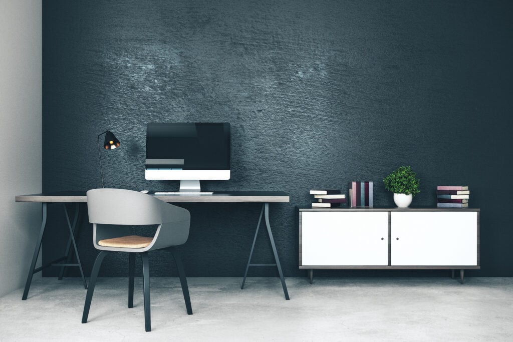
Green might be a color that makes us think of new life and springlike energy. But if you want to create an ambiance that inspires peace, forest green is worth a look. This very deep color offers the sense of quiet you feel in the middle of a forest, making it a useful color to have around when you really need to focus on work.
A word of caution when working with this very dark shade: to keep the room balanced, it’s wise to include plenty of a lighter color like white or pale beige. Forest green is a great example of a color that should be incorporated using the 60-30-10 rule. Make your pale neutral take up about 60% of the office. Forest green can take up 30%, and you can choose an accent color to take up 10%.
9. Pastel Yellow

Yellow is a sunny, optimistic color that’s perfect if you have a highly stressful job (or even if you often feel down). It’s a somewhat popular paint color, so you’ll have seemingly endless options when it comes to choosing a level of saturation. If you’re worried about the shade becoming too high energy, you can always use a very soft pastel that’s just a little more yellow than cream.
If you’re painting your home office pastel yellow and looking for companion colors, you might find that it goes well with earthy shades like chocolate brown and sage. As you can see in the office pictures, it’s also a great backdrop for green plants. And of course, it looks nice with natural wood tones. If you want your office to be bright, cozy, and inviting, this soft shade of yellow is worth looking into.
10. Sage Green
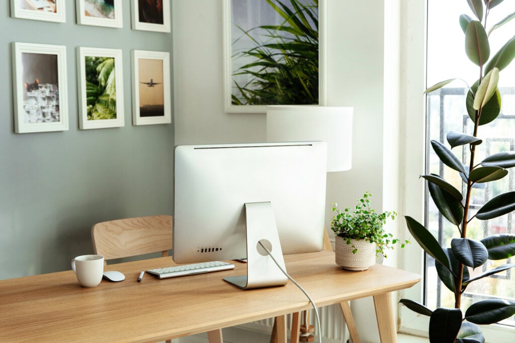
Visit any interior design blog on painting just about any room, and you’ll almost certainly see sage green listed! This color might be vintage-inspired, but it’s found its way into all manner of contemporary interiors.
Depending on the exact shade of sage you choose, this color can work similarly to a neutral. So if you’re looking for something a little more interesting than beige, white, cream, or gray, it might be a nice choice for your office. As you can see in the pictured office, sage office walls look good with pale wooden furniture. And if you really want to take advantage of this color’s earthiness, you might consider including a few botanical prints, actual plants, or both!
11. Slate Blue

Slate blue is one of the most sophisticated colors out there. Halfway between navy and charcoal, it’s a great way to create a bold, distinctive workplace that manages to not be overstimulating. This shade makes a great wall color, but it is also a great choice for desk drawers, bookshelves, and cabinets.
Slate blue does well when it’s counterbalanced by a lighter color or two. Try surrounding it with copious amounts of white. If you’re cautious about overdoing the white, you might find that wood with a very pale finish goes well, too. And if you want to add just a touch of opulence, consider including gold hardware and a gold desk lamp.
12. Red-Orange

You might be surprised to see such a bright and intense color on the list. Red-orange might not be the best choice of wall color for an office. But if you want to liven up a neutral or cool-hued space, a few red-orange accents can really go a long way.
The home office in the picture is a great example of a successful incorporation of red-orange. As you can see, even the smallest touches of this powerful color can really transform the energy of an entire room. Accent pillows, chair cushions, books, vases, and other seemingly small additions are a good place to start.
Red-orange looks better with some colors than others. It tends to go better with charcoal grays, slate blues, and other similarly dark shades. But if you want to incorporate a little more red-orange, you might consider adding an accent wall or rug that’s patterned in red-orange and white!
13. Bright Yellow

We mentioned above that soft shades of yellow can help create a gentle and encouraging office palette. And while it’s unorthodox, bright yellow can also add a burst of creative energy to your workspace.
As you might have already guessed, an overdose of yellow can be a little hard on the eyes. The office in the photo seems to incorporate it in just the right amount. The bright shade is concentrated around the work area itself, making it useful for days when you start to feel sleepy while working. The rest of the room is bright, modern white.
Of course, in order to prevent all the bright color from being concentrated in one space, it’s wise to add a few other bright accents in a setup like this. They don’t have to be yellow, either; a bright sky blue rug and/or a green plant to the opposite side of the room are great places to start.
14. Gold

You probably wouldn’t want to paint your entire home office gold. But as you can see in the example office, gold accents have the power to transform an office that is mostly white (or another neutral shade). Incorporating gold accents is especially helpful if you’re in a situation where you can’t paint the walls (like if you’re renting a space short-term).
When they think about adding gold accents to an office, most people immediately jump to gold metallics. Desk lamps, desk hardware, and even photo frames are easy and inexpensive to add to a home office.
You don’t have to feel limited to actual metals, though. Dried reeds used for decoration are often gold (or close to gold) in color. Similarly, some natural woven rugs even appear to be gold. If you’re looking for a quick way to give a dull home office a makeover, adding touches like this is a great way to do so!
15. Weathered Wood Tones

The finish used on wooden floors, walls, and furniture in an office has a major impact on the mood of the space. These finishes are most often used on brand-new wood, or at least wood in great condition.
If you appreciate the look of reclaimed spaces, you probably already know that weathered wood makes a welcome addition to many modern spaces. Wood that has been distressed often has a slight silvery-gray look, so it can be successfully paired with mostly-white office spaces. It also looks good alongside many cool colors, particularly those with hints of silver or gray.
If you can’t get your hands on authentically weathered wood, some manufacturers make veneers or wooden panels with a distressed finish. You can choose to use these to add interest to walls or as flooring. Alternatively, weathered wood can be used to create highly distinctive desks.
16. Blue-Green
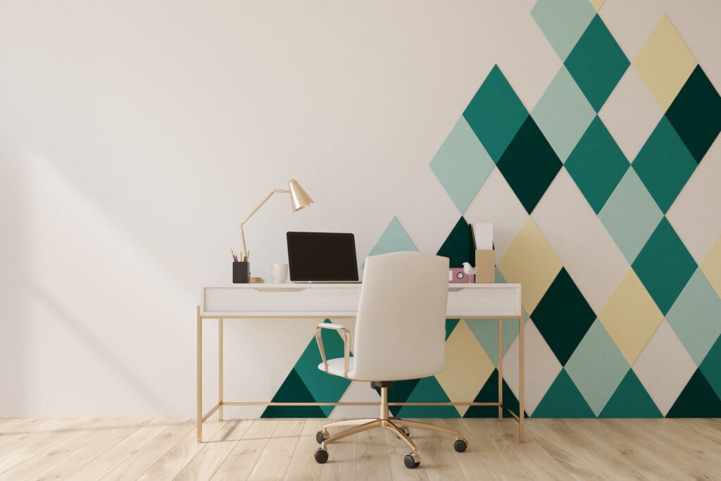
If you like cool colors and hope to use them to create a calming work environment, various shades of blue-green are ideal. This soothing color works well as a wall color, but as you can see in the illustrated office, even relatively small amounts are effective.
When you combine blue-green with white, you create a color palette reminiscent of the ocean. And if you find this palette a little too quiet, you might find that incorporating touches of warmer colors balances out the energy. You might try adding touches of soft yellow or gold metallic accents.
17. Medium Gray

Gray is a classic shade when it comes to office designs, though different shades will impact the overall feel of the space. A balanced medium gray like the one in the pictured office will look great in a palette full of other neutrals.
This type of layering of neutrals was inspired by Scandinavian design trends, though it has gradually become more popular worldwide. Consider pairing a medium gray with various shades of beige and wood tones. This light color scheme will benefit from the inclusion of some black or near-black in order to really ground the space. For a more dynamic look, include small pops of a non-neutral color (like green) as well.
18. Ash Blue

As colors go, ash blue is quite a versatile one. It’s commonly chosen for homes, businesses, and offices alike. Its quiet charm makes it ideal for a home office setting. It has enough blue to help you feel relaxed and be productive. However, there’s enough gray present to keep the blue from becoming too loud. Ash blue also straddles the line between neutral and non-neutral, so it’s a great option if you can’t choose between the two!
Since this shade is so close to neutral, it will look nice with virtually any color of office furniture. It looks especially peaceful alongside medium to dark wood tones. Or if you want to keep the entire office light, combine it with pale wooden office furniture and silver or white accessories.
19. Mahogany
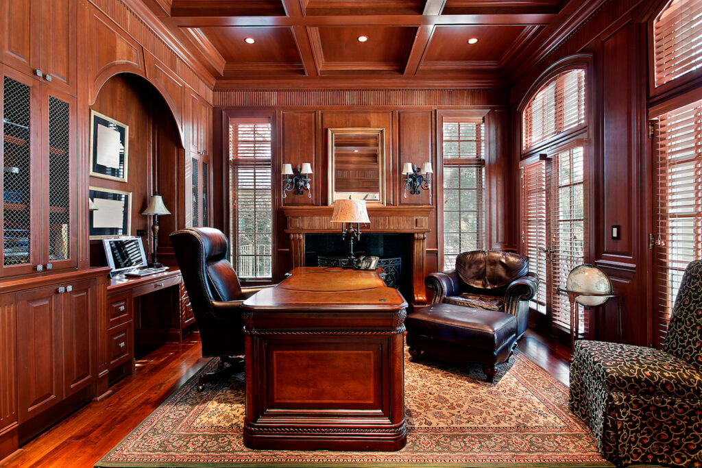
This rich shade of brown is a common finish for wooden office furniture, so it’s an easy one to incorporate into your office decor. If you want to create an especially luxurious home office, you might want to consider a wood-walled space like the one pictured. It’s effectively an upscale version of wood paneling, and it gives the office an enveloping feel.
If you’re working with a space with standard walls, you can create a similar look with warm brown or warm beige walls. As you can see in the example office, including elements of much darker brown also helps ground the color scheme. Dark brown leather chairs or lamps with very dark hardware are great ways to do this. And if the room needs a little more light, shades of parchment and pale beige work beautifully.
20. Cobalt Blue

Cobalt is a shade of blue for the bold. If you’re creating a modern office with a playful touch, including several elements of cobalt will help you achieve that goal. This shade of blue has become somewhat popular in modern design, so it’s reasonably easy to find chairs, rugs, wall hangings, and other office fixtures. Or if you find you need more cobalt in your office, try including an entirely blue wall.
Cobalt blue does well when it’s broken up with a good bit of white. As the pictured office illustrates, cool and crisp whites work well here, and they’ll give your office a breezy, nautical feel.
21. Soft Pink

Soft pink might sound like a color better suited for a bedroom. However, it can impart a lively spirit to your home office, too. If you like lighter color schemes but want to stay away from white, very pale pink walls may be what you’re looking for.
This type of setup goes well with white or very pale wooden furniture, and it will look especially lively if you include a few green plants as well. Including a few rose gold accessories will add just a little sparkle.
22. Black
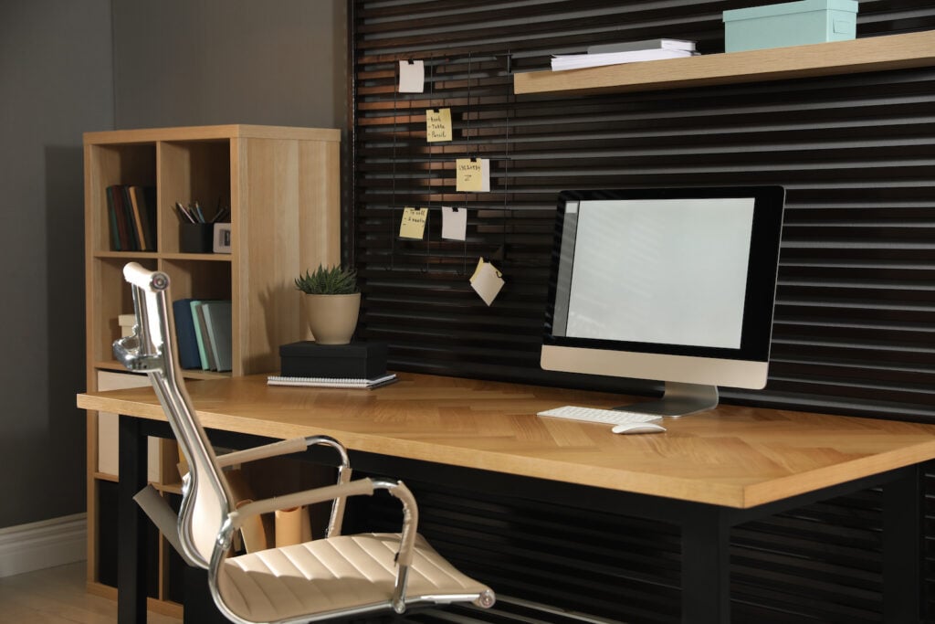
Most people wouldn’t want to paint an office entirely black. However, including fairly large amounts of this shade in your office can be useful when you want to create a businesslike mood. A single black wall or room divider will help set the tone, and you can also incorporate black furniture or rugs.
The other colors you include with black will have a major impact on the mood of the room. You might choose dark gray walls for a moody look. Including a good bit of silver (in chairs, computers, etc.) will give your workspace a modern edge. Or if you’d prefer high-contrast patterns, try adding a black and white patterned rug.
23. Turquoise

Turquoise might seem like a fun, casual color, but it’s also a nice fit for the home office. That’s especially true if you like the calming, focus-promoting benefits of blue but want to have an energizing color around. If you want just a hint of this color, go for a more muted turquoise like the walls of the pictured office. Include a brighter turquoise lamp and/or other accessories.
This color does well in a room with a lot of white, natural light, or both. Choose wooden office furniture for a relaxed and rustic look or go with silver for more of a modern edge.
24. Sand
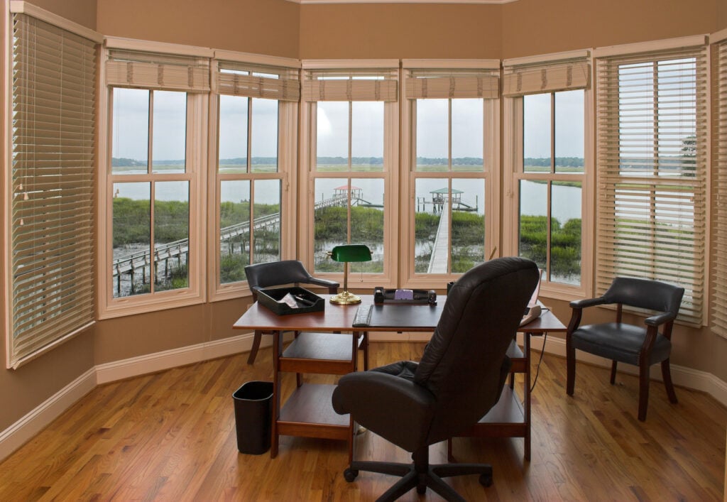
Some people might see sand as a type of beige, but most sandy shades have yellower undertones. Sand walls are a smart choice if you’d prefer a neutral palette but want something that’s a little more energizing.
Like beige, sand goes nicely with other neutrals: wood tones, leather tones, and white wall trim are all great to include. If you want to lean into the vaguely beachy vibe, include a few touches of muted blue. That said, sand will balance out nicely with most cool colors!
25. Silver
Silver is a color connected to professionalism, organization, and calm. So it comes as no surprise that it’s a great choice for a home office! It’s also quite easy to include, as office chairs, computers, lamps, desks, and other types of office furniture can be found in silver.
These accessories will look extra-sleek in an office with silvery-gray or white walls. Most people probably wouldn’t paint their office walls metallic silver, but you might be interested in wallpaper patterned with silver and white.
26. Lime Green
This shade might not be one of the first that comes to mind when you picture colors for an office. But believe it or not, lime green makes a great color for an office when used in moderation. Too much lime can become almost dizzying, but a single lime wall in a neutral office can be an energizing force.
Understandably, you might not want to paint an entire office wall green. But lime is a powerful enough color that it makes a difference even in small doses. Even choosing to put a lime green office chair and another lime accent in an otherwise-white office will help you really make a home office your own.
27. Dusty Purple
Dusty purple is an interesting shade you don’t hear about too often. It’s not quite lavender and not quite mauve. It’s quieter than other shades of purple, making it a suitable color for a peaceful office interior. Dusty purple is also complementary to sage-like shades, so if you’re looking for an accent color for a sage-colored office, it’s a good choice.
Dusty purple also makes a great primary color for an office. Its blue undertones promote focus and calm. But purple has also historically been associated with royalty and luxury. That association just might help you feel more confident in yourself and your work.
If you want a little bit of a warm counterbalance for this cool hue, try adding cream, ivory, and warm white. These colors provide an interesting contrast that will certainly set your home office apart.
28. Teal
For those who want cool yet powerful shades for home offices, teal may just be the right choice. The colors you choose to pair with it will also help you shape the mood of your office. For a light and summery feeling, pair teal with cool white furniture, rugs, and/or wall trim.
On the other hand, if you’re going for a darker and more modern aesthetic, teal walls go well with medium to dark brown wooden furniture. To lighten up this look, incorporate various shades of cool gray, too.
If you want to design your home office with a nod to the art deco era, paint the walls teal and add a black and white patterned area rug. This look can be completed with a minimalist black desk. If you find this palette to be a little too cold, add some pops of orange or yellow.
29. Burgundy
Burgundy is a dark reddish purple that can inspire confidence and calm in your office. It isn’t the most common office color, but it offers a nice balance of energy and calm. Its energy comes from its red undertones. But when used alone in an office environment, red is sometimes overstimulating.
So what’s the best way to use burgundy in an office setting? Like many other bold, cool shades, it is an excellent color choice for an accent wall. If you go this route, it’s a good idea to use cool white for the other walls in the room.
If you find the idea of a burgundy accent wall too overpowering, try incorporating burgundy patterns. This shade really shines in patterns with white. Whether it’s a patterned rug, wallpaper, or even just a wall hanging, this pattern is worth trying.
30. Mauve
The name of this muted, refined shade actually comes from a flower. In French, the flower is called “mauve,” but it’s known in English as “mallow.” It’s a lavender-like shade that is often seen in wedding palettes.
However, mauve is quite versatile, and it’s a great choice for the walls of an office, too. If you wish, you can use it to construct an almost-monochromatic palette: combine mauve walls with pale gray chairs, desks, etc. Mauve works well with silver and gray to create a chic, modern look. But it also has classic appeal when used with distressed wood. That’s especially true with driftwood-like pieces that have a slight grayish or silvery cast.
Of course, mauve also looks good with white. Cooler whites work best here; try incorporating them in the form of ceilings, wall trim, rugs, etc.
31. Olive Green
If you wish you could work outdoors, incorporating olive green into your home office’s palette is one way to (almost) bring the outdoors to you. This earthy color will give you a sense of being grounded and help maintain a peaceful environment even on stressful days.
You most often see olive green used as a wall color. But there’s an astounding variety of olive shades out there. Some are nearly brown, some have strong yellow undertones, and some are closer to army green. You can pair any shade of olive with a white desk and other furniture for an open, airy look. If you’re going for a moodier feel, try adding furniture that is either black or wooden with a very dark stain.
You can also lean into this nature-inspired color with your office decor. Even a couple of photographs or prints of the outdoors can offer you a refreshing, if momentary, escape.
32. Taupe
Taupe is a lovely and complex neutral that often looks like a mixture of gray, brown, and beige. There are plenty of varieties of taupe, so if you decide this color is the one for your office space, you’ll need to narrow down a precise shade.
Taupe is most commonly seen as a wall color. It’s one of the most versatile neutrals, so it will look good with almost any color you place beside it! For an office with a tranquil feel, add touches of deep blue. If you want a palette that’s both high-energy and high-contrast, consider adding accents in red, bright orange, or another warm color. Taupe also looks good in a palette with some white. Depending on the mood you’re going for, either warm or cool white will work.
33. Bold Red
Red is a color of many different associations. But when it comes to painting your home office, it may be helpful to know that red is associated with energy and creativity. Because many people see it as overstimulating, red is somewhat uncommon as an office color.
However, if you find your energy consistently lags as the workday goes on, it might be worth considering bringing even a little bit of red into your office palette. A bold red accent wall will make the entire office feel more alive. This color can also be incorporated in much smaller doses. A red patterned rug or wall hanging will work beautifully in an office that’s otherwise made of pale neutrals.
34. Soft Coral
Coral has a vivid, summery energy that’s perfect for an office, especially if you want to avoid the more traditional, businesslike shades. More saturated corals are often too much for a home office, but slightly more dilute shades will add just enough cheerful energy.
If you want to try something other than the accent wall approach, consider incorporating coral patterns. Coral makes striking patterns with white, turquoise, or both. If you’d like to add just a touch of this bright color to your office, add coral-patterned curtains or rugs. Coral pairs nicely with white, but if you want to quiet the room a little, it also goes well with soft shades of gray.
35. Medium Brown
You might think that brown sounds like a boring color for any room in a home, let alone a home office. But carefully-chosen shades of brown will actually make your office seem more lively. Medium shades of cocoa brown are especially good for this. Try setting your desk in front of a brown accent wall with plenty of mostly-white wall hangings. Include white wall trim and white ceilings to balance out the brown. This combination looks best when you include a darker, grounding color: try adding an espresso brown desk, chair, bookshelf, etc.
You can build a few different color palettes around a shade of medium brown. One approach is to incorporate a range of other neutrals like beige, espresso brown, and white. But if you would prefer a more colorful workspace, choose a color that pops against medium brown. Sky blue is a great example. You could include a sky blue desk chair, lampshade, or hanging tapestry.
36. Lavender Gray
Lavender gray is technically a shade of gray. But as you look more closely at it, you may find that it starts to look purplish, bluish, or both. Regardless, it’s a cool and complex neutral for those who want something a little different than most shades of gray.
This color is a great one to choose if you’re planning to design an office with a grayscale color scheme. You can include lavender gray in various saturations or use it alongside a few different shades of cool gray and cool white. Lavender gray is also a great backdrop for other colors, so feel free to add a few bursts of lighter shades.
37. Warm White
Creating a home office with interesting colors can be a great design choice. But if you prefer a classic, minimalist look, warm white might be the right color for your home office.
Design experts often warn against stark white office walls. But warmer shades of white help create a relaxed mood and give the office some character. Still, an office that is only warm white may seem more inviting if you add another color or two.
Doing this can be as simple as incorporating a colorful rug or wall hanging. A single burst of color in a mostly-white room can be incredibly striking. But if you prefer, you can layer in a few other warm neutrals or add a few pops of a color of your choice.
What Is the Best Color for Your Home Office?
There’s no single color that stands out as the best one for your home office. Your personal taste, the size of the room, and the type of work you do are all factors that can influence your choice. Hopefully, the ideas above have given you some inspiration to get you started!


