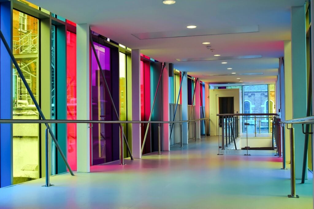
Many people associate work with dull, neutral colors. That perception likely comes from the monotonous tasks that are still common in some corporate jobs and from the fact that offices once relied more on neutral tones than vibrant ones.
While some corporate environments continue to use beiges and grays, today’s workplaces show much more versatility in their use of color. Colors have clearly evolved in the corporate world, and this shift has had a positive impact on employees.
The Evolution of Color in Business

Corporate workplaces, particularly offices and factories, have traditionally been dull and uninspiring. This is still the case for some work environments, but the use of simple, neutral colors was much more common in past decades than it is today. These colors were perceived as professional and calming, making people believe they were the best color schemes for productivity. While every person reacts to colors differently, further research has revealed that neutrals may not be the most effective approach.
Neutral colors continue to play a significant role in corporate environments, but many businesses are more mindful of their color choices than they were in the past. Too many neutral tones could do more harm than good. Staring at grey and beige all day could make employees feel bored and uninspired, making it harder for them to focus. This has the opposite effect that corporations intended with those color choices.
Over the years, people have gained a deeper understanding of color psychology, and many companies now use this knowledge to their advantage. Corporations are incorporating bolder colors into their workplaces to help employees feel happier and more energetic, enabling them to complete their tasks more effectively. It’s also common for businesses to use their brand colors in the workplace.
With a wider variety of colors at corporate jobs, working in these environments can feel much less tiresome than it used to. Some corporations still focus on neutral tones as a symbol of professionalism, but adding some bolder colors into office designs has become the norm.
Benefits of Color at Work
When designing an office space, colors do more than just add aesthetic appeal; they can also affect how employees feel and perform. Choosing the right colors can improve the work environment for everyone involved, offering several positive effects.
Improve Mood

For many people, bright colors can boost mood and evoke positive emotions. If the entire workplace features only dull, neutral colors, the space may feel boring, cold, and unwelcoming. This can lead to employees feeling burned out or unmotivated. Adding bolder colors could make people feel more positive overall, encouraging them to work harder and helping them enjoy the work they’re doing.
Increase Energy Levels
Neutral hues don’t evoke much energy, but energy is needed when working. Bright colors can help employees feel alert and energetic rather than exhausted and sleepy. Having plenty of energy helps make the workday easier and more enjoyable for individuals. Just make sure you don’t use too many bright colors since a room full of only oranges and reds can be overwhelming.
Enhance Productivity

When someone’s mood and energy levels improve, there’s a good chance their productivity will improve too. Being surrounded by the right colors can make people more engaged in their work, allowing them to complete tasks more quickly and efficiently. Using a good balance of bright and neutral colors can make people more focused without overstimulating them.
Boost Creativity
If a job requires creativity, bold colors are essential. Neutral colors can be relaxing and professional, but they often lack inspiration and intrigue. A workplace without bold colors can make it difficult for employees to brainstorm and add creative twists to projects. Even if someone’s role doesn’t involve creating art, there’s still a good chance they need some creativity to bring fresh ideas and perspectives.
Strengthen Brand Perception

Most companies carefully select their branding colors. Therefore, it makes sense to use those colors in their office spaces as well. The exact effects that brand colors have on employees depend on the specific colors, but they can help keep the brand perception fresh in people’s minds. By being surrounded by the brand’s colors, employees can more easily recall them while completing tasks, which is especially valuable in design roles. Additionally, if the brand colors are bold, they can also provide the above benefits.
How to Use Colors to Improve the Workplace
Since bold colors can have so many positive effects in corporate environments, they should be used strategically. Below are some tips for using colors to enhance employee productivity and improve their mood.
Select Stress-Reducing Hues

Work can be stressful, so it’s a good idea to minimize stress in the workplace whenever possible. Neutral colors can promote calmness, but since they can have negative effects in large amounts, it’s a good idea to incorporate some bolder, calming colors into the design as well. The most popular option is blue. Blue promotes calmness and relaxation while also relating to trust, loyalty, and responsibility, which are great qualities to have in a workplace.
Green is another great color for relaxation. It can make people feel revitalized, relaxed, and balanced, helping them stay focused and at ease while working. In some cases, light pink is a fun color that can be calming and soothing, but its effects are short-term, so it might not be the best choice for an office where people work full-time.
Include Pops of Color to Boost Energy
Even adding just a touch of vibrant color to an office space full of neutrals can improve the energy of employees. Warm colors such as red, orange, and yellow can energize and excite people, helping them become more engaged in work projects. Having a splash of high-energy colors can reduce the risk of people feeling sleepy in the office.
While bright colors are great for alertness, they should only be used sparingly. Using too much of one color can do more harm than good, especially when the color is bold. While orange accents in an office can evoke enthusiasm, painting the entire wall orange could strain people’s eyes or cause stress. It’s great to include bright colors, but don’t overdo it.
Choose Colors That Fit the Type of Work

Every color has unique effects, so catering those effects to the jobs in the office is a great idea. For example, blue is a great color for productivity, making it ideal for a position that requires a lot of work in a short amount of time. Purple can evoke creativity, so it’s beneficial for art and design tasks. Orange leads to a lot of enthusiasm, making it perfect for jobs where people are active most of the time.
So, while some bold colors are great for certain work environments, they might not be the best for others. Corporations should at least consider the roles of the people in the office before deciding which hues should surround them.
Use Warm Colors to Make Spaces Feel Warmer
Color choices can alter perceptions in certain contexts. One example is temperature perception. If people commonly feel cold in the office but you can’t raise the temperature, using warm colors like red could make the space feel warmer. It’s because we commonly associate red with things that are warm, like fire. The opposite is true for blue, which is associated with frigid temperatures. Too much blue in an office could make it feel colder than it actually is.
The color of the lights in the workplace can also influence the perceived temperature. Warm lights, which have a more yellow or orange tint, will make a space feel warmer than cool lights, which have a blue tint. White or very light yellow lights are positioned perfectly in the middle, not significantly influencing the perceived room temperature. Keep colors in mind when deciding how warm or cool you want a room to feel, since employees are more productive and content when they’re comfortable.
Create a Balance for Best Results

While every color has its benefits, it’s essential not to overuse any one color. Use bright colors as accents rather than the focal point of the room. Break up neutral colors with pops of color. Using complementary hues can provide numerous benefits and reduce the risk of boredom and stress. Even using tints, shades, and tones of the same color in an interior design can help make it more appealing.
However, there is such a thing as using too many colors. While it’s useful to have a variety of neutral and bold colors in a workspace, there are limits. Including too many unique colors can overwhelm people working in the space. Sticking with a few colors that pair well with each other is usually the best option.
The Future of Color in the Corporate World
The impact of colors is more well-known now than it was in the past. Jobs are also always evolving and changing. As more corporations learn about colors and their effects on people, more offices and factories will begin to utilize colors to their advantage.
Designing with color in mind is an easy and affordable way to boost the mood and performance of employees, making it a smart move for any business. Replacing dull, stressful colors with bold, beneficial hues is a simple upgrade that works in most workplaces.


