If you’re planning a wedding or creating a wedding design, don’t forget a very important part of it — your color scheme!
There’s no one-size-fits-all description when it comes to wedding palettes. In many cases, they include pastels and delicate, floral-inspired shades. Ultimately, wedding colors are whatever you want them to be. Not sure how to choose?
Check out these beautiful wedding color palettes. Hex codes are included if you want to use the colors in your next design.
1. Dockside Bouquet
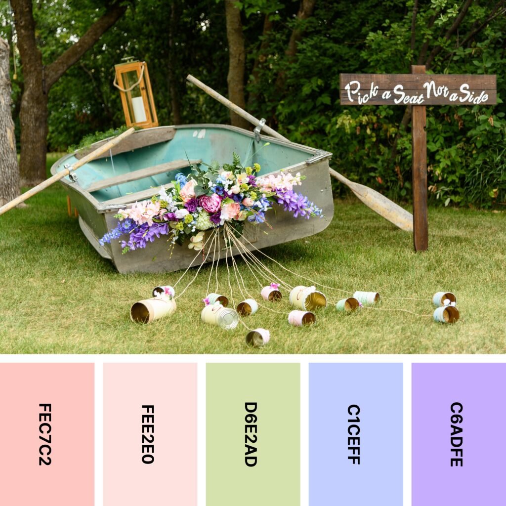
Names: Tea rose (red), Misty rose, Tea green, Periwinkle, Mauve
Hex Codes: #FEC7C2, #FEE2E0, #D6E2AD, #C1CEFF, #C6ADFE
This color palette’s example image shows an unusual choice of wedding decoration. This striking design is made even more inspiring by the colorful bouquet of flowers on the back of the boat. The array of gentle pastels includes a perfect balance of warm and cool. But as is the case with many pastel palettes, this one can start to seem a little washed out without any darker colors to ground it.
Darker (but not black) neutrals work well here. The deep wood tones of the trees and the sign in the picture are ideal!
2. Sweet Blooms

Names: Moonstone, Seashell, Baby powder, Tea rose (red), Orchid pink
Hex Codes: #62B5CB, #F2E8E4, #FCFDF8, #F8C5CA, #EAB2BD
This spectacular wedding cake almost doesn’t look real! Between the wallpaper-like flowers on each layer and the 3D blooms accenting it, it’s a true work of art. The color palette it’s based around is special in its own right — it takes a classic floral/wedding color palette and adds a modern twist.
Take a look at Seashell, Baby Powder, Red Tea Rose, and Orchid Pink together. These colors form a vintage-inspired, warm-leaning palette perfect for floral patterns. It’s pretty, but it’s also not particularly original.
When you add Moonstone, everything changes. This cool yet vibrant color is the perfect way to add some distinction to floral palettes. Shades of warm white and rose can sometimes look dated, so Moonstone adds some much-needed freshness.
3. Meadow
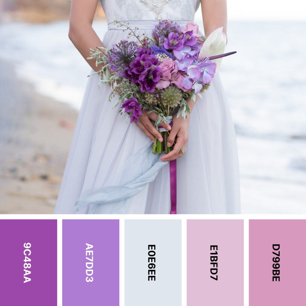
Names: Purpureus, Lavender (floral), Alice blue, Thistle, Lilac
Hex Codes: #9C48AA, #AE7DD3, #E0E6EE, #E1BFD7, #D799BE
Bold purples, muted pinks, and a quiet shade of blue come together to create this one-of-a-kind color palette. Because these shades have very different energy levels, they might seem like an unusual group. But the example image shows you how to use them to create a well-balanced design.
As you can see, the boldest shades in the palette are used very sparingly. Purpureus and Lilac are essentially accent colors, and there’s just slightly more Thistle and Floral Lavender. These colors are great for drawing the eye, and soft Alice Blue is an ideal background shade.
4. Autumn Alfresco
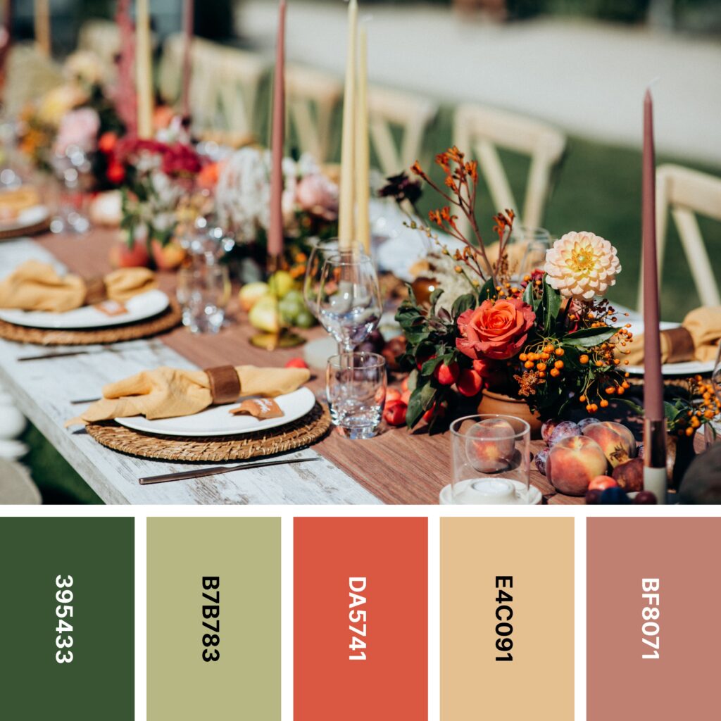
Names: Hunter green, Sage, Jasper, Tan, Old rose
Hex Codes: #395433, #B7B783, #DA5741, #E4C091, #BF8071
If you look at this palette without the example image, you might not think it’s a wedding palette at all. But not all weddings happen in spring and summer, and not everybody wants a wedding color scheme with lots of pink and purple, anyway.
If you want to give your own wedding a rustic, slightly autumnal feel, you’ll definitely want to check out this color scheme. Sage, Tan, and Old Rose are great near-neutral shades that you can use for backgrounds or base colors. And if you want to include some more vivid, saturated shades as well, Hunter Green and Jasper are perfect.
5. Retro
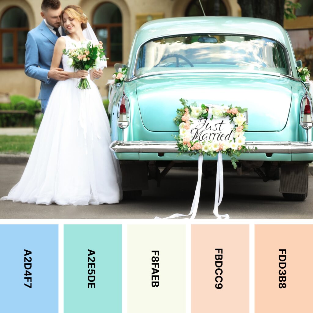
Names: Uranian blue, Tiffany blue, Ivory, Champagne pink, Apricot
Hex Codes: #A2D4F7, #A2E5DE, #F8FAEB, #FBDCC9, #FDD3B8
Pastels were thriving in the 1950s, and this charming palette brings back some of that retro-inspired energy. There’s a lot you can do with this grouping, too. If you need to create a gradient effect, the peachy trio of Ivory, Champagne Pink, and Apricot is perfect. Uranian Blue and Tiffany Blue are ideal for cooling things down a bit.
Thanks to that warm/cool contrast (and the relatively high saturation of Uranian Blue and Tiffany Blue), this is a higher-energy palette than many on the list. It’s ideal if you can’t make up your mind between a pastel color scheme or a brighter palette.
6. Aubergine Dream
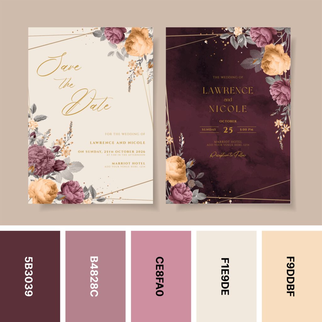
Names: Wine, Old rose, Puce, Linen, Light orange
Hex Codes: #5B3039, #B4828C, #CE8FA0, #F1E9DE, #F9DDBF
At first glance, this color palette might look a little staid. But when you take a closer look at the example image, you see that you can use it to create some surprisingly dynamic designs. The save-the-date card on the left illustrates how you can use this color grouping for softer designs. With a Linen background and touches of each of the other colors, it manages to create a quaint, vintage-inspired design.
If you want something a little bolder, the design on the right might be more appropriate. Its deep Wine background commands attention, but it’s softened somewhat by the Old Rose, Puce, and Light Orange flowers.
7. Flora

Names: Thistle, Pale purple, White, Anti-flash white, Platinum
Hex Codes: #CBB5D3, #E8D4E0, #FBFBFD, #E1E7EA, #D5DCE2
Flowers are an essential part of any wedding. If you want to make yours memorable, don’t be afraid to get creative when it comes to both the color scheme and the arrangements of the flowers themselves.
This pleasant palette unifies the colors of both the flowers and the dresses in the picture. Despite their names, Anti-Flash White and Platinum have a distinct bluish cast that makes them pair well with Pale Purple and Thistle.
Of course, if your wedding has a delicate color scheme like this, you can add some unexpected energy through arrangement. The wild rose branches behind the women in the picture are a perfect example!
8. Western

Names: Rose ebony, Sandy brown, Isabelline, Mardi gras, Palatinate
Hex Codes: #643D35, #F39347, #F9F6F1, #930D77, #5C1154
Many wedding palettes lean toward the soft and demure. Not this one! With the almost-complementary combination of Sandy Brown and Palatinate, this color grouping is decidedly different. It’s great for a wedding in summer or early fall.
If you decide to work with this palette, you might find that it seems to be leaning a bit warm — even though Mardi Gras and Palatinate are technically cool colors. The example image manages to cool things down just enough with little touches of green.
9. Frozen Forest

Names: Cardinal, Midnight green, Air force blue, Columbia blue, Alice blue
Hex Codes: #C51941, #02495E, #518BAB, #CCDAE6, #DAE6EE
This palette’s striking example image brings together a range of exquisite, icy shades. Even the woman’s dress is colored much like the snowy trees in the forest! Columbia Blue and Alice Blue are technically very pale shades of blue, but they look like silvery whites next to Midnight Green and Air Force Blue.
Cardinal might look a bit out of place in this lineup, but the example image shows you the best way to integrate it. When used as an accent color, it adds just a bit of interest and warmth. That being said, if you would prefer a monochromatic palette, feel free to just work with the other four shades.
10. Peachy Green
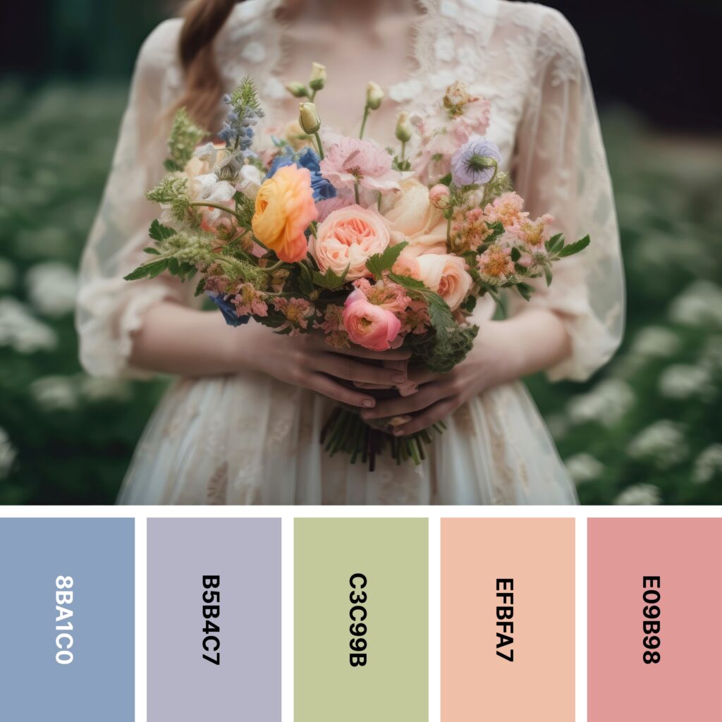
Names: Vista blue, French gray, Sage, Apricot, Rosy brown
Hex Codes: #8BA1C0, #B5B4C7, #C3C99B, #EFBFA7, #E09B98
At first glance, this pretty palette looks a bit like a muted rainbow (just without yellow). So naturally, it’s perfect for vintage-style designs and color schemes. Every wedding color palette needs at least one neutral, and the example image successfully uses a classic shade of warm white. These hues are ideal if you want your wedding to be both colorful and dreamy!
11. Cherry Delight

Names: Reseda green, Cambridge blue, Floral white, Tickle me pink, Red (ncs)
Hex Codes: #71856C, #98AB87, #FEFAEE, #FA88B0, #B90438
As you saw above, some softer color palettes effectively use bursts of deep, vivid red. This one is another great example. In this palette, quiet, dusty greens and pleasant Floral White get a burst of energy courtesy of Tickle Me Pink and NCS Red. This can make for a lively color grouping, as red and green are complementary colors.
Still, it’s wise to use caution — red and green are also the two main colors of Christmas. Unless you’re going for a winter-themed or Christmas-themed wedding, you’ll want to steer clear of any design that makes your audience think of the winter holiday. As the example image suggests, you can always use large amounts of Floral White, Cambridge Blue, and Reseda Green. Add accents of Tickle Me Pink and NCS Red.
12. Springlike

Names: Thistle, Melon, Misty rose, Antique white, Sage
Hex Codes: #BFB1CF, #F2B2B2, #FCE5DD, #FDECDD, #BCB99A
Want to combine two wedding classics? This palette is perfect for creating floral pastels with a lacy backdrop. Misty Rose and Antique White work together to replicate the character of old lace, Sage captures the freshness of flower stems, and Thistle and Melon are great shades for the flowers themselves. Pale ribbons complete the look.
13. Bright Lily

Names: Telemagenta, Amaranth, French rose, Persian pink, Lavender blush
Hex Codes: #D63776, #ED205A, #FF5489, #FF87C4, #FFF3F7
Lots of wedding bouquets feature white daisies, pastel roses, and other quietly-colored flowers. But what if you want to do something different? The bouquet in the picture includes bright magenta Stargazer lilies and richly-colored Gerbera daisies, along with a healthy dose of green and orange.
However, you can simplify this look by stripping it down to a handful of pinks. When you use it this way, you create a gradient palette that covers a lot of ground. At the brighter/more saturated end, you have super-vivid Amaranth. The colors get softer until you reach Lavender Blush, a shade that’s really more white than pink. Because of that steep gradient, this palette is ideal for creating artistic, shaded floral designs.
14. Moss Green

Names: Claret, Mountbatten pink, Timberwolf, Ash gray, Feldgrau
Hex Codes: #802130, #AC758A, #E4DADA, #93A194, #4C5D50
When it comes to wedding color schemes, color palettes with a “dusty” look have become especially popular. That might be because these shades can help you create a softer, more muted palette without using pastels. And while colors like this are certainly vintage-inspired, they feature prominently in many contemporary designs.
As the example image shows, this grouping of colors can work well for actual floral arrangements. But thanks to the inclusion of light Timberwolf, you also might consider using this palette for cards or invitations. Timberwolf makes a great background color, and you can add shaded flowers with Claret and its lighter counterpart, Mountbatten Pink. Likewise, you can create 3D-shaded leaves and stems with Ash Gray and Feldgrau.
15. Rosy Glow
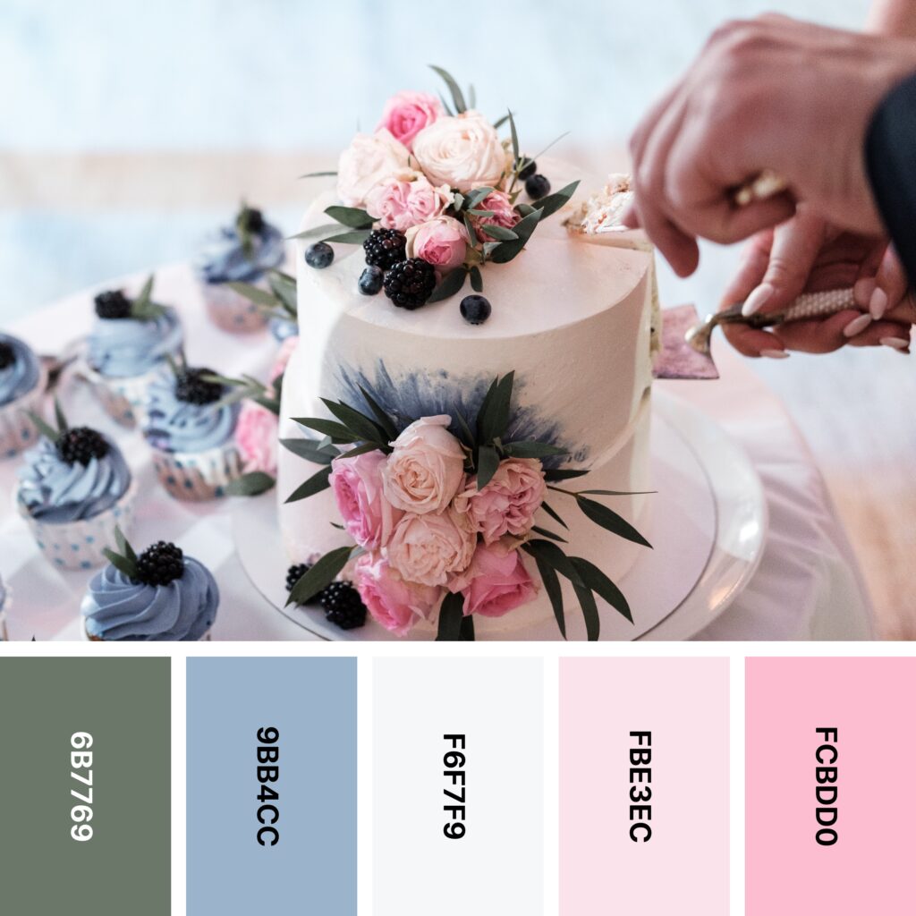
Names: Reseda green, Powder blue, Anti-flash white, Pale purple, Orchid pink
Hex Codes: #6B7769, #9BB4CC, #F6F7F9, #FBE3EC, #FCBDD0
Not all wedding cakes are created equal. This one looks more like a sculpture than something edible! Part of that beauty comes from its unconventional color scheme — it brings together both pastels and muted shades to create a palette with real depth and nuance.
If it weren’t for Powder Blue, this would be a pretty standard floral wedding palette. But blue’s coolness helps balance out the warmth of Pale Purple (which is really a shade of pale pink) and Orchid Pink. It also leaves room for creative embellishment like the splash of blue on the cake. The blackberry accents help ground the palette and underscore Powder Blue’s calming influence.
16. Mint Chocolate Chip

Names: Coyote, Raw umber, Dutch white, Isabelline, Mint green
Hex Codes: #796758, #926A47, #EDDDBC, #F0ECE9, #DAF1EB
Many of the wedding color palettes on the list thus far have included a neutral or two. But until now, we hadn’t seen one that was made mostly of neutrals. This palette is the perfect option if you’re going for a Western or rustic theme. Earthy Coyote and Raw Umber set the tone, and Isabelline and Mint Green add an ethereal touch. Dutch White bridges the gap between the two pairs.
17. Woodland Wonder
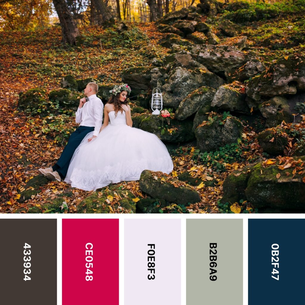
Names: Van dyke, Cardinal, Magnolia, Ash gray, Prussian blue
Hex Codes: #433934, #CE0548, #F0E8F3, #B2B6A9, #0B2F47
If you like the look of autumn leaves and the bright blue sky above them, you might find that a fall wedding is perfect for you. Even though the example image includes a fiery collection of leaves, the palette below it only has a few selected colors. These five shades create a classic, even businesslike aesthetic. To keep the general sense of calm intact, use a neutral-heavy backdrop, include slightly less Prussian Blue, and use Cardinal sparingly.
18. Teacup
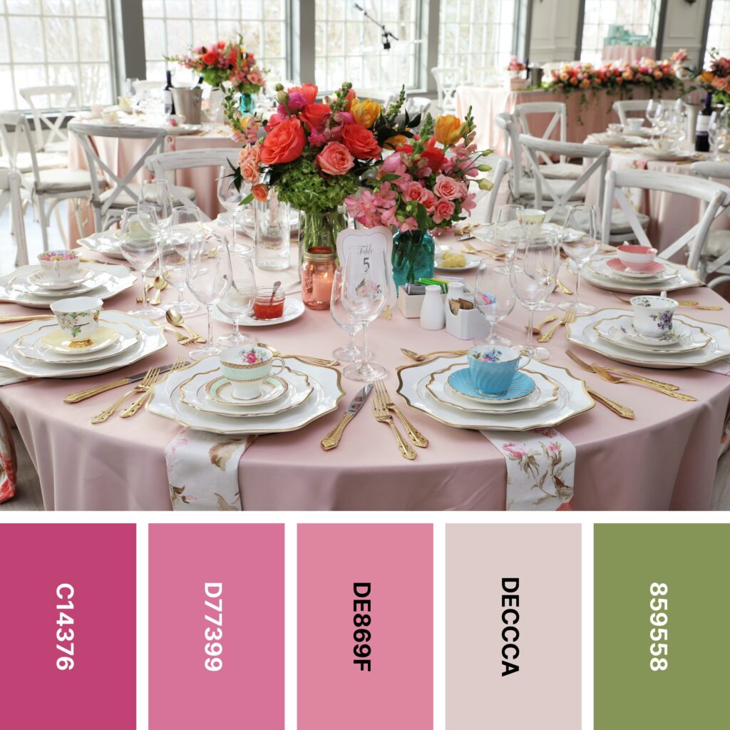
Names: Fuchsia rose, Thulian pink, Puce, Pale dogwood, Moss green
Hex Codes: #C14376, #D77399, #DE869F, #DECCCA, #859558
The example image above is a little different from what you might expect a wedding reception to look like. The place settings look like something out of a princess’s tea party, and the cottage-style, whitewashed chairs are a nice touch. But the floral arrangements are definitely a surprise!
If you saw the tables and had to take a guess as to what floral arrangements might be used, you probably would think of ivory and pastel pink roses. So the bright, saturated shades of the roses and other blooms here make a splash. In this context, though, they tie in nicely with the bright accents on the eclectic teacups.
Whether or not you want to include these bright bursts of color is up to you. But with or without them, the color palette above is a solid choice. The combination of pink and green is high-contrast and eye-catching. Pale Dogwood is light enough to work as a background color, but it has just enough pink in it to work beautifully with the other shades.
19. Chrysanthemums

Names: Imperial red, Bittersweet, Burnt sienna, Persian orange, Hooker’s green
Hex Codes: #E24A4C, #E57164, #EE7F5C, #E6955E, #547D66
Wedding bouquets don’t have to be just handfuls of flowers. The ones in the picture even include tiny succulents, and they’re mesmerizingly rounded. And whether or not you’re making an actual bouquet, the colors in this palette are worth a look.
As you can see, Imperial Red, Bittersweet, Burnt Sienna, and Persian Orange are all similar shades, but they don’t quite form a gradient. They’re great for busy designs like the pictured bouquets, but it’s wise to include a few shades of green to balance them out. If you don’t want your design to be completely saturated throughout, try including a background (or at least a decent proportion) of soft white like you see on the pictured dress.
20. Lilac and Cream

Names: Rose pompadour, Plum, Thistle, Papaya whip, Vanilla
Hex Codes: #ED819B, #794271, #C5B6D2, #FAEBCC, #FCE8B2
White is probably the color most associated with weddings, at least in the Western world. But if you want your design to be a little different, consider using warm shades of cream instead. As you can see in the picture, creamy shades like Vanilla and Papaya Whip do very well against floral shades like Thistle.
You can create simple yet elegant cards or invitations with a background of Papaya Whip and a border of Rose Pompadour, Plum, and Thistle flowers. That being said, Papaya Whip and Vanilla are somewhat common colors for flowers as well. You might consider making bouquets or flower arrangements with blooms in each of these shades!
21. Something Blue

Names: Carolina blue, Columbia blue, Champagne pink, Lavender blush, Tea rose (red)
Hex Codes: #7AB6CD, #B7D5E1, #F5DDD3, #F4E3E9, #F3CDCC
Pink and blue pastels will bring a vintage-inspired appeal to your wedding. However, you’ll want to use them carefully — you don’t want your guests thinking they’ve accidentally come to a gender reveal party!
The picture above illustrates how to successfully use these shades in a wedding palette. Try combining different shades of both pink and blue. Sprinkle in some cream and white as shown above, and you’ll have a welcoming color scheme that’s soft without looking childish.
22. Sagebrush
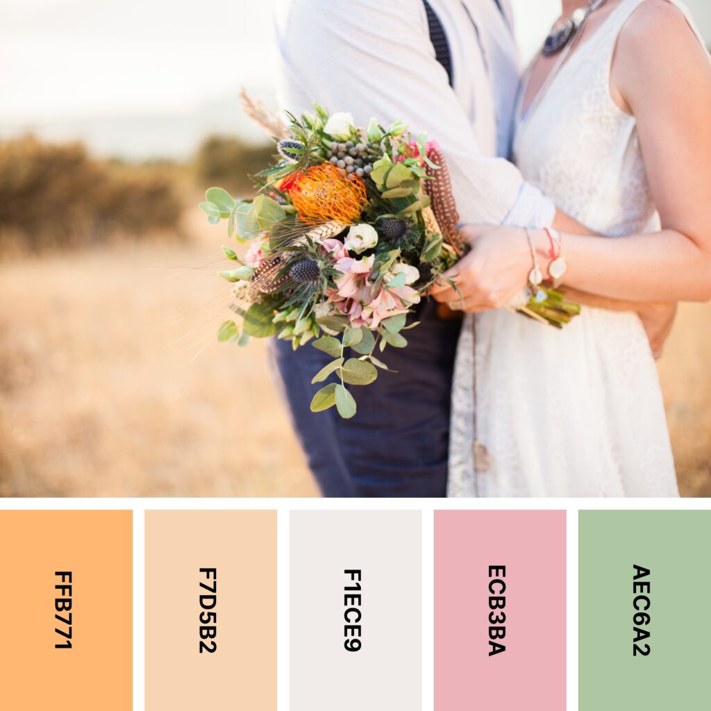
Names: Sandy brown, Light orange, Isabelline, Cherry blossom pink, Celadon
Hex Codes: #FFB771, #F7D5B2, #F1ECE9, #ECB3BA, #AEC6A2
Sage-like shades of green never really seem to go out of style. And while this palette may not contain sage, it does include Celadon, which is pretty close. As the only cool non-neutral in this particular palette, Celadon is essential when it comes to maintaining balance.
Because this calming shade of green is so different from other shades in the palette, you might consider using it as a kind of centerpiece. The example image does this well. The blurred Light Orange background works a lot like a neutral, and it frames the balanced mix of Celadon, Cherry Blossom Pink, and Sandy Brown in the middle of the design.
23. Dusty Roses

Names: Old rose, Amaranth pink, Pink lavender, Anti-flash white, Beaver
Hex Codes: #B67A82, #D6A0B1, #D6A7B7, #EDEBEC, #A57B6E
Dusty rose was a shade that reached near-icon status in the 1990s. But in the world of both interior and digital design, it’s slowly making a comeback. In this particular palette, Old Rose, Amaranth Pink, and Pink Lavender are all shades that most people would consider dusty rose.
These three shades form a relatively tight gradient, so they’re ideal for creating shaded designs. The darker roses in the picture are mostly made up of all three. Add a wood-tone neutral like Beaver and a lighter neutral like Anti-Flash White, and you’ve got a well-balanced design with vintage appeal.
24. Lavender

Names: Ultra violet, Amethyst, African violet, Wisteria, Ghost white
Hex Codes: #64619E, #7A73AF, #A093BF, #B69FD1, #EEEDF2
Some might see purple as a sorrowful shade. But when you combine multiple shades of lavender and add a little cool white, it’s anything but. The five colors in the palette form a complete color scheme as-is, but if you want to expand it a bit, the example image offers some helpful suggestions. In the bouquets, you can see elements of warm white and baby pink (and of course, leafy green!). Royal purple (as seen on the dress in the background) is also a great choice if you want even more purple.
25. Fresh-Cut Flowers

Names: Vanilla, Fairy tale, Desert sand, Platinum, Ghost white
Hex Codes: #D8D69D, #EBBFCC, #EACAB3, #E3E3E2, #EFEAEE
If you have a wedding planned for spring, you might find yourself wanting to lean into the colors of the season. This diverse pastel palette is a great way to do so. The lovely, pale flower arrangements in the example image give the whole setting a dreamy, fairy-tale-like feel.
But without any other colors, this palette runs the risk of seeming washed out. Fortunately, the example image gives you some ideas for both grounding your design and adding some visual interest. Metallics are a great choice — the copper vases in the picture continue the warm theme. Wood tones are also a solid option: the wooden chairs in the picture make sure the whole color scheme stays down to earth.
26. Winter Wonder

Names: Fire brick, Fire engine red, Isabelline, Coffee, Hunter green
Hex Codes: #B70C23, #D52928, #EEE9E5, #845C4B, #446540
At first glance, this looks like a Christmas color palette. It certainly could be! But if you’re planning a winter wedding, this is a great color scheme to consider. If you do choose this festive collection of colors, beware of overdoing red and green. The wedding cake in the picture is a perfect example: smooth Isabelline is the main color, but the accents of evergreen, holly, and pinecones get the winter theme across.
27. Rosebud

Names: Melon, Pale dogwood, Isabelline, Misty rose, Tea rose (red)
Hex Codes: #EDB8AF, #EAC7C1, #F4F3EF, #F7E2DB, #F3C4BC
If you really love pink, this is the ideal palette for you! When you arrange these colors carefully, you get a beautifully monochromatic color scheme that’s perfect for table settings, flower arrangements, invitations, and even bridesmaid dresses.
Of course, it’s worth adding just a touch of cool green. These shades of pink are all soft, but pink is a warm color nonetheless. You don’t need a lot of green — even the green stems of the roses in the photo help tie everything together.
28. Summer Plum

Names: Finn, Purpureus, Thistle, Pale purple, Magnolia
Hex Codes: #4F2F61, #85539A, #D8BFDF, #F1D9F3, #FAF5FB
Deep shades of purple may not seem like an obvious choice for a wedding color palette. However, as you can see here, they work nicely when counterbalanced with a good bit of white. This wide-ranging gradient covers a lot of ground, but the colors still blend smoothly into one another. As a result, this palette is a great choice for watercolor-style designs. The flowers on the announcements have a soft, painted look, and the faint prints of purple on the white background create just enough of a dreamy touch.
29. Vista

Names: Tickle me pink, Orchid pink, Mimi pink, Thistle, African violet
Hex Codes: #FC7EA3, #FCC0D2, #F5DBE2, #D6C2DB, #B089B8
This might be a delicate color palette, but as you can see in the picture, adding just a touch of gold makes it positively regal. But note how the colors are placed — gold only appears next to the fainter colors. Juxtaposing gold and shades like African Violet can look a little garish. By keeping gold beside colors like white and Mimi Pink (and using bolder shades like African Violet as accents), you can create dreamlike looks with distinction.
30. Blue Roses

Names: Moonstone, Light blue, Papaya whip, Thistle, Cambridge blue
Hex Codes: #71B5CA, #B9DEE6, #FEEDD4, #E8D1E5, #A4BCA1
Here’s another of the artfully-designed wedding cakes on the list. This one features a sash of summery flowers and fresh green leaves. But even if you’re not designing a wedding cake, this springlike palette is a beautiful way to celebrate new beginnings.
This palette is also somewhat unique in that it combines pastels with more saturated colors. Light Blue, Papaya Whip, and Thistle all fall firmly into the pastel camp. Moonstone and Cambridge Blue are a little more saturated. But this variation makes the palette especially dynamic!
31. Summer Garden

Names: Peach, Apricot, Champagne, Alabaster, Reseda green
Hex Codes: #EFBA92, #FAD4B9, #FFE5C5, #F1E9DC, #7F8D74
Pastels are often associated with spring. But peach pastels often have more of a summery look. If you like softer colors but are planning a summer wedding, this is a palette worth considering.
Like many of the other wedding palettes on the list, this one has a smooth color gradient. Peach fades into Apricot, then Champagne, and finally, to Alabaster. Reseda Green offers some coolness to counterbalance the warm energy of these different shades.
It’s a simple color palette, but it offers plenty of charm. As you can see in the example image, it does well with antiqued, warm metallics.
32. Peony

Names: Rose pompadour, Amaranth pink, Mimi pink, Lavender blush, Baby powder
Hex Codes: #E87D9B, #EA9DB2, #F5D7E1, #FEE8EB, #FBFEF7
Here’s another delicate, gradient-style palette. But this one is more springlike than summery. The more saturated pinks like Rose Pompadour and Amaranth Pink are close to the color of roses. But the papery hues of Mimi Pink, Lavender Blush, and Baby Powder come closer to the look of a peony.
Of course, this gradient is great for making shaded floral designs. But it also really lends itself to watercolor-style projects. Try a design made up of soft, fluffy pink clouds.
Using Wedding Colors in Your Design
Whether you’re creating digital designs or arranging the colors at an actual wedding venue, knowing how to use the colors you’ve chosen is incredibly important. Here are some tips to help you get started using wedding colors.
Decide on a Style
Although there are lots of traditional elements (like florals) when it comes to wedding design, there really aren’t any rules. This is great for freedom of choice. But if you don’t have at least a general style planned, you might find that things start to get disjointed.
For instance, let’s say that you’ve already sent out your vintage-style save-the-date announcements. You’re using the same color palette for the actual wedding invitations, but this time, you decide on a modern, minimalist look.
Even though the color scheme is the same, the huge disparity in design styles is bound to confuse your audience. The style you select is a commitment, so take your time and choose carefully!
Don’t Forget Texture
This applies whether you’re creating visual or physical elements of your wedding. Color is important, but an appropriate texture can add a sense of intrigue.
For instance, let’s say you’ve created wedding invitations, but you want to dress up the envelopes a bit. So you create a floral design that extends from the front of the envelope to the back. There’s still something missing. So to add a bit of texture, you find some sealing wax (in the same color as the floral design) and seal the envelope with a 3D floral stamp.
Even subtle textures are an important part of a successful wedding design. As you saw, some of the floral-printed cards above had hyperrealistic flowers. On others, the flowers appeared painted. The texture of the brushstrokes can really make an otherwise ordinary design stand out!
Bringing Your Palette Into Your Wedding
If you’ve chosen a wedding palette, you may have already found that it can be difficult to figure out exactly how to use it. Many of the example images above look effortless. But believe it or not, they’re the result of careful planning.
How you deploy a color scheme is up to you. But here’s some general advice:
- Use your tablecloths to create a backdrop of color (most people choose paler background shades for this).
- Introduce another color (or two) through napkins and table runners.
- Use glasses and flatware to incorporate another shade or add a grounding color.
- Showcase some of your favorite shades with flowers — you can choose similar colors to the rest of your palette or add a pop of an entirely new color.
Even if you have design experience, putting together a wedding palette can be a challenge. Don’t be afraid to consult with a wedding planner if needed.
Create a Memorable Wedding With the Right Color Palette
The color scheme you choose for your wedding (and related designs) is more than just something to entertain your guests. It’s an expression of love and a glimpse into your (and your future spouse’s) personality. Take your time and choose the colors you want to work with — then the fun begins!
Find more design inspiration in this collection of 24 themed color palettes.


