

Whether you prefer lazy days at the beach, exotic trips around the world, or just relaxing by the backyard pool, summer is a time for fun. And if you’re creating summer-focused designs, you want them to reflect that same warm, carefree spirit.
Summer colors impart a sense of joy, vitality, and energy to your audience. When you use them in a balanced, intentional way, these shades can be a great asset to your project, but with all the bright colors to choose from, it can be hard to know where to start.
Check out these beautiful summer color palettes. Hex codes are included if you want to use the colors in your next design.
1. Surfboard

Names: Sandy brown, Pale dogwood, Floral white, Robin egg blue, Celestial blue
Hex Codes: #FFA64A, #E8CEC2, #FFFAF4, #0AD1E0, #3197D6
Surfboards are one of the most universally recognized symbols of summer. And whether your design includes surfboards or not, this is a palette that captures the joy of this season. It runs the gamut from fiery orange to deep aquatic blues, giving it a great warm-cool balance.
This palette also includes an interesting choice of white. When you’re using white as a background color or accent color in a largely blue color scheme, you probably choose cooler whites. Many designers do. But this palette includes Floral White, a shade that leans slightly warm. Try it in your next design!
2. Picnic in the Park
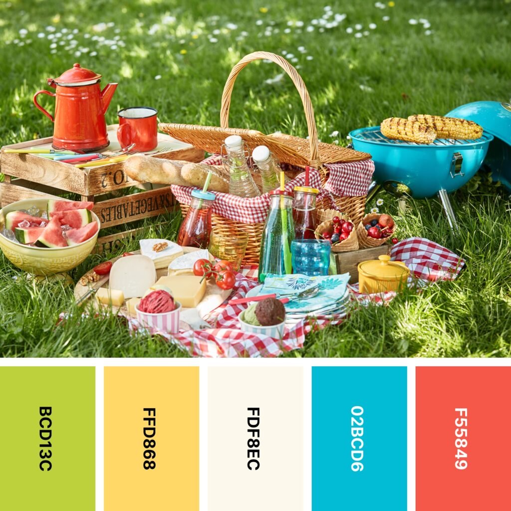
Names: Pear, Mustard, Floral white, Moonstone, Tomato
Hex Codes: #BCD13C, #FFD868, #FDF8EC, #02BCD6, #F55849
A picnic can be a relaxing way to spend a summer afternoon or evening. This palette captures all the fun of a picnic, from the green grass and blue sky to the red and white checkers on the classic picnic blanket.
This is an especially vivid palette, so it’s a good idea to choose one or two base colors and use the rest as accents. For instance, in the example photo, much of the background is Pear, and the other colors are used as accents.
3. Poolside

Names: Princeton orange, Maize, Silver, Plum (web), Red (munsell)
Hex Codes: #FE9C32, #FFF14B, #D1C9CA, #FF9EE3, #EC1E42
If you can’t get to a beach, the pool is a great place to spend the summer! And while the blue water is bright and alluring, there’s always plenty of color on the pool deck as well. This palette captures the neutral color of most pool decks, but it also includes the sunny shades of flip-flops, swimsuits, and towels you often find next to the pool.

As you can see, this particular color scheme doesn’t actually include blue. But if you want to create an especially vivid color scheme, the aqua blue of most swimming pools makes a great background color.
4. Strawberry Cream Cake

Names: Engineering orange, Fire engine red, Chili red, Cosmic latte, Dark moss green
Hex Codes: #C30100, #DC002E, #EA2816, #FDF9E7, #50693E
Not all summer-focused palettes have to involve beaches or pools. Some, like this one, center around delicious, summery desserts. This color scheme captures the vivid red of ripe strawberries, the soft white of creamy frosting, and the deep green of surrounding foliage.
Of course, bear in mind that red is an extremely high-energy color, and too much of it can be off-putting to your audience. Your best bet is to start using it as an accent color and only start using more if you think the design needs it.
5. California Poppies

Names: Apple green, Yellow green, Almond, Vanilla, Princeton orange
Hex Codes: #7EAF31, #B2D16C, #EADCCE, #FFE9A1, #FF9B32
Blooming wildflowers add plenty of color to the summer season in most parts of the world. And with many of them even growing beside roads and on highway medians, they’re easy to spot without going out of your way.
Thanks to its multiple shades of green, this color palette captures the striking beauty of a meadow. To a lot of people, green is a color that signifies spring. But the vivid glow of Princeton Orange makes it easy to see that this is a very summer-focused grouping.
6. Surfside

Names: Light sea green, Verdigris, Columbia blue, Light sky blue, Blue green
Hex Codes: #0BA1A0, #73B9B5, #CBDDE9, #95C5E9, #3E97BD
Between pools, lakes, skies, and the ocean, summer is full of shades of blue. So it’s no wonder that some designers prefer to use a range of different blue shades to form an almost-monochromatic palette.
However, this palette includes such a wide range of blues that it doesn’t need an accent color. Light Sea Green and Blue Green are deep enough to keep everything relatively grounded, and the rich blues and blue-greens of Verdigris, Columbia Blue, and Light Sky Blue offer wonderful variety.
7. Fruit Cup
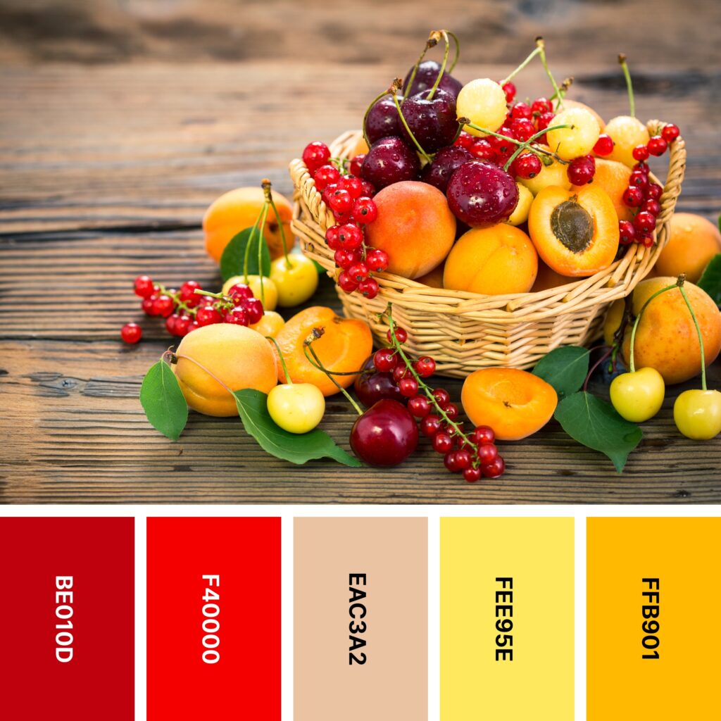
Names: Engineering orange, Off red (rgb), Desert sand, Maize, Selective yellow
Hex Codes: #BE010D, #F40000, #EAC3A2, #FEE95E, #FFB901
This is a somewhat unusual color palette for summer. And thanks to its inclusion of shades of red, orange, and yellow, some may even call it autumnal.
But these three colors are also the colors of the ripe citrus and berries we enjoy during the summer months! If you’re working on a seasonal project and you need a color scheme that’s truly invigorating, this is a good one to pick. Taken as a whole, the brightness of this combination might be a little much. You can cool it down (and add some eye-popping contrast) with a deep navy blue background.
8. Berry Sorbet

Names: Azure (web), Tiffany blue, Cherry blossom pink, Lilac, Lavender (floral)
Hex Codes: #D9ECE9, #A7E5DA, #F7A4B0, #CAABD5, #A277D0
Gelato, sorbet, and sherbet are all refreshing treats for the summer months. So why not celebrate that sugary goodness with a gentle-hued, almost-pastel palette?
This collection of colors may be relatively soft, but it doesn’t mean those colors can’t be dynamic. The almost-complementary combination of Tiffany Blue and Cherry Blossom Pink is reminiscent of the pink and turquoise pastels of the 1950s. But if you want to calm down this high-energy combination, you can always rely on the cooler vibe of Lilac and Floral Lavender.
9. Mediterranean

Names: Celestial blue, Vivid sky blue, Timberwolf, Jasmine, Celadon
Hex Codes: #0295E5, #0AC4FB, #E1D9D4, #FFE583, #B8D4A1
Who wouldn’t want to spend the summer in a seaside villa? If you can’t take a Mediterranean vacation, this color palette is a decent consolation prize. In particular, Celestial Blue and Vivid Sky Blue do a great job of capturing the energy of the blue sea. Celadon is a grassy shade that helps round out the cool end of this color scheme.
The sunny yellow of jasmine adds a burst of warm energy. This vivid palette benefits from the influence of a neutral shade — the rocky gray of Timberwolf. If you need a background color and want something other than white, this is a great one to consider!
10. Backyard Barbecue

Names: Rose pompadour, Puce, Linen, Olivine, Chamoisee
Hex Codes: #D6798B, #DE9BA2, #F9ECE2, #B7CB85, #9A795C
This palette captures another summer ritual — grilling outside and then enjoying an alfresco dinner on the deck or at the picnic table. Rose Pompadour, Puce, and Linen capture the beauty of summer blooms. Olivine is almost exactly the shade of sun-touched grass, and Chamoisee looks a lot like the color of weathered wood.
Thanks to the predominance of pink shades, this is a color palette that also works well for spring color schemes. If you’re working on an early-summer design or just want something a little rosier, it’s a good one to choose.
11. Fruit Smoothie

Names: Princeton orange, School bus yellow, Lion, Pigment green, Red (cmyk)
Hex Codes: #FE9C2C, #FEDC3D, #B39573, #399F33, #F32730
Smoothies are a refreshing summer treat you can easily make at home. And whether you’re using ripe berries, fresh greens, or juicy mangos, smoothies always come out looking fresh and extra-colorful!
This palette is another one that balances brightness with a wood-like brown. Compared to many on the list, it’s a collection that’s especially saturated and bright. Make sure you don’t overuse it!
12. Beach Ball

Names: Yellow green, Jasmine, Lavender (web), Violet (web color), Picton blue
Hex Codes: #AFD068, #FFE689, #DCD5DF, #FE8FE0, #30A3D8
Inflatable pools and inner tubes bring plenty of color to the summer season. And with various shades of green, yellow, pink, and blue, this palette manages to deliver plenty of color without getting too overwhelming.
If you rearrange the shades a bit, you also will find that this palette mirrors the rainbow fairly closely. Web Color Violet is reddish, Jasmine is yellow, Yellow Green is green, Picton Blue is blue, and Web Lavender is purple. This group is a nice choice if you like the general look of the rainbow color spectrum but want to do something a bit different.
13. Sun and Surf

Names: Dodger blue, Non photo blue, Ivory, Canary, Jonquil
Hex Codes: #459AFE, #B0EAF6, #FEFEF3, #FFE700, #FEC901
Yellow sun and blue water are two beautiful parts of summer, and this palette captures them well. If you want a color collection that reminds your audience of a sunny day at the beach, this is a good one to choose.
Even though blue is a cool color, the blues in this palette are especially vivid. Ivory helps tone down the palette’s overall energy a bit, imparting some balance. As a bonus, it’s also about the color of sand and whitecaps.
14. Sunset Vineyard

Names: Chinese violet, Vanilla, Maize, Earth yellow, Coyote
Hex Codes: #6E6383, #FDF6A5, #FAE854, #FAB869, #836040
Few sights match the peacefulness of a vineyard at sunset. And if you want to capture this unique ambiance with a color palette, you have the benefit of cool Chinese Violet balancing out sunny Maize and Earth Yellow.
This palette has an appealing color gradient from Vanilla to Coyote. These shades give it some overall warmth, and Coyote and Chinese Violet are both dark enough to keep it grounded.
15. Pink Sands

Names: Olivine, Alabaster, Melon, Tea rose (red), Misty rose
Hex Codes: #8CB886, #F4F0E4, #F7B8B1, #FED0CC, #FFE4E3
If you’re looking for a color palette that sits somewhere between springlike and tropical, this is a good one to choose. Alabaster, Misty Rose, Red Tea Rose, and Melon form a gradient from warm white to pink. This warm-leaning group is balanced out by cool Olivine.
As you can see in the example image, Red Tea Rose makes an excellent background shade. It’s deep enough to be noticeable, but not so deep that it would take away from the text used for your background. And if you include the brown of coconut shells, you also get the benefit of another dark grounding influence.
16. Sunglow

Names: Electric blue, Robin egg blue, Linen, Bright pink (crayola), Maize
Hex Codes: #65EBF2, #0CC7D7, #FFF6EB, #FE5F8D, #FDE658
Summer is a time for fun, energetic color palettes. This one includes variations of each primary color — Crayola Bright Pink is close to red, Maize is a shade of yellow, and Robin Egg Blue and Electric Blue are two especially vivid blue shades.
This color palette is especially versatile, as you can shape the mood based on the colors you select. The example image is sure to grab your audience’s attention, as it primarily relies on Maize. But to counterbalance that extra-warm shade, it also includes hints of green.
If you want your design to have a cooling (but still invigorating) influence on your audience, you might choose to primarily use Linen, Electric Blue, and Robin Egg Blue. You can then add a few bright splashes of Crayola Bright Pink and Maize.
17. Wildflowers

Names: Asparagus, Olivine, Mint cream, Pink lavender, Lilac
Hex Codes: #65A13F, #B5C572, #EEF3ED, #EBB3DF, #D7A5D0
Colorful wildflowers under a blue sky create a striking, summery aesthetic. You can capture that look with this striking palette. In contrast to many of the summer palettes on the list, this one leans cool. Asparagus, Olivine, and Mint Cream are all green and green-adjacent shades. Pink Lavender is a little warm with cool undertones, and Lavender is a light purple.
If you want to add a little more color, you can also use this color grouping as part of a broader palette. For instance, you might want to add hints of the red, yellow, and sky blue you see in the picture.
18. Lake Day

Names: Pacific cyan, Bright pink (crayola), White smoke, Sunset, Celadon
Hex Codes: #02A9D3, #FB7789, #F3F3F3, #FED18B, #98C999
When you think of a day at the lake, you probably picture tranquil shades of blue water, green foliage, and white clouds. But as you can see, colorful boats can really make a difference! This rainbow-like palette is a great way to impart summer-inspired energy, even if your design has nothing to do with visiting a lake.
Thanks to the range of colors used, this palette is ideal for designs that involve stripes, plaids, or other patterns. If you have a non-patterned design, make sure you choose a couple shades as base colors and a couple others as accents. Otherwise, your design can quickly become overwhelming.
19. High Tea

Names: Citron, Jasmine, Columbia blue, Cherry blossom pink, Rose quartz
Hex Codes: #CECE85, #F9E388, #CFE6EB, #F6AFB9, #AB9AB6
You might think of high tea as being something that happens indoors in opulent sitting rooms. But as this image illustrates, you can also have a beautiful tea outside on a summer’s day. Fittingly enough, this color palette is a little softer than the others on the list, and some of the colors almost reach pastel territory.
If you want your summer design to be more dreamy than vivid, this is a great palette to choose. It closely parallels the colors of the rainbow, so it offers both a wide selection of colors and a great balance of warm and cool.
20. Kayak

Names: Sunglow, Vanilla, Isabelline, Light red, Pacific cyan
Hex Codes: #FFCE5A, #FEED9F, #F9F6F1, #FE8089, #49AACD
Kayaks are some of the most colorful boats out there. And if you want to capture the sense of adventure and excitement that comes with a day out on a kayak, check out this palette. Pacific Cyan is a lovely shade of watery blue, Sunglow is reminiscent of the summer sun, and Vanilla and Light Red are some of the many colors you might find on a kayak.
Isabelline is a cool-leaning off-white and a great background color, so it keeps everything in balance. If you’d prefer a darker background color, go with charcoal gray — yellow shades pop against it, as do the orangish undertones you see in Light Red. All in all, this color grouping can be a lot of fun to experiment with.
21. Parasol

Names: Bright pink (crayola), Melon, Timberwolf, Vanilla, Pistachio
Hex Codes: #F76C7B, #FFBDB2, #DAD5D1, #FFF8AC, #B9CE79
Many summer palettes are ultra-vivid, leaning heavily on bright blues and energetic yellows. But if you’d prefer something that’s a little softer and a little calmer (without being too tranquil), this palette is a nice one. The example image captures the mood well — it’s floral-inspired, light, and delicate, but Pistachio gives it a touch of the bright green grass that’s so characteristic of summer.
As you can see, this is a palette that’s great for a wedding or party decoration scheme. But it also would serve you well in a digital design context. In this case, Timberwolf makes a good background color, but you also might try a cool-leaning, vintage-inspired ivory.
22. Beach Chair

Names: African violet, Non photo blue, Linen, Jasmine, Yellow green
Hex Codes: #9E7CA9, #94D5E9, #F7EEE7, #FFE991, #AAC948
The colors of an empty beach are beautiful enough. But so are the bright shades of beach chairs, towels, and umbrellas. This versatile palette is especially useful because it captures both the colors of the beach itself and the colors of beach chairs and other accessories. Non-Photo Blue and Linen look a lot like surf and sand. The other colors are ones you might find scattered along the shore.
This eclectic palette really lends itself to use with patterns. For instance, you might try stripes or spots of African Violet, Non-Photo Blue, Jasmine, and Yellow-Green on a Linen background.
23. Strawberry Lemonade

Names: Rojo, Bright pink (crayola), Timberwolf, Mustard, Yellow green
Hex Codes: #DE011A, #FF6D91, #E1D8D7, #FFE14D, #B9CC4E
A cold glass of strawberry lemonade is one of the best ways to beat the summer heat. Likewise, this fruit-inspired palette can add a refreshing touch to your next project. Rojo is the color of ripe strawberries, and Crayola Bright Pink and Mustard capture the color of the lemonade itself. And whether you think it represents green grasses or a fresh squeeze of lime, Yellow-Green is an excellent addition, too.
If you do choose this palette, keep in mind that three of the colors — Rojo, Crayola Bright Pink, and Mustard — are especially intense. Be careful to not overuse them. If you take a closer look at the example image, you’ll see that because these three bright colors are centrally located and surrounded by cooler shades, its color scheme is quite well-balanced.
24. Desert Sunset

Names: Navajo white, Peach, Melon, Light coral, Puce
Hex Codes: #FDDBA4, #FFBB94, #FFAB93, #F99693, #C191A8
Summers in the desert might be hot, but they’re certainly beautiful! This palette doesn’t include the color of the cacti, scrub, or sand, but it does include the beautiful gradient coloring of a peaceful sunset. You might consider using these colors for a soft, ombre-like background. Or if you prefer swirling designs, combining them with a watercolor-like effect can work.
25. Santorini

Names: Steel blue, Picton blue, Seasalt, Dun, Folly
Hex Codes: #007ED0, #02A9E3, #F7F7F7, #D8C3AF, #FF0044
Nothing captures the spirit of the Mediterranean quite like the blue-capped white buildings of Greece. Steel Blue and Seasalt perfectly capture this high-contrast design. If you’re working on a design that only needs a palette of two colors, these two are good choices.
However, if you need a more comprehensive color scheme, you only need to look a little more outward. Dun looks like the rocky Santorini coast, and Picton Blue captures the shade of the crystalline water. You don’t absolutely need an accent color, but if you want to include something that really pops, try adding Folly to the mix.
26. Pineapple Delight

Names: Hot pink, Pale azure, Lemon chiffon, Saffron, Mantis
Hex Codes: #FA6EB7, #79DBFC, #FDF7CB, #FCC851, #73B653
This palette’s example image successfully uses high-contrast colors to make a splash. Pale Azure sets the tone as a bright but cool base color. Hot Pink adds high-energy contrast. Lemon Chiffon captures a soft sunny glow, and the saturated Saffron and Mantis bring a fruit-inspired splash to the mix.
This palette can be incredibly effective, but you should use its colors carefully. For example, Hot Pink creates a noticeable impact, but it’s used in moderation.
27. Sweet Treat

Names: Bright pink (crayola), Carnation pink, Parchment, Vanilla, Celeste
Hex Codes: #FD6B85, #FEA2C8, #F2E9D1, #FBF2AF, #B2E2DF
Who doesn’t love ice cream on a hot summer day? This pastel-like palette can add a touch of sweetness to your summer-inspired project. It’s somewhat unusual in that Crayola Bright Pink is brighter and more saturated than the others on the list. However, it may not be deep enough to work successfully as a background color.
If you want to give each color in the palette a chance to shine, you might take some inspiration from the example image. The dark, slate-like gray is a neutral background that gives each shade a chance to shine.
28. Trolley Ride

Names: Magenta, Robin egg blue, Floral white, Sunglow, Mint
Hex Codes: #F0268D, #01CDD5, #F7F1E7, #FFCB3D, #10CC96
If you’re visiting a country with brightly-colored buildings for the first time, you’re in for a treat! With super-saturated, bright colors surrounding you every time you walk down the street, it’s easy to feel like it’s summer all year!
As you can see in the example photo, this collection of colors is great for colorblocking. This strategy lets each color shine and makes a profound impact on your audience. If you need to break up the bright shades a bit or just need a solid background shade, Floral White is the perfect choice.
29. Lupine

Names: Tropical indigo, Mauve, Uranian blue, Lavender pink, Plum (web)
Hex Codes: #9B8CFF, #C7A3FE, #B1E3FE, #FEC2EB, #F79CE1
Summer can be a wonderful time to explore the natural world. And while you might think of summer flowers as being vivid shades of yellow, orange, red, and pink, some are deep shades of purple and indigo.
This interesting combination of pinks, purples, and blue creates an interesting gradient effect that might remind you of flowers by the water. It’s a good choice if you’re looking to create a delicate color palette but don’t want to only rely on pastels.
30. Meadow at Sunset

Names: Orange peel, Xanthous, Sunset, Icterine, Moss green
Hex Codes: #FEA948, #FDBF54, #FFD68A, #FFF570, #98A176
This picture captures the magic of summer’s golden hour. The yellow-to-orange gradient is balanced out by Moss Green, a shade that looks a lot like sun-touched grass. The palette itself is largely warm, but some carefully-placed Moss Green accents may make a difference.
You may already know that the combination of orange and green is a common one when it comes to outdoor stores. Consequently, if you’re creating an outdoor-themed design, this palette might be one to keep in mind.
31. Summer Style

Names: Brilliant rose, Emerald, Baby powder, Maize, Xanthous
Hex Codes: #FA589C, #62D698, #FAFCF6, #FFE43D, #FFB42D
Some summer color palettes are so bright that they look like something out of a pop art gallery. And as you can see in the example photo, this is a palette that is especially great for portraits. When you choose one bright shade as the background, you can add some of the other bright colors as accents.
Alternatively, you might consider a striped pattern of the brighter colors in the palette on a Baby Powder background. Depending on the exact striping pattern, it might remind your audience of taffy or of a beach towel.
Using Summer Colors in Your Design
Choosing your color palette is a key part of planning a design, but so is using those colors well. There aren’t hard and fast rules on how to use summer colors. However, it’s a good idea to keep general guidelines in mind. For example, a hot pink background with bold red text can look garish, unappealing, and even overwhelming to an audience.
If you’d like some tips on where to start, here are some ideas for getting the most out of your summer color palettes.
Consider Your Brand
If you’re working on a website or advertisement for a brand, put some thought into the brand’s actual ethos before selecting a palette. For instance, say you’re designing a site for a business consulting firm. In this case, a palette of hot pink, vivid yellow, and bright blue probably isn’t ideal.
A palette of pastel summer colors isn’t the best choice, either. Consulting firms like to give off a sense of being reliable, and pastels give off a soft, sometimes childish vibe.
However, this doesn’t mean you can’t create a summer-inspired palette for the consulting firm. A combination of cobalt blue and cool white would work well. Cobalt gives off an air of strength, and the combination of cobalt and white looks refreshing while still remaining businesslike.
Keep It Balanced
If your design involves a lot of bright colors, you might find that a dark neutral can help keep everything grounded. Similarly, in many cases, an exact balance of warm and cool shades (even if it isn’t 50/50) will make your design look much more appealing.
You don’t always have to include a darker grounding color, or even include a neutral at all. But if you’re using several very saturated shades at once, you should be careful to not overwhelm your audience.
For example, you might choose a very vivid blue as a background color and then add a medium splash of yellow (like a person wearing a yellow shirt) to the foreground. From there, you could add smaller accents of other bright colors. Maybe the person in the picture is holding a lime-green cup, or their shirt is marked with hot pink spots.
Make Your Colors Pop
Sometimes, summer colors have enough pizazz on their own. But if you really want to make them pop, you might try using complementary or almost complementary colors in your designs. For instance, bright blue and bright orange look especially dynamic beside one another. Similarly, yellows and purples really pop.
Celebrate the Season With Shades of Summer
Summer is a season with its own unique energy. And if you want to capture that unique energy in your designs, summer colors offer you a great way to do so.
The grouping of colors you choose can really shape your design, so always choose your palettes with care. But don’t be afraid to experiment — summer shades offer you a great chance to be bold!
Find more design inspiration in this collection of 24 themed color palettes.


