It goes without saying that the colors that get the most attention are vivid and bright. But the subtle beauty of muted colors should not be ignored. Novice painters and anyone getting into visual design of any kind are likely to miss or ignore the value of muted colors and focus on more attention-getting tones. Of course, there’s nothing wrong with this, and the more flashy colors certainly have their place. But we want to broaden our horizons as much as possible.
Here, we will discuss muted colors, what they are, and how to use them in visual design.
What Is a Muted Color?
Meaning desaturated, grayed, or dulled, muted colors have a low chroma or low saturation. They exist along a spectrum, the opposite end of which is vivid. Any color can be muted: reds can be muddied, yellows can be dimmed, and blue can be made more stately with a moderate infusion of black or brown.

Examples of Muted Colors
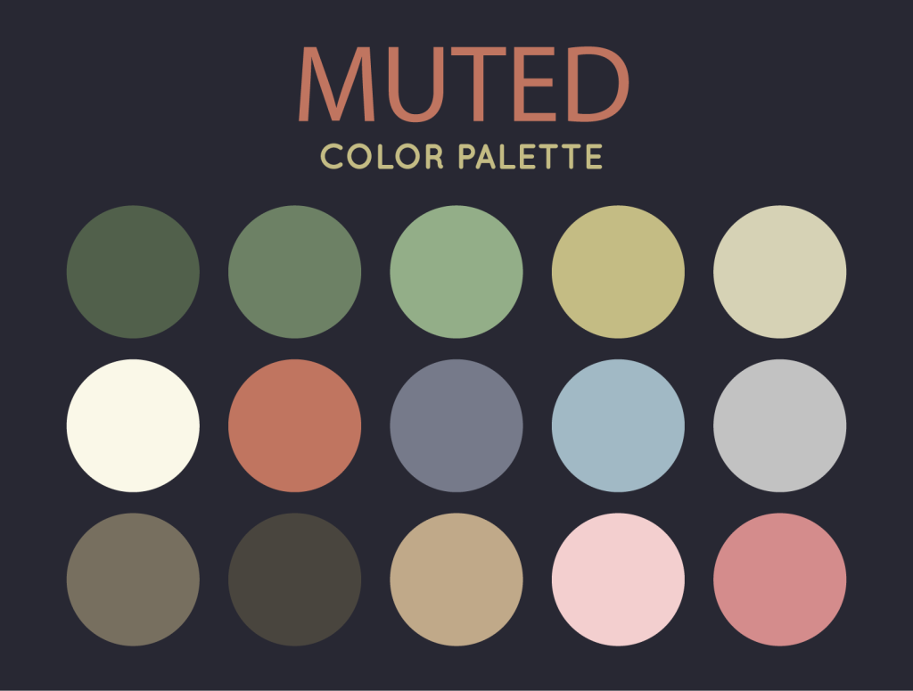
If you want to use the colors from the muted color palette above in your design, here’s a list with names and hex codes:
- Ebony | Hexadecimal Code: #51604B
- Reseda Green | Hexadecimal Code: #6D8165
- Cambridge Blue | Hexadecimal Code: #93AE88
- Sage | Hexadecimal Code: #C4BC84
- Pearl | Hexadecimal Code: #D6D2B5
- Ivory | Hexadecimal Code: #FAF8E8
- Brown Sugar | Hexadecimal Code: #C07560
- Slate Gray | Hexadecimal Code: #767A8A
- Powder Blue | Hexadecimal Code: #A1B9C5
- Silver | Hexadecimal Code: #C2C2C2
- Dim Gray | Hexadecimal Code: #776F5F
- Black Olive | Hexadecimal Code: #49453E
- Khaki | Hexadecimal Code: #C0A989
- Tea Rose | Hexadecimal Code: #F3CFCF
- Old Rose | Hexadecimal Code: #D48C8C
How to Mute Colors
In order to mute a color and move it away from the vivid end of the chroma spectrum, we can mix it in any of the following ways:
- Gray: adding gray will dull any relatively bright color
- Black: mixing any color with black will darken, deepen, and make it feel more solid
- Complement Colors: blue can be desaturated by mixing it with orange, for example
- Earthy Colors: browns, burnt sienna, or raw umber can add a more naturalistic muting effect
Adding white does not necessarily make a color brighter, certainly not more vivid. It will make it lighter. Consider the color pink, for example. It was not even considered a color before the 1950s when many young boys left their Red Rider wagons in the sun where they were bleached and became pink. Adding white to red washes out the distinct vividness of red, but we would not say it makes it brighter. White turns black to gray, which is also not bright.
Any of these methods will deliver somewhat different results, but all of them will reduce the saturation level of the color or colors we have on hand.
Why Use Muted Colors?

Bright and vivid colors certainly have a key role to play in any visual design discipline. But vivid colors can often be used to greater effect when they are used alongside muted colors. This makes bright, vivid colors stand out more. It enhances their brightness, drawing attention to their beauty and enhancing the clarity of the meaning they carry.
Consider a painted image of the mythical phoenix. A mighty bird with a body made of fire soaring through the air is definitely a striking image. Such images have been used in classical paintings, fine art, and not-so-fine art innumerable times throughout history. However, a novice artist is likely to use bright reds, yellow, orange, and the like exclusively while neglecting the need for muted colors and tones. They would render their phoenix in all bright colors and then wonder why their creation lacks the presence they were aiming for.
For greater effect, an experienced artist would add depth and heat to such an image by adding muted, sometimes extremely muted, colors into the recessed details of the bird. The spaces between its feathers, the dips between tongues of flame, and even the central mass of the creature would be detailed with muted and sometimes dark color to add a sense of solidity.
A phoenix is an excellent example because it is not just chromatically intense, but it is also thematically intense. This mythical bird dies and rises from the ashes, which is a deeply mythic and spiritual idea. It is also something that can carry with it a sense of dread, import, and severity. So, by using muted colors in rendering such an image, we can give it its full color and effect.
But this is just one example of why muted colors have their place. We don’t go around painting phoenixes everywhere, hopefully. Sometimes we might paint a house, decorate a room, design a logo, or create an image that is primarily made up of muted colors.
Muted Colors and Home Decor

Muted colors in home décor are used for their calming, reassuring effect. They are naturalistic and could be said to remind us of a verdant wooded area, a solid oak, the comforting green of a grassy field, a placid body of water, and the like. They are also neutral colors meant to evade attention. We also use vivid colors, of course, but their use is generally strictly limited.
If you have ever taken on the task of repainting a room, you have almost certainly been confronted with an interminable array of color options. It’s no secret that the most popular paint color for interior walls is off-white – not white, but off-white. This is a muted version of pure, simple white. But why? Well, bold, simple white can easily be much too bright, especially in a room with a lot of natural light ingress. A wall is a large visual space. Painting it all bright white, not to mention an entire room, might seem unnaturally sterile or shocking.
What’s more, many well-designed homes admit a large amount of natural light. Natural light is good for our health, it helps us wake up in the morning, and it makes us feel good. Therefore, good architecture often admits lots of sunlight. It’s easy to understand why a well-naturally-lit room would be unbearable if it were painted in all stark white.
The kind of white used most often in home interiors might be called a kind of eggshell white. It’s not a color found often in nature. It is most commonly seen and perhaps perceived, in eggshells, seashells, and bone. From this, we might suppose a psychological reason behind the prevalent use of off-white, eggshell tones in interior design. It’s comforting. It carries subtle womb-like symbolism. But perhaps most importantly, it is the most neutral and unobtrusive tone we can think of for a large, flat surface in a living space.
The most popular colors and tones used in interior design are muted. They are browns, greens, tans or buff colors, and off-white of course. The browns mimic wood tones or are wood tones more often than not. Wood flooring is muted but is often treated with a lustrous lacquer, which is an interesting contrast. But of course, we do use chrome, red, and other bright colors in interior design as well. By looking at how these colors are sometimes overused, we can develop a better appreciation for their muted counterparts.
Overusing Vivid Colors

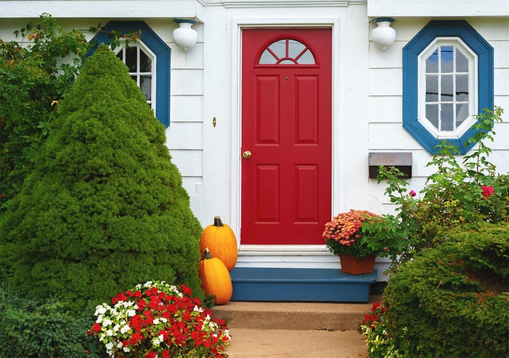
Staying with our home décor/design example, it’s easy to examine instances where vivid colors are overused. Common locations for bright colors include an exterior door, kitchens, children’s rooms, and recreation spaces. A burnished or even a bright red for a front door is not very common, but it’s far from unheard of, and it carries a heavy load of symbolic meaning, which you can certainly imagine. Bright colors such as red, orange, and yellow are common highlights in modern kitchens. Children’s rooms can go either for bright and festive or more calming colors.
Chrome surfaces in kitchens and bathrooms suggest modernity and cleanliness. But too much of these create a sense of dehumanization, which is not something we want in a living space.
The use of vivid colors in these examples is fairly standard. The sparing use of bold, bright colors makes their value more palpable. Like our phoenix example, a bright color buffeted by muted colors has its proper effect. The home environment is among the best examples of this.
Contrast and Effect

Like the flames of a phoenix rendered by a novice painter, the power of bright colors is reduced when they are surrounded by other bright and vivid colors. Consider a few simple examples. Take a bright red and set it against a bright green. The jarring contrast of these two colors is like looking at a badly designed Atari video game from the 1980s. It has an almost blinding effect. The edges of the two colors will seem to shimmer and conflict. It is unpleasant. A clever artist might put this jarring effect to good use, but it is unlikely that anything pleasing to gaze at or live around will result.
Now, take the same intense red and set it next to a desaturated green, such as a mint tone. The effect is still more than sufficiently bright if bright is the intended effect. But it is no longer unpleasant to look at. In fact, it’s a rather nice combination, like guacamole and salsa.
Matching a bright color with a muted pastel is a feasible way to create a sensation of brightness upon which the observer can sustain his gaze. Consider the Sun. It is certainly extremely bright, but its full brightness is rarely appreciated because we cannot gaze at it for more than a second. Likewise, a color pattern that is made of all bright, vivid colors will go unappreciated. If you want the eye to linger on your bright design, the judicious use of muted colors is absolutely necessary.
Many Examples of Fine Art Feature Muted Tones and Colors

In classical and fine art painting we can see countless examples of the ways in which bright colors enhance muted colors and vice versa.
River Landscape By Moonlight, painted by George Henry in 1887, comes to mind. In it, the artist portrays the light of a low sun on a body of water. The sun itself burns with all its expected intensity, yet it is quite muted indeed for a fiery yellow. The river, which stretches off to the right, is dark blue with bright blue undertones. The effect conveys the heaviness and depth of water as well as its gem-like ability to bend light. In this work, the sun is dimmer than it is bright, and the river is brighter than it is dim. Yet they both have their proper naturalistic effects, and it is marvelous.
In another example by Vincent van Gogh entitled Fishing Boats On The Beach at Saintes-Maries-de-la-Mer, painted in 1888, muted and vivid colors interplay with subtle, wonderful effectiveness. At first glance, it seems to be a starkly bright painting with orange sand, yellow wood, and white highlights. But on closer examination, we find that the brightness is stronger on the left-hand side of the painting while the more muted tones gradually increase as we move our gaze to the right of the frame. After considering the interplay of bright and muted colors, we begin to see that the impression of brightness does not match the actual presence of brightness in the image. It is dimmer than it seems, in other words. As such, it is an excellent example of how brights are enhanced by the presence of muted tones.
In 1880, Aleksey Savrasov painted The Rooks Have Arrived. It is a tall landscape in which diminished and muted homes stand in an oppressively white tundra. The immediate effect is to feel the sting of the cold and the sharp bright flash of the snow. But, again, after a moment of consideration, we realize this painting is actually much dimmer than its effect implies. The perspective, coming from behind some scraggly weeds enhances this effect, making its brightness seem overpowering. Yet it is composed of mostly browns and grays.
In Conclusion
We have many examples of how bright and muted colors can interact, each enhancing the effect of the other. We also have many examples of novice artists overusing bright colors and arriving at a diminished effect. To see this for yourself, simply do an image search for “phoenix.” You will see examples of every color matching effect we have discussed here.
Another fruitful image search you might try is “art deco home décor.” This will show you much of what interior designers often do right and wrong in their color designs.
To benefit from these examples, the best course of action is to experiment. Mixing different colors and tones, contrasting them, and comparing their effects within different types of spaces and within different uses of symbolism is the best way to master the potential usefulness of muted colors and tones.


