When you’re considering a color palette, you need to be mindful of what your finished design communicates to your audience. For example, if you’re designing a Christmas ad campaign, you probably wouldn’t include soft pink blooms like those seen in spring.
Fortunately, there’s no shortage of spring-inspired colors out there. If you want to give your next design the distinctly verdant energy that only spring can deliver, take a look at some of the colors below.
What Are Spring Colors?
Spring is the season of new life. So it’s no wonder that many of the colors associated with it can be found in newly blooming flowers, fresh shoots of grass, and hopeful blue skies.
In particular, most people readily associate pastel shades with spring. Part of that may be because so many spring flowers have pastel-colored petals. Another reason is that pastels are a transition of sorts — they’re in between the bleak whiteness of winter and the saturated warmth of summer.
Spring Colors
If you want your next design to exude the energy of a bright spring day, check out these quiet, refined spring colors.
Leafy Greens

As winter gives way to warmer spring weather, we start to see new shoots of grass and the small, bright green buds of leaves. Most people connect the color green to the season of spring, and shades of fresh, light green are especially fitting.
Light greens like those of new plants are also warmer-leaning greens, meaning they have more yellow than blue. That gives them a distinctive energy that is nearly synonymous with spring.
Yellow Green
Hex #9ACD32
RGB 154, 205, 50
CMYK 25, 0, 76, 20
Spring Whites

Cool white might not be the very first color you think of when you imagine spring. After all, you might associate it with the snowy ground of winter or the clean ocean whitecaps of summer.
However, new blooms are one of the defining characteristics of spring, and many of those blooms are bright white. It’s a color that’s especially striking against a backdrop of fresh green. If you’re opting to use white in your next design, it merits consideration as more than just a background color! Consider mixing a bit of green into the white for that extra pop of spring.
Spring White
Hex #ECFCEC
RGB 236, 252, 236
CMYK 6, 0, 6, 1
Pastel Yellows

Technically, you can use pastels in a design for any season. But most people associate delicate pastel hues with spring.
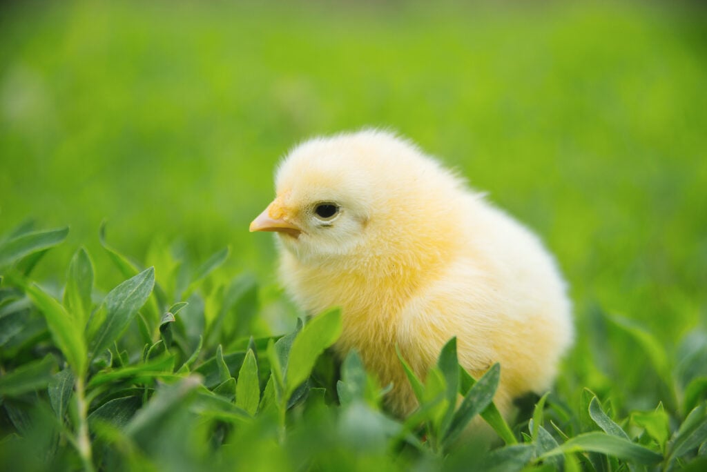
If you’re working on a seasonal design, you can’t go wrong with almost any pastel shade. But one of the most popular and vibrant is soft yellow. It’s the color of most baby chicks, and baby chicks are one of the most universally recognized symbols of spring.
Whether you’re using it in a digital design or an interior, pastel yellow is a solid choice — you just need to make sure you have a dark enough background for it to stand out. Soft shades of yellow tend to fade away into white backgrounds, but if you include a darker background (or even something just a little more saturated, like the green grass in the photo), you can really draw your audience’s attention.
Pastel Yellow
Hex #FDFFB6
RGB 253, 255, 182
CMYK 1, 0, 29, 0
Petal Pinks

Pale pink is another color most people associate with spring. It’s a common color for flowers, and its delicate warmth makes it a fitting symbol for the gentle optimism of spring.
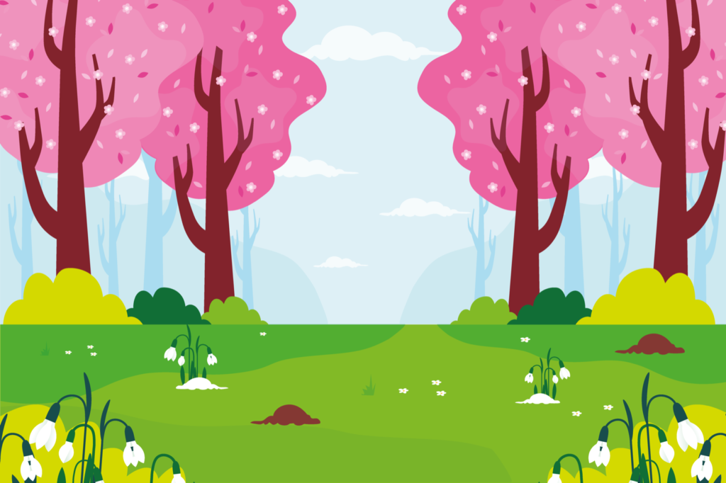
There are seemingly endless shades of petal pink — that’s one of the best parts of using this color in your own designs. You might choose to arrange a few shades in a light-to-dark ombre, as you see on the petals of the tulip tree above, or you might choose a solid shade as a background color. Or if your design includes a flower bouquet, you can even incorporate several petal pink shades at once!
Petal Pink
Hex #F2E2E0
RGB 242, 226, 224
CMYK 0, 7, 7, 5
Soothing Lavenders

The lavender plant is known for its wonderfully calming aroma. However, its cool purple hue is pretty calming as well!
Shades of light purple (and especially soft, dilute purple pastels) make us think of flowers, so you often see them included as part of spring designs. Often, that means that they’re included along with other pastels. But as the image above shows you, purple shades also do well on their own alongside shades of grassy green.
Pale Lavender
Hex #DCD0FF
RGB 220, 208, 255
CMYK 14, 18, 0, 0
Sky Blues

No collection of spring pastels is complete without the inclusion of quiet, sky-inspired blue. Winter is a season known for its often gray skies, so once the spring season arrives, the sky often appears to be a shade of light, energetic blue.
As you might imagine, shades of sky blue do especially well along with cloudy shades of white. If you want your design to make your audience think of the great outdoors, sky blue is an ideal choice of background color.
Sky Blue
Hex #87CEEB
RGB 135, 206, 235
CMYK 43, 12, 0, 8
Mint Greens

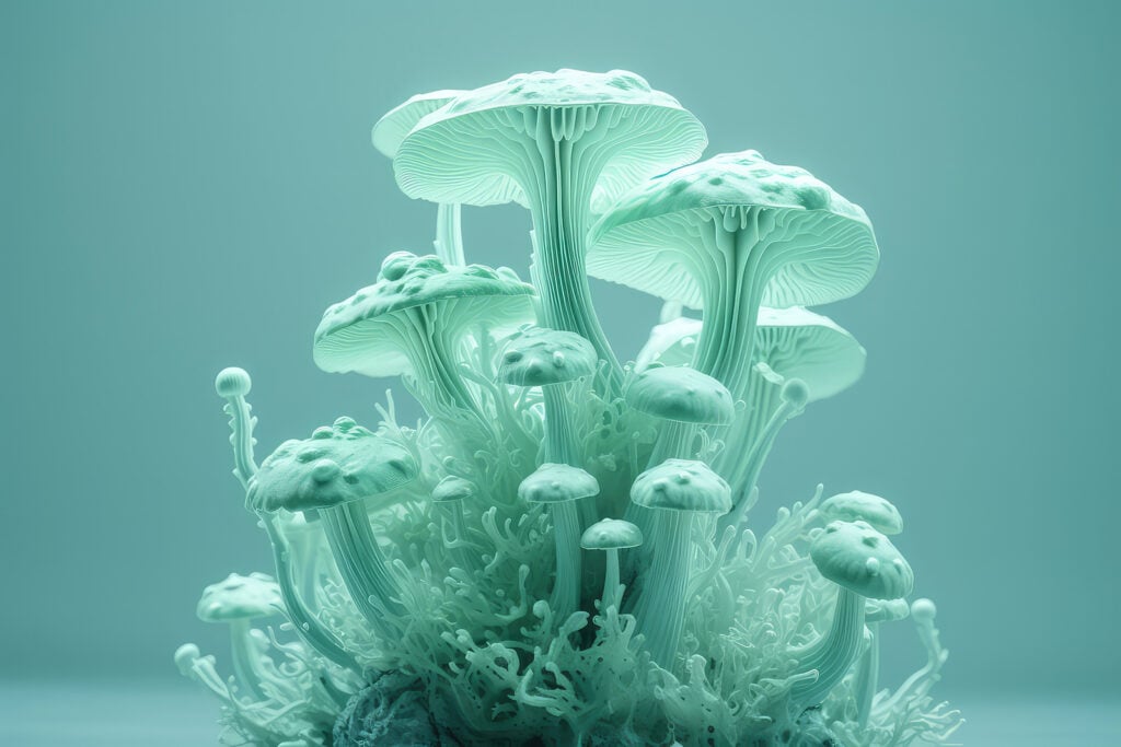
Not all spring colors are typically found in nature. Mint green makes an appearance in all manner of designs, but you don’t see it out in the natural world as you see many other spring colors. The name may make you think of mint leaves, but if you’ve ever seen a mint plant, you know that its leaves are closer to being kelly green.
Nonetheless, mint green is a pastel shade whose general coolness makes it a great companion for many other spring colors, particularly warmer ones. It looks especially nice next to shades of petal pink and pastel yellow!
Mint Green
Hex #A2E4B8
RGB 162, 228, 184
CMYK 29, 0, 19, 11
Soft Turquoises

At first glance, you might associate turquoise with summer. This bright, lively shade comes close to the color of tropical seas, and its warmer undertones make it right at home next to sunny yellows and bright, cool whites.
However, when you dial down the saturation and create a paler, more washed-out shade of turquoise, you create a color that will do beautifully in almost any spring palette. Pale turquoise isn’t the most common shade in nature, but it’s effectively a mixture of sky blue and mint green — two outstanding spring shades.
Soft Turquoise
Hex #74CED2
RGB 116, 206, 210
CMYK 45, 2, 0, 18
Sherbet Oranges

Last on the list is a soft pastel shade that’s right at home with the whole rainbow of pastels.
Orange is generally known as a loud, bright color that attracts attention. When you incorporate paler shades of orange into your design, you can harness some of that positive energy without letting it overwhelm the rest of your color scheme.
Orange Sherbet
Hex #FFD2A6
RGB 255, 210, 166
CMYK 0, 18, 35, 0
Harnessing the Spirit of Renewal: Using Spring Colors in Your Own Designs

Now you have an idea of some of the best spring colors to use in your designs. But choosing the colors to use is a small part of the design process. How you use them is equally critical.
Not sure what your next steps should be? Here are some suggestions for successfully deploying whatever spring colors you choose.
Keep Things Grounded
Many spring colors are pastels (or very close to being pastels). It’s possible to create a project that uses only these colors, but more often than not, the designs are so pale that they don’t seem grounded.
Fortunately, if you’ve created a spring-inspired design that’s starting to look a little too ethereal, there’s an easy fix. You might already know that darker colors (and especially darker neutrals) are a winning choice for keeping color schemes grounded. You just need to add a bit of a darker neutral — it doesn’t take much!
For instance, say you’ve illustrated a little spring scene on a pale blue background. Because all the colors are so pale, the design seems like it needs something else. If you add a charcoal gray border, you can ground the look without disrupting it.
Beware of Color “Clichés”
If you’re a creative writer, you know to stay away from clichés like “less is more” and “diamond in the rough.” But did you know that there are color clichés, too? And just like a writer will typically try to phrase clichés differently, a good designer will do their best to avoid tired color combinations.
So what exactly is a color cliché? A great example is the combination of pastel pink and baby blue. This pairing has been used to advertise baby products, announce new births, and adorn the covers of baby books. It’s become so closely associated with babies that your audience will probably think of babies no matter where they see it!
That’s not to say that you should never use pale blue and pink together. Just be sure that your design doesn’t prominently feature both pink and blue at the same time.
Here’s an example. Let’s say you need to create a polka-dot design. If you use a pastel pink background and light blue polka dots, your design is probably going to remind your audience of babies. However, if you keep the pink background but add blue, orange, green, yellow, and purple polka dots, there will be so many different colors that the baby connotation won’t be there.
Don’t Make Your Design Too Busy
Once you’ve decided to create a design that centers around spring colors, you might be tempted to use as many of these shades as possible. Don’t do this!
Some designs (like images of flower bouquets or wildflowers in a field) do perfectly well with a wide range of shades. But most designs will be easily overwhelmed by a huge range of colors. In many cases, it’s best to select a main shade and a couple of accent colors.
Bring the Beauty of Spring to Your Next Design
Spring is the season of renewal, so it’s only fitting that springlike colors can refresh and renew your current project (or even your approach to design as a whole). As a bonus, most spring shades go together beautifully, so it’s easy to create patterns and other intricate designs your audience will love!
Learn More: Explore the four seasons and find out how seasonal colors affect us.


