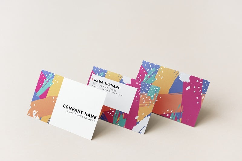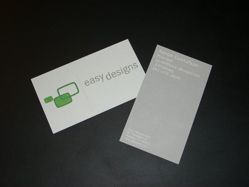
Your business card can be the first introduction to potential clients and, when properly designed, can be a powerful business tool that represents you and your business. Designing a business card can be fun, exciting, but also challenging. Most people know what content goes on a business card but they are stumped while selecting the card’s color scheme. Many opt to use their lucky colors for their visiting cards or business cards, but this may not always have the desired effect. It is vital to choose a color that is sober, elegant, decent and represents you and your business without being loud or harsh on the viewer’s eyes. This is where knowing the different color meanings come in handy. Your logo also plays a crucial role in the overall look of the business card as well; so always design your card after you have designed your logo.
In this guide, we will take a look at some of the more popular business card colors that are trending these days. Later on, we will also discuss tips that will help you select your business card colors along with important advice on selecting the font, content, and other elements that make a business card.
Here are some business card color schemes that are trending these days.
Background and accent colors for business cards and their meanings
Black

Black is a great background color for business cards. It represents sophistication and is associated with high technology. It can be ideal for use with text and logos that stand out against the black. Avoid using a black background color for your business card if your logo is also black in color. Black cards do well with silver, white, or gold text. It also pairs well with most lighter colors.
White

Some of the most popular business cards are white in color. White opens the doors to possibilities like the use of color ink other than black. Your business logo will definitely stand out against the white or off-white background. White also denotes equality, neutrality, trustworthiness, peace, and fairness. It pairs beautifully with black text. You can use white with almost every dark color available out there.
Brown

Brown makes a great background color for a business card. It denotes security and protection and also instills a sense of seriousness. Based on color psychology, brown on a business card or logo can indicate that the individual or company is serious about their duties and evokes a feeling of responsibility. At the same time, brown indicates loyalty, safety, and suppression of emotional conflicts. Brown pairs well with white, yellow, silver, and black. Orange and yellow are some other hues that do well on a brown background.
Gray

Gray has unfortunately received a bad rap, but as a business card background color, it represents strength and longevity. There are many shades of gray and they all indicate intellect and strife for knowledge, truth, and wisdom. Medium grays are resolute, subtle, conservative, and dignified. They also represent an understated authority. Gray is a perfect neutral color that can make a great business card when paired with colors like silver, black, and even brighter shades like orange and aquamarine.
Pink

One might think that pink is generally used only for feminine businesses like beauty, salons, spas, florists, etc. However, many people use pink subtly in their business cards as an accent color with white, black, and/or gray and the combination looks classy, elegant, and also ‘masculine’. You can choose between hot pink to soft, baby pink or blush tones for a cool business card scheme.
Orange

Many colors go well with an orange-colored business card scheme, although the most popular colors to pair up with it are black and white. Orange is viewed as a radiant, high-energy color. It represents a business that is friendly, practical, sympathetic, and stimulating. Being a combination of red and yellow, orange takes on the characteristics of both colors: passion and energy of red and intellect and warmth of yellow.
Blue

Blue is a calming and cool color. It symbolizes harmony, peace, and freedom; the ocean and the sky. Too much blue can symbolize sorrow or melancholy, so it is best to pair it up with white, black, or other shades of darker and lighter blues. Many business cards use a plain white background with accents of navy blue or light blue. It is a popular color in the business world; navy blue business suits are considered as highly professional, for both men and women. It is also considered a masculine color in most of the world although, in places like Iran, blue is undesirable.
Red

Red makes a great background color or accent color for a business card. You can pair it up with white or black. Black lettering on a red business card stands out and looks elegant.
Purple

Purple is associated with wisdom, dignity, royalty, mystery, independence, and magic. This color also symbolizes spirituality. As far as business cards go, purple is combined mostly with white or black. If you make purple as the background of the card, it can be paired with lighter hues of yellow or orange.
Factors to consider when designing business cards
If you are in a creative business, you can select several colors or go in for a bright and attractive business card. On the other hand, financial consultants need to stick to 1 or 2 colors and keep the look sober. In general, keep the following tips in mind when designing your business card:
Use your logo
Your logo is the most important element of your card and you should use it to determine the colors of the final business card design. The logo’s color will decide the background color as well as the font of the text as well as the size of the card.
Should be legible
Whether you choose a single color or multiple colors for the background of your business card, make sure that the writing on it is legible. Never use all-capital letters, or underlines. The font should be easy to read and convey all the information a potential customer may want about your business.
Should be easy on the eyes
While it is tempting to select your lucky colors for your visiting cards, make sure that the card background color is easy on the eyes. The font and the color should contrast and make it easier to get the important details.
Use the backside
A blank backside of the business card is comparable to the waste of valuable ‘real estate’. Make sure you add your location, key points about your business, appointment scheduling details, etc.
Seek professional help
If you are unsure about the right color scheme for a business card, you may want to get a consultation with a professional graphic design specialist. These professionals can show you plenty of business color card samples so you can make an informed choice. You can always have a say about the contents and color schemes, but these professionals will give the right guidance as to what will and won’t work. They also have software tools that can help you see your card on the screen so that you can make changes as needed.
Conclusion
Once you have your logo, you can go for printing your business cards. After all; nothing speaks volumes about a business as a business card does. If your business markets children’s toys, go for a brightly colored business card. On the other hand, if you run a financial consulting service, choose a background color for the card that symbolizes professionalism and reliability. In such a case, stick to professional colors like white, beige, or gray background. In any case, it is best to stick to 1 or 2 colors only.


