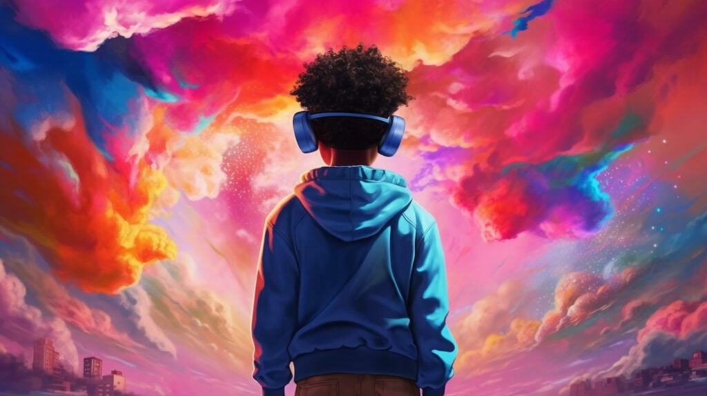
What do you look for in a video game? Maybe you like games with surreal, dystopian settings. Or maybe you prefer laid-back, colorful worlds.
There’s a lot that goes into the design of video games and virtual reality experiences. The highly technical aspects of design are certainly important. But so is color — it’s been shaping our experience of the world since the dawn of time. Game designers know that, and they carefully design and deploy color schemes to deliver the best possible experience.
How Color Shapes User Experience
Unless you move through your daily life while paying special attention to color, you likely aren’t fully aware of how it impacts you. Whether we’re paying attention or not, color has a profound ability to shape our experience of the world!
Color plays a critical role in video games and virtual reality as well. Here’s a rundown of how colors work with other game elements to create a memorable experience.
Game Branding

Well-chosen color palettes set the tone for each room you enter, book you open, and album you listen to. They do the same for video games and virtual reality simulations. A general trend has emerged over the years: more “casual” games tend to use brighter colors with less nuanced palettes. First-person shooter games and other complex games focused on realism tend to have more nuanced color palettes that are darker overall.
Although it’s likely a subconscious association, this color palette trend helps advertise games to their intended users. For instance, if you walk into a gaming store in search of a war simulation game like Call of Duty, you probably wouldn’t walk toward a shelf of games with rainbow cases.
Creating Emotion

In video game design and virtual reality design, developers work to create a world for players to explore. The structure of that world is one thing, and the color palette used is quite another.
Take a look at the game scenery shown above. The sun illuminates the flowing creek and the green grasses. Snow-capped mountains reach up into a bright blue sky. The result is a cheery, inviting landscape that practically asks to be explored.
Now imagine that same landscape with a different palette. If the scene had a darker cast, barren ground, and mountains silhouetted against an ominous sky, you’d probably have a different reaction. A darker color palette like this helps to create a sense of foreboding that signals possible danger to players.
Virtual reality and game designers often use a technique called “color grading” to shift a scene’s palette and create emotion. Color grading slightly alters the colors of an image to create a stylistic effect, and it’s commonly used in film and photography. If you’ve ever used an Instagram filter, you’ve used a basic form of color grading.
Guiding Users Through the Game

Without color, it would be difficult or impossible to know how to navigate a video game or virtual reality experience. If you enter a world that is in black and white with no distinguishing features, you’ll have a hard time knowing where to go, what items to collect, what characters to shoot, etc.
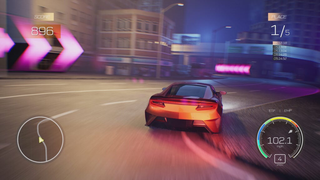
The car racing game pictured above offers a fairly obvious example of how color can guide you through a game — neon pink arrows help guide the player through the course. Because this color stands out from the rest of the landscape, it’s almost impossible for a player to miss! Games can use illuminated paths, spotlights, brightly-colored objects, and other similar features to help users know what to do next.
Time and Level Progression

One of the most satisfying things about video games is the progression through different levels. Games aren’t just a continuous slog until you get to the end — each level brings its own challenges, its own rewards, and usually, its own color palette.
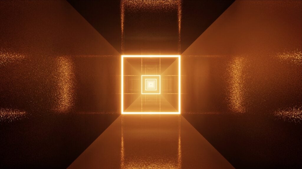
In the example picture, the doorway isn’t the only sign that the player is moving on to another level. As you can see, the level ahead has a cool blue glow, and the current level is orangish.
In realistic games like Red Dead Redemption 2, color can also give you a sense of time. The game cycles through day and night so players feel as though they’re truly immersed in a real-life experience. However, some users have complained that the day/night cycle is far too fast!
Indicating Danger

Imagine you’re playing a game involving rival armies or factions. Without color, you wouldn’t know which players or characters to shoot. But if you know that your enemies are wearing blue, you’ll be able to react quickly to neutralize threats before they pose a risk to you.
In first-person shooter games, the color of the crosshairs can also help you make split-second decisions on whether you should shoot or not. In many games, crosshairs will turn red if you have an enemy in your sights. If you turn your gun on a teammate, the crosshairs turn green, indicating that you shouldn’t shoot.
Communicating Object Function

Especially in games with complex worlds, it can be difficult for a player to know which objects to interact with. For that reason, some game developers use colors to help players understand the importance of different objects.
In some games, the bar indicating the player’s health is green, so objects that can support and improve health might have a green glow. The color blue is often associated with armor or protection, so protective objects might have a blue glow.
However, much to the consternation of some avid gamers, color symbolism across games is not always the same. For instance, some games use a red aura to show that an object will replenish a player’s health.
Color Psychology in the Real World and the Virtual World

Colors affect our moods and even our actions in daily life. So it makes sense that they would also shape the choices we make in both video games and virtual reality.
It seems logical that colors would impact us in the virtual world the same way they impact us in the real world. However, a study published in the journal Brain Sciences found that study participants reacted differently to some background colors in a virtual reality setting than they did in reality. Below is a quick summary of how different colors influenced study participants in reality and virtual reality.
Red

In the real world, red is associated with very high impulsivity. So of course, in the study, the red background caused participants to act impulsively and have a high error rate in reality.
In the virtual reality portion of the study, that error rate was even higher. But the researchers found something very surprising — red actually wasn’t the color that was most highly correlated with impulsivity. Instead, orange was the color that was most closely linked to impulsive behavior.
Orange

In reality, orange backgrounds seemed to increase impulsivity (although they didn’t make participants as impulsive as red backgrounds did). And as we saw above, in the virtual reality portion of the study, orange appeared to make participants the most impulsive of all.
Orange backgrounds also were connected to a somewhat high error rate in the real world. But in virtual reality, it seemed to cause even more mistakes. Orange backgrounds were second only to purple backgrounds when it came to error rates.
Yellow

Yellow is bright and is sometimes associated with danger, so you might think that it would make study participants become more impulsive. However, in both reality and virtual reality, yellow backgrounds were linked to the second-slowest response times. (Purple backgrounds were linked to the slowest response times in both reality and virtual reality.)
When it came to error rates, yellow presented an interesting paradox. In reality, the accuracy associated with yellow backgrounds was second only to that of green backgrounds. But in virtual reality, the yellow-background error rate was close to that of red and orange.
Green

Across both real life and virtual reality, green seems to be the winning color, at least if you want to optimize attention to detail, logical thinking, and lateral thinking.
Study participants maintained a fast response time and made the fewest errors with a green background in both situations.
Blue

Blue is generally considered to be a calming color, so it’s not surprising that it didn’t seem to make participants particularly impulsive in either reality or virtual reality.
However, when it came to accuracy, blue seemed to affect participants differently in reality and virtual reality. In reality, blue’s error rate was second only to that of red and purple. In virtual reality, its error rate was comparable to that of green (and sometimes even lower!).
Purple

Of all the colors in the study, purple seemed to be the least helpful for participants. In the real world, purple backgrounds were linked to the slowest response times and the highest error rates. In virtual reality, purple backgrounds still seemed to cause the highest error rates, and the response times were among the slowest.
Of course, more research will need to be done into the effects of color in reality and virtual reality. But this study opens up new possibilities for game designers and developers. If they can gain a greater understanding of how different colors work in virtual reality vs in real life, they can continue to optimize user experience.
Building Worlds, One Color at a Time

Video games and virtual reality provide us with an often-needed escape from real life, plunging us into new worlds altogether. Thanks to careful color curation (and an impressive knowledge of color theory), developers can create worlds we can’t wait to return to again and again.


