The world of color is an amazing landscape, combining both physics and biology. For centuries, humans have studied the art and science of color, using it in everything from ancient cave paintings to modern graphic design. People across the world have given cultural meaning to symbolic colors in their histories and recorded memory.
It comes as no surprise, then, that humans would eventually codify the science of color theory, which includes the concept of additive and subtractive colors – the two methods of producing color. This article delves into additive color theory and how it is used today, but first, let’s consider the very basics of color.
What Is Color?
Interestingly, color is actually described as the perception of different wavelengths of light. This means that even though color is considered to be contained within light, perception of what we know as color takes place in the brain. Science has shown that light is made up of particles called photons, which travel through space as energy waves. These waves consist of varying amounts of energy, creating a variety of wavelengths. As these wavelengths hit the human eye, they appear as different colors.
The Science of Light

Energy waves, including the wavelengths of light, are grouped together on the electromagnetic energy spectrum. This spectrum ranges from x-rays and ultraviolet light on the shorter end, to longer waves such as radio and infrared on the opposite end. Visible light falls somewhere in the middle, between 380 nanometers to 780 nanometers. Our eyes are only able to detect this small range on the spectrum, which we call the visible light spectrum.
The wavelengths of light that we perceive as blue are located at the shorter end of the spectrum, while longer wavelengths result in the color we perceive as red. In the middle is green, making up the third of the trio of colors at the root of the additive color system. Red, green, and blue (RGB) are the predominant colors that our eyes recognize using receptors in the eye’s retina called cone photoreceptors.
How Do Humans See Color?
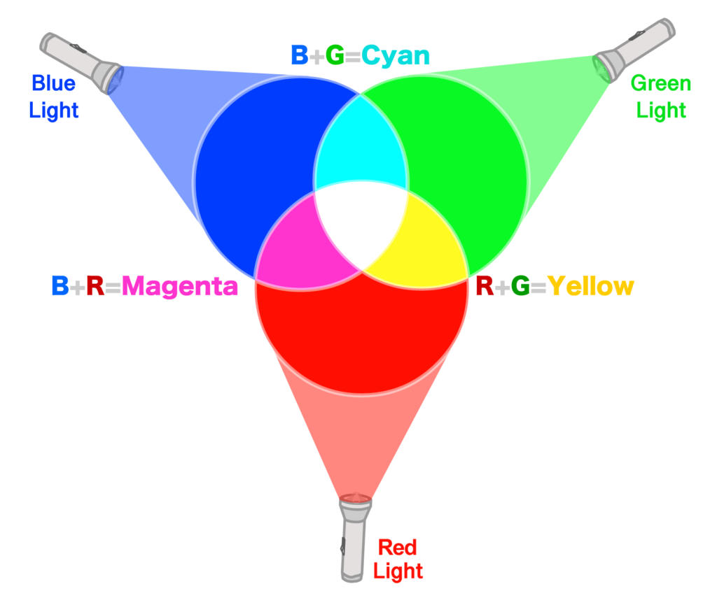
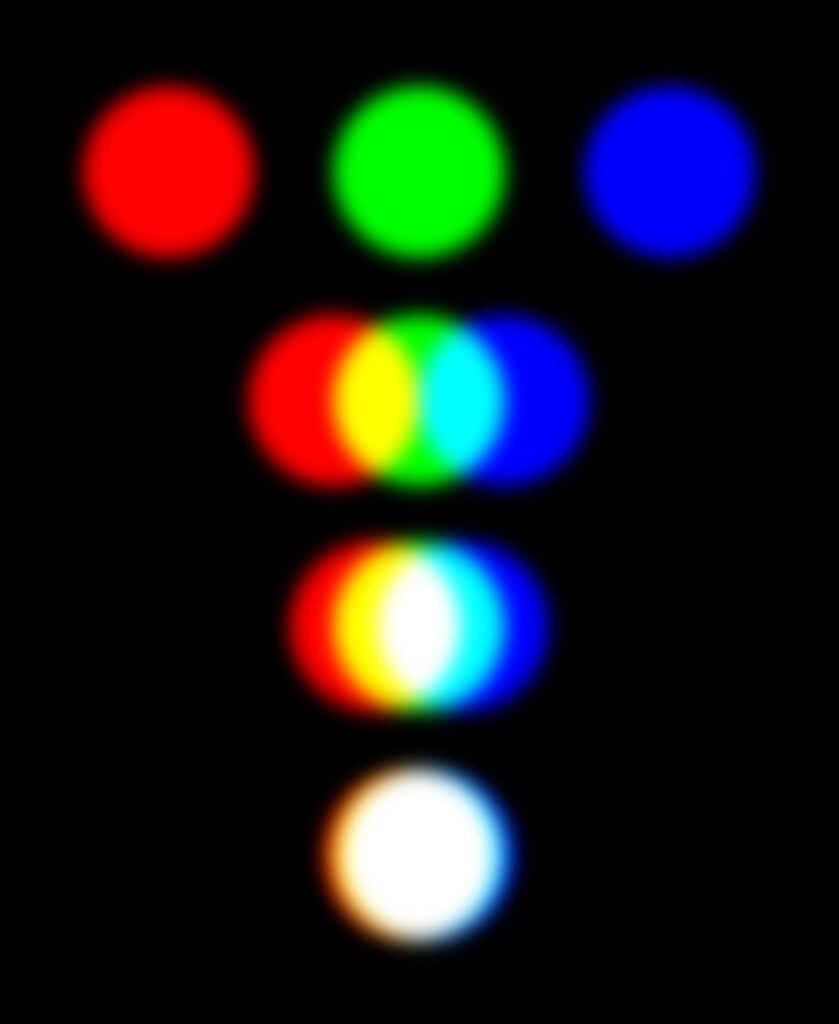
Color vision in humans is grounded in the additive color theory, which posits that all colors perceived by the human eye can be created by combining various amounts of red, green, and blue light. For instance, mixing equal proportions of each of these three colors gives the color white. The absence of additive colors gives the color black. Therefore, additive colors begin as black, and then move increasingly toward white as various proportions of red, green, and blue light are added.

Origins of Additive Color Theory
James Clerk Maxwell
Additive color theory is often attributed to 19th century scientist and mathematician, James Clerk Maxwell. Hailing from Scotland, he was the first to describe magnetism, electricity, and light as energy waves moving through space. Proving that light moves in undulating wavelengths and is part of the same phenomenon that is the cause of electromagnetism and electricity became the basis of what was to become color theory. His contributions to the science of electromagnetism have been credited as the most important research in the field following the work of Isaac Newton.
Hermann von Helmholtz
Hermann von Helmholtz was also a 19th century physicist who pioneered research in the fields of color vision, depth perception, and motion perception. He invented the ophthalmoscope, which was used to see inside the human eye. This was revolutionary for his time, and it spearheaded the discovery of the biological components of the eye that perceive colors.
Thomas Young
Both Maxwell and Helmholtz stood on the shoulders of 17th century polymath Thomas Young. He provided the original research that led scientists to understand that light travels as waves, not particles (as Isaac Newton had postulated). Young’s contributions earned him a reputation as the founder of physiological optics. He proposed the ideas that foreshadowed the proven hypothesis that the human eye has three receptors sensitive to the colors red, green, and blue.
Young-Helmholtz Theory of Trichromatic Vision
Together, Young and Helmholtz corroborated and furthered the research that eventually led to the development of the theory of trichromatic vision. This theory postulates that the physiology of the human eye is responsible for the experience of color vision. They determined (correctly) that the shorter wavelengths on the visible spectrum would be perceived as blue, the middle wavelengths as green, and the longer wavelengths as red.
Practical Uses of Additive Colors

Additive colors have been applied in a variety of settings, from theater productions to the design and testing of electronic displays. The RGB color wheel is often applied by graphic designers and web developers who mix colors that will appear on a backlit screen, such as a computer monitor or television screen. The pixels begin as black and then take on various shades of color as percentages of the primary red, green, and blue colors are added. Every time you create a design on your computer, you are using additive color theory.
Web and print designers must thoroughly understand and apply the science of color addition and subtraction since a design is displayed using additive colors, but will print using subtractive colors. So, even though a decent computer monitor can display up to 16,000,000 hues, printing methods are limited to a much smaller percentage of colors. Remember, the eye perceives color based on photoreceptors, and once a design moves from the screen to printed material, the ink and paper affect how the light passes through and reaches your eye to create perceptible color.
Marketing
It can boggle the mind how three colors can create a landscape of hues, tints, tones, and shades that humans use for everything from self-expression to business and marketing. Graphic designers are trained in the various language and science skills needed to strategically plan their projects. Additive color theory gives rise to several concepts well-known to the design world.
A reigning design model in modern graphic design is called user experience (UX) design. The goal of this model is to create designs that impart meaningful experiences to the human beings witnessing or using the design. To understand how to invoke these meaningful experiences, the artist must be both intuitive and skilled. Modern designers have created subgroups of techniques deriving from additive color theory, including color schemes that focus on hue, chroma, and value.
Hue refers to how a color appears (e.g. red). Chroma describes the purity or saturation of the color, meaning whether it has any tones, tints, or shades added. Value refers to how dark or light the color is. The lightest colors have the highest value. These elements are critical to the development of a UX color scheme and design.

Color Schemes
The additive color model is used in screen design, where artists strategically place color elements to create attractive interfaces and optimize the user experience. There are several color schemes, including monochromatic, analogous, complementary, and split-complementary.
Monochromatic schemes center around a single hue and using different shades of it. Analogous colors refer to the use of shades and tints of color that are next to each other on the color wheel. Complementary colors are used to create contrast – they apply opposite colors (e.g. yellow/blue) to create contrasting elements. Finally, split-complementary schemes take the contrast created in complementary schemes and add additional color from either side of the opposite complementary pair to soften it.
Psychological Effects
Understanding elements of additive color theory is critical for artists, but it also has a place in psychology. Colors affect perceptions and emotions, which then affect behaviors. Color choices and application in design can allow artists to evoke different sorts of emotions depending on the particular colors chosen. Color theory helps designers understand how to use these color schemes to elicit the desired emotions that will lead to a better perception of a company’s brand, product, or service. Combining the psychological effects of color with the user experience businesses hope to achieve has catalyzed a whole new world of marketing tools.
Color theory is complex enough in itself, but it is further complicated by the fact that each individual will respond to colors in their own unique physiological, psychological, and physical way. Nonetheless, artists, graphic designers, and scientists have effectively measured human responses using additive color systems within a controlled environment. Given a basic understanding of the observer and the observer’s angle of viewing, as well as knowledge of the light source and its components, we have recorded a breadth of knowledge about how color affects human emotion.
Since additive colors are so critical to designers in both print and digital advertising, it bears repeating the key takeaways of color theory. First, additive colors refer to the shades created by superimposing the three primary colors detected by photoreceptors in the human eye: red, green, and blue. Second, graphics on television and computer monitors are the most common forms of additive light. Finally, any student of graphic design will find it vitally important to learn and understand the basic color theory terms.


