
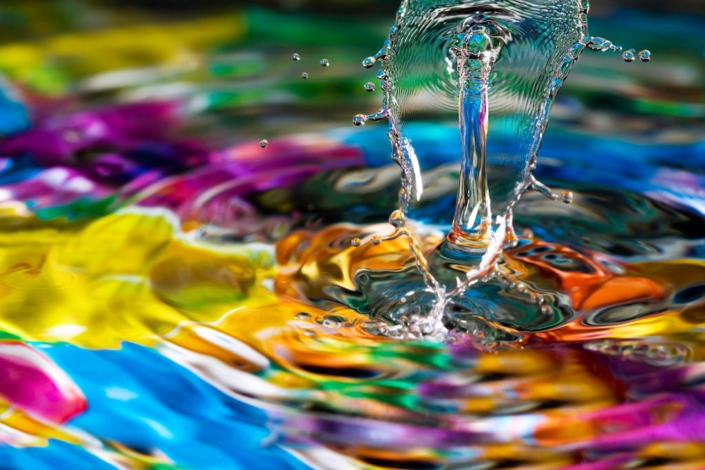
When colors come together in art, they have the power to evoke strong emotions and affect our mood. Artists often use harmony, tension, and other unique color combination methods to shape how we feel.
To better understand how the psychological effects of color collisions work, let’s take a closer look at how these methods are achieved and how they’re intended to make us feel. They might even inspire you to take a new approach for your next design.
What Is Color Tension?
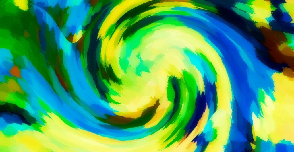
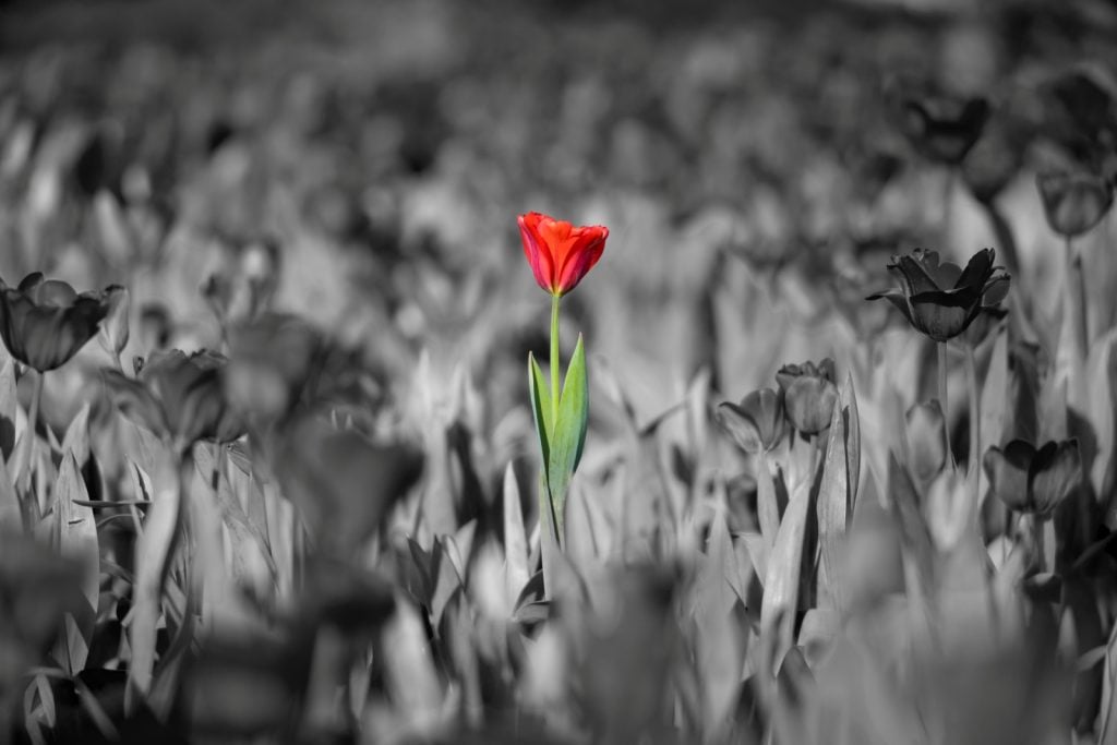
When colors contrast, that creates a form of tension, meaning there’s a sense of strain among the hues. The colors clash or pop next to each other rather than flowing naturally. While this might sound like an issue, it looks great when used strategically in the right context.
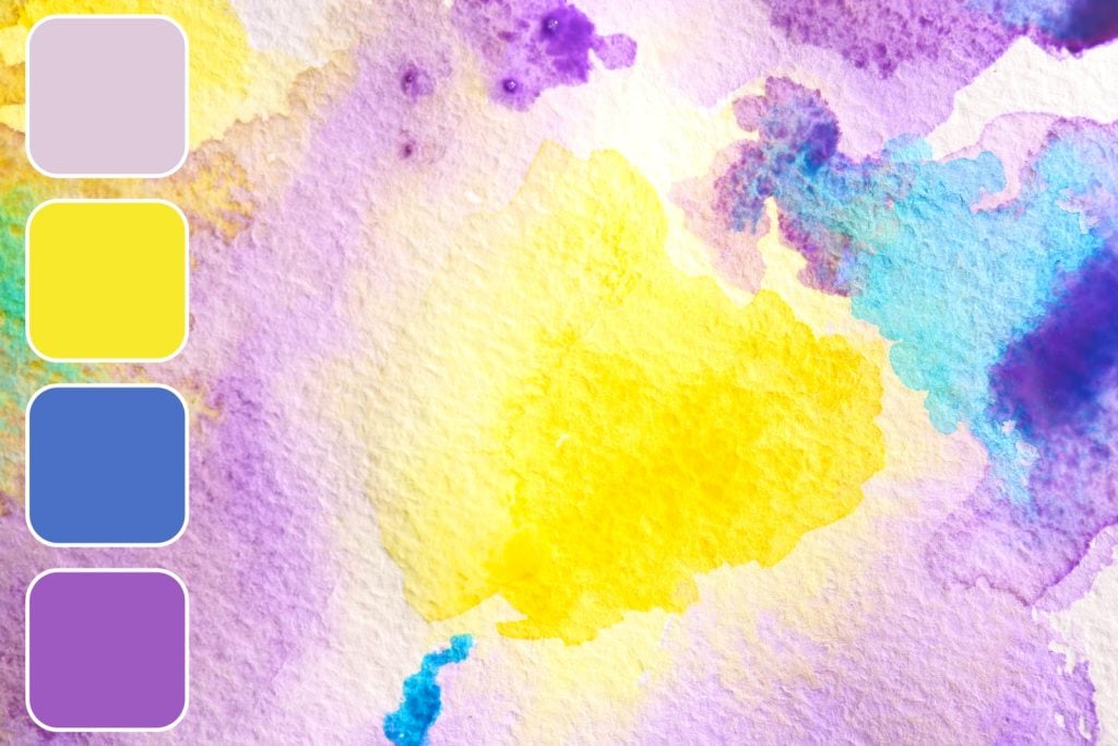
One example of creating tension among colors is the use of complementary colors, which are colors located on opposite sides of the color wheel. This includes blue and orange, red and green, and purple and yellow. Since these colors are so far apart on the color wheel, they’re very different from each other. So, while complementary pairs are considered a type of color harmony, when the two unique colors are placed next to each other at full intensity, they create a strong contrast that makes them stand out and feel tense.
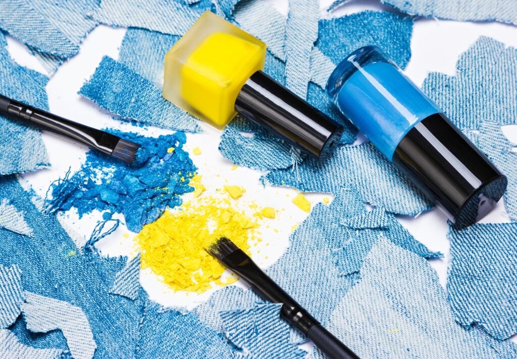
Another way to create color tension is to pair colors of different saturations. A vivid color next to a pale color can create some contrast, even if they’re very similar colors otherwise. Pairing warm and cool colors can also create some tension since those colors evoke different feelings (warm colors have lots of energy, while cool colors are relaxing). Overall, using two very different colors next to each other in a design is a unique way to make colors collide and help them stand out.
How Does Color Tension Make Us Feel?
Contrasting colors can create strong reactions. They draw your attention to a specific area of a design, so tension is great for focal points of paintings and room designs. These color combinations can make people feel intrigued or alert as they examine the highlighted element. In large amounts, color tension can overwhelm people, so it should be used sparingly for best results.
What Is Color Harmony?
Color harmony occurs whenever there’s a pleasing color combination, much like how the term harmony refers to bringing people together and creating a sense of unity. These colors are easy on the eyes rather than popping out at you. They make your eyes glide naturally from one area of a design to the next without any obvious color patterns sticking out.
Colors next to each other on the color wheel (analogous colors) usually provide harmony. For example, blue, blue-green, and green go together peacefully because they’re similar while still offering a little variety. Tints and shades of the same color (monochromatic colors) can also offer harmony due to their similarity.
Any color scheme that complements each other without any hues that stand out can offer harmony. Designs that are meant to be in the background rather than as a focal point work well with only color harmony rather than tension.
How Does Color Harmony Make Us Feel?
When colors offer harmony, there’s a sense of peace, comfort, and balance. These harmonious color combinations are easy on the eyes, making them ideal to look at while relaxing. They can be used in large amounts without overwhelming people because there’s a smooth transition from one color to the next. Harmonious palettes are usually the go-to approach, but adding a touch of contrasting colors can bring variety and keep the design engaging.
Practical Ways to Use Colliding Colors for Psychological Impact
Knowing how different types of color schemes affect us is only the beginning. It’s also important to know how to implement color combinations into designs to make them evoke the correct feelings. Consider the following tips for creating your design while staying true to your creative vision.

Include Both Harmony and Tension
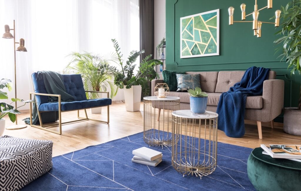
A design doesn’t have to be restricted to one color scheme. Rather than focusing only on harmony or tension, use a balance of both whenever it makes sense. Most designs have peaceful areas that are easy to look at, with some pops of colors that create tension. Having some of each offers the best of both worlds. The sweet spot is to use harmony as the foundation and tension as the accent.
For example, most of a room could have cool colors and neutral colors to create a soothing atmosphere. Yet, if there’s an area of the room that you want your eyes to be drawn to first, such as a chair or painting, have that be made up of warm colors to help it stand out.
Use Harmony for Backgrounds
Creating a sense of harmony is perfect for any patterns that you want to blend into the background. This is great for the sky and ground in a landscape painting or the walls of a room, since you want those aspects to look appealing without drawing in too much attention. When in doubt, choosing colors that look peaceful together is the way to go. You can even fill a whole room with colors that complement each other if there isn’t anything specific you want to stand out.
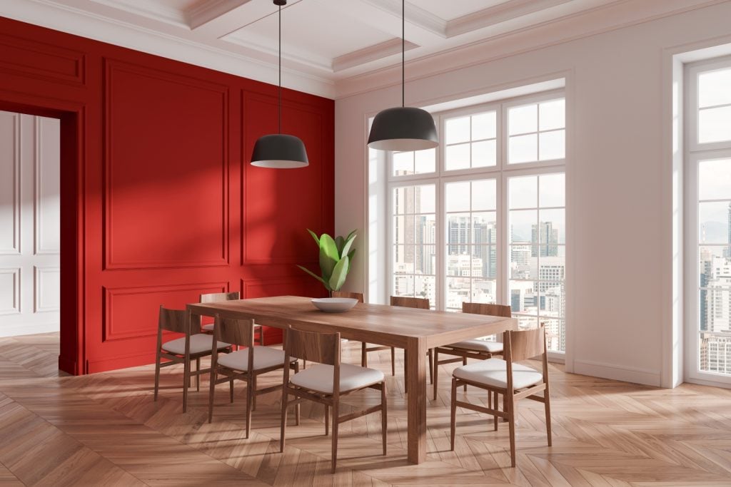
Create Tension for Focal Points
Since tension creates very different feelings and reactions, it doesn’t work well for background items. Instead, you should focus on contrast for areas that you want the eye to be drawn to first. This could be the main aspect of a painting, large text in an advertisement, or your favorite piece of furniture in a room. Any time you want something to pop out, choose a color that’s very different from the rest while still complementing the design. This focal point should be small rather than taking up the majority of a space.
Follow Basic Percentages
When you have two or three main colors in a design, having a sense of balance can bring it all together. If you’re unsure how much to use of each color, consider percentages like 80/20, 60/40, and 60/30/10. While 50/50 can sometimes work when you want two colors to neutralize each other, having a main color is often the best way to guide your eyes around the design. The color with the highest percentage is usually the background color, while smaller percentages act as focal points, making them great for contrasting hues.
Stick to a Specific Color Palette When Needed
For most art pieces, you can pick just about any colors you’re drawn to. Yet, if your design is part of a brand or a house’s interior design, it’s important to create a cohesive look among all designs. For advertisements and other marketing materials, make sure you include the brand’s colors, if applicable, to maintain a recognizable look for the company. Interior design typically has some consistent colors throughout the whole house, so keep that in mind when designing specific rooms. Knowing which colors to start with can help you decide which hues to pair with them.
Think About Each Color’s Meaning
Choosing colors is about more than looks. It’s also important to consider how the colors make people feel. For artwork and marketing designs, you really need to get into the head of your audience. How do you want them to feel when looking at your design? If it’s meant to be exciting, then vivid colors should do the trick, but cool colors are better if you’re looking for a calming design.
For interior design, how do you want people to feel while they’re in the room? If it’s a room for relaxing, such as the bedroom, soothing colors like blue are great. Yet, social rooms like the living room and dining room could benefit from more upbeat colors. It all depends on how you want people to feel in each environment.
Here’s what each color generally means:
- Red – Passion, energy, action, and strength
- Orange – Enthusiasm, emotion, optimism, and youth
- Yellow – Happiness, optimism, positivity, and intellect
- Green – Harmony, health, safety, and growth
- Blue – Trust, loyalty, responsibility, and security
- Purple – Spirituality, imagination, royalty, and mystery
- Pink – Love, compassion, playfulness, and femininity
- Brown – Stability, reliability, comfort, and honesty
- Black – Power, sophistication, elegance, and protection
- Gray – Compromise, control, neutrality, and practicality
- White – Purity, innocence, perfection, and cleanliness
Discover what all the colors mean with the interactive Color Meanings Explorer.
Colors can have different meanings depending on the context and the colors paired with them, but it’s always a good idea to keep these basic meanings in mind when creating a design. The emotions that colors evoke play a huge role in how well your design comes together.
Colliding Colors Create Deep Meanings
Combining colors in unique ways is an essential part of evoking strong emotions in designs. Utilizing both harmony and tension in one piece is a great way to convey complex emotions while helping people understand your message. Of course, every design is unique, so while the above tips are great for guidance, it’s okay to get creative and follow your own vision. Just keep harmony and tension in mind when combining colors.
As always, consider the meanings associated with each color while carefully selecting the hues to use. Colors affect emotions more than most people realize, so it’s important to use that to your advantage when creating an impactful design. Whether you want people to feel relaxed, enthusiastic, or even hungry, choosing specific colors and color schemes can help you achieve that.


