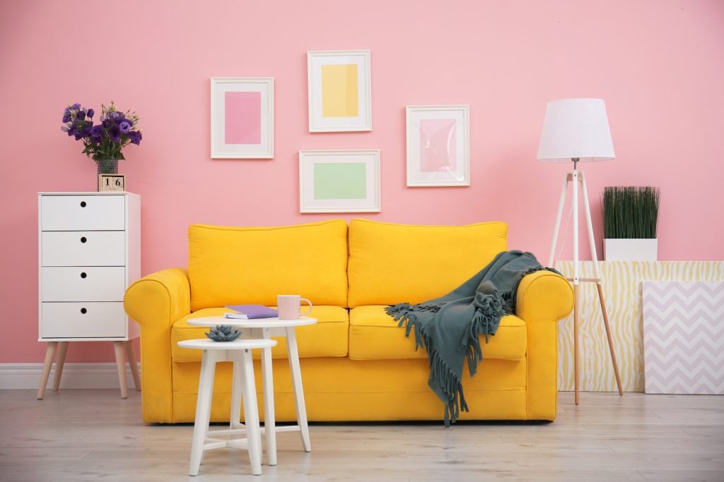
Yellow and pink are two vibrant, uplifting colors. So, they’re commonly associated with happy events, like spring and Mother’s Day. These two colors go well together in designs, but many people don’t think about mixing them. That’s a real shame because the mixture can help make art even more unique.
So, what color do yellow and pink make when mixed, and will that creation vary based on the medium you’re using?
What Do Yellow and Pink Make in Painting?
If you mix yellow and pink paint together, you’ll get peach. Pink is a lighter version of red, and red and yellow make orange. So, it makes sense that yellow and pink would create a tint of orange like peach. It’s a beautiful color that’s much more subtle than a traditional orange.
Understanding the RYB Color Model

RYB is the color wheel that almost everyone learned about in early art classes. It’s used for mixing paints and other hands-on art mediums. It’s a subtractive color model, which means it removes wavelengths from what we see rather than adding them. The colors are mixed by swirling two different paints together to create one.
In this color model, the primary colors are red, yellow, and blue. By mixing combinations of those three colors, you can get all the other colors on the color wheel. For example, they can create secondary colors, which are green, orange, and purple. Adding white, gray, or black to any color will create a tint, tone, or shade.
If you’re unsure how to create the perfect colors for your paintings, try experimenting with different color mixtures. Different types of primary paints may give you more unique results.
Is There an Easier Way to Make Peach Paint?
Mixing pink and yellow paint is likely the easiest way to make peach. However, if you already have orange paint, you could add more white to it to make it lighter. If you want to make the color look pinker, add a little more red into the mix. Either way, you’ll get a nice peach color.
Making Shades and Tints of Peach

Peach is already a fascinating color on its own, but you can create lots of varieties of it through shades and tints. Here are some ways to make lighter or darker versions of peach.
Mixing Lighter Colors
Tints are lighter versions of a color. Since peach is already a very light version of orange, you probably won’t want to make it much lighter. However, if you need to, you can add more white to it.
Mixing Darker Colors
Shades are darker versions of a color. So, if you want a darker peach, you can add a touch of black to the mix. Only use black paint sparingly though because it can easily overpower the other colors. Adding a little red might also darken the mixture, but then it will look much more orange than peach.
Peach Color Meaning

Peach is a tint of orange, so it shares some of orange’s color meanings. Orange is a symbol of emotion, youth, and optimism. It’s meant to encourage and uplift those who look at it. It’s also a sign of good communication.
While orange can have uplifting attributes like creativity, warmth, and positivity, it also has some negative ones. Some people view it as superficial, impatient, and dominant, but it depends on the context.
The color peach has a few specific meanings of its own, but most are similar to orange’s meanings. Peach is a sign of warmth, joy, and youthfulness. It’s meant to reflect all the happy areas of our lives, providing people with a sense of peace.
Can You Mix Colors to Make Yellow and Pink?
If you’re out of yellow and pink paint, you can create those colors if needed. Pink is easy to make since it’s a tint of red. So, just mix an equal amount of red and white to create a nice pink color. Adding more red will make it darker, while adding white will make it lighter.
Yellow is trickier because it’s a primary color. A way to make yellow paint from scratch is to mix a lot of white with orange. However, the yellow won’t be nearly as bright and vibrant as a true yellow. In lights, which we go over next, yellow is created by mixing red and green.
What Do Yellow and Pink Make in Lights?

It’s unlikely that you’ll ever need to mix pink and yellow lights. Yet, if you do, you will get a light orange color, similar to peach. This result may vary based on the brightness of the lights.
In lights, yellow is made of red and green, while pink is made of red and magenta. So, like in paints, it’s similar to mixing yellow with a different version of red. Red and yellow make orange in lights, so that’s why pink and yellow still make a light orange.
Understanding the RGB Color Model
The RGB color model is used for lights and electronic displays. It’s an additive color model because it involves adding wavelengths together.
On this color wheel, the primary colors are red, green, and blue. Those primary colors can create the secondary colors, which are cyan, magenta, and yellow. When all three primary colors mix together at full brightness, they create white.
The CMYK color model is similar to the RGB model, except it’s a type of subtractive mixing used for ink and printing. The primary colors of the CMYK color model are cyan, magenta, and yellow, while the secondary colors are red, green, and blue. These three primary colors mixed together make black.
Since the CMYK color wheel is the opposite of RGB, they both create the same tertiary colors. So, when pink and yellow mix together in ink, they’ll still create light orange.
How to Mix Colored Lights

If you already have colored lights, you can layer them on top of each other to create new lights. By following the RGB color model and by experimenting a bit, you can create many unique colors. Changing the brightness of each color can also affect the results. So, if you already have an orange light, you could tone down the brightness to create a different orange shade.
However, all colored lights can also be made by layering red, green, and blue on top of each other at different brightnesses. For example, you can make a beautiful orange by putting red at full brightness, green about halfway, and no blue. On the other hand, colors like purple can be made by putting red and blue all the way up with green at only 60%.
That’s why every popular color has an “RGB” value. It indicates its red, green, and blue intensity expressed using percentages or a scale of 0 to 255. If you work with website design, you’re also familiar with hexadecimal color notation.
Mixing colored lights is very different than mixing paints or inks. The process may sound simpler, but you need to experiment a bit to fully understand the RGB color model.
How Do Our Eyes Perceive Color?
When our eyes perceive colors and lights, a lot more is going on than we realize. In our eyes, we have cones and rods, which perceive certain colors. The colors we see fall on different wavelengths of the visible light spectrum. Violet has the shortest wavelengths, while red has the longest ones.
When we look at an object, the wavelengths that reflect off it are what those cones and rods allow us to see. For example, when we look at an apple, all the wavelengths of color are absorbed in the apple except red, which reflects off it. Thus, our eyes see the apple as bright red.
The cone cells help us see colors better in bright light, while rods are much more sensitive and allow us to see colors in dim light. The two cells work together to help us see the colors around us regardless of the lighting.
Yellow, Pink, and Peach in Design

Yellow, pink, and peach are perfect for a bright, cheerful design. That’s why they’re often used together in vibrant art pieces or lively kids’ rooms. They can be a lot to handle all at once, so you might want to tone them down by using tints of them instead.
When it comes to logos, paintings, and other types of artwork, these three colors go together because they’re all warm colors. Warm colors sit near each other on the color wheel, and they provide a vibrant and uplifting tone.
Pairing them with colors on the opposite side of the color wheel might make them clash, but if used properly, it can help a design stand out more. For example, yellow is the opposite of purple, pink is the opposite of green, and peach is the opposite of blue.
While you won’t see pink, yellow, and peach used regularly in room designs, they can make beautiful pops of color in certain circumstances. They go well with neutral pieces of furniture, such as ones that are white or beige.
No matter what medium you use, yellow and pink will always make some type of light orange. However, each mixing process is distinct and uses a different color model, so it’s a good idea to take the time to understand each one before beginning your designs.


