

Neutrals are the quiet workhorses of the color world. They’re present in many (if not most) interiors, websites, and advertisements. But we often overlook them, instead focusing on brighter, louder accent colors.
What happens if you center neutrals in your design? The results are more dynamic than you might think. If you’re prepared to venture deeper into the world of neutral shades, there are plenty of palettes to consider.
Check out these beautiful neutral color palettes. Hex codes are included if you want to use the colors in your next design.
1. Thistledown

Names: Silver, Timberwolf, Alabaster, Bone, Khaki
Hex Codes: #A9ABA8, #CBCCC7, #E0E0D5, #D0CABA, #B8AB90
This palette includes a wide range of colors, but those colors form a surprisingly unified gradient. Silver blends into Timberwolf, which in turn blends into Alabaster. But Alabaster has a brownish tint to it, so it also seems to blend into Bone and then into Khaki.
Because these colors are so closely related, they work very nicely in a painting-style design like the one shown. This is also a great palette for a calming, neutral website. And if you’re designing an interior, it’s the perfect choice for creating a cozy, layered room.
2. Blue and Gold
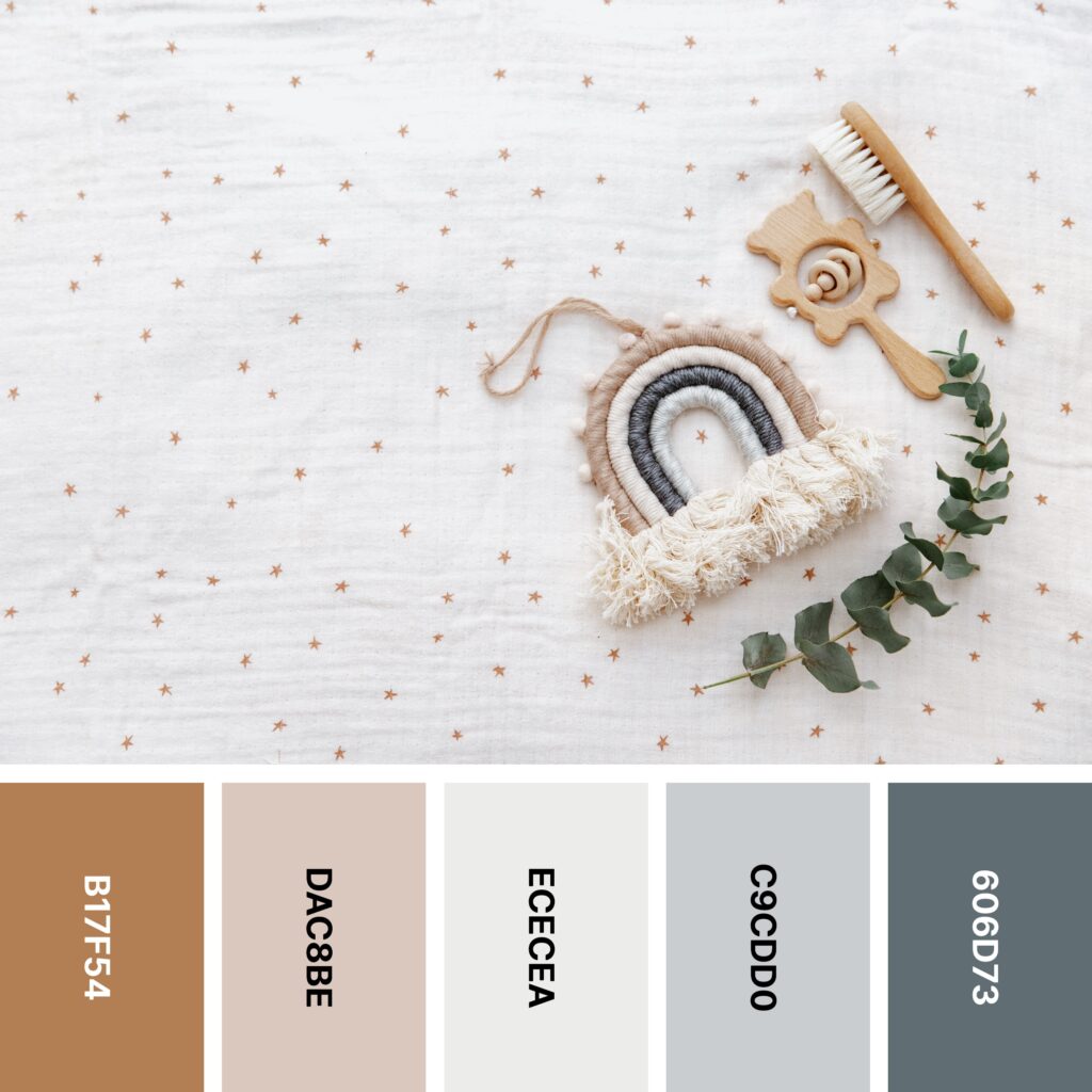
Names: Chamoisee, Champagne pink, Platinum, Silver, Payne’s gray
Hex Codes: #B17F54, #DAC8BE, #ECECEA, #C9CDD0, #606D73
You might think of neutral palettes as being low-energy, even dull. They certainly can be, but as this palette illustrates, neutral color schemes can be dynamic. Chamoisee is an orangish shade, and Payne’s Gray has clear blue undertones. Blue and orange are complementary colors, so these two make this palette refreshingly eye-catching.
Of course, to create a balanced neutral palette, you need to soften that contrast. Champagne Pink and Silver are paler versions of Chamoisee and Payne’s Gray, and Platinum’s soft, silvery glow rounds it out nicely.
3. Cherry Blossom
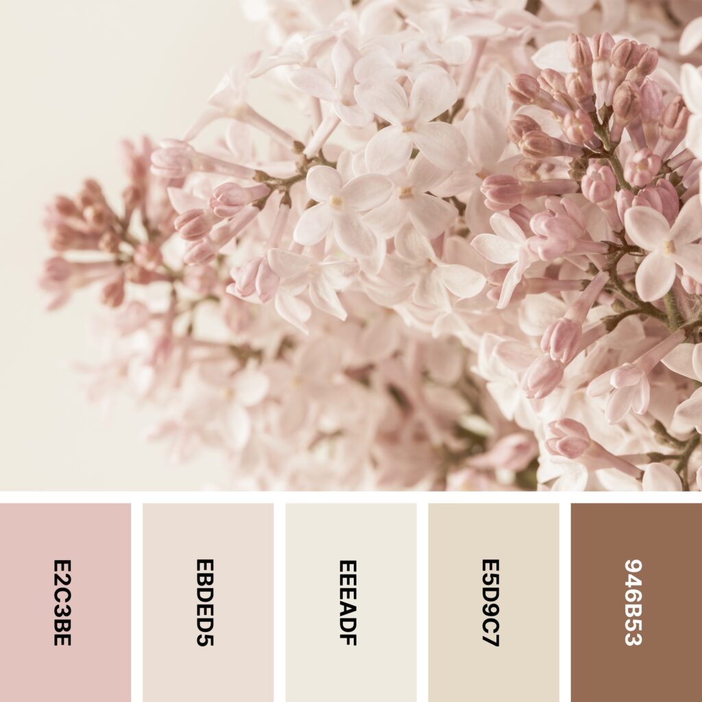
Names: Pale dogwood, Champagne pink, Alabaster, Bone, Raw umber
Hex Codes: #E2C3BE, #EBDED5, #EEEADF, #E5D9C7, #946B53
Neutral color palettes don’t always have to be limited to true neutrals. In this palette, Alabaster, Bone, and Raw Umber are true neutral shades. Pale Dogwood and Champagne Pink are technically shades of pink, but they’re dusty enough to fit in well with the other warm neutrals here.

As you see in the example picture, these colors are perfect for creating floral designs. If you put Pale Dogwood and Champagne Pink blossoms against Alabaster, you’ll have a beautiful, vintage-inspired pattern. Adding Raw Umber stems to your illustrated flowers can keep the design grounded.
4. Seaside
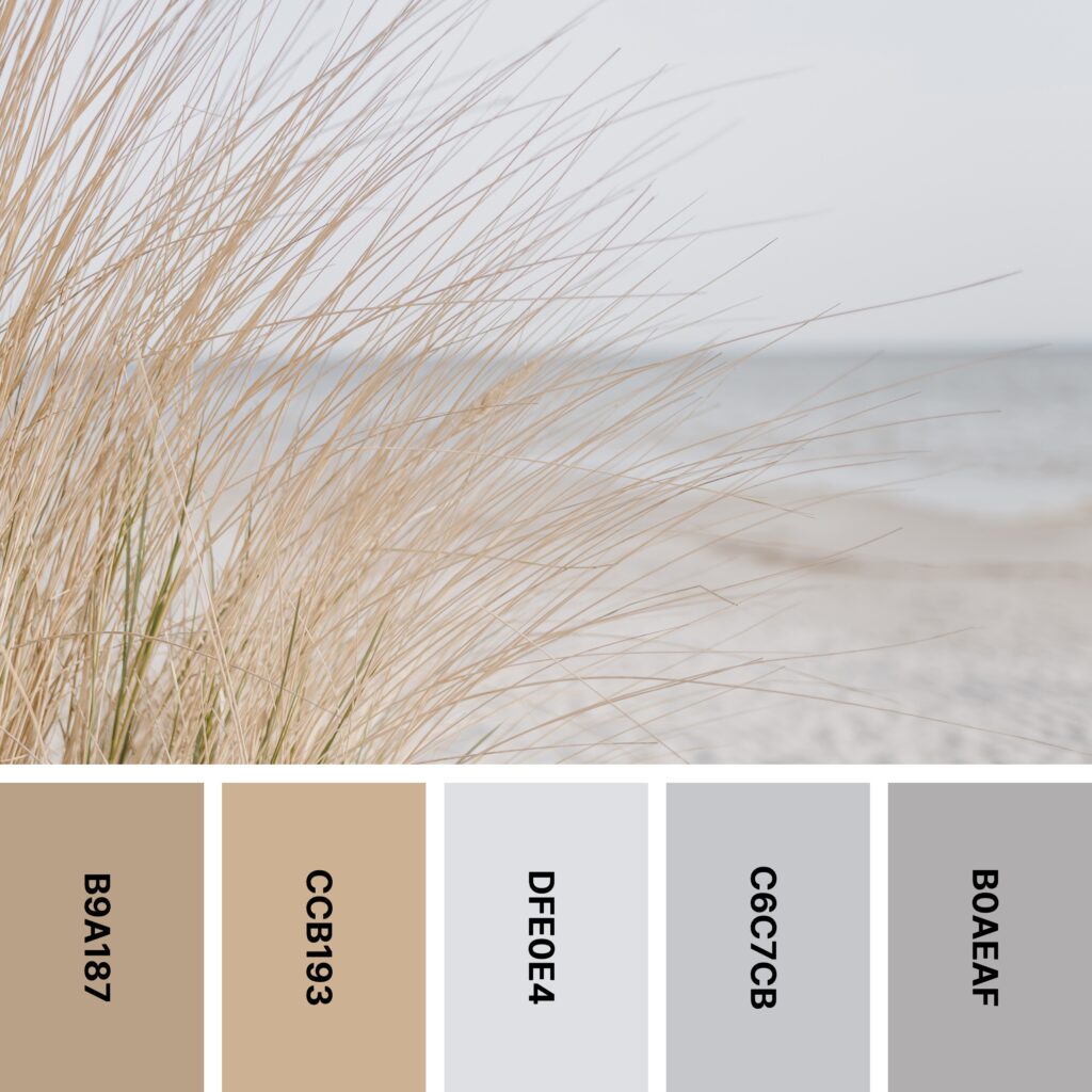
Names: Khaki, Tan, Platinum, French gray, Silver
Hex Codes: #B9A187, #CCB193, #DFE0E4, #C6C7CB, #B0AEAF
When you take a look at this example picture, you can almost feel the sea breeze. And when you use the corresponding color palette in a design, you can capture some of that energy.
This palette is an outstanding choice if you’d like to use a combination of warm and cool neutrals. Khaki and Tan are wonderfully enveloping shades of brown. The cooler Platinum, French Gray, and Silver are reminiscent of the color of the ocean on a cloudy day.
5. Thoughtful

Names: Dun, Khaki, Davy’s gray, Taupe gray, Ash gray
Hex Codes: #D3C6B6, #BAAA93, #534F50, #9C9897, #B7B7AD
Looking for inspiration for a layered neutral palette? This collection of colors gives you plenty of options, and the example picture is practically a tutorial on how to layer various neutral shades.
Diversity is generally a good thing in neutral color palettes. But if you use approximately equal amounts of these colors, you may find that your design looks disjointed. For a more effective project, choose one or two colors as background shades and incorporate smaller amounts of the other colors. The example image uses a backdrop of (mostly) Taupe Gray and Ash Gray.
6. Horizon
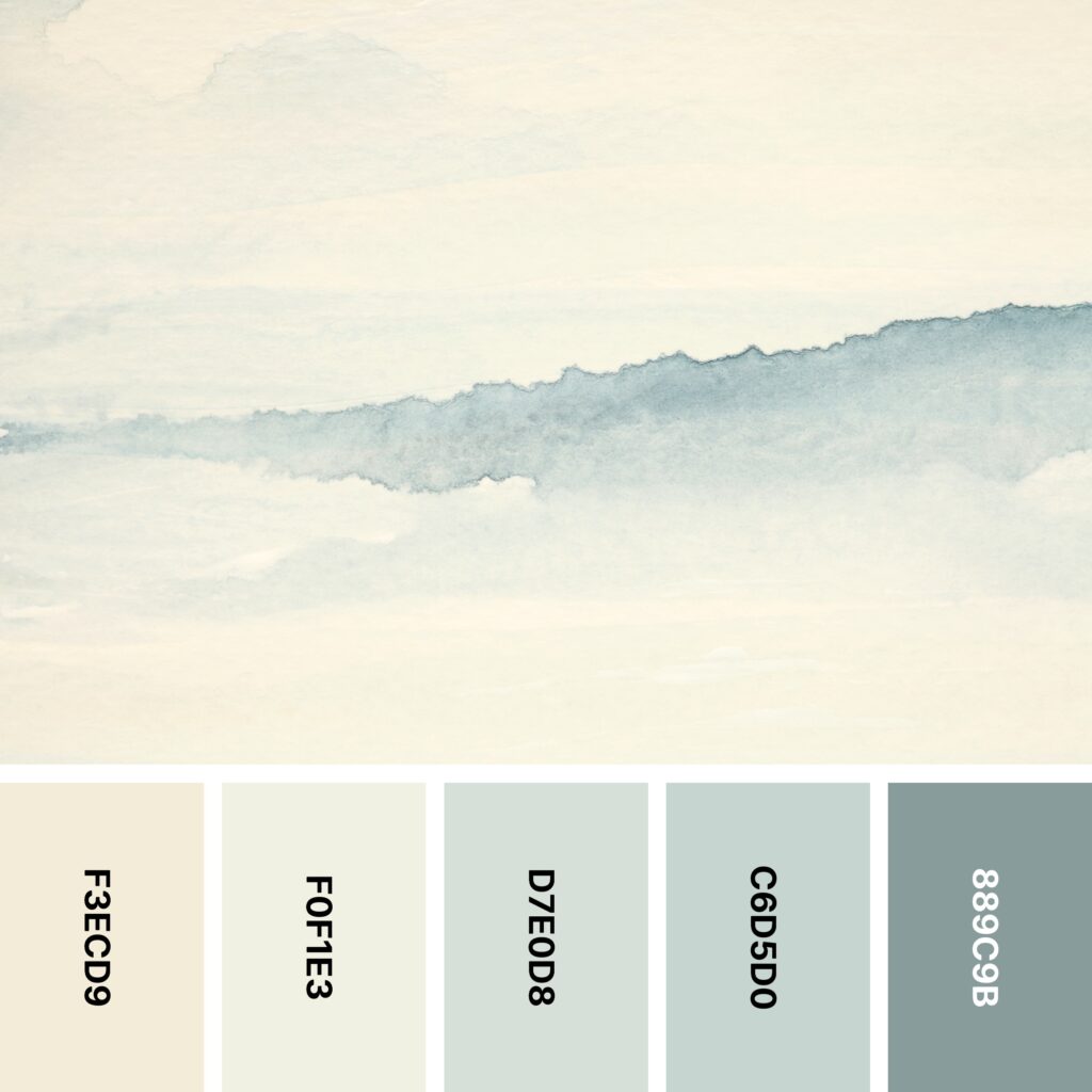
Names: Eggshell, Ivory, Alabaster, Ash gray, Cadet gray
Hex Codes: #F3ECD9, #F0F1E3, #D7E0D8, #C6D5D0, #889C9B
Some abstract designs have a kind of ethereal beauty. This is one of them. Like a Rorschach test, it might look like different things to different people. The splash of deep Cadet Gray might look like a faraway mountain range. Or maybe it looks like an opening in a cloudy sky.
Either way, this somewhat unconventional palette is a good one to have in your arsenal. With Eggshell and Ivory as base colors, it looks like it was created on a piece of aged parchment.
7. Vintage Rose

Names: Eggshell, Dutch white, Cinereous, Pale dogwood, Almond
Hex Codes: #EFE7D7, #E8D5B5, #A88E85, #DBC7BB, #F0DFCE
If you like neutral shades that lean a little pink, this palette just might be perfect for your next design project. Cinereous, Pale Dogwood, and Almond are close to the colors of dried rose petals. Eggshell makes a great background color if you like white but want something a little warmer.
As the example image suggests, this is also a great palette to use if you like to play with light and dark. This abstract design makes an intriguing gradient out of Cinereous, Pale Dogwood, and Almond. This is a great idea if you’re also making a watercolor-inspired design. But even if you aren’t, these shades are great for creating an almost-monochromatic, colorblocked design.
8. Soft Smoke
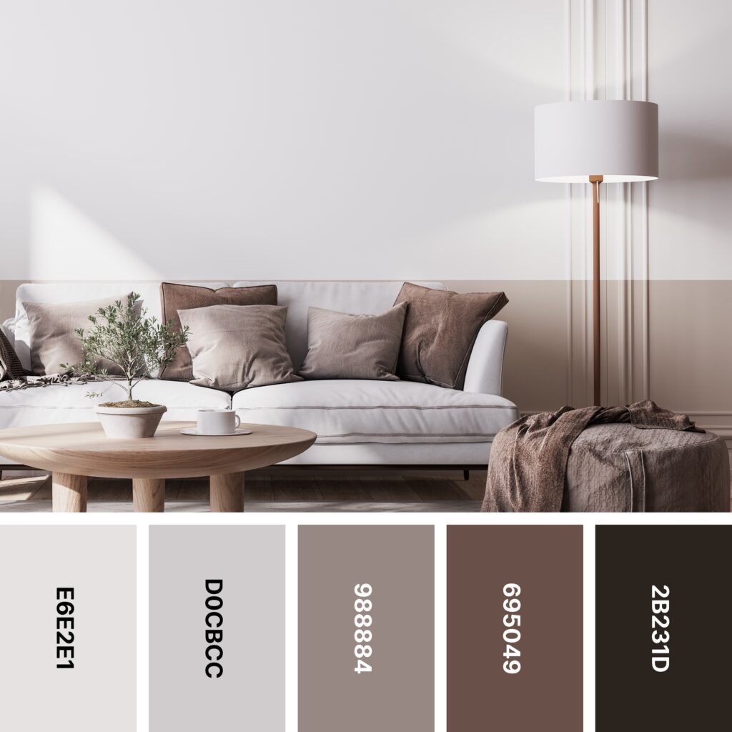
Names: Platinum, Silver, Cinereous, Liver, Raisin black
Hex Codes: #E6E2E1, #D0CBCC, #988884, #695049, #2B231D
Here’s a perfect neutral palette for interiors, although it also works nicely for digital designs. If you’re someone who makes grounding every design a priority, you’ll like this one! Most of this palette is made up of relatively pale brownish shades, but Raisin Black is heavy enough to tie everything together.
You might think that black would look overly harsh against these soft, cocoa-like browns. But that’s where specific shades of black and other colors become important. Raisin black has significant brown undertones, and it’s easy to mistake for a very dark seal brown. As a result, it’s right at home with the rest of the colors in this palette.
9. Desert Dust

Names: Almond, Dun, Khaki, Lion, Chamoisee
Hex Codes: #E2D6CA, #D3BEA8, #BDA58D, #AF967D, #907153
You might think sandy shades are boring. But when you think of them as being the color of a vast and wild desert, they get a lot more interesting! This palette pays homage to the desert, giving you the opportunity to create your own landscape.
Of course, this uniquely layerable palette is good for more than just creating landscapes. It’s good for a demure website backdrop. But if you want to try something unusual —like a monochromatic, geometric pattern — the smooth gradient between these shades makes them ideal.
10. Sandstone

Names: Khaki, Dun, Bone, Desert sand, Pale dogwood
Hex Codes: #B1A18A, #C5BEAC, #E6D9C8, #D5BAA5, #C1AAA2
Sandstone forms from ancient sediment. So it’s no wonder that it can include some truly beautiful colors and patterns. This palette captures the range of different colors you might find in a piece of sandstone, from rosy pink and soft red to slate-like gray.
If you wish, you can be inspired by the example picture and use these shades to mimic the actual look of sandstone or a similar rock. Nature-based designs can make quite an impact when done well!
11. Teddy Bear

Names: Platinum, Bone, Khaki, Beaver, Van dyke
Hex Codes: #E1DFDB, #D8D1C0, #CCB6A1, #8F7361, #523C31
As the example image illustrates, neutrals can look nice as part of a baby’s or young toddler’s room. They’re a nice alternative if you don’t want to go the more traditional route of pink or blue pastels.
This is another excellent gradient-style palette where you can adjust the mood of a piece based on the amount of light vs. dark color you use. For example, the picture above uses a good bit of Bone, so its overall vibe is a light, uplifting one.
If you would prefer your design to have a cozier, more enveloping effect, you might consider using deeper, earthier browns. Beaver and Van Dyke are great choices. Of course, make sure to include accents of lighter shades to stop your design from getting too dark.
12. Silkie

Names: Chamoisee, Beaver, Khaki, Timberwolf, Isabelline
Hex Codes: #86715D, #947E69, #BAA997, #E5DED5, #EDE9E3
At first glance, the photo above looks a lot like the soft feathers of a silkie chicken! But regardless of the design you choose, this palette almost exudes softness and comfort. The smooth gradient from Chamoisee to Isabelline makes it the perfect choice for layered designs.
Together, these colors create a serene, relaxing vibe. But if you’re feeling adventurous, you can transform this neutral color scheme with a pop of unexpected color. A touch of blue or green will stand out without looking out of place.
13. Winter Wheat

Names: Dark tan, Ecru, Dutch white, Alabaster, Platinum
Hex Codes: #8E7D4F, #B49F74, #DBD2AB, #DFDDD0, #EBEBE9
Paint chips can be a great way to choose your interior’s color scheme. But as you can see in the photo, sometimes the paint chips themselves create a captivating design.
The above palette doesn’t capture the color of every paint chip in the photo, but it does include some of the most prominent shades. It’s an interesting grouping of colors in that it includes paint chips with both green and yellow undertones.
That feature gives it a rustic touch that makes it an ideal palette for outdoor-focused designs. If you really want to lean into the green, you might consider expanding the palette with olive drab and similar green shades.
14. Atlantic Sunrise

Names: Gray, Cool gray, Silver, Khaki, Battleship gray
Hex Codes: #7A7879, #9B9BA7, #CCC9C9, #BAA586, #92877C
In many places, the churned-up Atlantic Ocean starts to look more brownish than blue. But as the sun rises, that color begins to look almost golden. This palette captures the wonderfully complex gray, brown, and gold of this moment.
However, because this palette doesn’t necessarily look very aquatic, you can use it in any way you like. The steeliness of Cool Gray and the relative depth of the colors in the palette make it a great choice for a brand that needs to convey strength or toughness. For instance, these shades might do well in a logo for a construction or hauling company.
15. Quiet Quicksand

Names: Platinum, Alabaster, Bone, Dun, Khaki
Hex Codes: #EBEAE8, #E5E1D8, #E1D9CE, #D8C8B4, #BFA687
As you see in the example picture, this palette can be used to create a design that looks a lot like a stone tile. With this sort of blurry, marbled design, you can adjust the levels of each color to make the overall picture lean more warm or more cool.
For instance, because the example image emphasizes Dun and Khaki so much, the design has an overall warm effect. If you want to cool things down a bit, you can include more of Platinum, Alabaster, and Bone.
16. Springlike

Names: Linen, Almond, Cinereous, Pale dogwood, Timberwolf
Hex Codes: #F6ECE2, #E6D0BB, #897D77, #E1CEC8, #E2DFDA
If you’re running low on inspiration, you might get some ideas from this palette’s example image. The abstract shapes seem to float in front of a Linen background, and they appear to be semi-translucent when they overlap. This unusual feature alone makes it particularly intriguing.
Some people might not regard this palette as being truly neutral. After all, Almond looks a bit like a dusty shade of orange, and Pale Dogwood is a dusty shade of pink. Either way, the adventurous designer can do a lot with this color scheme!
17. Fern

Names: Ebony, Ash gray, Anti-flash white, Timberwolf, Battleship gray
Hex Codes: #5C625C, #C8CDBE, #EDEEF0, #DED4D1, #7D7A70
If you’ve done any work in the interior design world, you know the power of near-neutrals and how they can really transform a space. In this palette, Ash Gray looks more like a shade of sage than gray. Likewise, Timberwolf’s rosy undertones make it look more like a very dusty shade of pink. Green and pink are complementary, so using these two together offers a subtle yet meaningful contrast.
18. Windswept

Names: Almond, Bone, Linen, Old lace, Floral white
Hex Codes: #E4D8CC, #E7DDD1, #F3EBE0, #FBF3E7, #FEFAF2
Depending on the type of design you’re creating, you might prefer something with a good bit of contrast. Alternatively, you might want a palette whose shades are all closely related. This palette represents the latter type.
As you can see in the example design, these shades can be used to create subtle patterns. Because there isn’t a huge amount of contrast, these patterns can work nicely as backdrops. In the case of the above design, text in a deep seal brown color would work especially well.
19. Modular

Names: Van dyke, Wenge, Timberwolf, Beaver, Raw umber
Hex Codes: #493B38, #695650, #DED2CE, #B99B8C, #87614A
The unusual collection in the image above definitely draws the eye. But it’s not only the objects themselves that are fascinating — it’s the color scheme. Although each color in the palette above could be considered a shade of brown, these browns run the gamut from red and earthy to cocoa-like to rosy.
To make sure each of these colors gets a chance to shine in your design, it’s a good idea to use either Timberwolf or Beaver as your background color.
20. Pampas Grass

Names: Chamoisee, Lion, Khaki, Dun, Bone
Hex Codes: #A17D61, #B29881, #C6AE98, #D2BDA4, #D9CEC1
Shades of beige and tan are classics that never seem to go out of style. This palette offers you a sampling of these versatile neutrals. And because they work somewhat like a gradient, these colors can create a sense of depth (the shading in the grass in the picture is a great example).
As is the case with other relatively light palettes, this one can sometimes look a little too light. If you get that sense while working on your project, there’s an easy fix — just mix in a little seal brown to keep everything grounded.
21. Mesa

Names: Isabelline, Almond, Desert sand, Beaver, Chamoisee
Hex Codes: #F8F4F1, #E5D9CF, #CFAE9D, #B38E78, #9C7661
You’ve seen plenty of designs depicting hilly landscapes. But have you ever seen one like this? The picture itself is deceptively simple, but it makes you look at mountains in a whole new way.
This color palette may be a basic gradient, but it’s the perfect color scheme for a dreamy, distinctive design like this one. You of course don’t have to use these colors to create a landscape, but if you can capitalize on the gradient effect between the colors, you can make your design especially memorable.
22. Sabino

Names: Silver, Timberwolf, Anti-flash white, French gray, Cool gray
Hex Codes: #C6C2C3, #D4D0D0, #EBEAEB, #B2BAC4, #9594A0
This design is another example of how paint-style projects can work beautifully with neutrals. This one mostly centers around shades of gray, but it strikes a great warm/cool balance. Silver and Timberwolf have somewhat warm undertones, and Anti-Flash White, French Gray, and Cool Gray are all cooler-leaning neutrals.
Blurring the lines between each color is a great way to create a rugged or industrial aesthetic. The grungy-on-purpose vibe of the design above might make it a good choice for a concert or event poster.
23. Welcome Home

Names: Beaver, Chamoisee, Umber, Cinereous, Timberwolf
Hex Codes: #AD9788, #92745F, #634B3D, #9C8E8B, #D2C8C4
You can use the palettes on the list for any type of design. But as you can see, this one in particular lends itself to use in interiors. Note how most of the room is taken up by paler shades. When your palette is mostly light neutrals and you add accents of darker neutrals, the space will look open and inviting. If you take the opposite approach (a mostly-dark palette with accents of lighter neutrals), you might end up with a room that seems suffocatingly small.
24. Dunes

Names: Dun, Almond, Isabelline, Platinum, Timberwolf
Hex Codes: #C4B7AB, #E6DACE, #F2EFED, #E4DFDC, #D1C7BF
Neutral palettes made entirely of soft colors are perfect for creating designs with delicate aesthetics. And while any of the colors in the above palette could be used as a background color alone, these shades look best when they’re used to create shaded, 3D designs like the one in the example.
The rippled look of the example image is certainly eye-catching, but you don’t need to feel like you’re limited to this type of shading. When you play around with this color combination, you can create surreal landscapes, realistic textures, and unusual patterns. Don’t be afraid to think outside the box!
25. Plush

Names: Dun, Khaki, Chamoisee, Coffee, Café noir
Hex Codes: #D2BCA3, #BBA48C, #94795C, #674F35, #533A22
Here’s another highly distinctive texture. This lightly-shaded tan background looks a lot like plush fabric, and the raised lines also add some interest. There’s a lot of Dun and Khaki in this design, and you might have trouble spotting the other colors at first. But these are the colors used for shading — they might not jump out at you, but they’re vital when it comes to bringing the image to life!
26. Whirlaway

Names: Bistre, Coyote, Dun, Alabaster, Seasalt
Hex Codes: #463428, #866E55, #D4C6AA, #E6E4D9, #F5F7F6
The soft slopes and inexact edges of this design make it oddly soothing to look at. It looks a bit like the outline of a mountain lake, with the faint outlines of other mountains stretching into the distance.
This is a great palette to select if you want something with a wide range of colors. With dark browns, tans, and shades of white and smoky beige, you’ll have everything you need to create your own landscape.
27. Stucco

Names: Champagne pink, Almond, Isabelline, Linen, Timberwolf
Hex Codes: #E0D2C9, #EEE2D7, #F9F3EC, #F0E7DA, #DFD7CD
When creating text-based designs, lots of designers choose pale neutral background colors. Pale neutrals don’t look quite as stark as plain white. And by shifting your balance of warm and cool neutrals, you can shape the mood of your design without taking away from the impact of the text.
There’s nothing wrong with choosing a single neutral color for your background. But if you want something that draws the eye a little more, try combining several pale neutrals like the example image. The key is to make sure the colors are all somewhat similar. As long as there isn’t substantial contrast between them, they shouldn’t compete with your text.
28. Golden Fields

Names: Alabaster, Tan, Lion, Chamoisee, Café noir
Hex Codes: #EFEFE6, #D1B797, #B3977B, #9B7D63, #5A4227
The colors in this example picture are a bit more striking than those of other neutral palettes. Why? The field grasses are various shades of tan, but when you juxtapose Alabaster with Tan and Lion, you get a silvery effect (like what you see at the end of the tufts in the picture).
This isn’t the only way to use the colors of this palette — it’s also ideal for colorblocking. An Alabaster background will be light enough to let lines or shapes of the other colors shine.
29. Brushstrokes

Names: Khaki, Bone, White smoke, Platinum, Ash gray
Hex Codes: #C5B99F, #E1DBCB, #F5F5F4, #E1E2DD, #B6BAAB
Pale neutrals are perfect for a wide variety of applications. Many pale neutral palettes include several closely-related shades. But if you want to work with an especially diverse palette, this is a great one to choose.
Like many neutral color schemes, it includes shades of tan, white, and gray. But it also includes Ash Gray, a color that could better be described as a shade of sage green. Sage is ideal for adding a touch of cool color. As a bonus, this vintage-inspired near-neutral never seems to go out of style!
30. Planetarium

Names: Walnut brown, Tan, Bone, Sage, Ebony
Hex Codes: #716454, #D3BA92, #E4DACB, #C4BFA1, #61625A
The captivating neutral design in the example image is a great illustration of how to use neutral colors for something besides a backdrop. It also masterfully balances warm and cool. Ebony, a green-tinged black, is heavy enough to counterbalance Tan and a touch of brighter orange, and Bone’s slight warmth gives the whole design a retro-inspired feel.
Using Neutral Colors in Your Design
Neutral colors are more useful than we give them credit for. In many cases, they serve as soft canvases for louder designs. But if you’re creating something more earthy or mellow, you might find that you can make a complete design out of only neutrals. Regardless of how you plan to use them, here are some tips to help you make the most of neutral shades.
Pay Attention to Warm and Cool
Some neutral shades might make you think of a cozy wool sweater. Others might make you think of an icy winter morning. Neutrals can be warm or cool, and you can use them to create unified or high-contrast palettes.
For example, let’s say you have a palette of warm-leaning tans and beiges. If you want to include an accent color but keep the warm theme going, you might consider adding burnt orange or a jewel-toned golden yellow. Alternatively, you might choose to temper the warmth of your neutral palette by adding a cooler accent shade like blue or green.
What type of palette you choose depends on the mood you want to create. Warm colors tend to have an energizing feel, and cooler shades have a calming effect. Of course, you can always experiment with different color schemes and see which one delivers the intended effect.
Don’t Be Afraid of Texture
From stone to sand to feathers, you probably noticed that the above designs also included some element of texture. That’s not to say that every single design you make should be textured, but the right texture can add just enough interest to any design.
This is an especially useful tip if you find yourself worrying about your all-neutral design becoming dull or uninteresting. One or more textures will add some life to your project without you having to bring in brighter, louder colors.
Try Using Neutrals as a Backdrop
As you’ve seen, you can build an interesting design out of neutrals alone. But if you’re in advertising (or otherwise want to make a design really stand out), you might consider using neutral colors as a base to allow other colors to really pop.
For example, the combination of bright orange and charcoal gray is relatively common in modern design. The contrast between the two makes orange seem to jump out at the audience.
If you go this route, make sure you don’t overdo it with the orange (or whatever accent color you choose) — you don’t want to dilute the impact or completely overshadow the neutral base!
Never Underestimate or Overlook Neutrals
You might not necessarily get excited about neutral color palettes. But the right neutrals can make the difference between the perfect design and a design that’s utterly unremarkable.
Hopefully the palettes and example designs above have given you some inspiration. And don’t be afraid to experiment — an unlikely color combination might turn out to be just what you need!
Find more design inspiration in this collection of 24 themed color palettes.


