
Fall is a favorite season for many. Cooler weather offers a pleasant respite from the heat of the summer, and the vivid green leaves begin to turn fiery shades of red, orange, and yellow.
Naturally, plenty of designers want to channel the spirit of this wonderful season. If you’re creating an advertisement for a fall-specific product, helping your audience get into the spirit of fall might help them start thinking about what they need for the current (or upcoming) season.
Even if you aren’t developing an advertisement, fall colors can stir a sense of peace, gratitude, and even adventure in your audience. They might think of the crisp air on an autumn hike or gathering around a Thanksgiving table.
Check out these beautiful fall color palettes. Hex codes are included if you want to use the colors in your next design.
1. Stoney Creek
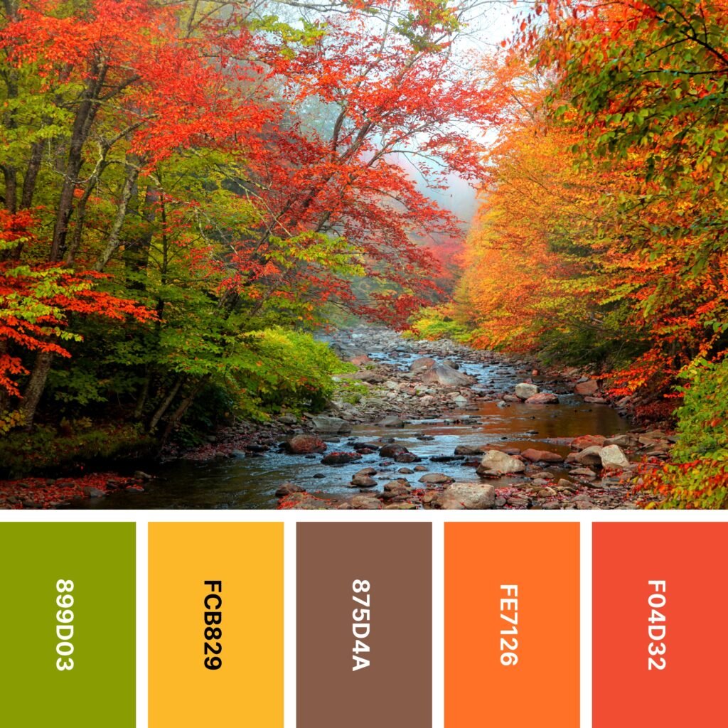
Names: Apple green, Selective yellow, Raw umber, Orange (crayola), Cinnabar
Hex Codes: #899D03, #FCB829, #875D4A, #FE7126, #F04D32
If you like being outdoors, hiking through the woods is the perfect autumn activity. The fall foliage itself is breathtaking. And when you come across a rocky stream like the one in the example image, you might pause a moment to listen to the peaceful sound of the water.
With this color palette, you can capture the beauty of the moment and use it to draw your audience in. This type of color scheme is perfect for fall festival posters and advertisements for fall-specific events. But even if you’re creating an ad that doesn’t have to be seasonal, a fall-inspired color scheme just might catch your audience’s eye.
2. Autumn Earth

Names: Raw umber, Olive, Dun, Burnt orange, Sienna
Hex Codes: #925C2B, #968037, #E5CFBA, #AE5B22, #8C2517
If you had to pick one type of color to symbolize fall, it would probably be earth tones. This pretty, neutral palette includes an impressive range of warm-leaning earth tones. It’s perfect for crafting cozy interiors, but it also works well for digital designs.
These muted shades are easy on the eyes and great for layering, so they would also work nicely for websites. Dun is light enough to be a background color, and you can use the other colors throughout as accents.
3. Late Harvest

Names: Orange (crayola), Moss green, Coffee, Wenge, Murrey
Hex Codes: #ED8143, #97A65F, #725542, #7C655D, #821D4D
Roasted root vegetables are a quintessential fall dish. Even if you haven’t spent the last several months growing carrots, beets, and potatoes, you can take some inspiration from their colors (and the colors of the earth) from this color palette.
Because the colors so closely match those of actual vegetables, this color scheme is a good one if you want to create realistic designs. But if you prefer patterns, the balance of warm and cool colors and the sheer variety of shades makes it an outstanding color grouping, too.
4. Old Mill
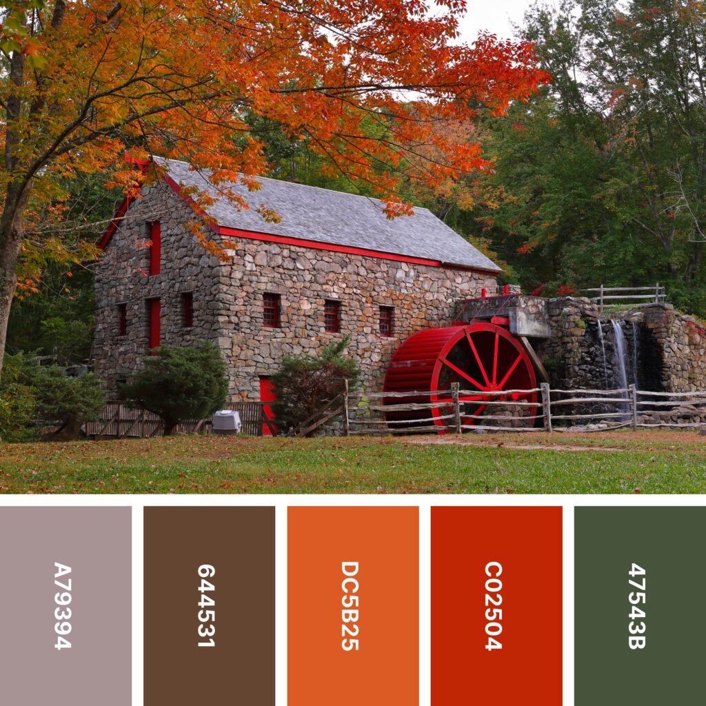
Names: Cinereous, Coffee, Flame, Engineering orange, Ebony
Hex Codes: #A79394, #644531, #DC5B25, #C02504, #47543B
Stone buildings are beautiful all year long, but there’s something about their rustic appeal that makes them especially well-suited to fall. In this color palette, Cinereous comes pretty close to capturing the color of the mill — it’s a shade that blends seamlessly in with the rest of the scene.
However, this palette also features a surprise burst of Engineering Orange, a color that looks like vivid red in this context. Some people might think it adds a pop of welcome color. Others might think it interrupts the natural vibe of the picture.
Likewise, you can choose whether this is a color suitable for your design or not. Red is attention-grabbing and ideal for making a statement. But if you’re hoping to create a serene, calming design, you may just want to use the rest of the palette without Engineering Orange.
5. Lichen

Names: Moss green, Olive, Cocoa brown, Syracuse red orange, Kobicha
Hex Codes: #9C9D40, #90862D, #E3752E, #C9521B, #5B3413
When most people think of fall color palettes, they imagine the reds, oranges, and yellows of changing leaves. It’s all too easy to forget that green is a color of fall, too — it just steps out of the spotlight and lets the more vivid colors shine.
Thanks to the inclusion of two separate green shades, this palette is able to capture the multiple types of green we see in autumn: moss, grasses, and even leaves that have yet to turn.
6. Acorn
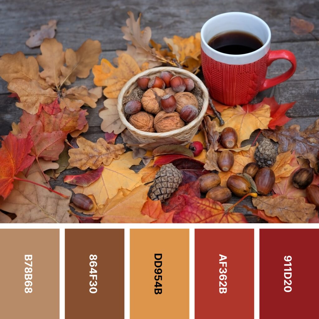
Names: Lion, Russet, Butterscotch, Fire brick, Carmine
Hex Codes: #B78B68, #864F30, #DD954B, #AF362B, #911D20
This is arguably one of the earthiest color palettes on the list. If you want to capture the spirit of late fall when most of the leaves have fallen and faded to brown, it’s the perfect choice.
However, this palette isn’t based solely on the colors of decay. Deep Butterscotch, Fire Brick, and Carmine are all shades you commonly see in late fall. Lion and Russet capture the colors of walnuts, acorns, and pinecones.
7. Trailhead
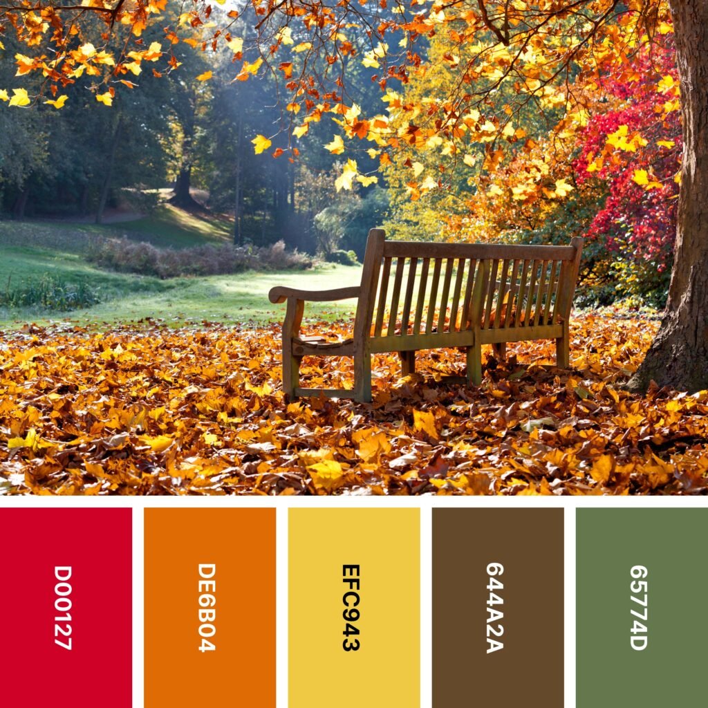
Names: Fire engine red, Cocoa brown, Saffron, Kobicha, Reseda green
Hex Codes: #D00127, #DE6B04, #EFC943, #644A2A, #65774D
Walking through the forest in fall can feel like walking through a painting. Sometimes, the view is so stunning you have to take a moment to sit and soak it in.
This color palette helps re-create some of the sights you might see. Fire Engine Red, orangish Cocoa Brown, and slightly dusty Saffron are close to the color of fall foliage. Kobicha is the color of trees and earth, and Reseda Green captures the color of the grass.
You could successfully use this color scheme in a wide range of designs. But if you’re creating something text-based and need a background color, try cream or a shade of warm white.
8. Burlap
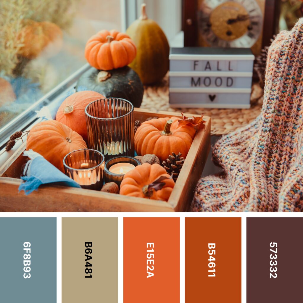
Names: Slate gray, Khaki, Flame, Rust, Caput mortuum
Hex Codes: #6F8B93, #B6A481, #E15E2A, #B54611, #573332
Burlap isn’t just for sacks of feed anymore — it’s frequently seen in home decor, particularly around the fall season. In this color palette, Khaki can be a great stand-in for the color of burlap. If you wish, you can even digitally re-create the texture of burlap.
The rest of the palette is made of vivid shades that pair nicely with Khaki. Flame and Rust add a good bit of warmth, but that warmth is tempered by cooler Slate Gray and purplish Caput Mortuum.
9. Autumn Mix

Names: Golden gate bridge, Pumpkin, Coffee, Saffron, Olive
Hex Codes: #EA4303, #F57524, #774E35, #F2BE01, #958D04
Most fall colors are some variation of red, orange, brown, yellow, or green, and this palette has one of each! It’s perfect for creating illustrations of the autumnal outdoors, especially if you’re making a border. Very pale warm neutrals make nice background colors.
But what if you want to do something a little different? If you want to make this striking array of colors really pop, try incorporating a deep navy blue background. Its cool, dark quality will help tone down high-energy Golden Gate Bridge. And every one of these colors (but especially Pumpkin, Saffron, and Golden Gate Bridge) will seem to jump out at your audience.
10. The Gardener

Names: Fern green, Sage, Kobicha, Russet, Quinacridone magenta
Hex Codes: #55702C, #B3BF8E, #6F4529, #895435, #893161
You might associate fresh vegetables like tomatoes and snow peas more with summer than with fall. But throw some root vegetables into the mix and you’ll have a side dish reminiscent of autumn.
Whether you’re creating a vegetable-focused design or something entirely different, you might find this color palette useful. Notably, it’s one of the very few on the list that has no form of red, orange, or yellow.
Thanks to the close relationships between the shades (Sage is essentially a lighter form of Fern Green and Russet is almost a lighter shade of Kobicha), this is a palette great for layering. The various greens and browns will help your audience feel connected to nature, and a few accents of Magenta will keep things interesting.
11. Woodlands
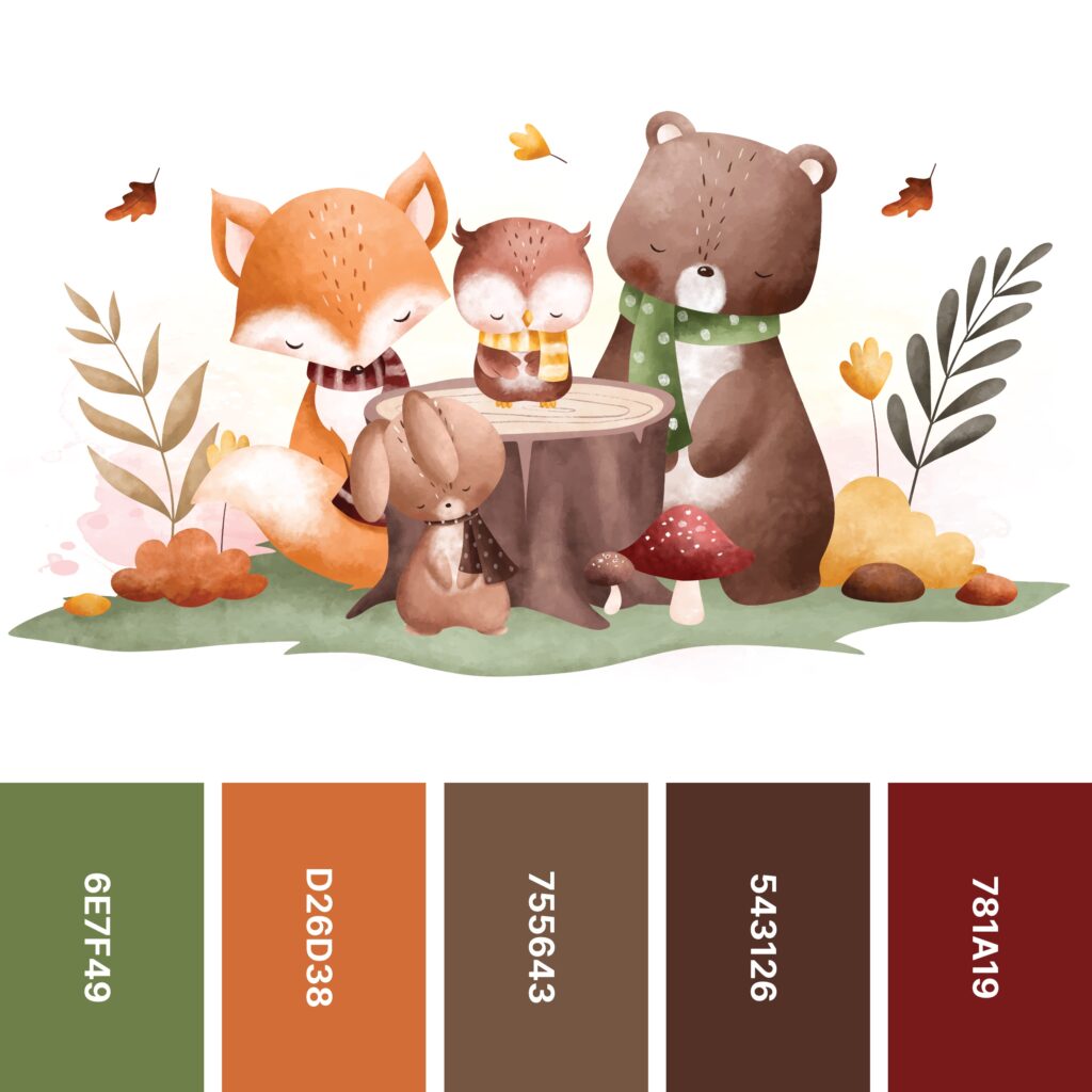
Names: Reseda green, Cocoa brown, Coffee, Caput mortuum, Falu red
Hex Codes: #6E7F49, #D26D38, #755643, #543126, #781A19
Take a look at the color palette above. How do the colors make you feel?
If you’re like many people, this color collection has a somewhat soothing effect. Note that each one (even the warm-leaning Cocoa Brown and Falu Red) has a muted, slightly dusty character.
Thanks to its demure mood, this is a palette that’s ideal for capturing the peaceful side of autumn. And as the example image of the little woodland creatures might suggest, it’s a nice choice for forest-focused designs.
12. Reflective

Names: Hunyadi yellow, Orange (wheel), Bittersweet, Rust, Hunter green
Hex Codes: #E9B95C, #ED8738, #E86854, #A95932, #325E3C
If you’re looking for a moment of peace in a chaotic world, try taking a minute to look out over a still pond in autumn. The water reflects the landscape back up, so you get twice the effect of the brilliant foliage.
This color palette is one of the best ones when it comes to matching the colors of changing leaves. The warmer shades in the palette run from golden yellow to orange to deep rust red. Hunter Green looks a bit like the color of pine trees nestled throughout the forest.
13. Decorative Gourd Season

Names: Pakistan green, Tangerine, Selective yellow, Mikado yellow, Red (NCS)
Hex Codes: #1A4417, #E67D05, #FAB103, #FFC601, #B80032
If you enjoy decorating your home for fall, you might include baskets of small pumpkins and decorative gourds. They come in a range of colors that this palette reflects well.
If you’re hoping to include a gradient effect in your current project, this palette offers you an outstanding opportunity. You can create a warm, smooth ombre that fades Tangerine into Selective Yellow and Selective Yellow into Mikado Yellow.
14. Pinot Noir

Names: Dark moss green, Moss green, Van Dyke, Ultra Violet, OU crimson
Hex Codes: #3E4A08, #738A46, #563C31, #625E7B, #860116
When you think of fall harvests, you might picture vegetables like corn, squash, and pumpkins. But did you know some fruits can be gathered in the fall as well?
Some varieties of grape are in season even in autumn, and the dusty Ultra Violet shade of the ones in the picture is perfect to add to your design. It’s even soft enough to serve as a background color.
On the whole, this color palette is also quite well-balanced. Dark Moss Green, Moss Green, and Van Dyke are all earthy, grassy shades that make us think of nature. Ultra Violet is a cool-leaning, fruit-like shade, and OU Crimson is there if you need to include a little more warmth.
15. Field

Names: Flax, Asparagus, Reseda green, Engineering orange, Garnet
Hex Codes: #FBE98B, #729863, #627D5D, #B3341A, #6A2B27
At first, this unusual-looking palette may not seem especially focused on fall. Flax comes close to a pastel shade of yellow, and Asparagus and Reseda Green look almost springlike beside it.
However, the somewhat toned-down red of Engineering Orange comes close to being the color of autumn leaves. Garnet provides an earthy, grounding force.
16. Campfire

Names: Barn red, Auburn, Raw umber, Bronze, Field drab
Hex Codes: #6D1D07, #AE3633, #836253, #D67F2A, #545018
If winter is a season of sitting around the fireplace, fall is a season of gathering around the campfire. Appropriately, this palette embraces that warm, cozy feeling with Barn Red, Auburn, and Bronze.
Like some other palettes on the list, this one is especially reminiscent of the great outdoors. If you’re creating a logo, ad, or website for an outdoor-focused company, it’s worth considering.
17. Forest Flame
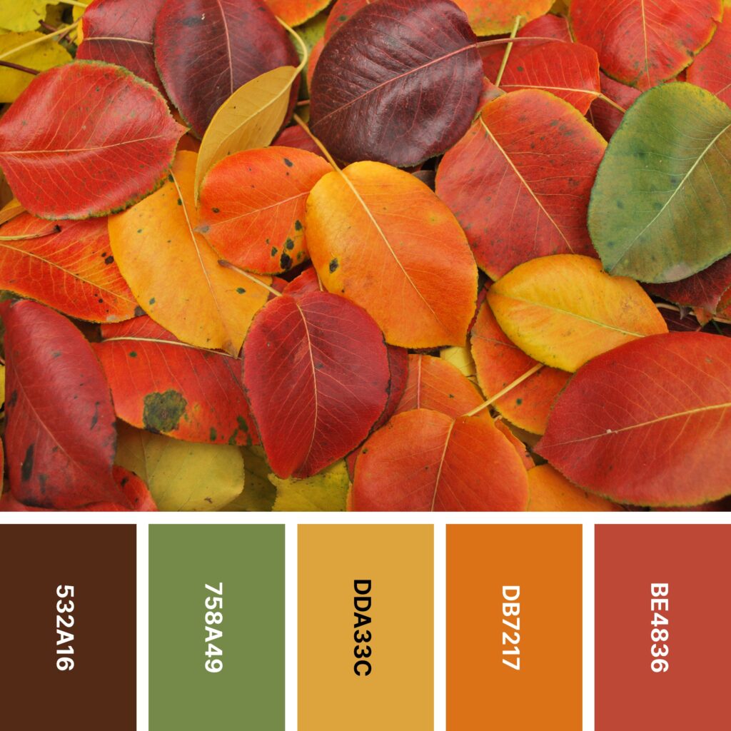
Names: Seal brown, Moss green, Hunyadi yellow, Cocoa brown, Persian red
Hex Codes: #532A16, #758A49, #DDA33C, #DB7217, #BE4836
This colorful palette is similar to the one above, but it’s a bit brighter and a bit more saturated. It also comes close to mirroring the rainbow spectrum.
Although it’s of course suitable for any sort of design, this palette is especially great for interior designers looking to really make a statement. Moss Green and Hunyadi Yellow both make striking wall colors. When you pair these walls with Sea Brown furniture, you get a palette that is both high-contrast and grounded. For an extra autumnal touch, you can include a few accents of Cocoa Brown and Persian Red.
18. Russet

Names: Walnut brown, Feldgrau, Hooker’s green, Cocoa brown, Violet (jtc)
Hex Codes: #5F564F, #4F6550, #5C7E68, #E07937, #6B3756
If you’re a foodie (or even if you just really like to cook), you know that squash, potatoes, beets, and similar vegetables are a major part of the harvest. You build delicious fall dishes around them, so why not build a color palette, too?
This somewhat unusual color combination captures the shades of beets, carrots, greens, and some types of squash. It also includes a great grounding color: Walnut, a shade close to that of fertile ground.
19. Cozy

Names: Ash gray, Battleship gray, Sandy brown, Orange (wheel), Auburn
Hex Codes: #A0B19F, #9A9A9A, #EAA05B, #EF8531, #A53231
A lot of fall-themed color palettes have an overall brownish cast. However, this one has a more pronounced touch of gray. Between the cool, greenish Ash Gray and the cloudy Battleship Gray, this palette is a bit reminiscent of those overcast, late fall days when winter is beginning to set in. Battleship Gray also might make you think of warm wool socks —another reason this palette has such a cozy feel!
20. Spiced Cider

Names: Chocolate, Jonquil, Pumpkin, Off Red (rgb), Barn red
Hex Codes: #723501, #F8CB0F, #FB6A01, #ED0201, #800E09
Now we come back to another fiery fall palette. The overall red-orange hue might make you think of an autumn treat — hot spiced cider (stirred with a cinnamon stick, of course).
This one is a wise choice if you need a design that will immediately attract attention. But you may have noticed that even Chocolate, the neutral of the group, leans very warm. If the heat of the palette is a bit much and you want to bring things back into balance, you might consider incorporating a cool-leaning brown like the weathered wood in the picture.
21. Run River

Names: Fire brick, UT orange, Taupe gray, Pakistan green, Taupe
Hex Codes: #B23B35, #F88B36, #A79A98, #0E4C0F, #50412E
This example image has one of the most magnificent views on the list, and its corresponding color palette captures everything from the deep red leaves to the blue-gray water. Both Fire Brick and UT Orange look slightly weathered or faded, so if you’re creating a vintage-style design, this palette might suit you.
The warmer-leaning colors in this grouping are balanced out by the extra-verdant Pakistan Green. But if you’re making something like a vintage-style sign, you can swap it out for a more distressed sage green.
22. Pinecone and Plum
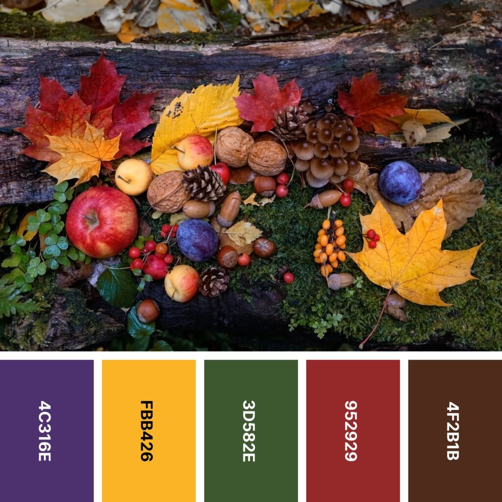
Names: Tekhelet, Xanthous, Hunter green, Auburn, Seal brown
Hex Codes: #4C316E, #FBB426, #3D582E, #952929, #4F2B1B
Purple might not be the first thing you think of when you imagine fall colors, but it certainly rounds out this palette nicely. And because purple and yellow are complementary colors, Tekhelet and Xanthous add some eye-catching contrast. So do Hunter Green and Auburn, as green and red are complementary as well.
All of that high-contrast energy has the potential to make your design seem disjointed or frenetic. Fortunately, deep Seal Brown is up to the task of grounding this eclectic collection. Don’t forget to include it if you choose to use this color palette.
23. Butternut Squash

Names: Reseda green, Cambridge blue, Brown sugar, Sandy brown, Sinopia
Hex Codes: #77917A, #77AC8F, #A26B4B, #FEA959, #CA4927
Butternut squash soup is an iconic fall dish, so it’s no wonder it has an entire color palette dedicated to it. Sandy Brown is the most squash-like shade of the bunch, and the other colors might remind you of different fall vegetables.
You might notice there’s something that sets this color palette apart: with the exception of Sinopia, the colors appear faded or washed out. You can use this feature to create highly memorable designs.
For example, let’s say you’re creating an announcement for a fall event. You might combine Reseda Green, Cambridge Blue, Brown Sugar, and Sandy Brown in a soft yet dynamic background. Then, you could make a bold Sinopia inset with your text. Just make sure your text color stands out!
24. Greenway

Names: Flame, Carrot orange, Silver, Dark moss green, Pakistan green
Hex Codes: #DA592C, #E28E2A, #BAB1AA, #3A560E, #293719
The rolling, tree-lined road in the picture seems to beckon you to come take a drive (or walk, or bike ride). Its vivid colors are reflected in this saturated, well-balanced color palette: there are two warm colors, two cool colors, and a neutral shade that is right between warm and cool.
The palette itself might have an even warm/cool balance, but you can shift that balance depending on the effect you want your design to have on your audience. If you want your design to be bright and invigorating, you might include more Flame and Carrot Orange and only include accents of Dark Moss Green and Pakistan Green. If you want something cool and relaxing, you can switch the color groups.
25. Cornucopia

Names: Spanish orange, Gamboge, Dun, Drab dark brown, Coyote
Hex Codes: #E35F02, #EA951A, #DDC5A4, #3C421A, #785D46
In many cultures, fall is a celebration of the harvest. This lively palette helps you do just that! Spanish Orange, Gamboge, and Drab Dark Brown are all shades you’d find in squashes, pumpkins, and gourds. Dun and Coyote are both great colors for wooden baskets.
So what’s the best way to use this color palette in a design? In many cases, Dun is an outstanding backdrop to use with accents of the other colors.
The darkness and saturation of most shades in the palette mean that they can quickly overwhelm an audience if you aren’t careful. But a few touches will catch your audience’s eye and make them think of this wonderful season.
26. Wanderlust

Names: Avocado, Rose ebony, Harvest gold, Engineering orange, Sienna
Hex Codes: #617502, #563B34, #D69333, #B83E26, #872B0D
For the outdoor enthusiast, the brilliant colors of fall are an invitation to explore. This palette is a fitting tribute. Unlike some basic fall palettes that include super-bright red, yellow, and orange, this one includes the nuances of color you see in between.
This group of colors includes the green of the grass and an array of colors you often see on autumn leaves. Each shade is bold enough to stand alone, so it’s a great palette for colorblocking!
27. Apple Crisp

Names: Golden brown, Dun, Bronze, Rust, Seal brown
Hex Codes: #945703, #E8D0B4, #CE7E07, #B34704, #692600
Many fall palettes involve bright, vivid warm colors. But if you’re looking for a more neutral palette, check out this one! You can use it for any type of design, but the very on-trend Rust makes it an especially good choice for interiors.
This group of colors does very well with layering. But if you do that, use some caution — layering darker shades (like Rust and Seal Brown) together will muddy your design. Instead, break them up with Dun and/or other pale neutrals.
28. Walk in the Woods

Names: Seal brown, Sienna, Rust, Ochre, Dark moss green
Hex Codes: #4D2508, #742505, #C1380A, #C67713, #666822
This palette’s example image captures the beauty of sunlight filtering through changing leaves. The palette itself captures that same spirit. It’s perfect if you want a collection of fall-like colors that lean toward earth tones.
As you’ve seen, many of the palettes on the list include bright greens that echo the color of grass. But the Dark Moss Green of this one has an appealing, muted character that keeps the overall palette looking earthy.
29. Fall Flannel

Names: Battleship gray, Khaki, Ochre, Carmine, Rosewood
Hex Codes: #828888, #BAA897, #C9741F, #950811, #6D1B18
This palette’s example image is quite obviously not flannel-related. But if you take a close look at the colors, you’ll see that they’re reminiscent of the warm, cozy flannel shirts that are a staple of fall.
If you’re looking for a color scheme that gives you several neutral options, this is a good one to consider. Most palettes on the list include warm beiges and browns, but this one includes both Khaki and Battleship Gray.
30. Thanksgiving

Names: Chocolate, Olive, Jonquil, Carrot orange, Syracuse red orange
Hex Codes: #774003, #6A7001, #F7C406, #F79601, #DF3A02
This pretty palette is a lot brighter than some. And as you can see, it parallels the colors of the rainbow (or at least the first four colors).
Thanks to its relative brightness, this palette is perfect for designs that need to be both autumnal and high energy. But if your design includes text, keep in mind that you may want to include a paler, more neutral background. An aged white or parchment-like color will help continue the warm theme.
Using Fall Colors in Your Design
If you live in a temperate part of the world, you can simply walk outside in autumn to experience the wonder of fall colors. But how do you translate those colors into meaningful designs?
The beauty of the design world is that there’s no set formula for using fall colors (or any colors, for that matter) in your designs. But with endless options, it can be hard to know where to begin. Here are some suggestions for implementing fall color palettes into your next project.
Don’t Forget About Color Psychology
If you’re selecting a color palette for a fall-themed design, it’s easy to focus on finding the colors that best symbolize what fall means to you and/or your audience. However, you should also make sure you’re paying attention to the psychological impact the colors have on your viewers.
For instance, red is a highly noticeable color that’s often linked to action. If your chosen palette includes shades of yellow, orange, red, and green, you want to think carefully about what color you use where. And if you’re creating a website with a call-to-action button (a button that says something like “Sign Up Now!”), it would make the most sense to make that button red.
Cultivate a Mood
If you’ve been in the design world for any length of time, you know at least a bit about color psychology. Individual colors have an impact on mood, but so do color combinations.
When selecting a color palette, look at each one you’re considering and think carefully about how it makes you feel. Your gut feeling should be a good guide on this. But if you aren’t sure where to start, here are some general guidelines on common fall color combinations and the moods they inspire:
- Happiness/Joy: Yellow, gold, orange, purple, green
- Warmth/Coziness: Red, orange, yellow
- Peace/Relaxation: Green, brown, toned down red and orange
- Cold: Various muted hues along with grays and light blues
Keep It Grounded
There isn’t an absolute rule that says you have to include a grounding shade in every fall design. However, in many cases, a grounding shade makes your project appear more balanced.
Grounding shades are darker, typically neutral colors that give your design a sense of being anchored. For instance, say your fall color palette includes various fiery shades of red, orange, and yellow. These shades are bright and great for catching the eye of your audience. But on their own, they might make your design start to feel too hot.
This is where a grounding shade comes in. Black often looks too harsh. Nature-inspired colors like dark grays and browns are usually better choices.
Capture the Spirit of the Season With Innovative Design
Fall is a dream for the designer who likes to experiment with color. And because fall has one of the most recognizable palettes of any season, you can be assured that your audience will catch the spirit as well. Hopefully the above palettes have inspired you, but don’t be afraid to try new and exciting combinations!
Find more design inspiration in this collection of 24 themed color palettes.


