

Cool colors — blues, greens, purples, and related shades — tend to have a calming effect on an audience. That may well be because there are so many cool shades (or at least shades of blue and green) found in nature. Shades like hunter green and navy blue even communicate professionalism and sincerity in business circles.
In a fast-paced world, most people relish the opportunity for a retreat, no matter how momentary. When you create an advertisement, logo, or other design with a cool color scheme, you invite your audience into a calmer universe.
Check out these beautiful cool color palettes. Hex codes are included if you want to use the colors in your next design.
1. Borealis

Names: Aquamarine, Turquoise, Cerulean, Rebecca purple, Tekhelet
Hex Codes: #01EFAC, #01CBAE, #2082A6, #524094, #562A83
The aurora borealis is one of the world’s most spectacular sights, and this color palette captures it in all its glory. If you’re looking for a cool palette that includes green, blue, and purple — the three main cool colors — this one is worth looking at.
There of course aren’t set rules on how to use these (or any) colors. But if you use this palette, you can include a nod to the aurora borealis with a blurred or airbrush-like effect.
2. Blue Planet

Names: Dodger blue, Argentinian blue, Pale azure, Jordy blue, Tropical indigo
Hex Codes: #2297FA, #50B6FE, #7ED8FA, #94AEFE, #8082D6
Blue is the most popular favorite color in the world, so this striking palette’s bouquet of different blues is sure to appeal to a wide audience. It also includes a balance of vivid and demure blues, and Jordy Blue and Tropical Indigo start to approach periwinkle territory.
As the example design shows, these colors do beautifully when swirled together. Altogether, they create a tranquil, aquatic-inspired color scheme that’s sure to draw your audience in.
3. Oasis

Names: Dark moss green, Office green, Olivine, Columbia blue, Ruddy blue
Hex Codes: #23570D, #367C28, #86B06B, #BAD5EC, #6BA2DE
The lush green foliage and tumbling waterfall in the example image create an atmosphere that almost doesn’t look real. If you want your design to capture the refreshing spirit of the outdoors, this is an ideal palette to choose.

Because it includes multiple layers of green and blue, this palette would work well for logos, websites, and other designs for nature-focused companies. For instance, if you’re creating a logo for a park, you might use the shades of green to create rows of hills against a blue sky.
4. Black Forest

Names: Night, Dark green, Cal poly green, Feldgrau, Ash gray
Hex Codes: #0E1609, #1D2C20, #2E462B, #5C6D5E, #A0A899
There’s something incredibly alluring about the endless depths of a mist-shrouded forest. This palette includes a gradient that extends from near-black to a light, misty green. There’s plenty of variety here, but if you want to extend the palette a little further, try adding a less-saturated form of Ash Gray or even a shade of cool white.
5. Butterfly Blue

Names: Celtic blue, Aero, Tiffany blue, Vista blue, Medium slate blue
Hex Codes: #3173D7, #50BFDB, #A6E4DD, #6F9CDC, #7270DD
Palettes with a range of blues and purples often have a fanciful, near-magical look. The colors here are diverse enough that they can make your design look chaotic or overcrowded if you aren’t careful, but thoughtful arrangement can give you a design that’s positively ethereal.
One potential arrangement for these colors is the burst-like design you see in the picture. The center of the design is primarily Tiffany Blue, the lightest shade in the palette. The darker shades, particularly Celtic Blue, Aero, and Medium Slate Blue, appear closer to the edges.
6. Arctic

Names: Air superiority blue, Powder blue, Alice blue, Pale azure, Celestial blue
Hex Codes: #83A7C9, #A2C6E8, #E0ECF8, #6ACCF3, #2094D1
Blue is one of the most evocative shades on the color wheel. Bright shades might remind you of sunny skies or tropical water. Cool, pale shades look like ice.
This color palette is unique in that it includes both types of blue. Air Superiority Blue, Powder Blue, and Alice Blue all have a distinctively icy cast. Pale Azure and Celestial Blue don’t. But together, they create a color scheme that is beautifully nuanced.
7. Verdant

Names: Mantis, Algae, Pigment green, Dartmouth green, Pakistan green
Hex Codes: #76C474, #4FB65E, #1D9642, #116630, #063009
If you’ve ever walked through a forest in springtime, you’ve seen a seemingly endless array of greens. From grasses to vines to the leaves on the trees, nature itself is home to an unending palette of green shades.
One five-color palette can’t possibly capture them all, but the palette above offers a nice sampling. It’s a great choice if you’re looking to create an all-green color scheme. If you want something with a bit of an earthier touch, try including a light, cool brown. Or if you’re looking to create a high-contrast, eye-catching design with a modern edge, you might consider including a burst of hot pink.
8. Icecap

Names: Glaucous, Jordy blue, Cornflower blue, Denim, Yale blue
Hex Codes: #777DB4, #99B5F4, #709FEB, #3765A9, #08386E
There’s a reason so many flavors of gum have blue wrappers and “ice” in the name — shades of icy blue have a distinctly refreshing vibe. This palette includes the perfect combination of icy and shadowy blues, and it captures the atmosphere of the tundra at twilight.
As you can see, this color scheme lends itself to landscapes, but it also works well for creating abstract patterns. Yale Blue is dark enough to work as a background shade, especially for the lighter Jordy Blue and Cornflower Blue.
9. Turquoise Torrent

Names: Northern lights blue, Tiffany blue, Celeste, Non photo blue, Sky blue
Hex Codes: #6ED1D4, #87EAE5, #B1EDEF, #A4D9EB, #84CEE9
Even without the energetic, zigzagging example image, this color palette is clearly a lively one. The turquoise-like Northern Lights Blue and Tiffany Blue are reminiscent of Caribbean waters. The cooler-leaning Celeste, Non-Photo Blue, and Sky Blue are closer to the color of the water in a backyard pool.
Despite their differences, these shades of blue work beautifully together. Try juxtaposing them in different ways to find which combinations you like best!
10. Alaska

Names: English violet, Pomp and power, Platinum, Vista blue, Royal blue (web color)
Hex Codes: #5E436C, #7D648E, #D5DAE3, #87A4DE, #5873CB
Icy blues, dusty purples, and silvery gray come together in this remarkable color palette. Platinum is light enough to work nicely as a background shade, and the blues and purples are different enough to create striped or blocked patterns.
Although all of these colors work well together, you can make your design look a little more unified by choosing to emphasize either blue or purple. For instance, if your design is primarily made of Vista Blue and Royal Blue, you can incorporate accents of English Violet and Pomp and Powder.
11. Blooms in Blue

Names: Fern green, Pigment green, Viridian, Celestial blue, Steel blue
Hex Codes: #427938, #4DA73D, #488872, #359DED, #0282C9
Blue flowers aren’t terribly common in nature — when you see them, they stand out! This palette combines springlike greens and radiant blues to form a cool color scheme that is anything but quiet.
If you use this palette but find that your design needs a little something extra, you might be inspired by the example image. If you look closely, you can see the dots of little yellow flowers. Even a smattering of yellow can add all the warmth your design needs.
12. Clear Cobalt

Names: Light cyan, Light blue, Blue green, Lapis lazuli, Rich black
Hex Codes: #D6F0F1, #9DCCD7, #5997AE, #165578, #0F151D
You often see color palettes that combine blue and white. It’s a classic color pairing, but the blending of blue and black can be just as magical. This versatile and intriguing palette runs the gamut from almost white to deep black.
If you choose to use this palette, you have plenty of options. This combination of colors can create aquatic to galactic designs, and the light-dark gradient is ideal for creating the illusion of depth.
13. Crystalline

Names: Prussian blue, Indigo dye, Lapis lazuli, Sea blue, Cerulean
Hex Codes: #002D3F, #024A65, #015E80, #016A8E, #047A9A
This palette of closely-related blues is ideal for crafting nuanced designs. It’s also a good choice for experimenting with different textures. Irregular textures like water, clouds, or swirls will add a touch of mystique.
Of course, you might decide that you need to add a bit of another color, too. The example image effectively uses bright white as an accent. It pops against the deep blues of the palette, and it also imparts a clear, ocean-inspired aesthetic.
14. Blue Ridge

Names: Alice blue, Uranian blue, Savoy blue, Yale blue, Oxford blue
Hex Codes: #DCF2FD, #BBE6F9, #596BB3, #1E386B, #102447
This palette is practically a who’s who of cool colors: Alice Blue is a classic shade of powder blue, Uranian Blue looks like what most of us call sky blue, Savoy Blue is a periwinkle-like shade, and Oxford Blue is close to navy.
As you can see, this palette’s light-dark gradient is ideal for recreating the hazy vistas over mountain ranges. If you’re a fan of high-contrast designs, you also might consider using Oxford Blue as a backdrop for Alice Blue and Uranian Blue.
15. Jungle

Names: Hooker’s green, Dark slate gray, Dark green, Eerie black, Payne’s gray
Hex Codes: #4E785E, #2A4B44, #24342A, #131C1B, #4C5C65
There’s a certain peace to be found in the woods after rain, and this color palette captures it beautifully, from leafy Hooker’s Green to misty Payne’s Gray. It might not be a bright palette, but it will capture your audience’s attention with its tranquil, grounding appeal.
This palette also offers you an opportunity to expand and create a soothing, earthy color scheme. Dark and medium cool-leaning browns will complete the forest-like aesthetic.
16. Coral Cove

Names: Midnight green, Caribbean current, Verdigris, Robin egg blue, Fluorescent cyan
Hex Codes: #0B4746, #085B5B, #17A8B1, #3FD5DE, #1EE9F2
If you’ve ever been scuba diving or snorkeling along a coral reef, you know just how striking the different corals can be. While the example image captures the texture of one of the world’s many coral varieties, the color scheme is an accurate depiction of the surrounding tropical waters. Fluorescent Cyan, Robin Egg Blue, and Verdigris are all shades you’d expect to find at shallower depths. Caribbean Current and Midnight Green mirror the color of deepening water.
17. Fields of Lavender

Names: Midnight blue, Ultra violet, Feldgrau, Muted blue, Indigo dye
Hex Codes: #2E2462, #4D5082, #51645C, #376F91, #113C5F
This palette’s example image includes three soothing sights: fields of blooming lavender, a star-dotted night sky, and an inviting tree. The blues, purples, and greens of this palette are all slightly muted, creating a quiet character that mirrors that of dusk.
This color combination also includes a classic, nature-inspired color pairing: lavender and sage. Ultra Violet is close to lavender, and Feldgrau is very similar to the ever-popular sage green.
18. Caribbean Coast

Names: Midnight green, Caribbean current, Teal, Olivine, Dark moss green
Hex Codes: #16505B, #20646D, #2D8181, #8EAF82, #255A00
This color palette was inspired by the cool blues and green foliage of a tropical retreat. It’s also an ideal color grouping to use if you want to include layering in your design. Carefully combining Midnight Green, Caribbean Current, and Teal will give you a nuanced and watery canvas. And if you also want to include some green-on-green layering, Olivine makes the perfect backdrop for hints of Dark Moss Green.
19. Northern Lights

Names: Robin egg blue, Cobalt, Bice blue, Bondi blue, Non photo blue
Hex Codes: #4BCFD6, #1A5092, #346EA4, #3D8FB1, #A7DCEF
When most people imagine the Northern Lights, they picture shades of purple and green. These are two of the most common colors, but did you know the Northern Lights can also be blue? This palette captures the otherworldly effect of blue lights, blue skies, and blue water. As a group, these colors are powerful enough as-is. But if you’d like to add a little icy magic, try including touches of cool, snowy white.
20. Bluebells

Names: Ultra violet, Glaucous, Vista blue, Olivine, Asparagus
Hex Codes: #5A619A, #6785CC, #8697CA, #87B77B, #67A45F
The shades in this palette aren’t quite pastels, but they have a gentle softness to them that makes them ideal for springlike designs. The delicate blues in this grouping are well-suited to creating floral designs, but if you prefer, they’re also great for designs with bold blocks of color. Because it’s so easy on the eyes, this is also a palette that would work well as a website color scheme.
21. Moonstone

Names: Bice blue, Turquoise, Blue (munsell), Caribbean current, Brunswick green
Hex Codes: #016FAE, #6BE6CF, #019DAC, #01697C, #015649
The image for this color palette is a prime example of how texture can transform a palette. Although it’s a close-up image of a stone, it looks like it could be an aerial view of a strange, faraway planet.
As you can see, the cool greens and blues of this palette work nicely in a mottled design. And if you want to lean into the planet-like aesthetic, you also might consider adding cloudy whites or sandy shades of beige.
22. Ursa Major

Names: Lapis lazuli, Blue green, Moonstone, Glaucous, Tekhelet
Hex Codes: #075A77, #079BBB, #13B8CE, #6D79C2, #512475
Purple seems to be a color that people either love or hate. But regardless of how you feel about it, it adds an air of mystique to designs of all types. This particular design artfully uses purple to bring the audience’s focus to the center.
The best designs seem to further unfold the longer you look at them, and this one is no exception. Deep Lapis Lazuli forms the silhouettes of evergreen trees along the edges, and the blue and purple streaks beneath the bear are nothing short of magnificent.
Note that while this design uses almost entirely cool shades, there is the barest hint of warmth. The sun-like glow from the upper right corner adds a new dimension without detracting from the overall mood.
23. Paradise

Names: Prussian blue, Blue (munsell), Moonstone, Hooker’s green, Cal poly green
Hex Codes: #01374A, #0395A7, #72ADBF, #5E877D, #2B5435
This palette is roughly the color of an island escape. People are naturally drawn to water, so when you use colors like these, your audience will feel refreshed and (hopefully) drawn to your design. Even the green shades look a little watery — if you look closely, Hooker’s Green is about the color of the submerged part of the island.
This palette gives you an opportunity to create a unique sea-to-shore gradient. Prussian Blue is the color of the deep ocean, Munsell Blue the color of shallower water, and Moonstone the color of water close to the shore. Hooker’s Green is the shade of the submerged part of the island, and Cal Poly Green is the shade of the bright, alluring foliage on land.
24. Little Pigeon
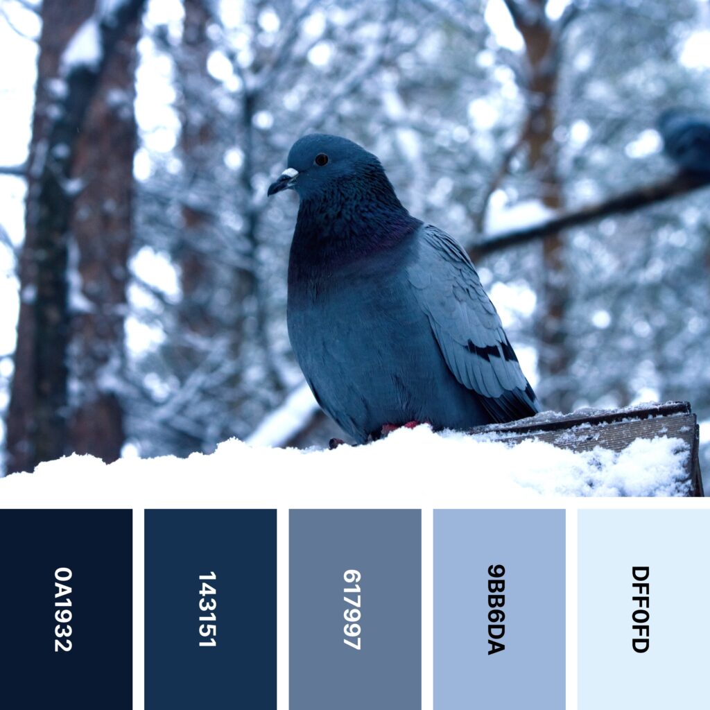
Names: Oxford blue, Prussian blue, Slate gray, Powder blue, Alice blue
Hex Codes: #0A1932, #143151, #617997, #9BB6DA, #DFF0FD
City pigeons (also called rock doves) can be found all over the world. They’re common enough that most people don’t look closely at them. However, these birds are actually made up of surprisingly beautiful colors, from their slate blue bodies to the iridescent feathers around their necks.
While this palette doesn’t capture the shiny purple-green feathers you see on some pigeons, it does do a good job of replicating the various shades of blue and blue-gray found on their bodies and wings. And as you may have gathered from the wintery cast of the example, it’s also a great palette to use for winter-focused brands and designs.
25. Amethyst Freeze

Names: Resolution blue, Palatinate blue, Byzantine blue, Non photo blue, Persian green
Hex Codes: #332686, #523DC5, #375ED2, #BEF4FE, #289991
Cool colors certainly make a statement when used in the foreground of a design. But as you can see here, they also make intriguing backgrounds. The purple and teal combination looks vaguely 90s-inspired, and it’s perfect for showcasing the ghostly outlines of the leaves at the picture’s center. But even though the leaves are largely white, they keep the cool theme going with hints of electric Non-Photo Blue.
26. Lakeshore

Names: Prussian blue, Indigo dye, Payne’s gray, Blue (ncs), Brunswick green
Hex Codes: #122C41, #08445B, #2E647A, #2185B6, #035042
A day at any lake is a good one. But there’s something especially refreshing about an alpine lake surrounded by evergreens and snowy mountains. This calming palette captures just about every cool color you’ll find at one of these lakes, from blue sky and water to deep green trees.
This watery look is ideal for nature-focused designs. Each shade in the palette will look nice against cool, crisp white, so if you’re looking for a neutral to include, this is a great one to pick.
27. Fly by Night

Names: American blue, Ultra violet, Glaucous, Air superiority blue, Powder blue
Hex Codes: #433E76, #514F81, #65779D, #819CBA, #AFBCCE
You can’t really go wrong with bird silhouettes in design. But what makes this design stand out isn’t so much the silhouettes of birds and trees as it is the striking purple-blue background.
Lots of designs blend colors like these in a watercolor-like effect. But often, that blend simply fades one color into the next (or shows the spectrum between the two).
This design is a little more unconventional — the blue on the left fades into the purple in the middle, which fades back into blue. This pattern adds some symmetry to the image while drawing your audience’s eye right to the center.
28. Blue Agate

Names: Dark slate gray, Blue (munsell), Platinum, Verdigris, Myrtle green
Hex Codes: #264248, #398A95, #DCE2E5, #60BDBC, #1B7979
Countless designs have been inspired by swirling blue ocean water and pristine white sands. Many of them simply use those colors in other applications, but this design looks remarkably like a tropical beach.
However, it’s abstract enough that it very well could represent other things, too. The star-like spots of white on the blue make it look galactic, and the intricate lines and swirls aren’t unlike those found in agate.
If you want to really lean into the beach-like look of this palette, you might want to add one more shade: the color of sand.
29. Equator
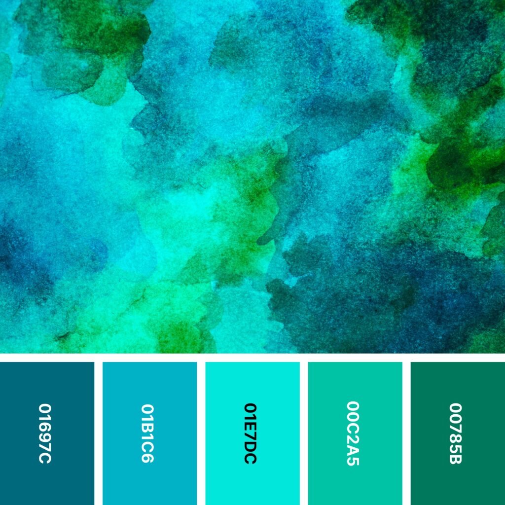
Names: Caribbean current, Moonstone, Turquoise, Keppel, Dark spring green
Hex Codes: #01697C, #01B1C6, #01E7DC, #00C2A5, #00785B
You already know that layering darker and lighter shades is a great way to create depth. This mesmerizing design shows you how to do that while still keeping the overall design simple. It looks like islands viewed from above, with Caribbean Current representing deeper areas of water and Moonstone and Turquoise representing shallower areas.
That being said, like the design above it, this one is abstract enough that it doesn’t have to be a body of water. It’s eye-catching enough to draw your audience in, but not so eye-catching that it seems too loud.
30. Skyline
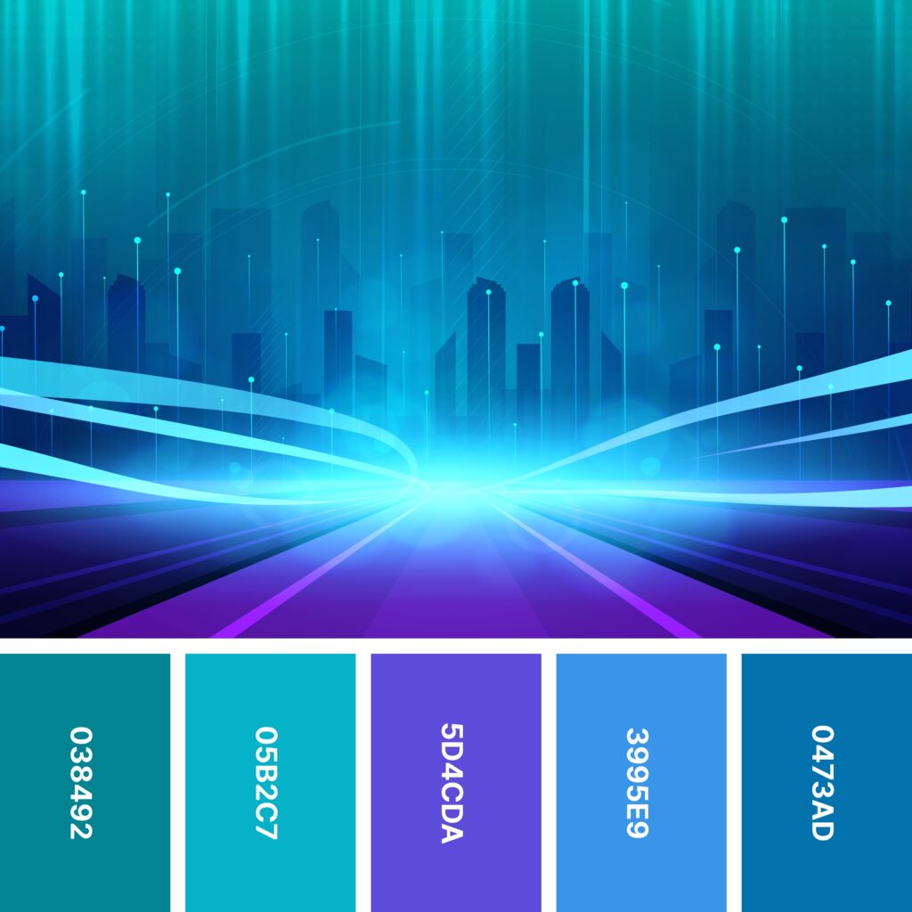
Names: Teal, Moonstone, Majorelle blue, Dodger blue, Honolulu blue
Hex Codes: #038492, #05B2C7, #5D4CDA, #3995E9, #0473AD
Plenty of designs include city skylines, so if you want yours to stand out, it’s important to include some kind of unique element. This example uses stunning electric blue lines against a background of deep, tranquil purples and blues.
Of course, you don’t have to use this color palette to create abstract and colorful cityscapes. But the example image offers helpful inspiration: when you place shades of glowing electric blue over deep blues and purples, your design is sure to get noticed!
Using Cool Colors in Your Design
Even people with little design experience know that cool colors have a calming effect. That’s likely because they’re found so often in nature. Blue water, blue skies, and green foliage are everywhere. You still see warmer colors (like the colors of bright tropical birds, flowers, and some fruits), but these shades are far less common.
When you’re careful about how you use cooler shades, you can create a design that connects deeply with your audience. Here are some things to keep in mind as you move forward.
Understand Color Meanings and Associations
You already know that cool colors are strongly associated with the natural world. But it also can be helpful to understand some of the meanings of each one. Of course, color meanings can vary by culture and with the exact shade you’re using, but here are some very general meanings:
- Green: Freshness, prosperity, new life, environmental consciousness
- Blue: Calm, relaxation, trustworthiness, loyalty, honesty, responsibility
- Purple: Mystery, spirituality, creativity, imagination, royalty
Very bright or neon versions of these colors may seem to contradict traditional meanings. For example, super-bright blues (think the color of Caribbean waters) tend to be energizing.
Be Mindful of Space
If you have interior design experience, you might already know that some designers suggest painting a smaller room in a cool color to make it look larger. That’s because cool colors create the illusion of receding from us, while warm colors appear to be closer.
For that reason, cool shades give you an opportunity to create depth. This is particularly true if your design includes warmer shades as well. For example, if you were creating an advertisement for a yellow rubber duck, you might photograph the duck against a deep blue background so it appears to jump out at your audience.
Don’t Forget Cooler Neutrals
Cool color schemes don’t only have to include varieties of blue, green, and purple. Neutral shades can be right at home in these palettes, too. In most cases, cooler neutrals work best. These are neutral shades with blue, purple, or green undertones.
It can be hard to pick out these undertones individually. However, if you already have a good eye for warm and cool colors, you’ll be able to intuitively pick out which neutrals lean toward the cool side.
That said, it’s important to note that there’s no rule saying you must use cool neutrals with cooler colors. If you’re the kind of person who likes to play up contrast, you might find that warmer neutrals work better for your design. For instance, in interior design, you sometimes see shades of powder blue with warm whites.
Create Welcoming Worlds With Cool Designs
Whether you’re incorporating a scene from nature into your design or making abstract shapes and patterns, cool colors have a profound effect on your audience and how they feel. When you combine the palettes above with your creativity, you’ll have the opportunity to dive into new and exciting designs.
Find more design inspiration in this collection of 24 themed color palettes.


