

If you are beginning to understand color theory, you may have come across some colors described as “high key,” “low key,” or even “mid key.” Having an understanding of these types of colors is essential if you’re an artist or designer. Even if you aren’t, though, understanding these types of colors can further your understanding of the world around you.
What Does High Key, Low Key and Middle Key Mean?

When you think of the phrase “high key,” you might imagine something with considerable energy. Imagining the phrase “low key” might evoke an image of something slower or more mellow.
This comes close to the heart of the definition of high key, middle key, and low key colors. In order to understand what these types of colors mean, picture a continuum from pure white to pure black. This continuum is known as a “value scale.” Simply put, colors that are closer to the paler end of the value scale are high key, while those closer to the darker end are low key. Of course, those in the middle are middle key.
Here’s a closer look at the value scale and what it means for a color to be a high, middle, or low key. On the white end of the spectrum, you have pure white and a continuum of pale grays. These are your high key colors. In this diagram, though, you can use a color besides black/white. Let’s use green as an example. As you get closer to pure white, you’ll see pale, pastel, and even washed-out green. Toward the pure black end of the continuum, you get very, very dark greens.
The end of the spectrum that’s closer to black is where your low key colors reside. Low key colors are often referred to as shades because they are mixed with black, where high key colors are called tints as they are mixed with white. These deeper colors are sometimes chosen over high key colors in interior design since they can bring a sense of elegance and even peace to a space. Depending on the color chosen, low key color schemes can lend a definite sense of boldness, too.
Mid key colors are, as the name suggests, right in the middle between high key and low key colors. These colors, also called “mid-tone” or “middle” colors, strike a balance between pastel hues and darker shades.
Now that we’ve gone over the basics, we’ll take a closer look at each type of color – its psychological impact on a viewer, its uses in interior design, and its uses in fine art.
High Key Colors

Whether it’s a photograph, a painting, or an interior, a high key color scheme is often seen as bright, airy, and even energizing. Depending on just how high key a color scheme is, though, you can get a sense of relaxation. Imagine, for a moment, a room with seafoam-green walls. This is a high key color that’s a pastel, but it tends to have a calming effect.
Interior designers have different reasons to use a high key palette. For example, a room that doesn’t have a lot of natural light can start to feel stuffy. To remedy this, a designer may go with a higher-key palette to give the room a lighter feel.
Of course, the exact mood that a high key palette evokes will depend on the actual colors used. In some cases, higher-key colors are used to tone down a color scheme that incorporates red, gold, or other very strong colors. High key colors can be an excellent tool when you (or a client) like the look of an interior with warm colors but want to avoid having the color become too overpowering.
If you’re a fine artist, a painting with a high key palette often has its advantages. High key paintings let you maximize saturation, since the darker values in these paintings are really mid-tone hues. If you want a painting that is very colorful to look at (and maybe not completely true to life), a high key palette affords you more complexity than most low key palettes.

Middle Key Colors

Middle key colors may not have the excitement of high key colors or the boldness of low key colors, but they have their own uses, too. Middle key colors are effectively middle-of-the-road colors: they aren’t too dark, and they also aren’t too bright. These colors sometimes run the risk of appearing flat or boring, but most people find them generally comfortable to be around.
In interior design, middle key colors have their advantages. You can make your home appear cozy (and stand out in a world of eggshell-white walls) without making every room look like a statement piece. Middle key colors are essentially a step up from neutrals. They’re just bold enough to give a home or a room an air of distinction.
In rooms with middle key palettes, homeowners or designers sometimes want to brighten them up a bit. This is usually easy to do, you’ll just need to add a touch of a complementary color. A room with purple walls might benefit from a yellow throw rug, or a room with blue walls could be accented by orange pillows on the couches.
When it comes to fine art, you don’t see a lot of middle key paintings. Unsurprisingly, these paintings can come off as dull and lifeless. Of course, it isn’t impossible to create a beautiful painting with a middle key palette, but it’s likely going to be a challenge.
Low Key Colors

As we mentioned above, low key colors are darker, fuller tones. Since you’re getting a definite dose of color with this type of scheme, you’ll want to carefully choose which colors you incorporate based on how they affect the viewer and what the colors symbolize. For example, a deep blue is likely to create a sense of calm, while a deep red may inspire energy or confidence.
In terms of interior design, a low key palette isn’t the right choice for everyone. Since these looks are closer to the darker end of the value scale, they are tones that incorporate more black. In the hands of an unskilled designer, a palette like this can look too intimidating, too dark, or too dull.
However, there are some spaces where a low key palette shines. For example, consider a room that’s often cluttered. Maybe it’s a small home office with a lot of stray books and files lying around. A darker palette can take some of the attention off of the clutter and onto the design scheme itself. Of course, with a low key color selection, it’s a good idea to make sure that a room has enough natural light. This will balance out the natural darkness of the palette.
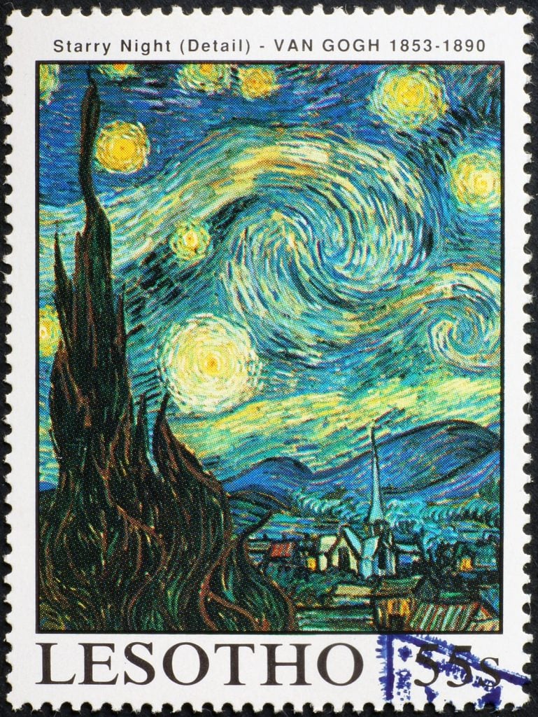
When it comes to painting and photography, choosing low key colors can go a long way toward creating a mood. It can be somewhat difficult to create sufficient detail in a very low key painting, as it becomes harder to distinguish between colors as they get closer to black. However, a painting with a silhouetted building or object in the foreground is a great example of a promising subject for a low key painting. Similarly, the buildings and dark blue skies of Van Gogh’s “Starry Night” makes it an example of a successful low key painting. However, Van Gogh balances out the darkness with bright celestial orbs so the viewer sees some contrast.
Final Thoughts on High, Middle, and Low Key Colors
Color theory is an interesting science. Parts of it are intuitive, and others become clearer once you’ve done your research. We’ve all walked into a room with a memorable color palette, but we might not have understood at the time just why that palette was memorable. But by coming to understand high, middle, and low key colors and the responses they evoke, we’ll all be better equipped to create art, design interiors, and simply understand the colors in our everyday life.


