
Color is a language in itself. Like music, it exudes distinctive energy that can seem impossible to capture in words.
So, how exactly do you go about describing colors? It helps to have a handful of fitting adjectives in your arsenal and a thorough understanding of what each word means.
Here are 264 descriptors to get you started — we’ve divided them into these sections:
- Words to Describe Colors in General
- Words to Describe Shades of Red
- Words to Describe Shades of Orange
- Words to Describe Shades of Yellow
- Words to Describe Shades of Green
- Words to Describe Shades of Blue
- Words to Describe Shades of Indigo/Purple
- Words to Describe Shades of Pink
- Words to Describe Metallics
- Words to Describe Shades of Brown/Beige
- Words to Describe Shades of White
- Words to Describe Shades of Gray
- Words to Describe Shades of Black
Words to Describe Colors in General

1. Vivid
A vivid memory is sharp and clear — it stands out from the noise of the rest of your mind. Vivid colors are similar. They’re strong and described as being “very high in chroma.” That means that they’re highly pure, with little to no white, black, or gray.
2. Bright
Bright colors are intense and saturated. Even if you know virtually nothing about color theory, you’ll be able to spot a bright color when you see one.
Some bright colors might appear fluorescent or neon. It’s easy to assume that a “bright” color would be a warm shade like red, orange, or yellow. But if you’ve ever seen an intensely blue sky (or even a green highlighter), you know that cool colors can be bright, too!
3. Saturated
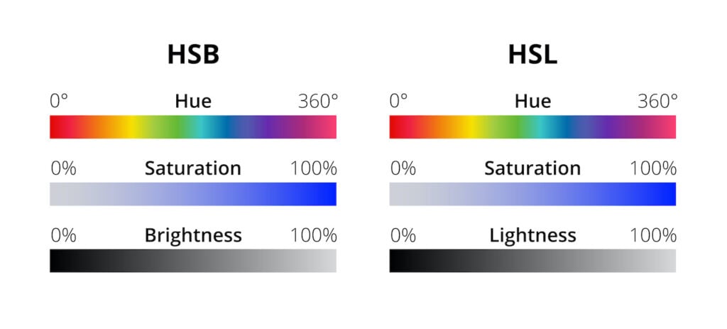
Saturated colors are pure and intense. An image with highly saturated colors might look more vivid and “alive.” Some visual artists and designers will strategically make some images look overly saturated. This can create an artificial look, but when it’s done carefully, it can be very effective.
The diagram below shows you two common representations of the RGB (red-green-blue) color space. HSL stands for hue-saturation-lightness, and HSB stands for hue-saturation-brightness. These two models are slightly different, but for our purposes, they do a good job of illustrating what low vs. high saturation looks like:
4. Jewel-Toned
Jewel-toned colors are very saturated and somewhat dark. They’re inspired by the color of actual gemstones like emeralds, sapphires, garnets, etc.
5. Rustic
Rustic colors are those that can be found readily in nature. They usually are deep and earthy, and many have an autumnal feel.
6. Matte
A matte color is a shade whose finish is not glossy. It might look “dull” or “flat.”
7. Dark
A darker color is one that has some black added to it. A color that is changed in this way is known as a “shade” of the original value.
8. Pastel
Pastel colors are soft, light versions of colors made by adding white to a more saturated hue. (When you change a color by adding white, you create what’s called a “tint” of the original value.) Most people describe pastels as being “soothing” or “relaxing,” and they are commonly used to make audiences think of spring.
9. Luminous
Technically, “luminous” means that something glows or emits light. But you can also describe a color as being luminous if it’s so bright it appears to glow. For example, vivid neon shades could be colloquially described as being luminous.
10. Brilliant
The word “brilliant” has a number of different meanings. But at least when it comes to color, a brilliant shade is one that is (1) highly saturated and (2) reflects a lot of light.
11. Muted
You can probably recognize a muted color when you see one. “Muted” is the opposite of “vivid,” so muted colors are somewhat dull and relatively desaturated. Practically speaking, if you want to make a muted color, you take a base color and add some black, gray, or a complementary color.
12. Warm
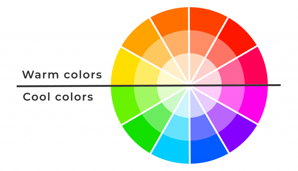
Warm colors are red, orange, yellow, and their combinations. As you can see above, exactly half of the color wheel is made up of warm colors, and exactly half is made up of cool colors.
You might hear people talk about “warm neutrals” as well. Neutral colors are technically neither warm nor cool, but they can have undertones that make them lean either warm or cool.
13. Ashy
Ashy (or “ash”) is sometimes used to describe colors that have a slightly smoky, muted quality. You most often see this modifier used in “ash blue,” a pale, powdery blue with a little gray mixed in.
14. Earth-Toned
As the name suggests, “earth tones” are colors that are often found in nature — think muted, often neutral shades like khaki, rust, olive green, and cocoa brown. Most of the time, earth-toned colors and rustic colors are essentially the same.
15. Deep
When used to describe color, “deep” isn’t really a technical term. It’s more of an analogy. A deep pool of color (like the deep part of the ocean) tends to have a certain richness and darkness to it. If a certain shade makes you think of a deep pool or well of color, you can safely describe it as being “deep.”
16. Desaturated
Desaturated colors are hues that have another color blended in. That color makes them look closer to a grayscale shade, so designers commonly make desaturated colors by mixing in black or white. The illustration under “saturated” above can also give you a good idea of what a desaturated color looks like.
17. Variegated
This is a word used to describe the coloration of a plant, animal, or other entity — not the characteristics of an individual color. It usually means something is colored with at least two different shades, and typically, those shades are arranged in an irregular pattern.
“Variegated” is a word often used to describe plants. In this context, it refers to a plant with leaves that have either edges or a pattern of another color besides green.
18. Drab
Some people use “drab” to refer to a specific shade of dull brown. Others use it to describe dull, muddy colors in general. One of the best-known of these is “olive drab,” a dull shade that looks like a mixture of brown and olive green. Unfortunately, the word itself has a somewhat negative connotation, as “drab” can also be used to mean “boring.”
19. Garish
This isn’t a technical term, but it can be used to describe colors that are overly or offensively bright. Something that is garish is typically also gauche, tasteless, or tacky.
20. Bold
A color that is bold is both saturated and bright. Bold shades command attention, and they’re commonly used when a designer wants to make something very eye-catching.
21. Neon
A neon color is a version of a color (either a primary or secondary color) that is extremely bright. Take a look at an illuminated neon sign or the almost-glowing ink of a highlighter, and you’ll have an idea!
22. Opalescent

Opalescent colors are those that have an iridescence like that of an opal. The iridescence itself changes depending on the angle of the light.
The best way to really understand opalescence is to see it on an opal. The picture above shows a magnificent piece of natural blue opal on a contrasting black background.
23. Cool
A cool color is the opposite of a warm color. Cool shades are made up of blue, green, purple, and their mixtures. As you can see on the color wheel above, cool colors make up the side of the color wheel right across from warm colors.
24. Muddy
You might hear “muddy” used to describe colors in a couple of different ways. Some people might use it to describe brown and gray shades that are close to the color of actual mud. Others might use it to describe colors that have been desaturated (“muddied”) by the addition of colors like these.
25. Stark
At least in terms of color, you most often hear “stark” used to describe shades of white that seem harsh or bare. Usually, it’s reserved for the kind of cold, plain white often seen in hospital hallways.
“Stark” is also sometimes used to describe dramatic contrasts in color schemes. For example, if you’re designing an interior with a bright white couch against a dark charcoal wall, you’re certainly employing a very stark contrast!
26. Fluorescent
“Fluorescent” is a word used to describe colors that appear unnaturally bright. That’s not an illusion — fluorescent colors do actually have an unnatural feature that makes them incredibly bright. These shades absorb UV light. They then radiate the bright color we see.
Because fluorescent colors emit more light than most shades, they’re very useful for any kind of application where you need to draw attention. That’s why you so often see them used for safety vests, highlighters, and even some signs.
Words to Describe Shades of Red

27. Fiery
What color is fire? Most of the time, it’s a bold, bright orange. Still, red is often described as being fiery. In this context, it usually refers to the passion and energy of fire, rather than its exact color.
28. Claret
Claret is a deep, rich shade of purplish red. It gets its name from a French wine of the same color. Because claret wine is traditionally produced in the Bordeaux region of France, it’s also the color most people mean when they say “Bordeaux.”
29. Vermilion

Traditionally, vermilion was a red-orange pigment made from powdered cinnabar (a red mineral). Today, it can be used to describe rich, intense shades of red-orange. The bird shown above is the vermilion flycatcher (Pyrocephalus obscurus), and it offers a striking illustration of the color!
30. Crimson
Crimson is a shade of rich red similar to that of a red rose, but it leans just a touch more purple. Somewhat confusingly, it used to be the name used to describe a dye made from an insect called Kermes vermilio. Of all shades of red, this is probably the one most closely associated with courage, power, and nobility.
31. Brick
Simply put, brick red is roughly the color of traditional brick. Depending on who you ask (and the building you’re looking at), it might be closer to either red with a hint of brown or brown with a hint of red.
32. Rose
Similar to brick red, the color of rose red can vary a bit depending on who you ask. If you’re talking about a color sometimes just called “rose,” you might mean a shade that’s exactly between red and magenta on the color wheel. But often, “rose red” means the deep, rich, slightly purplish color of a classic red rose.
33. Ruby
Of all jewel tones, ruby is probably one of the ones that leans the warmest. Just like actual rubies, the exact shade of ruby red can vary a little. But in many cases, it has the rich depth of a quality ruby with just a hint of pink.
34. Cherry
There are plenty of different species of cherry, so it’s easy to get a bit confused over what exactly constitutes “cherry red.” But generally speaking, cherry is a bright, extra-hot red that’s the color of a maraschino cherry.
35. Flaming
You might sometimes hear someone describe red as being “flaming.” This descriptor often refers to a red with clear orange undertones.
36. Scarlet
Scarlet is another shade of red characterized by orangish undertones. It’s also rich with symbolic meaning: scarlet is the shade of red most closely associated with the blood of Christ, so it plays an important role in many Christian denominations.
37. Cardinal
You saw above that the vermilion flycatcher is a bird whose color matches the name. So you may be surprised to hear that cardinal red doesn’t always match up to the color of male cardinals. The birds are closer to scarlet in color, and cardinal red usually has a trace of purple. The color name gets even more confusing when you realize it’s not the color worn by Catholic cardinals, either — they wear scarlet!
38. Carmine
Carmine is a shade of red with an interesting history: it originated as a dye made from crushed cochineal insets. However, most people today use “carmine” to describe shades of red that are a little bit purplish, but not as purplish as crimson.
39. Tomato
“Tomato” is a descriptor used for reds inspired by fresh tomatoes. If you’ve ever seen a perfectly ripe tomato, you’re familiar with it — it’s a bright, saturated red-orange shade.
40. Oxblood
Oxblood is a rich, intense shade of red that sits somewhere between the purplish burgundy and the brownish maroon. It can be used to describe various shades of dark, muted red.
41. Cinnabar

Cinnabar red is the color of the mineral cinnabar. Since vermilion is the color of powdered cinnabar, you could use these two adjectives interchangeably.
42. Wine
If you’ve ever paid close attention to the words people use to describe shades of red, you’ve almost certainly seen “wine” come up. Usually, “wine red” is a dark, purple-tinted red shade similar to claret.
43. Garnet
If you love jewel tones, you certainly appreciate a nice shade of garnet red. That said, real gemstones can vary a good bit when it comes to color. You could correctly use “garnet” to describe a number of different shades of dark red.
44. Madder
Madder red started out as a pigment that came from the common madder plant, Rubia tinctorum. The color itself is sometimes described as being a “true red,” as it sits right between red orange and purplish red.
45. Cordovan
Cordovan is a shade of reddish brown (or brownish red) named for a traditional leather produced in Cordoba, Spain. It’s an apt descriptor for a red shade that’s somewhere between burgundy and a very dark rose.
Words to Describe Shades of Orange

46. Tangerine
Tangerines are citrus fruits related to oranges. Often, their skin appears a bit brighter, so many shades of bold, saturated orange are referred to as “tangerine.”
47. Burnt
Burnt orange is a classic, fire-inspired orange shade that often makes its way into autumnal palettes. Typically, shades of burnt orange are dark and slightly reddish.
48. Sunset
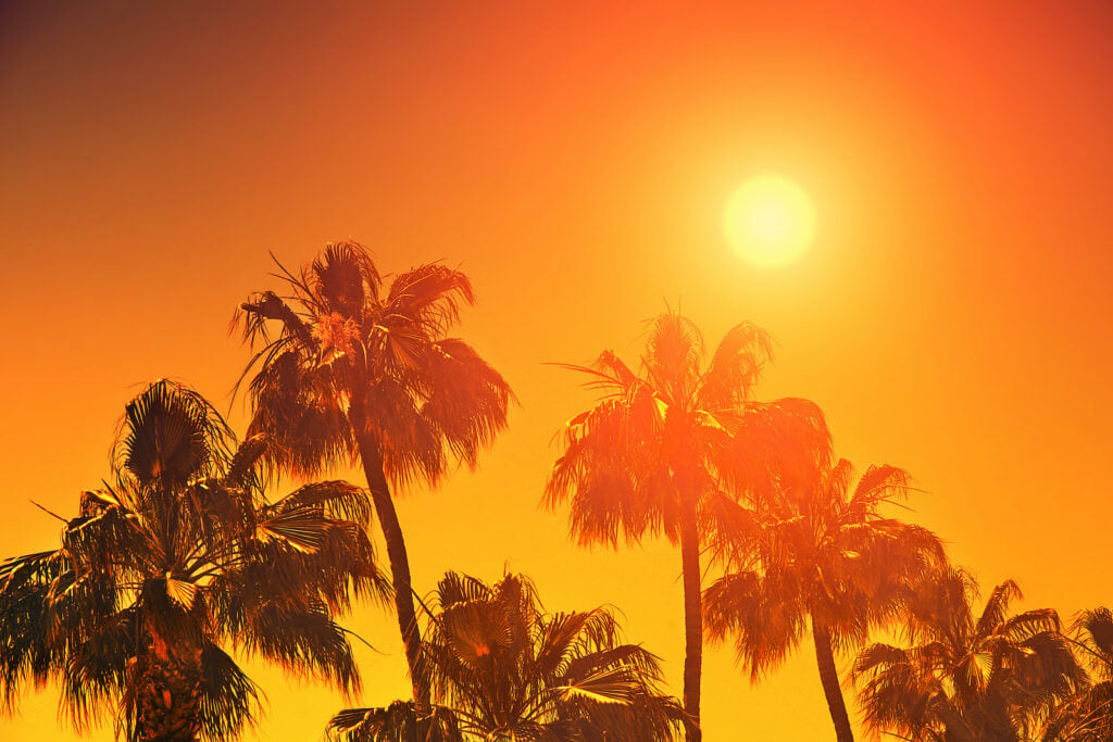
Everyone loves a beautiful, fiery sunset. And if you see a shade of orange that reminds you of the last time you saw a setting sun, you might just call it “sunset orange.”
49. Carrot
One of the best ways to clarify the quality of a particular orange shade is to compare it to something orange. Everyone knows the color of a carrot, so describing a shade as “carrot orange” can be particularly useful. However, you sometimes see this color name used to denote a pale, yellowish orange that’s lighter than most carrots.
50. Reddish
Some of the words on our list offer you unique, creative ways to describe different colors. Others, like this word, are plain and utilitarian. Many shades of orange have clear undertones of red. If you describe them as “reddish-orange,” anyone will know what you mean!
51. Apricot
Apricots are related to peaches, so it’s fitting that “apricot” describes a somewhat similar color. Apricot is a lighter shade of orange with yellow undertones.
52. Sherbet
There’s nothing quite as refreshing as a bowl of orange sherbet on a hot summer day. And as you might already know, sherbet orange is a pale, pastel-like shade.
53. Citrus
Oranges are citrus fruits, so describing any orange shade as “citrus” might seem like a no-brainer. But most people who describe a specific orange shade as “citrus orange” mean a color that is bright, saturated, and juicy.
54. Marmalade
If you’ve ever put orange marmalade on your toast, you know that this distinctive condiment is actually a mix of different orange shades. But if you had to pick one color to capture the essence of marmalade, it would likely be a soft yet energetic tangerine-like shade.
The color “orange marmalade” can be described as the shade of a saturated, pure, tangerine orange with a sherbet undertone.
55. Peach
Is peach a shade of orange? Maybe. If you spot a shade of light orange with decidedly pink undertones, you might just get away with calling it “peachy.”
56. Bittersweet
Bittersweet is a memorable shade of orangish brown — or at least it can be. The orangish-brown description matches the color of the Crayola crayon called “bittersweet,” but if you do a deep dive into this polarizing color, you’ll see some people describe it as a shade of red, others describe it as a shade of brown, and still others as a shade of orange!
57. Pumpkin
Each year when fall rolls around, you can count on a host of website updates and other designs including some level of pumpkin orange. “Pumpkin” might be one of the most common words to describe shades of orange, but as you might have already discovered, it’s used to describe a surprisingly wide range of colors.
58. Cheerful
Orange is probably one of the most exuberant colors there is. So it makes sense that “cheerful” is an appropriate word to describe it!
59. Persimmon

Not everyone is familiar with the persimmon, an orange fruit whose color can range from a pale, yellowish orange to a rich red-orange. But if you’re looking for a different way to describe a shade of orange, “persimmon orange” is great.
60. Autumnal
“Autumnal orange” isn’t a specific shade. However, almost every autumn-inspired color palette includes some shade of orange inspired by the changing leaves. If a specific shade of orange reminds you of the fall, it’s safe to call it autumnal.
61. Zesty
If you’ve ever included orange zest (finely grated fresh orange peel) in a recipe, you know that this zingy ingredient is aptly named. Some shades of orange embody the energetic character of orange zest, so why not describe them as “zesty”?
62. Cantaloupe
What color do you picture when you imagine cantaloupe orange? This energetic color is somewhere between pumpkin orange and sherbet orange.
Words to Describe Shades of Yellow

63. Golden
Golden yellow could be considered an earth tone — it’s about the color of the leaves of aspen trees in autumn. If you want to describe a shade of rich, slightly muted yellow, this is a great word to use.
64. Lemon
When you’re describing colors, it can be fun to come up with unique adjectives. But sometimes, you just want to describe a classic shade — like the bright yellow of a lemon peel.
65. Sunny
The sun has traditionally been portrayed as being yellow. There’s no singular shade of sunny yellow, but it’s usually a bright, energetic color close to lemon yellow.
66. Highlighter
Everyone’s familiar with highlighter yellow — “highlighter” is the perfect adjective for neon or fluorescent yellow.
67. Saffron
Saffron, one of the world’s most expensive spices, comes from the dried-out stigmas of saffron crocus flowers. These stigmas are usually a rich red color. However, when you add even a touch of powdered saffron to rice or another dish, you’ll see a vivid shade of yellow that’s somewhere between lemon yellow and golden yellow.
68. Ochre
If you describe a shade of yellow as “ochre,” you’re referencing one of the world’s oldest pigments. Yellow ochre, a pigment made of various kinds of iron oxides, has been made and used by humans for around 300,000 years.
But what type of yellow could accurately be described as “ochre”? This shade is muted and slightly dusty, much like mustard yellow.
69. Gamboge
Gamboge is a rich, golden yellow with orangish undertones. It gets its name from a pigment made from tree sap from trees in the Garcinia genus. The toxic pigment has largely been replaced by artificial alternatives, but “gamboge” can still be used to describe rich shades of golden yellow.
70. Daffodil
Daffodils are some of the most recognizable yellow flowers. They come in many shades of yellow, so you could refer to a number of bright, springlike yellow shades as “daffodil yellow.”
71. Mustard
Mustard yellow is usually dark and slightly muted. It’s named after the condiment, but it’s typically closer to the gold hue of Dijon mustard than the extremely bright yellow of traditional mustard.
72. Amber
This might sound like an odd adjective for any shade of yellow. After all, amber is usually a honey-like color that sits somewhere between brown and yellow.
However, a shade of yellow with a rich, golden cast could also be described as “amber.” Yellow traffic lights are a great example — they’re officially called “amber” in color.
73. School Bus
The best adjectives let someone instantly picture the exact color you mean. And few color descriptors are as vivid and specific as school bus yellow!
74. Canary

Canary yellow is the color of a canary’s bright yellow plumage. It’s a cheerful, sunny color that might just make you think of this little bird’s sweet song.
75. Xanthous
Looking for a memorable way to describe a shade of yellow? “Xanthous” describes the distinct, yellow-orange color of an egg yolk. It comes from the Greek word “xanthos,” meaning “yellow.”
76. Buttery
Buttery yellow (sometimes just called butter yellow) is a light, warmish shade that’s a bit more yellow than cream. It’s a beautiful color for adding some cheer to interiors!
77. Mikado
In Japanese, “mikado” translates to “emperor.” Mikado yellow is a rich, golden shade once worn by emperors to show their royal status.
78. Dandelion
Yellow might not be the most common color in nature, but when it appears in the form of flowers, it creates an effect that’s nothing short of joyous. If you spot an intense shade of yellow that has the velvety glow of this common (but beloved!) weed, you could appropriately call it dandelion yellow.
79. Lemonade
The adjectives you use to describe colors have a profound effect on how other people see them. For instance, when asked, people love a color called “mocha,” but they don’t like a color called “brown” — even though the two colors are exactly the same!
Likewise, you might describe a pale shade of yellow as “lemonade yellow.” “Lemonade yellow” and “butter yellow” can be used to describe similar (or even identical) shades, but “lemonade yellow” has a lighter, more refreshing connotation. “Butter yellow” is more likely to make an audience think of warmth and coziness.
80. Goldfinch

As you’ve seen so far, many colors can be described using the names of different birds as adjectives. “Canary yellow” is a color name so common that it’s become a cliche.
If you like bird-name descriptors but want to sound more original, try describing a color as “goldfinch yellow.” American goldfinches are bright little birds whose color is close to lemon yellow.
Words to Describe Shades of Green
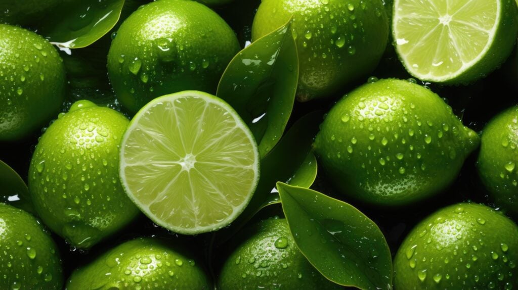
81. Verdant
Verdant green is the color of lush, fresh vegetation. If you spot a shade of deep, rich green that makes you think of a rainforest or a jungle, you could accurately describe it as “verdant.”
82. Leafy
“Leafy” is a shade of green that’s pretty close to verdant. In practice, it sometimes refers to a slightly lighter, springlike shade.
83. Spring
Spring green isn’t really a specific shade. It usually refers to a light green similar to that of new leaf buds. Most spring greens are fairly light, but not so light they’d be considered pastels.
84. Hunter
Most people know hunter green as a classic shade of dark green. However, a significant number of people also incorrectly use it interchangeably with forest green. Both are dark greens, but hunter green is closer to true green. Forest green has more blue undertones.
85. Jade
Jade green gets its name from the gemstone jade. Not everyone knows that jade comes in several different shades, including blue, black, red, lavender, brown, and white. It’s most commonly a light yellowish green — the shade most people mean when they describe something as “jade green.”
86. Forest
As mentioned above, shades of green described as “forest” are dark with cool blue undertones.
87. Pear
Pears come in a number of different colors. However, most shades of green described as “pear” are a pretty shade of yellow green. That being said, they’re more grassy than yellow — celery green is a similar color, but it has more of a yellow undertone than pear green does.
88. Lime
If you describe a shade of green as “lime,” you probably mean a mega-energetic shade of light green with a little bit of yellow. Larger stretches of lime green can get overwhelming pretty quickly, so in both digital and interior design, it’s commonly used only as an accent color.
89. Kelly
Looking for an adjective to describe a bright, true green? You might be looking for the word “kelly.” Kelly green is a shade that sits exactly between blue and yellow on the color wheel.
90. Pine
Pine green evokes the fresh, unmistakable scent of pine trees in winter. Thanks to its generally positive connotations, it’s a great word to describe shades of dark green.
However, it can be a challenge to figure out what shades of green could properly be described as “pine green.” Just as different pine trees have differently-colored needles, there’s no singular hex code for pine green. Most people will tell you it sits between hunter green and forest green, though.
91. Iguana
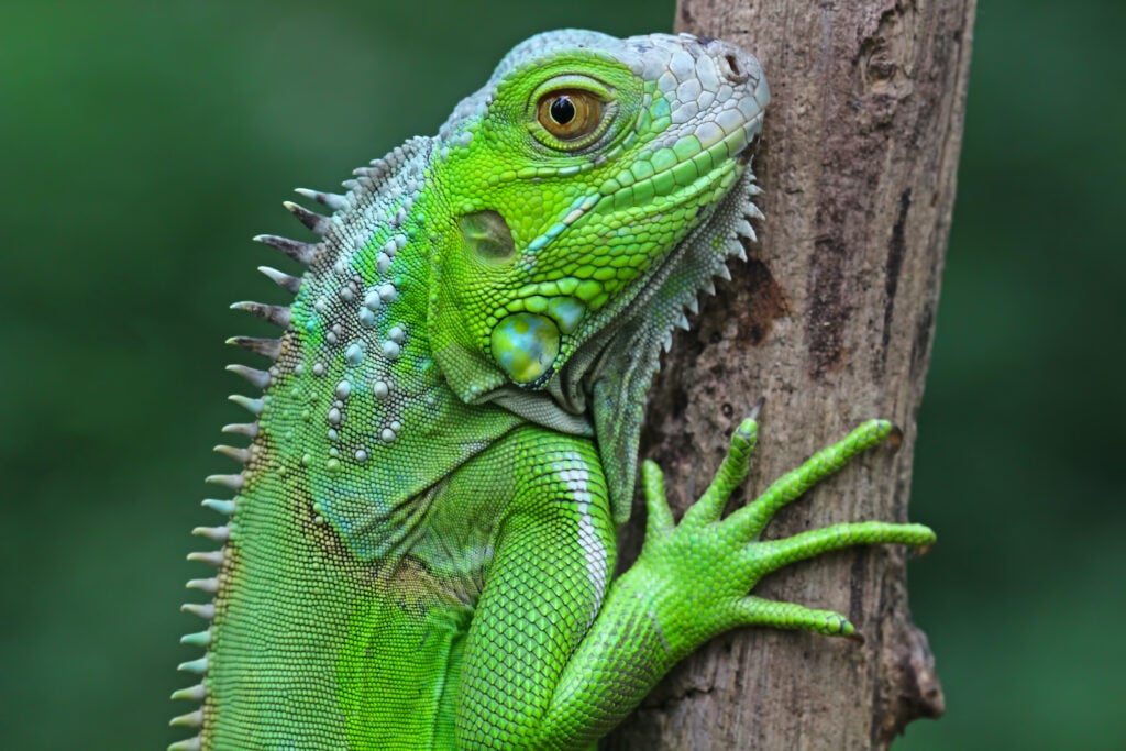
Reptiles come in all kinds of wonderful colors. Iguanas aren’t the absolute brightest, but many of them are an intense green like you see in the picture. If you’re looking for a new way to describe an energetic, kelly-like shade of green, try “iguana green.”
92. Lush
When someone describes foliage (usually grass) as “lush,” they usually mean it’s thick, abundant, and a rich shade of green. This is a word that could be used to describe a number of different shades, much like “verdant.”
93. Apple
There are more than 7,500 varieties of apples, so “apple green” could technically be used to describe seemingly endless colors! However, it’s almost always used to describe the light yellow green color of a Granny Smith apple.
94. Chartreuse
“Chartreuse” sounds like a sophisticated way to describe a color. It refers to a bright, energetic shade of light yellow green, and the word itself comes from an herbal, slightly sweet French liqueur.
95. Honeydew
Looking for a word to describe a light, pastel green that isn’t quite mint? Try “honeydew.” This sweet, juicy melon usually has a color that’s light green with a slightly bluish undertone (but not as bluish as the undertones in mint green!).
96. Olive
“Olive” probably isn’t the most original word you could use to describe a shade of green. But if you need someone to understand exactly what color you mean, it’s a smart choice — it refers to the color of a green olive.
On a related note, you might have also heard of the color “olive drab” — this is a duller, more brown version of olive green.
97. Celadon
Celadon is a beautifully exquisite green that originated as the color of a pottery glaze from ancient China. This glaze created a light, jade-like color by changing the ferric iron in iron oxide to ferrous iron. Before it got the name it goes by today, the ancient Chinese called it mi se, or “mysterious color.”
“Celadon” is a modifier for a fairly specific color. But if you want to describe a shade of light green that sits roughly between jade green and tea green, it’s a beautiful and original choice of adjective.
98. Emerald

Emerald is an appropriate adjective for a deep, jewel-toned shade of green. As you might have noticed, there’s some variation in the colors people describe as “emerald.” Some use it to mean a bold, almost true green like that of the emerald crystals in the picture. Others use “emerald” to mean a darker, bluish shade closer to forest green.
So which color does “emerald” truly describe? As it turns out, either one is technically correct. There’s a lot of variation in the colors of emeralds — some are so bluish they’re even described as teal.
99. Tea
Tea green is a color based on the color of green tea once it’s been brewed. More specifically, it’s a pale, even pastel yellowish green. If you see a pastel green that looks like mint green’s yellower counterpart, “tea green” might be an appropriate name for it.
100. Mint
You’re almost certainly already familiar with mint green. Like “olive,” “mint” isn’t the most original word you could use to describe a color. But if you use it, almost anyone will know what you mean.
101. Clover
In many parts of the world, clover blankets the ground in spring and summer. “Clover” describes a shade of green that is bright and rich, much like a slightly deeper and darker kelly green.
102. Pea
Pea green is usually a muted, slightly yellowish green. Actual peas tend to be a little bit greener, but most people use “pea green” to describe a color like that of pea soup.
103. Sage
Of all shades of green, sage might just be the trendiest. It’s light yet earthy — a rare combination, but a useful one for interiors. You can use “sage” to describe light green shades that match the herb itself. More often than not, they’re slightly muted with silvery undertones.
104. Celery
Celery isn’t most people’s favorite vegetable, so it might not sound like an especially appealing shade of green. However, this shade has become fairly trendy in recent years, especially in the world of interiors. If you want to sound like you’re up-to-date on current design trends, “celery” is a good descriptor to use for a yellow-leaning light green.
105. Pistachio
If you spot a shade of green that reminds you of a pistachio nut, this is a great adjective to use. Pistachio green is somewhat similar to sage — it’s just a little more yellow.
106. Grass
What color is grass green? The exact shade might vary depending on personal opinion, but “grass” typically describes a light, medium green.
Words to Describe Shades of Blue
107. Powder
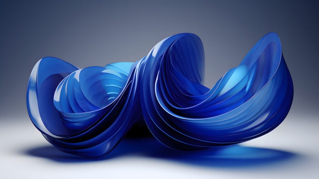
Powder blue is one of the most recognizable shades of blue. Of course, there’s no exact definition, but if you need to describe a pale and slightly grayish blue, “powder” is a recognizable adjective to help you do so.
108. Royal
Like powder blue, royal blue is another well-known shade. It’s deep, but it’s much lighter than navy. It comes close to what many people imagine when they picture a “true” shade of blue.
109. Cerulean
Cerulean is a beautifully intense blue that’s a little darker than deep sky blue. A pigment by the same name was originally made using cobalt. Today, the exact color of cerulean varies depending on who you ask. For instance, Pantone’s version is fairly pale, and Crayola’s is greener than most.
110. Caribbean

Whether you’ve been on a Caribbean vacation or have just seen its beautiful beaches in photographs, you probably have an idea of what someone means if they describe a color as “Caribbean blue.” More often than not, it describes the turquoise-like shade you see in the picture above.
111. Navy
As one of the best-known shades of blue, navy doesn’t really need an introduction. It’s an apt descriptor for several different shades of dark blue.
112. Cyan
If you’ve done any work with the CMYK model of subtractive color, you’re probably already familiar with cyan. Even though “cyan” refers to a very specific shade, many people use this word to describe a handful of shades of bright blue-green.
113. Peacock
If you’ve ever seen a male peacock in person, you’re familiar with the magnificent fan of green feathers with their eye-like markings. But you’ve also seen the bird’s bright blue body with magnificently iridescent feathers. This color — a shade similar to royal blue, but a little darker — is best described as “peacock blue.”
114. Cobalt
Cobalt is a remarkable blue shade that’s lighter than royal blue but darker than sky blue. The original color came from a pigment made from the cobalt mineral. If you spot a shade of blue that’s both medium and bright, chances are good that you could accurately describe it as “cobalt.”
115. Sky
Sky blue is easily one of the most famous shades of blue. The color “sky” describes is pretty self-explanatory — just take a look at the sky on a clear day!
116. Teal
Is teal a shade of blue or green? This shade does a great job of straddling the line between the two, although slightly differing shades of teal might technically fall into different categories. Either way, if you describe a color as “teal,” anyone will know that you mean this rich, deep blend of cool colors.
117. Turquoise
Many people errantly mix up turquoise and teal. Both are shades of blue-green, but the similarities end there. Turquoise is bright, vivid, and light, just like the stone it’s named after.
118. Sapphire
Sapphire blue is an intensely colored jewel tone. It’s both bright and saturated, and it really makes a statement. You might already know that sapphires come in many colors. But because blue is far and away the most common, just about anyone will know that if you describe something as being “sapphire” in color, you mean that it’s blue.
119. Icy
What color is ice? You might say it’s clear, and you wouldn’t be wrong. But just like water, ice looks blue if you look through enough of it. Usually, designers depict this color as being a very dilute cyan or cornflower blue.
120. Piercing
There isn’t really a color known as “piercing blue.” Rather, “piercing” is an interesting adjective sometimes used to describe blue. It tends to only be used to describe blue eyes.
121. Ocean
The ocean can be a number of different colors depending on where you are in the world. That means that if you use “ocean” to describe a shade of blue, you could mean any number of different colors. But usually, if “ocean” is used to describe blue, it refers to some version of blue green.
122. Ultramarine
Ultramarine blue is a shade that is incredibly saturated and leans toward violet. Like many classic blues, ultramarine originated as a pigment. It was made with finely ground lapis lazuli, and because the process of grinding it was so lengthy and complicated, the pigment was roughly ten times the cost of the stone it came from!
123. Midnight
You might think that any shade of blue described as “midnight” could also be described as “navy.” However, in general, “midnight” refers to a blue that is so dark it could almost be mistaken for black.
124. Watery
Some of the descriptors on our list are meant to describe a specific shade. Others are more general. This one falls into the latter category. Several paint companies have offered their interpretations of “watery blue,” and many of them are pale, muted shades of blue with greenish undertones.
125. Lapis Lazuli
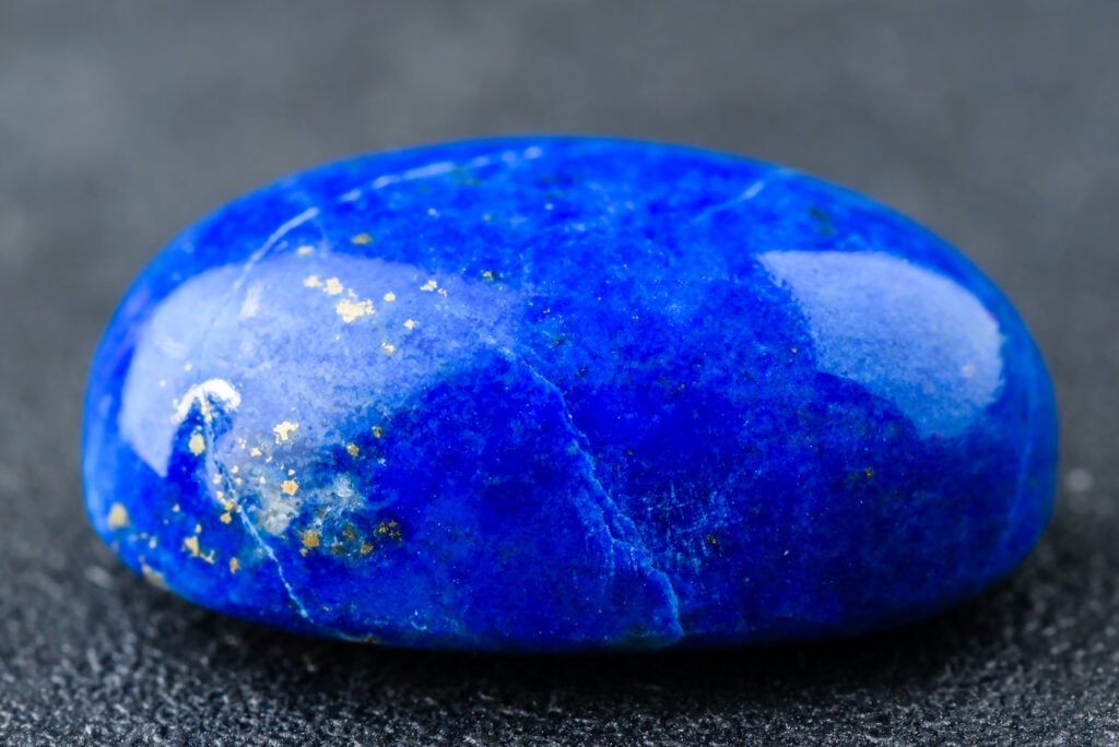
You saw above that ultramarine pigment was originally made from ground lapis lazuli, so you might think you can use these terms interchangeably when describing colors. However, ultramarine is more intense and saturated. If you see an object colored like the lapis lazuli stone shown above, you could describe it as being “lapis lazuli blue.”
126. Azure
Need to describe something that’s approximately the color of the sky? “Azure” might be the adjective you need. It describes a color that sits right between cyan and blue on the color wheel.
127. Denim
This is a pretty self-explanatory one — if you spot something that’s about the color of blue jeans, you could describe it as being denim blue!
Words to Describe Shades of Indigo/Purple

128. Regal
Both royal blue and royal purple are relatively well-known colors. If you want to indicate that something is royal purple but would rather use a word that’s not quite as common, try describing it as a shade of “regal purple” instead.
129. Tyrian
Tyrian purple, a reddish-purple dye, was first produced by the Phoenicians by grinding up shellfish. Because clothing colored with this dye was so expensive, Tyrian purple was also known as “royal purple” and “imperial purple.” If you want to use an interesting adjective while showing off your knowledge of history, don’t miss this one.
130. Lavender
Lavender is a color that can be extracted from the lavender plant. Even people with a minimal understanding of color theory are familiar with it — it’s a soft, quiet shade of purple that leans more blue than red.
On a side note, some people mistakenly describe lavender objects as being “lilac” in color. “Lilac” refers to another color inspired by a flower. Lilacs are pinkish to purplish, although the purple ones lean more red than blue.
131. Burgundy
Some people describe burgundy as being more red than purple. However, it looks a lot like a dark purple with more red than average. Usually, if something is about the color of red wine (but with a little extra hint of purple), you can correctly describe it as being burgundy.
132. Aubergine
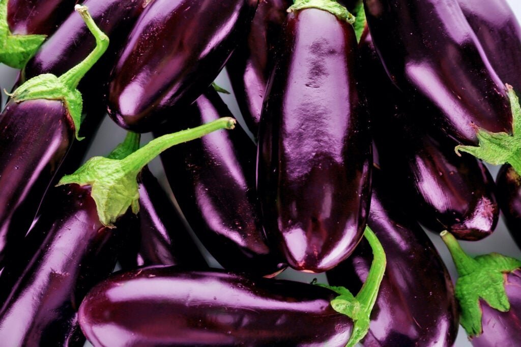
As a color name or color descriptor, “aubergine” sounds mysterious and sophisticated. However, it’s simply the French word for “eggplant.” Darker shades of aubergine can look almost black, and even light versions are shades of deep, commanding purple.
133. Violet
Some people regard violet as its own color. Others think it’s more accurately categorized as a shade of purple. Either way, if you spot something that’s a deep, blue-leaning purple, you could describe it as “violet.”
134. Plum
Plum is a popular purple shade that often pops up in winter color palettes. Actual plums are often very dark, but the color generally called “plum” tends to be more of a reddish purple with a hint of brown.
135. Electric
Purple is a cool color, so you might not think of it as being particularly bright or energetic. But “electric purple” describes an ultra-bright, near-neon shade. It’s a fun adjective to add to your color vocabulary!
136. Mulberry
Mulberries are sweet blackberry lookalikes. But if you try to look up which colors could be correctly described as being “mulberry,” you’ll see that there’s not really a consensus. You could correctly use the word to describe the deep, red-tinged black of the outside. But you also could use it for the deep, rich purple-red cast of mulberry juice or jam.
137. Imperial
As you saw above, imperial purple is yet another option you have for describing royal purple or Tyrian purple.
138. Orchid
Orchids come in all sorts of colors, so it might seem odd that one of these is called “orchid purple.” This color usually denotes a pretty shade of light purple that almost looks pink — a fairly common color among orchids.
139. Amaranthine

If you describe a color as “amaranthine,” you mean that it’s colored like an amaranth. These distinctive plants come in different colors, many of which are some version of red, purple, or reddish-purple. The unusual color of the amaranths in the picture above is hard to describe, so it’s a good thing you have an adjective like amaranthine to capture it!
140. Heliotrope
Heliotrope flowers can bring clusters of rich purple and sweet aromas to your garden. But their typical color is something truly unique: it’s a bold and red-leaning purple, but it’s not quite the same as royal purple.
141. Amethyst
Aside from being a beautiful-sounding word in its own right, amethyst describes a particular, delicate purple. You occasionally see clouds of this color around sunsets, so you might refer to a sky like this as having an amethyst-edged sunset.
142. Perse
“Perse” is an uncommon word indicating a deep shade of either blue-gray or purple. Because of the dual meanings, this might be a confusing descriptor to use with no context. However, if your audience already knows that the object in question is some shade of purple, describing it as “perse” can indicate the fact that the color is incredibly deep.
143. Periwinkle
This whimsically-named color gets its name from a flowering plant called the lesser periwinkle. Depending on the exact makeup of the color you’re looking at, you might describe it as “periwinkle blue” or “periwinkle purple.” Having periwinkle as a descriptor is pretty helpful — without it, you might need to explain exactly how much blue and purple make up the color you’re referencing.
Words to Describe Shades of Pink

144. Bubblegum
This one is probably one of the first words many people would think of if asked to come up with a shade of pink. After all, gum comes in all kinds of flavors, but pink is the original (and the most recognizable). Even if you describe something as “bubblegum-colored” (without the pink), most people will still understand exactly what you mean.
145. Rosy
The word “rose” is frequently used to describe shades of red. But often, if a shade is described as “rosy,” it’s some kind of pink. This is a great word to use if you want to make the color in question seem quiet or delicate.
146. Shell
If you’ve ever looked at the smooth pink shade inside a conch shell, you know exactly the color that “shell pink” describes. If you need to describe a shade of pink that seems to just be barely there, “shell” might be just the word.
147. Watermelon
Watermelons have a good bit of variation between them when it comes to color. Some perfectly ripe ones might be red, but many are a clear shade of energetic pink. If you’re trying to describe a shade of pink in a way that sounds appetizing, invigorating, and refreshing, try using “watermelon” as an adjective.
148. Hot
Everyone’s familiar with hot pink! This mainstay of 1980s fashion is an intense, neon-like pink that’s perfect for crafting designs that command attention.
149. Floral
“Floral” isn’t a word that necessarily describes a specific pink. Instead, you could use it to describe any shade of pink — whether it’s an ultra-pale pastel, a deep, vibrant shade, or something in the middle — that reminds you of a flower.
150. Soft
A lot of people use “soft” to describe light colors that aren’t quite pastels. A shade of “soft” pink will have a soothing, gentle vibe.
151. Cerise
If you’re looking for an uncommon word to describe a certain pink shade, this might be it! Cerise is French for “cherry,” and it denotes a deep, almost-red pink.
152. Roseate

“Roseate” is a word used to indicate something is rose-colored. It’s a word you often see in the names of birds, like the roseate spoonbill shown above.
153. Salmon
Salmon pink sometimes looks more orange than pink — kind of like some shades of coral. If you’ve ever prepared a fresh salmon filet, you know what it looks like!
154. Dusty
Pink (or any color) that appears “dusty” has a slightly grayish or brownish tint. The most famous shade of dusty pink is probably dusty rose, a demure shade that was ubiquitous in the 1990s.
155. Candy
Some people describe candy pink as being a shade close to that of a medium magenta. Other people imagine it as being closer to the color of newly spun cotton candy. Either way, it’s a fitting adjective to use!
156. Blush
Pale shades of reddish pink mimic the look of flushed or blushing cheeks. As a result, they’re often known as shades of blush pink.
157. Carnation
“Carnation pink” usually refers to a shade that is light yet energetic. It’s often fairly similar to shades of rose pink.
158. Coral
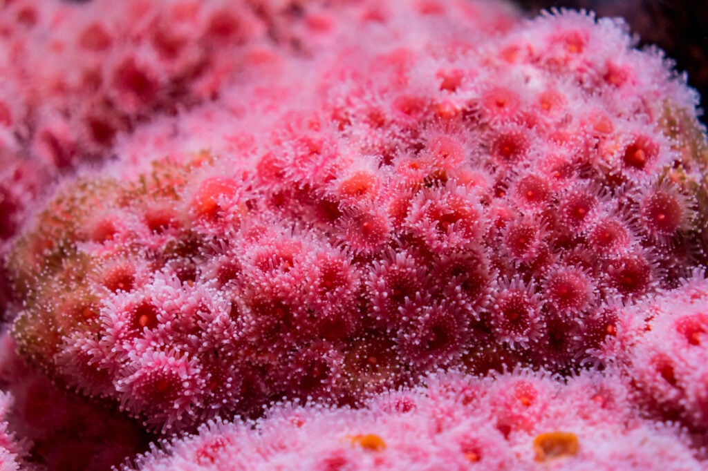
You might already know that coral comes in a huge range of colors. But in the world of color, “coral” almost always refers to a vivid shade of pinkish orange. It’s similar to peach, but it has more red than orange (and it’s usually more saturated).
159. Fuchsia
This odd-sounding word describes an especially vivid, bright purplish pink. The name comes from the name of the fuchsia plant, whose flowers are the same color.
160. Magenta
Magenta is a shade of purplish pink. If you’re familiar with additive (RGB) and/or subtractive (CMYK) color models, you might recognize this intense color. In both models, Magenta is shown as being exactly between red and blue.
161. Flamingo
Flamingos vary somewhat in their coloration, so there’s no singular shade of flamingo pink. The birds’ pink color comes from all the beta-carotene in their diet!
Words to Describe Metallics

162. Shiny
“Shiny” might not be the most imaginative word, but it certainly describes most metallic shades!
163. Glossy
Like “shiny,” “glossy” is commonly used to describe metallics — especially highly polished ones.
164. Gold
You already know gold as a precious metal. But practically speaking, “gold” is used to describe anything with a finish that mimics the look of real gold.
165. Antiqued
Old, worn metal has a certain elegance to it. But for those who want that well-worn look right out of the box, many manufacturers of home furnishings offer curtain rods, lamps, and other metal furnishings in “antiqued” finishes. Essentially, these finishes are made to look deliberately tarnished or old.
166. Shimmering
This adjective even sounds beautiful! If you’re describing a metallic color that’s shiny in a delicate way, “shimmering” is a great word to pick.
167. Silvery
You can use this word to describe cooler metallic shades, but it’s also a great choice for describing colors that are almost metallic, but not quite. For instance, you sometimes see shades of cool, gray-tinged white described as “silvery.”
168. Pewter
To the untrained eye, pewter might look a lot like silver. The colors are similar, but pewter (a metal alloy consisting mostly of tin, antimony, and copper) tends to have bluer undertones. It’s also not quite as shiny as silver.
169. Rose Gold

If you describe a color as “rose gold,” just about anyone will know what you mean. Rose gold (the metal) is a pretty alloy of copper and gold, and it has quite a distinctive glow. In the right context, “rose gold” could be used to describe non-metallics of a similar color. For example, pinkish clouds at sunset sometimes have a color similar to rose gold.
170. Chrome
Need a word to describe a metallic that looks like an even brighter version of silver? “Chrome” is perfect. The word itself is short for “chromium.” When chromium is used to plate metal, it creates a silver-like finish that reflects light almost like a mirror.
171. Oil-Rubbed
If you’re familiar with the various types of finishes used on metal hardware, you’ve likely come across a unique color called oil-rubbed bronze. This finish is usually created by oxidizing brass, but the end result makes it look like older metal that has gotten a patina over the years. If you need a word to describe a dark metallic that gives off vintage vibes, this might be it!
172. Satin
The main thing setting metallic shades apart from other colors is their luster. That said, some metallics are shinier than others. If you’re describing a metallic finish whose luster is more of a soft glow, “satin” might be an appropriate adjective.
173. Nickel
Nickel is a metal that looks a bit like silver. However, it has a slight tinge of gold, so it leans a little warmer. Just like with the terms “gold” and “silver,” you can describe an object colored this way as “nickel,” even if it isn’t actually made of the metal itself.
174. Brushed

Metals of any color can have a brushed finish. This type of finish adds a distinctive texture while slightly muting the shine.
175. Glimmering
This is an adjective that sounds a lot like “shimmering.” It has a similar meaning, too. A glimmering metal is shiny, but the light it reflects is somewhat weak and inconsistent.
176. Copper
Many metals — like silver, pewter, chrome, nickel, etc. — are very similar in color. But copper has a unique, reddish-orange-gold glow all its own. Ever wondered why copper has the striking color that it does? The metal primarily absorbs blue and green wavelengths of light, so it mostly reflects orange (complementary color of blue) and red (complementary color of green) light.
Words to Describe Shades of Brown/Beige

177. Almond
Especially in the world of interior design, beige never really seems to go out of style. However, in order to differentiate the never-ending shades, paint manufacturers and others who work with color have come up with interesting and inventive names. “Almond” describes a soft, yellow-leaning beige that’s roughly the color of the inside of an almond.
178. Hazel
“Hazel” is a pretty-sounding modifier, but it can lead to some confusion. In the world of design, it usually means a shade of medium brown with reddish undertones. But if you’re using it to describe the color of someone’s eyes, it usually means a distinctive mixture of green, brown, and gold.
179. Earthy
Shades of earthy brown are the kinds of colors that make you think of soil. But soil can look dramatically different depending on where you are in the world, so “earthy” can describe several different colors. Usually, earthy browns are medium to dark shades of grayish, chocolate-like shades.
180. Sandy
Like soil, sand comes in a range of different colors, from black to tan to pinkish white. However, if a shade of beige is characterized as “sandy,” it’s usually a light, tawny color, much like your average beach sand or play sand.
181. Clay
Neutrals described as being “clay” or “clay-like” in color are typically a rusty, reddish brown, like the color of red clay soil.
182. Mahogany
“Mahogany” as a color descriptor comes from the hardwood of the same name. Mahogany wood is commonly used to make furniture and musical instruments, so many people are familiar with it. Usually, it’s a deep shade of reddish brown.
183. Chocolate
This beloved confection comes in a range of brown shades. But practically speaking, most people seem to use the adjective “chocolate” to describe a color that sits somewhere in between that of milk chocolate and dark chocolate.
184. Desert
This apt descriptor is based on the color of most desert landscapes. It usually denotes a light shade of red-leaning brown or tan.
185. Ecru
This unusual-sounding word means “unbleached” in French, and it was traditionally used to describe the color of unbleached linen. However, at least in English, it has come to describe a distinctive grayish yellow with undertones of brown (and sometimes even green).
186. Russet
Technically speaking, russet is the color you get when you mix exactly equal amounts of orange and purple. It’s a rich, reddish brown similar to mahogany.
Many people’s first exposure to the word is at the grocery store, where they run into russet potatoes. The skin of these potatoes might be somewhat reddish brown, but it’s a lot more muted than what most designers think of as russet.
187. Chestnut
This shade of brown is named after the nut of the chestnut tree. It’s medium and reddish, although it usually includes a good bit more red than mahogany does. You might sometimes hear chestnut referred to as “castaneous.” That’s because chestnut trees are from the genus Castanea.
188. Caramel
If you’ve ever enjoyed the sweet, buttery candy that goes by the same name, you know what color “caramel” describes. In the world of interior design, this color has become somewhat popular to describe light-colored leather furniture.
189. Camel
“Camel” is a word often used to describe light, sandy brownish shades. If you have an interest in fashion, you’ve almost certainly run into this color before. “Camel coats” are soft, warm coats traditionally made from the hair of the Bactrian camel, although they also may be made out of dyed sheep’s wool and other materials, too.
190. Tawny
Tawny colors are shades of light brown that lean either yellow or orange. These colors might also be described as “sandy” or “buff.”
191. Taupe
Taupe is a color that sits between brown and gray. Shades described this way often have a refined, dignified look. The word “taupe” itself comes from the French word for “mole.”
192. Buff
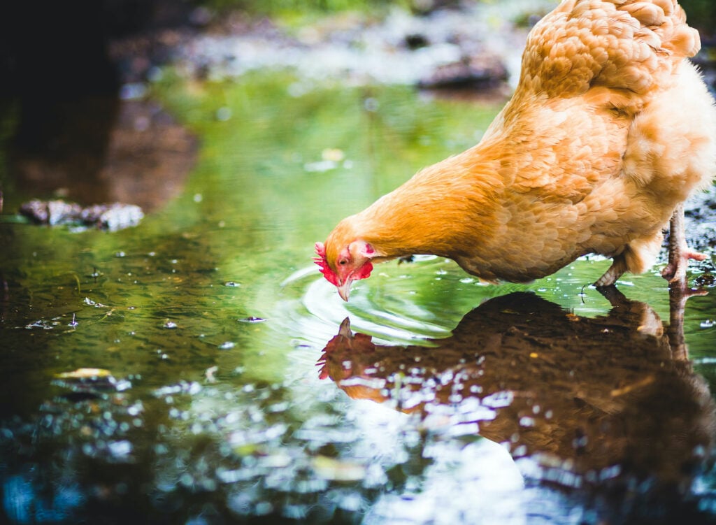
Buff colors are shades of light yellowish brown. The hen above — a Buff Orpington — illustrates the color beautifully! The word “buff” was first used centuries ago to describe tanned ox leather because the Latin term for ox is bufalus.
193. Fawn
As you’ve seen so far, many of the words on our list can be used to describe very similar colors. Fawn is pretty similar to buff, and it usually refers to a pale, yellowish tan. It’s often used in breed standards to describe a dog’s coat color.
194. Umber
If you’re a painter, you’ve probably run across umber. This common paint color originally came from one of the oldest known pigments in the world.
Umber (the pigment) is a mixture of manganese oxide and iron oxide. Its color can vary significantly, so “umber” can be used to describe neutrals ranging from very dark browns to lighter, more yellow-leaning browns.
195. Coffee
Depending on how you take your coffee, this massively popular beverage can appear to be many different colors. However, most of the time, colors described as “coffee” are closer to the dark shade of a roasted coffee bean than they are to the lighter color of brewed coffee with cream.
196. Tan
As adjectives go, “tan” might sound kind of dull and unimaginative. But like some of the other straightforward words on the list, it’s an effective way to make sure the person you’re talking to knows what color you’re talking about!
Have you ever stopped to wonder where the word itself came from? “Tanning” is the process of turning hide into leather, so “tan” came to describe the light color of new leather. The name of the process comes from the fact that chemical compounds called “tannins” were traditionally used.
197. Khaki
If you’ve ever bought a pair of khaki pants, you know that “khaki” can be used to describe a surprising range of neutral shades. It usually refers to a pale shade of tan with yellow undertones. However, some shades described as “khaki” also have olive-like undertones.
198. Oatmeal
Most people have a good idea of what oatmeal looks like. But how do you break down this delicious shade? While “oatmeal” can describe several similar colors, it’s usually used to mean a light shade of beige with faintly gray undertones.
199. Sepia
Sepia ink — whether it’s used for writing, photographs, or illustrations — has a certain unmistakable beauty. The ink came to be called “sepia” because it traditionally came from the ink of cuttlefish in the Sepia genus. Although sepia ink isn’t used too often now, the word “sepia” is still used to describe shades of rich, red-tinged brown.
200. Sienna
Like umber, sienna is a natural earth pigment whose name has been widely used as a color name. However, if you want to describe something as being “sienna” in color, you should clarify whether it looks like raw sienna (a yellowish-brown shade) or burnt sienna (a darker, reddish-brown shade).
201. Mocha
A mocha is a drink made with chocolate, milk, and espresso. So as you might have guessed, something that’s the color of coffee with milk could be correctly described as “mocha” in color.
202. Bay
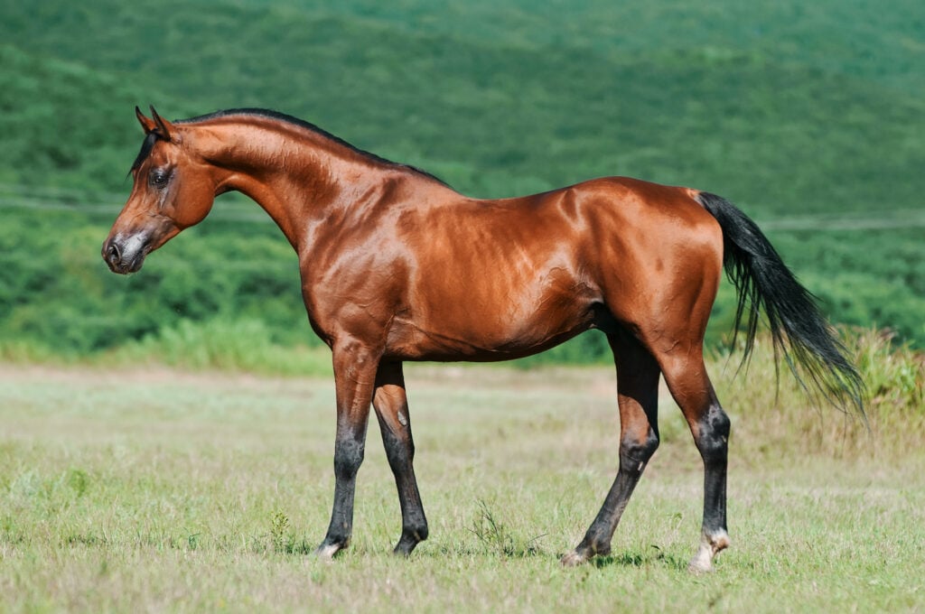
If you’re familiar with horses, you know that bay is one of the most common coat colors across multiple breeds. Bay horses have brown bodies and black manes, tails, and lower legs.
On a bay horse, the exact color of brown can vary. But in the design world, “bay brown” usually refers to a rich red-brown similar to the color of the bay horse in the picture.
203. Auburn
“Auburn” refers to a deep shade of reddish brown. It’s usually used to describe a human hair color that sits between red and brunette.
204. Henna
You might be familiar with the henna dye used for body art. The dye comes from the henna tree (Lawsonia inermis), and when it’s first applied, it’s bright orange. But when you see a color described as “henna,” it’s typically the darker, reddish-brown shade that the dye turns as it oxidizes.
205. Sable

The word “sable” can be used to describe several different brown shades, but all of them are browns tinged with gray or black. That’s because in dogs and some other animals, “sable” describes a coat color where each hair is fawn or brown at the root and black at the tip. The Belgian Malinois above is a great example of a sable-colored dog.
206. Bistre
If you’re looking for an uncommon word to describe a shade of dark brown, try “bistre.” Traditionally, bistre was a pigment that was made from the soot of burned beechwood trees, so you might expect it to be black. However, it’s actually more of a grayish brown with a slight touch of yellow — kind of like sepia.
207. Champagne
Want to describe a glamorous shade of beige? Designers and manufacturers alike often use “champagne” to describe very pale beige shades with a little touch of yellow. In interior design, it’s a common name for pale beige fabrics with a satiny finish.
Words to Describe Shades of White

208. Pearl
Pearls come in all kinds of colors, but “pearl white” usually describes a warmish off-white. It’s an especially apt descriptor for whites with a satiny, almost metallic sheen similar to that of an actual pearl.
209. Alabaster
If you’re looking for an ornate-sounding adjective to describe a shade of warmish white, “alabaster” is perfect. Traditionally, alabaster is a stone used for carvings or for powdering into plaster. In the design and paint industries, it usually describes a shade of off-white with yellowish undertones (but much fainter than the undertones found in cream and similar shades).
210. Creamy
Cream or creamy shades of white are warm whites with pronounced yellow undertones. “Creamy” can describe a range of shades from pale warm whites to colors reminiscent of butter.
211. Ivory
Lots of people mix up cream and ivory, but these are two very different shades. Both are off-white, but ivory tends to be closer to white (meaning there’s less yellow added). You can also make ivory by adding a little bit of peach or light brown to white.
212. Ghost
There isn’t really a specific white shade called “ghost,” but this is an interesting and inventive word you can use to describe the color. Stark or cool-leaning whites (or those with a little touch of blue or gray) are fitting choices.
213. Eggshell
Just about every company offering interior colors makes some kind of eggshell white — a classic choice for anyone who wants white walls but doesn’t want them to be too stark. Eggshell white is usually a slightly warmish white, although it often has undertones of both yellow and green.
As a side note, at least in the paint world, “eggshell” doesn’t only describe a color — it also denotes a specific type of paint (in any color) that has a very slight shine, much like the shell of an actual egg.
214. Snow

If you’ve experienced the striking look of the sun glinting off a snowy landscape, you know the invigorating feeling of being surrounded by vibrant, icy white. Fittingly, you can describe many different shades of cool white as being “snow white” or “snowy white.”
215. Salt
Plain table salt usually looks bright white. But if you’ve ever looked closely at sea salt, you might have noticed a very faint grayish cast. Fittingly, “salt white” is an interesting way to describe any white shade with a little bit of a gray undertone.
216. Linen
There’s a vast category of off-white shades that many people just characterize as “warm.” But if you want to get a little more specific with your descriptions, “linen” is a great word to have in your vocabulary. It usually describes a warmish white shade with undertones of both brown and yellow.
217. Porcelain
Porcelain is a ceramic material made from heated kaolin (a type of clay) and sometimes bone ash. Depending on the individual materials used to make it, it can lean slightly cool or slightly warm. Oddly enough, porcelain (the material) is slightly translucent, so porcelain (the adjective) is an especially evocative way to describe delicate shades of white.
218. Parchment
Parchment is an especially popular shade of off-white. It typically mimics the look of aged parchment paper, so different shades may have yellow, yellow-green, sepia, or umber undertones.
219. Bone
This is a fairly classic adjective used to describe a shade of off-white. Because bones tend to yellow slightly as they age, “bone white” is normally a white shade with yellowish undertones. However, it typically has touches of green and/or gray.
220. Frost
You might think that frost white would be the same color as snow white. However, at least in most contexts, frost white has slightly chilly gray undertones.
221. Chalk

As you can see in the image above, white chalk is a cool, brilliantly clean white. If you’re mixing this shade yourself, you can do so by adding a small amount of slate blue. And if you’re just looking for an interesting way to describe a refreshing, cool white, you can accurately use the word “chalk.”
222. Flaxen
Depending on who you ask, flaxen might be a yellowish white, a grayish white, or even a very pale grayish yellow. It’s about the color of white-blonde hair — a slightly warmer version of platinum.
223. Vanilla
This appetizing adjective is perfect for describing anything with the slightly yellowish white of vanilla ice cream!
224. Daisy
Nearly everyone is familiar with the cheerful daisy, a flower whose vivid yellow center and white petals can brighten anyone’s day. You might describe a similarly bright white as “daisy white.” But confusingly enough, many paint companies offer colors called “daisy white” that lean a whole lot warmer than the petals of actual daisies.
225. Milk
Like milk itself, milk as a color is a pale, cool-leaning shade. “Milk” is also a great descriptor to use for white shades that are translucent or close to it.
226. Starlight
Starlight white is about the color of the silvery glow of stars in the night sky. “Starlight” isn’t a cliched (or even common) way to describe a color, so it’s a great word to choose if you need an unusual adjective.
Words to Describe Shades of Gray

227. Charcoal
“Charcoal” might be the most common word used to describe shades of gray. You’ll find it used in fashion design, interior design, and more.
228. Misty
Think of the last time you saw mist floating over a forest or field. The mist itself probably looked whitish, but when you take a look at the overall cast of a misty sky, you see a faint, barely-there gray — a color you could accurately describe as misty gray.
229. Iron
At first, it might seem like iron and charcoal are the same color. However, if a shade of dark gray has greenish undertones instead of bluish ones, it would be more aptly described as “iron.”
230. Shadowy
You could probably use “shadowy” as an adjective for almost any gray shade. It’s a great word to use if you need a descriptor that’s both vague and evocative.
231. Smoky
Like shadowy, “smoky” can be used to describe a wide range of gray shades. However, many people characterize smoky gray as a shade with blue and/or violet undertones.
232. Dolphin

Dolphin gray is one of the quieter marine-inspired colors out there. You could describe many cool-leaning shades of gray as “dolphin gray.”
233. Slate
“Slate” usually describes the deep, bluish-gray shade of natural slate. However, you sometimes see it used as “slate blue” to describe a similar shade with much more blue.
234. Wolf
Shades of “wolf gray” are typically deep, blue-green-leaning, brown-tinged grays. However, wolves themselves have so much color variation that you could describe any color that reminds you of a wolf’s coat as “wolf gray.”
235. Gunmetal
Despite the fact that a huge portion of guns are black in color, “gunmetal” is a fairly popular word to describe shades of charcoal-like gray, whether they have a metallic sheen or not.
236. Graphite
As you likely already know, “graphite” is a gray shade that’s the color of a pencil tip. It’s a dark shade with clear blue undertones.
237. Stone
“Stone” is a word that can be used to describe all manner of gray shades. However, it seems to be used most commonly to describe shades of light, medium gray. After all, stones can be found in an endless array of colors!
238. Battleship
This shade of gray is modeled after the color of military ships. “Battleship” is usually used to describe deep, blue-leaning shades of medium gray.
239. Glaucous

This odd word can be used to describe shades of blue-gray. You might recognize it from the names of certain birds like the glaucous gull and glaucous tanager. Botanists also use “glaucous” to describe plants that have a dust-like, bluish-gray coating on the leaves.
240. Marengo
If you’re a history buff, you might recognize this color as the name of Napoleon’s horse. However, the emperor’s small warhorse was named after the Battle of Marengo, not the color. The color denotes a very dark, bluish-blackish gray like the color of wet asphalt.
241. Cloud
You could probably use “cloud” to describe several shades of both white and gray. But usually, when someone says “cloud gray” or “cloudy gray,” they mean a pale, mist-like shade, often with periwinkle-like undertones.
242. Cinereous
You don’t hear “cinereous” used to describe color too often! Since it sounds so similar to “cinders,” you might already have guessed that “cinereous” describes a color that’s somehow related to fire. It denotes a shade of gray like that of ashes — medium in intensity and with prominent undertones of coppery brown.
243. Ash
“Ash” can of course also be used to describe the color of ashes. However, “ash gray” often doesn’t include the brown undertones you see in cinereous.
244. Mineral
“Mineral” can sometimes be used to describe shades of gray, but there doesn’t seem to be a consensus on what “mineral gray” actually looks like. For instance, many paint companies offer “mineral gray” colors that are close to slate blue. Ford has an automobile finish called “Mineral Gray” that’s lighter and has dusty brown undertones.
245. Eigengrau
This distinctive color name means “intrinsic gray” in German. The name is fitting enough — eigengrau is the name for the color most people see when they close their eyes in total darkness. It might look like a shade of black at first, but it’s really a shade of very dark gray.
246. Space
Ask a group of people to tell you the color of outer space, and most of them will probably say it’s black. However, “space gray” can describe a shade of very dark gray with decided blue undertones. It’s a name popularly used by Apple to describe the color of some of its products.
247. Cadet
Cadet gray is a color name that gives a nod to military uniforms. You could correctly describe anything with a light, bluish-gray color as being cadet gray.
248. Carbon
Manufacturers of a wide variety of different items (including Porsche cars!) offer a color called carbon gray. Usually, shades of gray described as “carbon” are dark and somewhat bluish, much like slate.
249. Storm

Earlier, we mentioned that “cloud gray” usually indicates a light, misty type of gray. But if you want to describe something that’s more the color of storm clouds, “storm gray” works beautifully.
250. Steel
As you’ve seen, plenty of gray shades are named after metals. Steel gray is a color that sits between silver and gunmetal.
251. Gainsboro
If you want to describe a shade of gray in a way that shows off your knowledge of color history, try describing a light, balanced shade of gray as “Gainsboro.” This gray shade was added to the X11 list of colors in 1989. Paul Raveling, who added Gainsboro to the list, said it was based on a Sinclair Paints color with the same name.
Words to Describe Shades of Black

252. Inky
Like a pool of ink, inky black is an incredibly dark shade. Like most types of ink, it also has undertones that are reddish and/or purplish.
253. Faded
Faded black has the look of black paint that has lost its intensity. For instance, a black outdoor fence that hasn’t been repainted for decades would likely be faded black in color.
254. Coal
Typically, coal black is an incredibly dark shade. “Coal” is a great alternative to “jet” if you want to describe a very, very dark color.
255. Jet
“Jet” is a familiar adjective that many people use to describe extremely dark shades of black. You might think the name comes from some kind of airplane, but it actually comes from a deep black gemstone called jet.
256. Obsidian

Obsidian is an ultra-dark volcanic glass. So naturally, “obsidian” is a somewhat common adjective to describe intense black. It tends to have bluish undertones that make it a cooler black than most.
257. Sooty
Sooty shades of black are the dark color of soot, and they typically have cool, bluish undertones. That might sound similar to obsidian, and it is. However, “obsidian” is more appropriate for describing sleeker, glossier shades of black. Soot’s matte finish (and general dustiness) makes it a better choice for describing black shades that aren’t glossy.
258. Pitch
Like “jet,” “pitch” is often used to describe ultra-dark blacks. The word comes from the pasty black coal tar residue that’s often used by roofers.
259. Ebony
This is yet another word great for describing super-dark shades of black. Its name comes from the ebony tree, a South Asian tree with extremely dark wood.
260. Raven
Describing any black shade as “raven” instantly gives it an air of mystery. Like the often-sunbleached feathers of the bird it’s named for, raven black tends to have a faded cast that might sometimes make it look like a very, very dark gray.
261. Onyx
Onyx is a beautiful, banded stone that’s typically a variety of chalcedony. Most of the time, it’s a deep black with greenish undertones, and it features lines or bands of pure, cool white. If you’re describing a shade of black that seems unusually deep, “onyx” might be the right word to help you do so.
262. Licorice

Black licorice might not be everyone’s favorite candy. But like it or not, you’ve got to admit it has strikingly rich coloration! “Licorice black” would make a great name for a dark shade of black with purple undertones.
263. Vantablack
Vantablack isn’t so much a color as it is a specialized coating. Developed by a company called Surrey Nanosystems, Vantablack is made of tiny carbon tubes that absorb almost all light. This color is so non-reflective that if you coat a piece of wrinkled aluminum foil with it, the foil will look like it’s a completely flat sheet of black!
264. Raisin
“Raisin black” is a shade of black that, much like raisins themselves, has reddish undertones. It’s close to being a shade of very dark reddish brown.
The Right Adjectives Open Up a Whole New World of Color
Whether you’re a creative writer, a product designer, or just someone who wants to be able to better describe color, using the right words can make all the difference. Why just describe a sweater as “green” when you can more accurately call it “verdant” or “emerald”?
Always remember that you don’t have to stick to conventional adjectives. Some of the best descriptions of color are completely original!
Now you know the right words to describe colors. If you’re creating a design and need to find the right colors, here’s a list of 550 color names and hex codes.


