

When a color becomes popular, people tend to adopt it. Sometimes a little too eagerly. Whether used to evoke certain emotions, drive sales, or make a bold statement, color can be a powerful tool. But it doesn’t always work out as planned.
History is full of color fails, where certain choices seemed smart or stylish but ultimately backfired. Some were minor marketing mistakes, while others had serious, even deadly consequences. Thankfully, many of the disasters taught us valuable lessons.
1. A Popular Green Pigment Turned Out to Be Poisonous

Green has always been a popular color, but certain shades of green have been especially trendy throughout history. Scheele’s green was one of the most popular greens out there, particularly in the early to mid-19th century. It was a vibrant green hue commonly used for wallpapers and other decorative items. Despite its elegant appearance, it took a dark turn.
Swedish chemist Carl Scheele created Scheele’s Green using copper arsenite, a compound that contains the element arsenic. People were unaware of arsenic’s toxicity at the time, which is why it was frequently used in homes. Unfortunately, people became ill after being exposed to Scheele’s Green, but they initially didn’t realize the pigment was the cause.
Scheele’s Green caused lots of symptoms, including vomiting, rashes, cramps, and headaches. In extreme cases, it led to severe illnesses and even death. Once scientists discovered that Scheele’s Green was the common factor behind these dangers, it eventually stopped being used altogether.
2. People Used Deadly White Lead Paint for Centuries

Green wasn’t the only color that turned out to be deadly. Lead white oil paint was a popular paint option for artists from the 7th century until the 1960s, when it began to be banned in certain locations. While it was most commonly used as an artist pigment, the simple color was also used for cosmetics. People loved its opacity and how fast it dried.
Lead is poisonous, so people can get very sick if it gets inhaled, ingested, or enters cuts and wounds. While it’s likely that they didn’t know about its toxicity for a while, people recorded the harmful effects associated with it over time.
As alternatives became available, countries banned the use of lead paint for public safety. Many European nations banned it in the 1960s, and it was later banned in the US in 1977 and the UK in 1991. Today, most countries prohibit the use of lead paint in homes, but artist-grade pigments like lead white are still sold under strict regulations. However, when safer options perform just as well, most artists and manufacturers avoid hazardous pigments like lead white.
3. Heinz Tried to Make Ketchup More Exciting with Colorful Varieties

To make condiments more exciting for kids, popular ketchup company Heinz decided to create different ketchup colors. From 2000 to 2006, they created ketchup color varieties known as Blastin’ Green, Funky Purple, Stellar Blue, Passion Pink, Awesome Orange, and Totally Teal. They even came in an easy-to-squeeze bottle for kids.
While these new colors were definitely cooler than the traditional red ketchup, they didn’t last. These products tasted like regular ketchup but contained a high amount of food dye to give them a distinctive appearance. They sold well at first, as they were something new and exciting, but people quickly discovered that the new colors felt off.
Even though they technically tasted the same, the perceived taste wasn’t as good as the original, since the new colors weren’t associated with ketchup’s flavor, unlike red. The products were discontinued, which is why you no longer see colorful ketchup on the shelves.

4. Burger King’s Black Halloween Whopper Was a Failure

In 2015, Burger King released a special Halloween Whopper, which was their signature burger on a black bun. Like the colored ketchup, the black bun still tasted normal, but it had a fun and spooky appearance. At first, this seasonal item was a hit because people loved its unique appearance, but the positive opinion of it quickly shifted.
Not long after the Halloween Whopper launched, people began reporting that it turned their poop green. Many people experienced it, which led to the burger becoming a trending topic on social media. Of course, that’s not what Burger King had hoped the menu item would become popular for.
Luckily, the unusual side effect wasn’t dangerous. It was simply a result of the food dyes mixing as they broke down during digestion. Although the concern was amusing, Burger King decided not to bring back the special Whopper the following October.
5. The French Army’s Red Pants Made Them Easy to Spot

For many years, the French army’s signature look included long blue coats with bright red pants. Those pants were famously called “pantalon rouge.” While the outfit certainly gave them an iconic look from 1829 to 1914, army uniforms aren’t meant to be stylish and set a trend.
Eventually, the French realized that red was way too bright a color on the battlefield. It drew attention to them instead of helping them camouflage. In 1915, they stopped using such vibrantly-colored clothes and instead switched to dull blue-gray uniforms. The color was known as “horizon blue” and was intended to help them blend in with the sky behind them. They eventually switched to khaki, which is another simple hue meant for blending in.
6. Painting Prisons Pink Failed to Calm Inmates

In the 1970s, a light pink hue known as Baker-Miller Pink or Drunk-Tank Pink became popular for use in prisons and holding cells. While a delicate color like pink might not seem fitting for that type of environment, research supported its use. Researcher Alexander Strauss observed that a specific type of pink appeared to have a relaxing effect, reducing violent and aggressive behaviors as a result.
Baker-Miller Pink became a popular prison color in an effort to reduce prisoners’ aggression. Unfortunately, the color choice ultimately proved to be a failure. While it seemed to have calming effects at first, those wore off faster than expected. Further research determined that the hue reduced aggression for about half an hour but then had no effect. Thus, Baker-Miller Pink eventually ceased to be used in prisons, as it didn’t offer long-term benefits.
7. Interest in Mummy Brown Died After People Learned What It Was Made Of
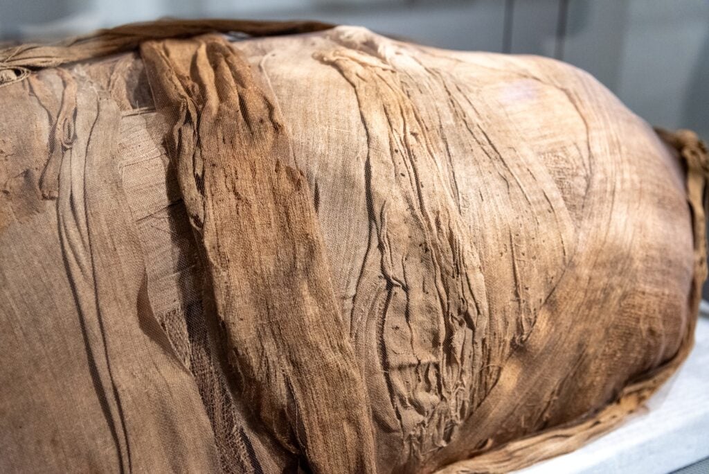
Back in the 16th century, Mummy Brown was a popular paint color. The name originated from the method of production, which involved grinding up Egyptian mummies and mixing them with other ingredients, such as white pitch and myrrh. The ingredients created a unique transparent brown that was perfect for shadows and flesh tones in artwork. At the time, mummies weren’t nearly as respected as they are today.
While some people were okay with the paint’s origins, others were unaware of them. It was often sold under different names, such as Egyptian Brown, so people wouldn’t know it was made from mummies. Even the people who knew it as Mummy Brown didn’t realize that the name was so literal.
Once people discovered the truth about Mummy Brown, its popularity decreased. The fresh supply of mummies also decreased over time, and artists noticed a decline in the quality of the paint. By the mid-20th century, suppliers had stopped offering it altogether.
8. Luminous Radium Paint Caused Deaths During Production
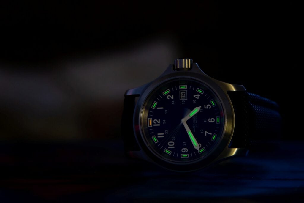
People love colors that glow in the dark. So, when factories started making glow-in-the-dark watches in 1916, they were a huge hit. The paint that made the watches glow included radium. While radium is known for causing serious harm today, relatively little was known about its properties and effects at the time.
Producing these watches was considered a well-paid job. However, a specific technique was required to color the watches and achieve the perfect look. The women making the watches were instructed to point the paintbrushes with their lips, meaning they were ingesting small amounts of radium throughout the day. By the 1920s, many of the workers grew severely ill and some even died, likely because of radium poisoning.
Once the negative effects of the luminous radium paint became clear, some of the workers sued and eventually received compensation. Production halted and radium paint stopped being used completely by 1968 due to its dangerous effects.
9. Fans Hated the Beige Carpet at the Oscars
Even in recent years, there have been crazy color fails. One notable example was the beige carpet at the 2023 Oscars, which replaced the famous red carpet. It was the first time since 1961 that the carpet wasn’t red at the Oscars. The odd color change occurred because the creative consultants thought the red would clash too much with the orange tent that was meant to protect guests from the sun and rain. They settled on a champagne carpet, which appeared more beige or even gray, creating a simple, understated look that didn’t stand out much.
People had strong opinions about the neutral-colored carpet. Fans and guests thought it looked bland and didn’t capture the excitement and luxury that comes with the award show. The feedback was clearly considered because the following year, the carpet returned to its classic red hue.


